
Sign-Up Form
This tutorial shows how to build a sign-up form through the stages of checking if the email and password inputs are filled out, validating the email format and checking the password length. You can either follow the entire tutorial or finish at whichever stage you want.
→ Download a ready .uxp file for this tutorial.
Setting Up the Design
- Create a Form with a header, two inputs – one for the email and the other for the password – and a sign up button.
- Then, use the Box to create a Confirmation Screen and group all its elements. Place it over the Form so that it covers it completely.
- Hide it by clicking the eye icon in the Layers panel.
Tip
Tabbing through inputs in forms depends on the order of Layers in the Layers Panel – from top to bottom. So a bottom to top layer order in the Layers Panel gives the right Tab focus from in the form on Preview.
States for Email and Password Inputs
You will now create states for the email and password inputs – the State 1 (Base) and the Empty state.
- Select the input, the text label and click Add State in the Top bar. State 1 (the Base) will be created automatically.
- Create another state by typing in Empty and click Enter.
- Add a text element inside the group for the Empty state.
- Change all elements in the Empty state to a red color – this will inform about the error.
- Repeat these steps for the password input.
Displaying Errors for Empty Inputs
Start by adding conditions for both the email and password inputs and the button.
- Hold down
Ctrl
and select the email input. - Click the + icon on top of the Properties Panel to add an interaction.
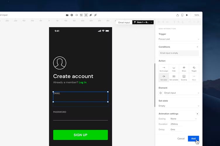
- In Trigger, select Focus Lost.
- Add a Condition with the +.
- In the first dropdown select Content of element. In the dropdown below, select your Email input.
- In the third dropdown, select is empty.
- Click Add condition.
- In the Action section, choose Set state.
- Under Element, choose your Email input and select Empty in the Set state dropdown.
- In Animation settings, change the Easing to None.
- Click Add.
- Repeat these steps for the password input.
Clearing Error Messages on Focus
Now that you have created interactions that show errors for empty inputs, it’s time to add interactions that will make these error messages disappear on focus.
- Select the email input and add a new interaction.
- In the Trigger dropdown choose Focus.
- In the Action section, choose Set state.
- Under Element select your Email input group and in Set state choose State 1 - Base.
- In Animation settings, change the Easing to None.
- Click Add.
- Add the same interaction for the password input.

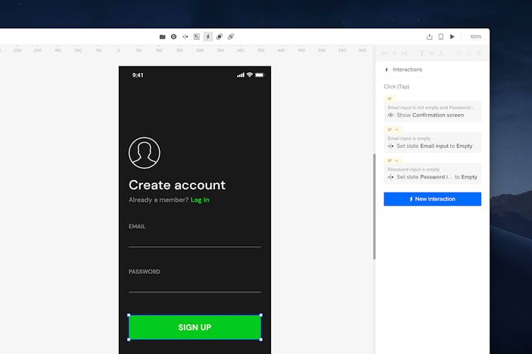
Adding Interactions on the Button
Interactions added on the sign-up button will check if the inputs are filled out and, if yes, the Confirmation Screen will be displayed.
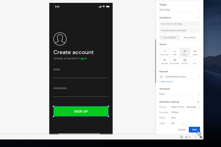
- Select the button and add an interaction with the + in the Properties panel.
- Add a new Condition.
- Set the first dropdown to Content of Element and choose your Email input below.
- Set the last dropdown to is not empty.
- Click Add condition.
- Add the same condition for the Password input.
- Then, in the Action section choose Show.
- In Element select your Confirmation screen.
- Under Animation, choose Fade and click Add.
- Add another interaction for the button.
- Create a condition and choose Content of element in the first dropdown.
- In the Select element dropdown choose Email input, and is empty below.
- In the Action section, select Set state.
- In the Element section choose Email input.
- In the Set state section choose Empty.
- In Animation settings, change the Easing to None.
- Click Add.
- Add the same type of interaction for the Password input and save it.
You've just completed the first part of the tutorial. You can either proceed or finish at this point. The video below shows your design at this stage.
Email and Password Validation
You will now add interactions that validate the email format and display it on the Confirmation Screen, and one that checks the password length. Edit the content on the Confirmation Screen by changing the Header and adding body copy, and a separate text element for the email address.
Create an Incorrect state for Email input
- Select the Email input and open the State dropdown.
- Click New State
- In the Set name field type in Incorrect
- Press Enter.
- Adjust the copy and style of the text inside that state.
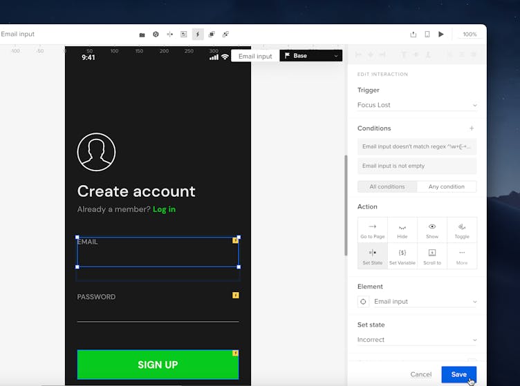
Validating the Email format
You will now add an interaction that will inform about an incorrect email.
- Select the Email input and switch to State 1 (Base).
- Add a new interaction.
- In Trigger, choose Focus Lost.
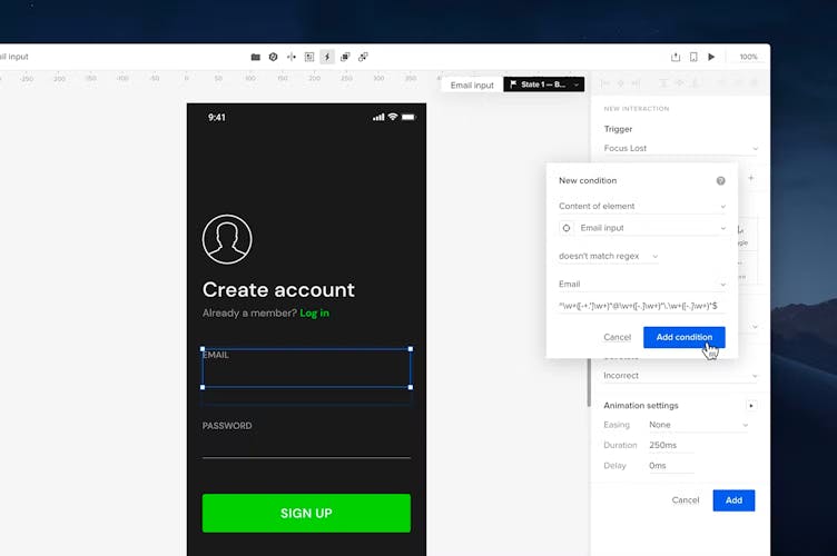
- Add a Condition and choose Content of element in the first dropdown.
- In the Select element dropdown choose your Email input.
- In the last dropdown choose doesn’t match regex.
- In the dropdown below it, select Email.
- Click Add condition.
- Add another condition for the Email input, choosing is not empty in the third dropdown.
- In the Action section choose Set State.
- Under Element choose your Email input.
- In Set state select the Incorrect state.
- In Animation settings, change the Easing to None and click Add.
Displaying the Email on the Confirmation screen
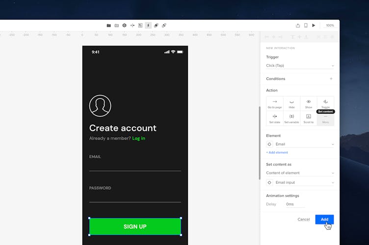
- Select the Button and add a new interaction.
- In the Action section click More and then choose Set content.
- Under Element choose the separate text element from the Confirmation Screen.
- In Set content, choose Content of element and then select the Email input.
- Click Add.
- Preview your prototype.
Create Incorrect State for the Password
- Select the Password input and open the State dropdown.
- Click New State
- In the Set name field type in Incorrect
- Press Enter.
- Adjust the copy and style of the text inside that state.
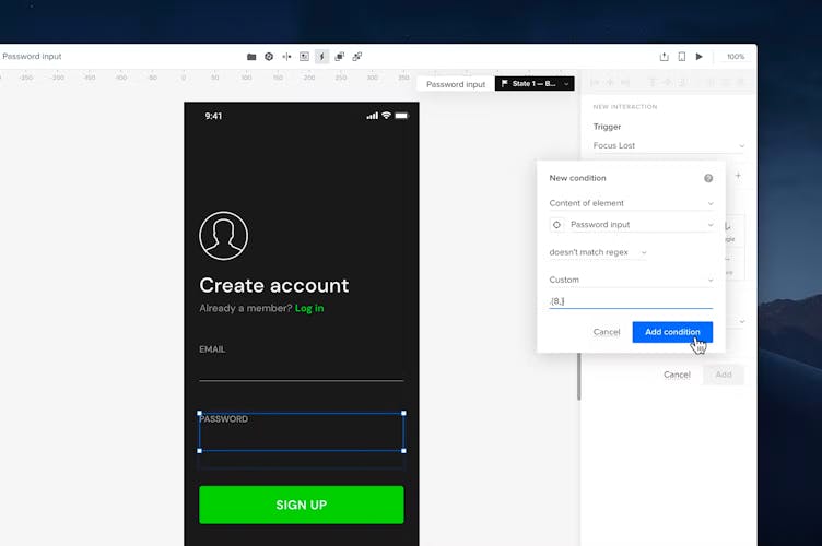
Verifying the Password Length
- Select the Password input with
Ctrl
and add a new interaction. - In Trigger choose Focus Lost.
- Add a new Condition.
- In the first dropdown choose Content of element.
- In the second choose Password input
- In the third dropdown choose doesn't match regex.
- Below, set the dropdown to Custom. In the Set pattern input type
.{8,}. - Click Add condition.
9. Add another condition for the Password input choosing is not empty in the last dropdown and add it.
10. In the Action section choose Set state
11. In Element choose Password input.
12. In Set state choose the Incorrect state.
13. Change Easing in the Animation Settings to None.
14. Click Add.

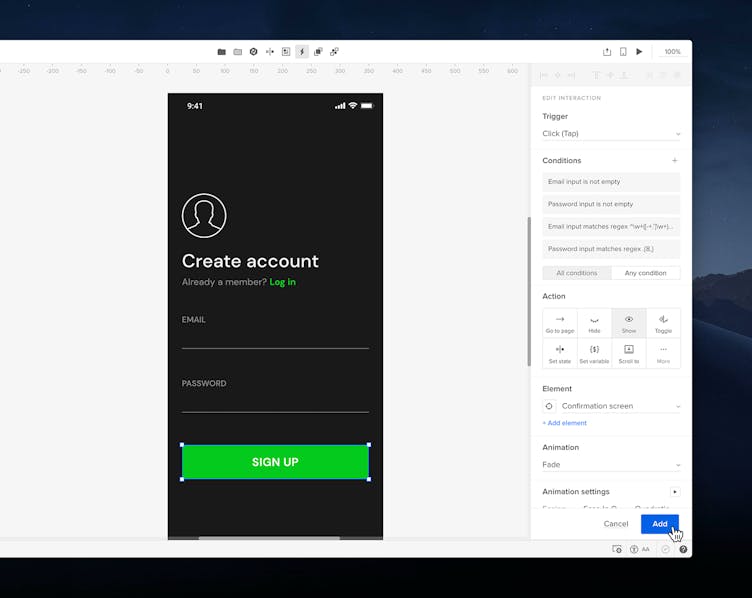
Setting Interactions for a Correct Password Length
- Select the sign-up button and add another condition for the existing interaction.
- Set the first dropdown to Content of element.
- Then, choose your Password input as the element.
- In the dropdown below choose matches regex.
- Then, in the Set pattern input type
.{8,} - Click Add condition, then Save.
You can now preview the final design as below.