
AI Component Creator
AI Component Creator, powered by the OpenAI API, helps you speed up prototyping and streamline component creation with minimal effort. Whether crafting dynamic interfaces or exploring design concepts, this feature simplifies your workflow. Here’s how:
- Prompt-Based Design: Just input a prompt describing what you need, and the AI takes care of the rest, instantly generating a customized component for your prototype.
- Time-Saving: Say goodbye to manual design work. This tool cuts down the hours you'd spend crafting components, so you can focus on the bigger picture.
- Customization: The AI Component Creator tailors components to fit your project's specific requirements while allowing customization across every aspect of the component.
The AI Component Creator is especially useful for:
- Designers or UI Developers who need to create prototypes quickly and efficiently.
- Individuals who may lack extensive design experience but require custom components for their projects.
- Teams looking to minimize repetitive design tasks and focus on broader project goals.
How to generate components
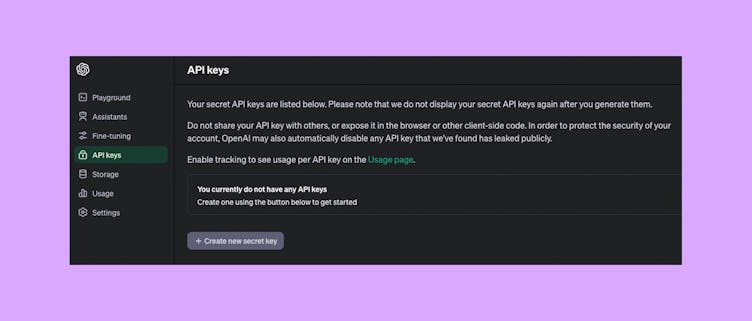
- Get an OpenAI API Key from the OpenAI website.
2. Go to Editor and open AI Component Creator from the Quick Tools panel.
3. Open the Settings tab and paste the API Key you got in the 'OpenAI API Key' field.
4. Open the Prompt tab and generate customized components.
Note
The AI Component Creator's performance depends on the AI platform's performance. Please keep in mind that longer prompts might result in slower generation times.
AI Models
AI Component Creator gives you a few different models to choose from, depending on what you’re working on. Each model has slightly different strengths and speeds.
- Claude 3 Sonnet – A good option when you're focused on generating clean, component-ready results. It may take a bit longer, but often creates strong design elements.
- GPT-4.1 – Useful for detailed, well-structured responses across a range of topics.
- GPT-3.5 and Claude 3.7 – These models respond quickly and are helpful for early drafts or simple tasks where speed matters more than precision.
OpenAI models (GPT-4.1 and 3.5) generally perform more consistently under heavy use, so if you're working during busy times, they’re a good choice for staying productive.
You can switch between models at any time to compare results and find what works best for your project.
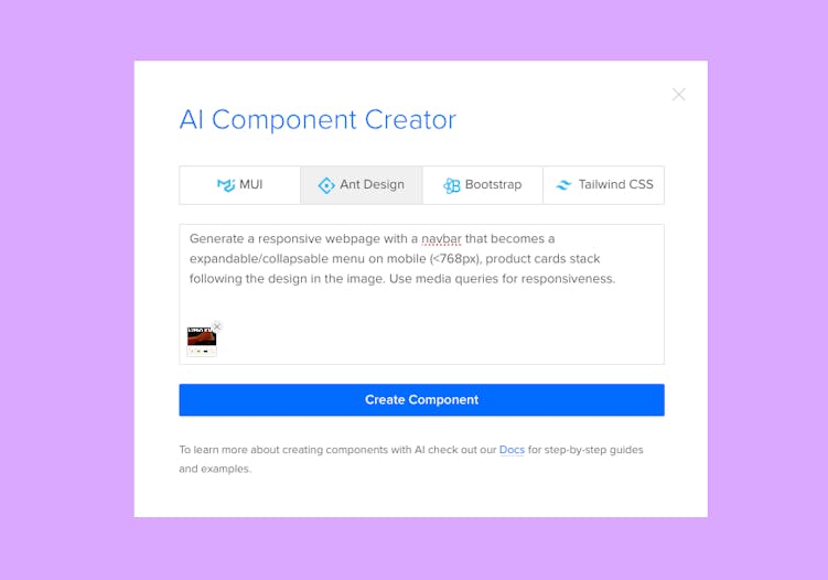
AI Image Upload
The AI Component Creator allows you to upload images to quickly generate UI components, transforming visual mockups into functional code. Combining images with detailed prompts allows you to speed up the prototyping process and translate design concepts into working components without starting from scratch.
Whether you’re working with low-fidelity wireframes or high-fidelity mockups, the AI can generate the core structure of your components. However, the level of detail in your image will affect the output:
- Low-Fidelity Wireframes: Simple designs that are ideal for generating rough layout structures. Be sure to provide prompts to add missing details such as colors, spacing, and interactivity.
- High-Fidelity Mockups: Polished designs that provide more context, leading to more visually precise components. The AI can better recognize elements like typography, colors, and spacing from these detailed mockups.
While prompts aren’t required, adding them will help you gain more control over the output and ensure the generated components align with your specific design needs.
Tip
You can paste copied images directly from your clipboard.
Tips for Best Results:
- Break Down Design into Parts: Upload specific sections of your design (e.g., header, footer, product gallery, or hero section) rather than an entire webpage. This approach allows the AI to generate more precise and detailed components. Uploading a full webpage may result in less accurate output as the AI may struggle with complex designs.
- Be Specific with Details: Provide clear instructions about which design elements should use Flexbox, specific color schemes, layout preferences, spacing, and other properties. The more details you give, the better the AI can interpret your design intent.
- Use Clear Image Formats: Upload images in PNG or JPEG formats, ensuring they are clean and focused on the relevant design components. Avoid unnecessary clutter or distractions in the image to improve the accuracy of the generated components.
Tips and Tricks
- Be specific with your prompts: To get the best results from the AI Component Creator, provide clear and detailed prompts including specific design requirements, such as colors, typography, and layout preferences. The more specific you are about the characteristics and functionality of the component you're looking to create, the more accurate the AI-generated results will be.
For example: Create an input field with the label 'Email' positioned above it. The label should have a font size of 16px and be bold. The input field should have a bottom border of 2px solid, and a blue border when focused. - Experiment with different prompts: Don't be afraid to experiment with different prompts to explore the full potential of the AI Component Creator. Try out different combinations of words and phrases to see how they affect the generated components and discover new possibilities for your prototypes.
- Provide multiple instructions separately: Break down complex UI components into smaller, more manageable parts, and provide instructions for each component individually. This can help generate components with greater detail and accuracy.
- Iterate and refine Generated Components: While the AI Component Creator can save you time by automatically generating components, it's important to review the results and make any necessary refinements. If the initial output is not as expected, experiment with different wording, structures, or additional details until you achieve the desired outcome.
Example Prompts
- Create a testimonial card with a 5-star rating. The testimonial should be in quotes. Its copy should be ‘The best tool I've ever used’ and 5 out of 5 stars should be active. Use #FFD700 for stars and #636363 for text. Add a label 'Long-time customer’.
- Create a navbar navigation with the following specifications:
Gradient background with shades of blue and pink. Place the store name on the left side, using uppercase letters and without a logo. Center-align menu items within the navigation. Add a 'Login' button on the right side with a hover effect.
- Create a sign-up form layout with testimonials displayed on the left side, featuring a dark color scheme. For the form container use #111827 and text-white. Use input fields with rounded corners and borders in #374151. Include placeholders in the inputs. The submit button should be #8B5CF6 and rounded corners. For the testimonials section use #1F2937 to visually separate the testimonials from the form. Apply text-white, text-large, and font-semibold for testimonial quotes.
- Persona card with a profile picture of the person on the left side. Avatar should be rounded. Display the person's name in bold font at the top. Provide details such as age, occupation, and location beneath the name. Include a brief description or bio about the person's background and interests. Add icons or visual indicators to represent key attributes or characteristics. Ensure the card has a visually appealing layout with sufficient spacing and alignment.
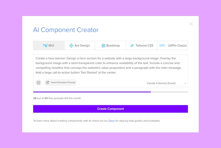
- Design a hero section for a website with a large background image. Overlay the background image with a semi-transparent color to enhance readability of the text. Include a concise and compelling headline that conveys the website's value proposition and a paragraph with the main message. Add a large call-to-action button 'Get Started' at the center.
- Create a pricing table with three columns representing different pricing tiers.
Column 1: Pricing plan for freelancers priced at $19.
Column 2: Pricing plan for startups priced at $39.
Column 3: Pricing plan for companies priced at $59, with this column highlighted and labeled as 'Most Popular.'
Under the table add information to 'Contact us' to get the Enterprise plan.
- Generate a horizontal footer for the clothing store without images. For background use gray.
AI Helper
Note
Currently available only for built-in React libraries: MUI, AntD, Bootstrap, and Tailwind.
AI Helper lets you update and style Merge components using simple text prompts. Instead of adjusting properties manually, you can describe what you want to change, and AI will apply the update for you.
This is especially useful for quick design iterations or when making multiple small adjustments.
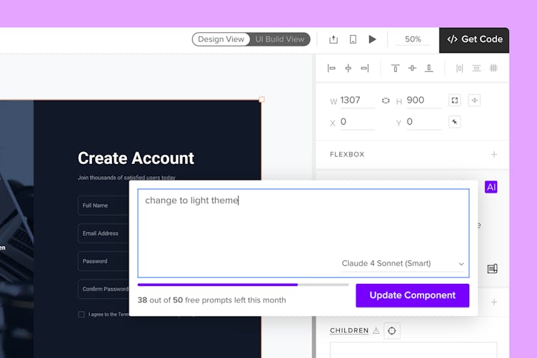
How to use
- Select a supported component.
- Click Modify with AI purple icon in the component info section.
- Type what you want to change in the prompt field.
- Click Update Component.
Note
If you deselect the component while the AI is processing your request, the operation will be canceled.
What can be modified
AI Helper works with any supported component, including those created using AI Component Creator.
You can use it to:
- Update visual styles – adjust colors, borders, typography, and other design properties.
- Modify layout and spacing – reposition elements, change alignment, and apply padding or margins.
- Generate and edit text content – create or refine labels, headings, and paragraphs based on your prompt.
Once you submit a prompt, AI will apply the changes directly to the selected component. You can continue editing as usual or undo the changes at any time.