
Tailwind CSS Integration
What is Tailwind CSS?
Tailwind CSS is a utility-first CSS framework designed to speed up front-end development. It allows you to control the layout, color, spacing, typography, shadows, and more directly within HTML using classes. This means you can style elements without having to write a bunch of CSS. It's like having a set of building blocks that you can easily put together to create a website that looks just the way you want it to.
Tailwind CSS creators made Tailwind UI, a library of pre-built Tailwind components and patterns that users can copy to their projects. This library is also integrated as a Merge library.
Tailwind UI Library
Note
Tailwind UI is currently in Beta version.
The UXPin built-in Tailwind UI Library is integrated as a Merge library, fully customizable, and themeable. This integration brings the power and flexibility of Tailwind CSS directly to your prototyping workflow. Currently, there are 18 components and elements available, along with handy component compositions and patterns to kickstart your projects.
Custom Components
Tailwind UI allows you to create custom Tailwind components based on the HTML code of Tailwind CSS components. These components are fully customizable.
Note
Components that require JavaScript may not function correctly after being uploaded to UXPin, as the JavaScript code is removed during the component creation process
Users can also use AI Component Creator to generate a custom component for their UXPin library.
Global and Local Theme Prop
Tailwind UI includes support for both global and local themes.
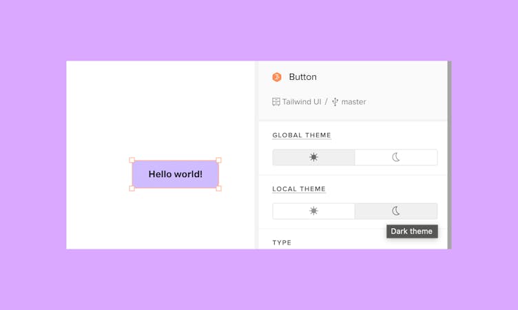
Global Theme: You can set up a global theme to propagate across the entire page, ensuring design consistency.
Local Theme: If you want to change the theme only for a specific component you can set up the the local theme property to apply theme changes exclusively to specific pages, offering flexibility in design customization.
Additional Resources
Heroicons – Beautiful hand-crafted SVG icons, by the makers of Tailwind CSS, that you can use with the Icon component or property. Just copy SVG and paste it into the component or property; it’s that easy!
Hero Patterns – Seamless SVG background patterns by the makers of Tailwind CSS, that you can add as custom CSS to apply as the background.
Utilities and Classes – Tailwind CSS offers a wide range of customizable utility classes to streamline your front-end development. Explore the documentation to discover how you can easily customize colors, typography, and more for your projects.
Tailwind UI – Ready-made components and patterns made by Tailwind CSS creators. You can copy the code on the website and paste it as a Custom Component in the Merge library.
Design Handoff
All Tailwind components in UXPin, regardless if they were built-in or added by you, are backed with code. Once you create your design with Tailwind built-in or custom components, you can grab their HTML code or open them in StackBlitz from the Spec Mode. This speeds up your product development because your components don't require translation from design to code.