ARIA live regions make dynamic web content accessible by ensuring screen readers announce updates to users in real time. This is crucial for notifications, form errors, or updates like shopping cart changes. Here’s what you need to know:
- Why it matters: Screen readers process content linearly, so updates outside a user’s focus might be missed. ARIA live regions solve this by announcing changes without requiring user interaction.
- Key attributes:
aria-live: Prioritizes announcements (polite,assertive, oroff).aria-atomic: Announces the whole region or just the change.aria-relevant: Specifies the type of updates (e.g., additions, removals).aria-busy: Delays announcements until updates are complete.
- Best practices:
Quick Overview of Use Cases
- Form validation: Notify users of errors like "Password must be 8 characters."
- E-commerce: Announce "Item added to cart" without disrupting navigation.
- Live updates: Use for chats, sports scores, or status messages.
By following these steps, you can ensure your dynamic content is accessible, compliant with WCAG standards, and user-friendly for everyone.
Announce Content Changes with ARIA Live Regions
How ARIA Live Regions Work
ARIA live regions use specific attributes to guide assistive technologies on when, what, and how to announce updates to dynamic content. Let’s break down these attributes and how they impact live announcements.
ARIA Live Region Attributes Explained
ARIA live regions depend on four main attributes that determine how screen readers handle and announce updates:
aria-live: This attribute tells a screen reader that an element will be updated. It describes the type of changes users can expect and sets the priority for how those updates are announced.aria-atomic: Controls whether the screen reader announces the entire region (true) or just the specific parts that have changed (false).aria-relevant: Specifies the types of changes that should trigger an announcement. Options includeadditions(new nodes),removals(deleted nodes),text(content changes), orall(any modifications). By default, it’s often set to "additions text".aria-busy: Indicates if the element is still updating. When set totrue, screen readers delay announcements until the updates are complete, avoiding partial or confusing notifications.
Politeness Settings: Polite, Assertive, and Off
The aria-live attribute has three key values that determine how and when updates are announced:
aria-live="polite": Waits for the user to pause before announcing updates. This is ideal for non-critical messages like confirmation notifications or shopping cart updates.aria-live="assertive": Used for urgent or time-sensitive updates. It interrupts any ongoing announcements to deliver the message immediately.aria-live="off": Updates are announced only when the user interacts with or focuses on the region. This works well for background changes, like live sports scores or carousel updates.
| Setting | Behavior | Best Use Cases |
|---|---|---|
| polite | Waits for user to finish current activity | Success messages, cart updates, minor alerts |
| assertive | Interrupts ongoing announcements immediately | Error messages, urgent alerts, warnings |
| off | Announces only when user interacts or focuses | Background updates, social feeds, live scores |
How Screen Readers Process Live Region Updates
Screen readers process content in a linear way, which can make handling dynamic updates tricky. When an element is marked as a live region, screen readers monitor its content and announce updates without shifting the user’s focus. The way updates are handled depends on the politeness settings:
- Polite updates are queued until the current speech finishes.
- Assertive updates interrupt any ongoing announcements to deliver the message immediately.
Typically, screen readers announce updates only once and focus on changes rather than the initial content. To ensure announcements are triggered as intended, developers often start with an empty live region and update its content separately.
Implementing ARIA Live Regions for Dynamic Content
Using ARIA live regions effectively means knowing when and how to apply them. These tools make dynamic content updates accessible, ensuring users stay informed without a full page refresh. Here’s a closer look at how to make the most of ARIA live regions.
Common Use Cases for ARIA Live Regions
ARIA live regions shine in scenarios where real-time updates need to be communicated seamlessly. Some key applications include:
- E-commerce notifications: When a user adds an item to their cart, a live region can announce, "Item added to cart", without interrupting their shopping flow.
- Form validation: Live regions can instantly announce issues like, "Your password must be at least 8 characters long", helping users correct errors as they go.
- Real-time chats: By using
role="log"andaria-live="polite", live regions can keep screen reader users updated on new messages without disrupting their focus. - Live sports scores: Set
aria-live="off"to ensure updates are announced only when the user actively focuses on the score area.
Live regions also work well for status updates, such as confirming a successful form submission or signaling completed actions. These are just some of the ways ARIA live regions can enhance user experience.
Step-by-Step Implementation Guide
To implement ARIA live regions effectively, follow these steps:
- Set up empty live regions on page load to prevent unintentional announcements:
<div id="status-messages" aria-live="polite" aria-atomic="true"></div> - Choose the right politeness level based on the urgency of the update:
- Use
aria-live="polite"for general updates, allowing announcements during natural pauses. - Use
aria-live="assertive"for critical updates, like error messages or security alerts.
- Use
- Configure attributes to fine-tune behavior:
- Set
aria-atomic="true"to announce the entire region, oraria-atomic="false"to announce only the changes. - Use
aria-relevantto specify which changes (e.g., "additions text") should trigger announcements.
- Set
- Update the live region programmatically when dynamic events occur:
document.getElementById('status-messages').textContent = 'Your password must be at least 8 characters long'; - Test across multiple screen readers, such as NVDA, JAWS, and VoiceOver, to ensure the updates are clear and reliable.
Best Practices for Reducing Disruptions
Once your live regions are set up, focus on minimizing distractions for users:
- Limit the number of live regions on a page to avoid competing announcements.
- Keep messages short and meaningful, as screen reader users process information sequentially. Concise updates are more effective than lengthy explanations.
"Live regions are powerful tools, but they work best when used sparingly and thoughtfully. Your goal is to keep users informed without overwhelming them." – Florian Schroiff, Writer
- Ensure critical messages remain visible long enough for users to process them. For urgent alerts requiring immediate attention, consider using
role="alertdialog", which keeps the message on screen until the user interacts with it. - Provide actionable and specific information instead of vague notifications. For example, instead of saying, "Error occurred", explain what went wrong and how to fix it.
Finally, always consider the user’s context. A message that’s helpful in one situation could be distracting in another. Testing your implementation with real users can help perfect the timing and clarity of your live region updates.
sbb-itb-f6354c6
Best Practices for Accessible Dynamic Content
Making dynamic content updates accessible requires careful use of ARIA live regions, thorough testing, and avoiding common mistakes that might make your interface confusing or overwhelming for users.
When and How to Use ARIA Live Regions
Use ARIA live regions only when absolutely necessary – focus on updates that users need to know immediately or during idle moments. For updates that aren’t critical, set the region to polite. Reserve assertive for urgent, time-sensitive changes. Avoid overloading the interface with too many live regions, as competing announcements can frustrate users.
During processes where updates are still in progress, consider using aria-busy="true". This prevents premature announcements and ensures users are informed only when the content is ready.
Certain roles like log, status, alert, progressbar, marquee, and timer act as live regions by default. For better compatibility, you can add aria-live="polite" to elements with roles like log and status. However, avoid pairing aria-live="assertive" with role="alert" – this combination can lead to issues like double announcements, especially on VoiceOver for iOS.
Lastly, always validate your implementation by testing with multiple screen readers to ensure reliable functionality.
Testing Compatibility with Assistive Technologies
Testing ARIA live regions with real screen readers is critical. Automated tools might miss nuances, as different screen readers process live updates in unique ways. Focus on widely used tools like NVDA, JAWS, and VoiceOver, each of which handles timing and behavior differently.
Test live regions in diverse scenarios, including during active navigation, idle periods, and rapid updates. Additionally, gather feedback from users who rely on assistive technologies to ensure the timing and context of announcements feel natural. Don’t forget to verify functionality on mobile devices, where screen reader behavior can differ significantly from desktops. This hands-on testing ensures your dynamic content is accessible and user-friendly.
Common Mistakes and How to Avoid Them
Even with testing, some common errors can hinder accessibility. Here’s how to address them:
| Common Mistake | Why It’s Problematic | Best Practice Solution |
|---|---|---|
| Overusing assertive announcements | Overwhelms users with unnecessary alerts | Use aria-live="assertive" only for critical updates |
| Announcing every small change | Bombards users with too much information | Limit updates to meaningful changes that impact the user |
| Skipping screen reader testing | Leads to unexpected issues across devices and technologies | Test thoroughly with NVDA, JAWS, and VoiceOver |
| Providing unclear error messages | Leaves users unsure of what went wrong or how to fix it | Offer clear, actionable error messages |
| Using one live region for multiple updates | Confuses users about the nature of updates | Create separate live regions for distinct types of updates (e.g., errors, statuses) |
Keep your announcements short and to the point. Long messages can become tedious for users relying on screen readers, which process updates sequentially. Use aria-atomic="true" if the entire live region should be announced, or aria-atomic="false" to announce only specific changes. The aria-relevant attribute can help fine-tune which updates trigger announcements, reducing unnecessary interruptions.
Finally, make sure live regions are empty when the page loads. This avoids unintended announcements during initial setup, ensuring that users only hear updates that are intentional and relevant.
Adding ARIA Live Regions to Design and Prototyping Workflows
Integrating ARIA live regions into your design and prototyping workflows can make dynamic content more accessible from the start. By addressing these considerations early, you can avoid costly fixes later. Modern design tools now allow teams to prototype, test, and implement ARIA live regions seamlessly, ensuring accessibility is part of the process from concept to production.
Prototyping ARIA Live Regions with UXPin
UXPin stands out by enabling functional ARIA live regions during the design phase. Unlike static mockups, UXPin allows you to build interactive prototypes using real React components, complete with built-in accessibility features.
For example, when designing dynamic content like form validation messages or status updates, you can directly implement aria-live attributes in your prototypes. This lets stakeholders and team members experience how screen readers will announce these updates, making accessibility testing an integral part of the design review process – not an afterthought.
UXPin’s React libraries, including MUI, Tailwind UI, and Ant Design, come pre-configured with accessibility features, often including proper ARIA live region implementations. Tools like the contrast checker ensure your dynamic content complies with WCAG standards, while the color blindness simulator helps verify that key updates remain visible for users with various types of color vision.
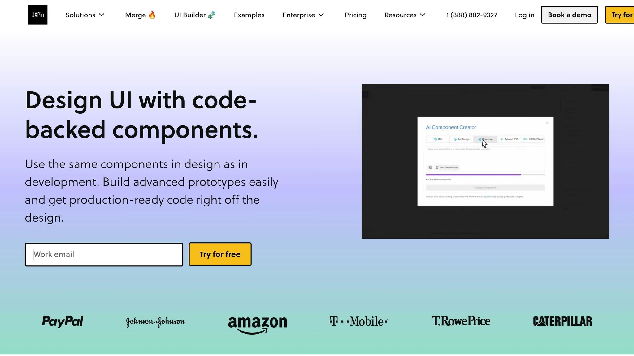
Additionally, UXPin’s AI Component Creator simplifies the process of generating accessible components. You can describe the desired behavior – such as a polite status message or an assertive error alert – and the AI generates components with the correct ARIA attributes, saving time and reducing manual coding efforts.
Improving Collaboration Between Designers and Developers
Accessibility details often get lost during traditional design handoffs, especially when dealing with dynamic behaviors that are difficult to document in static designs. UXPin addresses this issue by allowing designers to create prototypes that developers can inspect for precise implementation details, including ARIA attributes and live region configurations.
For instance, if a designer prototypes a form with live validation feedback, developers can see exactly which elements require aria-live="polite", how error messages should be structured, and when updates should trigger announcements. This clarity eliminates guesswork, leading to more informed decisions and accurate implementation.
UXPin’s real-time collaboration features further enhance this process. Designers, developers, and accessibility specialists can review prototypes together, leaving comments directly on elements. This allows teams to discuss whether updates should be polite or assertive, or whether too many live regions might overwhelm users. These discussions happen in context, streamlining the workflow and ensuring accessibility remains a priority throughout development.
By integrating with tools like Storybook, UXPin ensures that accessible components created during prototyping can flow directly into development. Developers don’t need to start from scratch – they can build on the accessible foundation established during the design phase, maintaining consistency and minimizing errors.
Using AI and Reusable Components for Accessibility
AI and reusable components can significantly speed up the process of creating accessible designs. With UXPin’s component library system, teams can develop a collection of accessible patterns – such as notification banners, progress indicators, and form validation messages – that can be reused across projects. This ensures consistency in how dynamic content announcements are handled. Instead of each developer implementing ARIA live regions differently, everyone relies on the same tested, accessible components. This standardization reduces bugs and creates a more predictable experience for users of assistive technologies.
UXPin’s AI-powered tools also analyze your designs and suggest accessibility improvements for dynamic content. For example, the AI can recommend the appropriate ARIA live region configuration based on the urgency of a status message. This proactive guidance helps teams address accessibility issues during design, rather than discovering them during testing or after launch.
To further support accessibility, UXPin allows component documentation to include specific guidelines. For example, when using a notification component, designers can access clear instructions on when to use aria-live="polite" versus aria-live="assertive", along with examples of suitable message content.
The platform’s version history and pattern management features ensure that accessible components can evolve over time. If a particular live region implementation causes issues with certain screen readers, you can update the component once, and the improvements will automatically apply to all projects using it. This continuity ensures that accessibility is maintained from design through development, reinforcing the usability of dynamic content for all users.
Conclusion
ARIA live regions play a crucial role in bridging the gap between visual updates and screen reader announcements, making them indispensable for modern, interactive web applications. As these applications grow more complex, incorporating these accessibility features is no longer optional – it’s essential.
Key Takeaways
Here’s a recap of the main points and practical insights we’ve covered:
- Compliance with WCAG 4.1.3: According to WCAG Success Criterion 4.1.3 (Level AA), status messages must be programmatically determined through roles or properties. This makes ARIA live regions not just a best practice but a compliance requirement.
- Prioritize Urgency: Tailor announcements based on their level of urgency. This ensures users receive the necessary information without feeling overwhelmed.
- Test Across Platforms: Screen readers handle announcements differently. Cross-platform testing is essential to ensure consistent and reliable accessibility.
- Craft Clear, Immediate Messages: Live region announcements are transient, disappearing once delivered. This makes it critical to write concise, meaningful messages that users can grasp instantly.
As Level Access explains:
"Functionally, ARIA roles, states, and properties are analogous to a CSS for assistive technologies. For screen reader users, ARIA controls the rendering of their non-visual experience".
Next Steps for Designers and Developers
To apply these insights effectively, here are some key actions for designers and developers:
- Start with Empty Live Regions: Initialize live region containers as empty on page load. This prevents unintended announcements and gives you full control over what gets announced and when.
- Integrate Accessibility Early: Bring accessibility considerations into the design phase. Many prototyping tools now support ARIA features, enabling teams to test and refine accessibility before development begins. This proactive approach avoids costly fixes later in the process.
- Write Clear, Specific Announcements: Instead of vague messages like "Error", provide actionable details, such as what went wrong and how users can address it. Screen reader users benefit from clarity and brevity.
As Gokulnath B from HurixDigital notes:
"Remember, web accessibility is an ongoing journey, and it requires a collaborative effort from all stakeholders involved in the website development process. By championing accessibility, we pave the way for a digital landscape that celebrates diversity and inclusivity".
- Audit and Update Regularly: Accessibility isn’t a one-and-done task. Regularly review and update live region implementations to adapt to evolving content and functionality.
- Avoid Overuse of ARIA: Misusing or overloading ARIA attributes can create confusion and hinder accessibility. Focus on dynamic content that genuinely benefits screen reader users. The goal is to keep users informed without overwhelming them with unnecessary details.
FAQs
What are ARIA live regions, and how do they make dynamic content more accessible for screen reader users?
ARIA live regions are part of the Accessible Rich Internet Applications (ARIA) specification, aimed at making web content more accessible for users who rely on screen readers. These regions help developers identify areas of a webpage where dynamic content changes occur, ensuring screen readers announce updates even if they aren’t visually apparent.
The aria-live attribute allows developers to manage how updates are communicated. For example, you can set the priority of these updates – polite for less urgent changes or assertive for those requiring immediate attention. This ensures screen readers deliver updates in a way that aligns with their importance. Whether it’s a new notification, an error message, or real-time data, users can stay informed without needing to refresh or navigate away. This feature significantly improves accessibility and makes the web more inclusive for those using assistive technologies.
How do I choose the right politeness level for ARIA live regions?
When deciding on the politeness level for ARIA live regions, think about how urgent the content updates are. Use ‘polite’ for updates that matter but don’t need immediate action. This allows screen readers to wait until the user is not busy before announcing the changes. For updates that demand instant attention, go with ‘assertive’, which interrupts the user to deliver the message right away.
To keep things user-friendly, try to stick to one ‘polite’ and one ‘assertive’ live region per page. This approach helps manage updates efficiently without overwhelming or confusing users.
How can designers and developers make ARIA live regions work effectively with different screen readers?
To make ARIA live regions work well across different screen readers, use the aria-live attribute with the right politeness level. Choose polite for updates that aren’t urgent and assertive for those that are critical. You can also use attributes like aria-atomic to ensure updates are announced in full, giving users clear and complete information.
Testing is crucial – try your setup with a variety of screen readers to identify any inconsistencies, as support can differ. Stick to accessibility best practices by providing clear, descriptive labels and avoiding unnecessary updates that might overwhelm users. These steps help create a more seamless and user-friendly experience for everyone.

