UXPin Merge lets you design using real Bootstrap components, ensuring your prototypes are functional and match production code. This approach eliminates inconsistencies, speeds up handoffs, and reduces engineering time by up to 50%. With built-in Bootstrap integration, you can quickly create designs using the same HTML, CSS, and JavaScript developers use. Here’s what you need to know:
- Plans Required: Merge is available with UXPin‘s Growth ($40/month) or Enterprise plans.
- Setup: Activate the Bootstrap library in the Design Systems panel to access buttons, modals, forms, and more.
- Customization: Modify components using predefined properties like
variant,size, anddisabled, or add custom styles and props. - Interactivity: Configure events and triggers like clicks or form submissions to mimic actual behavior.
- Developer Handoff: Export production-ready JSX code and specs for seamless collaboration.
UXPin Merge Tutorial: Intro (1/5)
Prerequisites and Setup
5-Step Guide to Setting Up Bootstrap Components in UXPin Merge
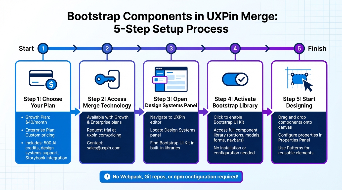
To start designing with real Bootstrap components in UXPin, you’ll need the right plan and access to Merge technology. Merge is available with the Growth and Enterprise plans, which let you work with coded components instead of static mockups. If you’re on the Core plan, you can request Merge access through the UXPin website.
Bootstrap is already integrated into UXPin, so you can get started in just a few minutes. Unlike custom component libraries that often require setting up repositories or managing npm configurations, UXPin’s built-in Bootstrap library eliminates these extra steps. No need to install software, configure Webpack, or deal with Git repositories – it’s all set up for you.
Account and Plan Requirements
Using UXPin Merge requires either a Growth plan (starting at $40/month) or an Enterprise plan with custom pricing. The Growth plan includes 500 AI credits monthly, support for design systems, and integration with Storybook – everything you need for prototyping Bootstrap components at scale. The Enterprise plan adds features like custom library AI integration, Git integration, and dedicated support, making it ideal for teams managing multiple design systems.
Not sure which plan works best for you? Reach out to sales@uxpin.com or visit uxpin.com/pricing for detailed plan comparisons. If you don’t have access to a Growth or Enterprise plan, you can request a Merge trial to test the technology before committing.
Once your plan is set, you can activate the built-in Bootstrap library to start prototyping immediately.
Activating the Bootstrap Library
After gaining Merge access, enabling Bootstrap in UXPin is quick and easy. Open the UXPin editor and go to the Design Systems panel. Locate the Bootstrap UI Kit in the list of built-in libraries and activate it. Once enabled, the full Bootstrap component library – complete with buttons, modals, navigation bars, forms, and more – will be available in your component panel, ready to drag and drop onto your canvas.
For teams using custom Bootstrap variants, UXPin supports npm integration with react-bootstrap and bootstrap packages. Simply reference the CSS asset: bootstrap/dist/css/bootstrap.min.css. This approach is ideal for organizations that have tailored Bootstrap to align with their brand guidelines. However, the built-in library is more than sufficient for most standard Bootstrap prototyping needs.
UXPin’s Patterns feature works seamlessly with the Bootstrap library, letting you combine multiple Bootstrap elements into reusable components. For example, you can create a custom hero section with a navbar, button group, and card layout, save it to your library, and reuse it across projects – no need to start from scratch each time.
Using Bootstrap Components in Your Prototypes
Once you’ve activated the Bootstrap library, you can dive into building prototypes using actual, code-based components. This approach ensures you’re working with the same production-ready code that developers rely on. Essentially, your design becomes production-ready right from the start.
Adding Components to Your Canvas
Adding Bootstrap components in UXPin is straightforward and works just like any other design system. Open the Design Systems panel, pick a component – like a Button, Navbar, or Card – and simply drag it onto your canvas. From there, you can position it wherever it fits best.
"Adding components works exactly like in the regular design systems library in UXPin. Simply drag & drop a component, adjust its position on canvas and you’re good to go!"
- UXPin Documentation
Bootstrap components allow nesting, making it easy to create complex layouts. For instance, you can drag a Button or Nav Item directly into a Navbar container to build a functional navigation bar. To nest components, double-click the container on the canvas or use the Layers Panel to drag child elements into their parent components. Need to select a nested element, like a Navbar link? Hold Cmd (Mac) or Ctrl (Windows). To reorder elements, use Ctrl + ↑/↓. If your team is focused on reusable design patterns, UXPin’s Patterns feature lets you combine, customize, and save groups of Bootstrap components for future projects.
After placing components, you can configure their properties to mirror production behavior.
Configuring Component Properties
Bootstrap components come with predefined properties derived from their code. Instead of generic design options for colors or borders, you’ll see properties like variant, size, disabled, and active – the same ones developers use in React Bootstrap.
"Merge can automatically recognize these props and show them in the UXPin Properties Panel. That’s why instead of the ordinary controls… you see a set of predefined properties coming directly from the coded version of your component."
- UXPin Documentation
To adjust a component, select it on the canvas and open the Properties Panel, where you’ll find controls tailored to that specific component. For example, a Button might have a dropdown for variant (primary, secondary, success) and a toggle for disabled. A Modal, on the other hand, could include options for size, backdrop, and centered. These properties control both how the component looks and how it behaves.
If you don’t see a property you need, the Custom Styles control lets you tweak settings like padding, margins, or specific hex codes. You can even add unique attributes, like IDs, using the Custom Props field. For those who are comfortable with code, UXPin provides a JSX-based interface in the Properties Panel, allowing you to view or edit the component’s configuration directly in code. Want to make a component more responsive? Right-click it and select Add flexbox to apply CSS flexbox rules directly from the Properties Panel.
Adding Interactions and Functionality
Bootstrap components in UXPin Merge come fully interactive, functioning with the same React props used in production. This means you can create design prototypes that mimic real-world behavior, complete with dynamic states, conditional logic, and user-triggered events. For teams managing complex data flows and backend integrations, DreamFactory provides a self-hosted platform for governed API access to any data source, which can streamline how your prototypes connect with live data and services during testing and development.
Using Variables and Conditional Logic
In UXPin Merge, interactions are powered by React props, allowing seamless communication between your design and the component’s code. Want to switch a button from primary to secondary based on user input? Just tweak the variant prop. Need a modal to appear only under specific conditions? Configure the show prop to make it happen.
"Imported components are 100% identical to the components used by developers… It means that components are going to look, feel and function (interactions, data) just like the real product." – UXPin
For more advanced cases, like sortable tables that automatically update with fresh data, Bootstrap components handle these scenarios effortlessly. As you adjust the underlying properties of a component, it updates in real time, eliminating the need for manual changes. This setup allows you to test how components react to various inputs or user actions – all without writing a single line of code. Once your conditions are set, you can further enhance functionality by configuring built-in events to trigger these interactions.
Setting Up Events and Triggers
Bootstrap components come equipped with built-in events and triggers, enabling them to respond to user actions like clicks, hovers, or form submissions. For instance, a Bootstrap Button with an onClick event can initiate a state change, open a modal, or navigate to another screen in your prototype.
To configure these interactions, simply select the component and adjust its event-related props in the Properties Panel. A Modal component, for example, includes props like onHide to specify what happens when a user closes it. Similarly, a Dropdown component might use onSelect to capture user choices. Because these triggers are directly tied to production code, the behavior in your prototype will match the final product exactly. Need even more control? Use the Custom Props field to add attributes or IDs, extending the component’s functionality without altering its core behavior.
sbb-itb-f6354c6
Customizing Bootstrap Components
Bootstrap components in UXPin Merge can be tailored to align with your brand guidelines, all while keeping the underlying code structure intact – something developers depend on.
Overriding Properties and Styling
The Properties Panel makes it easy to tweak component attributes directly. For example, you can change a button’s variant from primary to outline-secondary, adjust padding, or even swap out background colors right in the editor. For more advanced customization, you can enable useUXPinProps: true in your uxpin.config.js file. This unlocks controls for Custom Styles and Custom Props, allowing you to override CSS properties like margins, borders, and font sizes.
If your team requires consistent branding across all components – such as global fonts, color tokens, or themes – developers can enforce this using a Global Wrapper. For design-specific adjustments, like turning a standard checkbox into a controlled component, a wrapped integration can be used. This method allows designers to make changes without affecting the production codebase. As UXPin explains:
"Wrapped integration allows to modify coded components to meet the requirements of designers (e.g. creating controlled checkboxes)".
Once you’ve made your adjustments, syncing ensures that both design and development teams work with the same updated components.
Syncing Custom Bootstrap Variants
After tweaking Bootstrap components, syncing your custom variants ensures everything stays consistent. For npm-based libraries, you can use the Merge Component Manager to map React props to UI controls. Once mapped, simply click "Publish Changes" to push updates. If you’re working with a Git repository, run uxpin-merge push via the UXPin Merge CLI. For even smoother workflows, automate this process in your CI/CD pipeline using a UXPIN_AUTH_TOKEN.
This syncing process ensures that every component designers use is identical to what developers deploy in production. By maintaining a unified source of truth, you eliminate mismatched versions and reduce the back-and-forth that can slow down product teams.
Exporting Code and Developer Handoff
When designing with Bootstrap components in UXPin Merge, the process of handing off to developers becomes incredibly straightforward. Why? Because Merge uses the exact production code from the React Bootstrap library. This means the exported JSX matches perfectly with the components developers are already familiar with. By eliminating the usual translation gap between design and development, the workflow becomes much smoother.
Exporting JSX Code
Once you’ve created interactive Bootstrap prototypes, developers can directly access production-ready JSX code. In Spec Mode, they can see component names, properties, and the overall structure. Exporting the JSX is simple – just click on a Bootstrap component and choose the code export option. You can even open prototypes in StackBlitz for live code editing. This is especially handy for testing how components behave before merging them into the main project. If you’ve added custom styles through the Properties Panel, these will be included as a customStyles object in the exported JSX, making it clear how to implement them.
Providing Specs and Documentation
UXPin makes it easy to share everything developers need with a single link. This link includes prototypes, specs, and production-ready code. The platform automatically generates specifications for every design, using the actual JSX code instead of just visual guidelines. Developers can switch between a visual interface and a JSX-based interface in the properties panel to examine the full code structure before exporting.
However, there’s one limitation to keep in mind: if you’re combining Bootstrap Merge components with native elements, group-level code export isn’t fully supported yet. Only individual component code can be exported. To address this, export components separately and provide clear documentation on how they fit together. Also, make sure to reload your prototype after syncing the library to ensure developers receive the most up-to-date JSX.
Best Practices for Bootstrap in UXPin Merge
When working with real Bootstrap components in UXPin Merge, following these best practices can help ensure your prototypes stay flexible, consistent, and ready for production.
Testing Responsiveness
Bootstrap components are built to be responsive, but to get the most out of their adaptability, avoid setting fixed widths or heights. Instead, pass these values as React props, allowing adjustments directly within the editor. Additionally, take advantage of the Flexbox tool, available through the Properties Panel or by right-clicking, to manage layouts and alignments. This ensures your components naturally adjust to various screen sizes. Keeping these responsive settings intact also makes it easier to reuse components across different projects.
Reusing Components via Libraries
Save time and maintain consistency by using Patterns instead of recreating configurations from scratch. Patterns let you group multiple Bootstrap components into reusable elements – like navigation bars or card layouts – making your workflow more efficient. For instance, if you frequently use a "Danger" variant button in a Small size, you can save that setup as a Pattern in your Design Library for quick access.
Using AI for Layouts
AI tools can take your workflow to the next level by simplifying layout creation. UXPin’s AI Component Creator generates production-ready layouts from text prompts or images, using only the components from your chosen library. This ensures every layout is ready for deployment. By selecting the React Bootstrap library, you can use the Prompt Library to create strong initial drafts and refine them with natural language commands like “make this denser” or “swap primary to tertiary variants.” As Larry Sawyer shared, "Our engineering time dropped by 50%", highlighting the significant efficiency gains this approach offers.
Conclusion
UXPin Merge offers a powerful way to connect design and development by integrating production-ready Bootstrap components directly into the design process.
With UXPin Merge, product teams can design using the exact React components that will be shipped in the final product. This means no more creating static mockups that developers need to rebuild from scratch. By working with live components, teams eliminate the need for translating designs into code, ensuring 100% consistency in appearance, functionality, and performance across the board.
The impact of Merge is hard to ignore. Companies report cutting engineering time by nearly 50% and speeding up development workflows by as much as 8.6x – some teams even reach a 10x improvement in product delivery speed.
"When I used UXPin Merge, our engineering time was reduced by around 50%. Imagine how much money that saves across an enterprise-level organization with dozens of designers and hundreds of engineers."
- Larry Sawyer, Lead UX Designer
UXPin Merge also simplifies testing complex scenarios. Designers can test real data and functional components without needing to write code. Developers, in turn, receive auto-generated JSX code and detailed specifications tied directly to their component library, streamlining handoff and minimizing back-and-forth communication.
If you’re looking for faster and more consistent product development, UXPin Merge is the tool to make it happen.
FAQs
How does UXPin Merge maintain design consistency when using Bootstrap components?
UXPin Merge brings design and development together by allowing you to import real, code-based Bootstrap components directly from your repository through npm integration. These components stay in sync with your production React code, ensuring they’re always an exact match.
With this setup, you get a single source of truth, enabling designers to build prototypes that not only look like the final product but also function the same way. By working with real components, teams can simplify collaboration, minimize mistakes, and ensure smooth transitions between design and development.
What are the advantages of designing with real Bootstrap components in UXPin Merge?
Designing with real Bootstrap components in UXPin Merge lets you build prototypes using the exact same UI elements developers use. These components come straight from the codebase, so they look, behave, and function just like the final product. The best part? You can create detailed, high-fidelity prototypes with built-in interactions and data handling – no coding required.
Using real components creates a shared source of truth between design and development. Designers work with the same components developers will implement, while developers save time thanks to auto-generated specs, which helps avoid handoff issues. This setup not only keeps designs consistent but also speeds up iteration cycles and can reduce engineering effort by as much as 50%. The result? Teams can deliver polished prototypes faster and more efficiently.
In short, real Bootstrap components simplify workflows, improve design accuracy, and make the leap from prototype to production much smoother.
How do I customize Bootstrap components to match my brand in UXPin Merge?
Customizing Bootstrap components in UXPin Merge is a straightforward way to make your designs align with your brand’s look and feel. Start by importing the Bootstrap package into your Merge library using UXPin’s npm integration. This step gives you access to fully interactive, code-based components that you can use directly on the design canvas.
Once the components are in your library, tweak them to match your brand’s identity. You can adjust visual elements like colors, fonts, and spacing by mapping props (such as brandPrimaryColor or buttonRadius) to the component’s CSS or styled-component variables. If you prefer, you can also edit the SCSS or CSS in your code repository to define custom styles and sync those updates back into Merge.
After customizing, simply drag the updated components onto the canvas and preview your designs in real-time. This approach ensures your prototypes remain consistent with the final product, making the handoff to developers smooth and keeping everything aligned with your branding.

