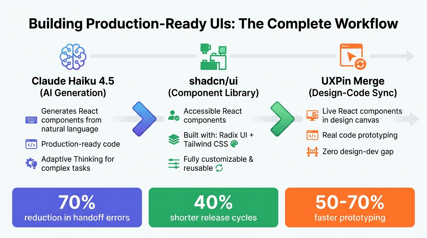
Building user interfaces can feel like juggling speed and precision, but combining Claude Haiku 4.5, shadcn/ui, and UXPin Merge makes the process smoother and faster. Here’s how these tools work together:
- Claude Haiku 4.5: AI generates React components from natural language prompts, ready for production use.
- shadcn/ui: A library of accessible, unstyled React components built with Radix UI and Tailwind CSS, offering flexibility for customization.
- UXPin Merge: Syncs live React components into a design canvas, allowing designers to prototype with real code.
This workflow eliminates the gap between design and development, reducing handoff errors by 70% and shortening release cycles by 40%. Designers and developers work in sync, ensuring prototypes align perfectly with the final product.
Quick Takeaways:
- Use Claude Haiku 4.5 to generate production-ready components.
- Customize and reuse components from shadcn/ui for consistent designs.
- Prototype directly with live code in UXPin Merge, speeding up iterations.
This approach not only saves time but also ensures designs are consistent and ready for deployment from the start.
Claude Haiku 4.5, shadcn/ui, and UXPin Merge Workflow Integration
I Built My Entire Design System in 4 Hours With AI. Full Tutorial (Claude + Cursor + Figma)
sbb-itb-f6354c6
Understanding Claude Haiku 4.5 for AI-Driven UI Design
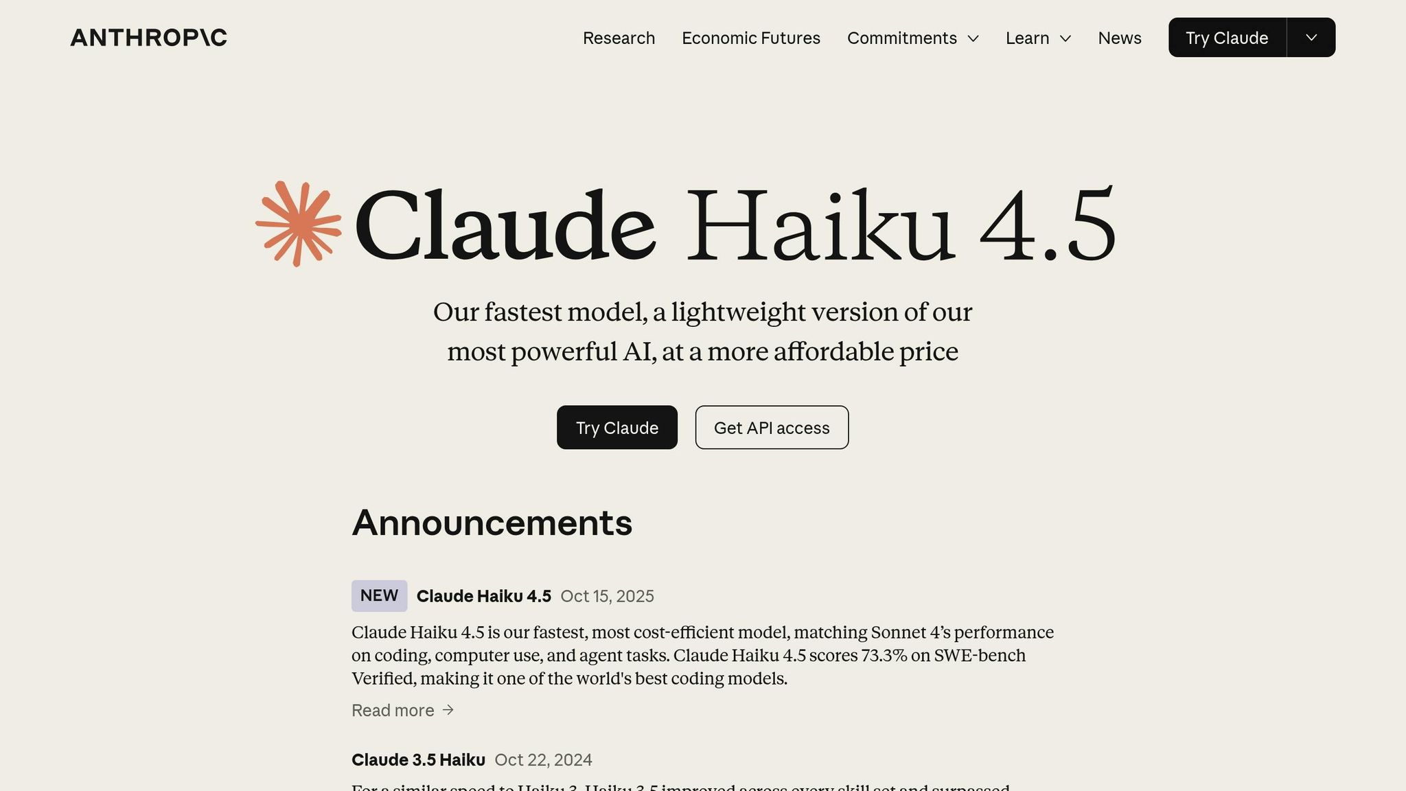
Claude Haiku 4.5 is designed to deliver precise, production-ready React components with its improved instruction-following and vision capabilities. Unlike earlier versions, this model excels in accurately interpreting instructions, making it ideal for creating React components that are ready for deployment. Its enhanced vision allows it to analyze screenshots and UI elements effectively, enabling users to provide existing designs and receive matching components without needing to write lengthy descriptions.
One standout feature is its Adaptive Thinking ability. This allows Claude to adjust its reasoning depth based on the complexity of the task and a user-defined effort parameter. For example, a straightforward task like creating a basic form might use a low effort setting. In contrast, more complex tasks, such as building an interactive dashboard with state management, trigger deeper analysis. These improvements create a seamless connection between design prototypes and production code, making it easier to craft high-quality UI components.
What Claude Haiku 4.5 Can Do
Claude Haiku 4.5 shines in generating both simple and intricate UI elements. It can produce polished, ready-to-use components on the first try. For instance, you could prompt it with: "Create a user analytics dashboard card that displays monthly active users, with a trend line showing growth over the past six months. Use shadcn/ui Card, Chart, and Badge components to match our existing design system". The model can handle everything from basic buttons to complex layouts, including animations and interactive states.
The vision enhancements are especially helpful for design teams. By using the "Crop Tool" instruction, Claude can focus on specific areas of a screenshot, ensuring more accurate recreation of components. It also supports structured formats like JSON to manage UI states and Git logs to track design changes. This helps maintain consistency during extended design sessions and ensures components align with your design system.
How to Write Effective Prompts for Claude
To get the best results, prompts should be clear and provide context. Instead of saying, "make a dashboard," include details about why specific elements are required.
Using XML tags can help organize your instructions. For example, wrap design guidelines in <style_guide> tags and component details in <component_specs> tags. Including a "default to action" instruction can also be helpful. For instance, adding <default_to_action>Implement changes by default instead of just making suggestions.</default_to_action> ensures Claude generates functional code rather than merely offering suggestions.
To control output quality, use positive instructions. Instead of saying, "don’t add unnecessary features," phrase it as: "Output must be functional React code using shadcn/ui components with only the requested features." If the model tends to over-engineer, explicitly instruct it to keep implementations simple. Additionally, when Extended Thinking is turned off, avoid using the word "think", as it may lead to unintended behaviors. Use alternatives like "consider", "evaluate", or "believe" to improve consistency in the output. Mastering these prompt techniques ensures that the design results align closely with development needs.
Working with shadcn/ui Components
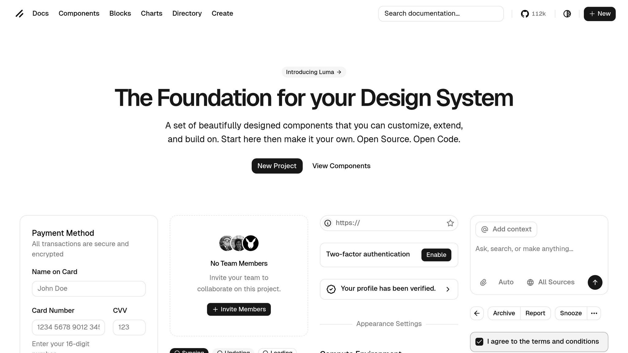
What is shadcn/ui?
shadcn/ui is an open-source library of reusable React components built with Radix UI and styled using Tailwind CSS. Unlike traditional npm packages, you copy these components directly into your project, giving you complete control over the code.
This approach eliminates vendor lock-in and keeps your bundle sizes lean. Built on Radix primitives, every component is accessible by default, and you can easily customize them using Tailwind classes. By late 2024, the project has gained impressive traction, boasting over 85k stars and 6.5k forks on GitHub. Companies like OpenAI and Vercel are already using it in production.
For workflows involving AI tools like Claude Haiku 4.5, shadcn/ui proves especially handy. The components are straightforward, code-driven, and integrate seamlessly into AI-assisted environments. Claude can generate Tailwind-styled snippets that fit directly into your project without needing extra dependencies. This makes building production-ready UIs faster and smoother. Plus, these components can be easily imported into UXPin Merge for prototyping.
"shadcn/ui is the future of component libraries" – Lee Robinson, Vercel VP, 2023
Now, let’s dive into how to set up and configure these components.
Installing and Configuring shadcn/ui
To get started with shadcn/ui, you’ll need Node.js v18+, a React-based project (such as Next.js or Vite), and Tailwind CSS v3+. Setting up is quick and straightforward.
- Create a Next.js app
Run the following command to create a new project:npx create-next-app@latest my-app --typescript --tailwind --eslint - Install the shadcn/ui CLI
Use this command to install the CLI:npx shadcn-ui@latest initThe CLI will guide you through configuration steps, including setting up TypeScript, default styles, and component paths.
- Add components
Once the setup is complete, you can add components individually. For example:npx shadcn-ui@latest add buttonThis will generate the component’s code within your project and create a
components.jsonfile for managing path aliases. It also includes alib/utils.tshelper file for thecn()function. - Enable dark mode and custom themes
Update yourtailwind.config.jswith:darkMode: 'class',Then, extend the theme with custom colors. In your
globals.css, define CSS variables (e.g.,--background) to handle light and dark mode styling. This ensures smooth integration when importing components into UXPin Merge. - Integrate with UXPin Merge
To align design and development workflows, export your shadcn/ui components as React code. Install the Merge SDK:npm install @uxpin/mergeCreate a
Merge.tsxwrapper with typed props and push the components using the Merge CLI:uxpin-merge pushOnce uploaded, your components will be ready for use in UXPin’s design canvas, ensuring consistent prototypes powered by live code.
This setup streamlines the process of building and designing with production-ready components, bridging the gap between code and design workflows. The native integration makes it easier to use these components in both development and prototyping environments.
Integrating UXPin Merge with shadcn/ui and Claude Haiku 4.5

This integration streamlines your design process, keeping it as precise and efficient as your development workflow.
Setting Up UXPin Merge
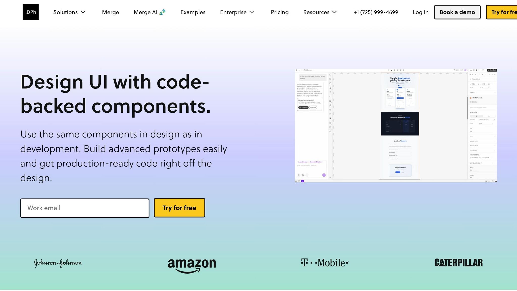
UXPin Merge allows you to connect your React components directly to the design canvas. To begin, create an account at uxpin.com and set up a workspace. Then, install the Merge CLI globally by running:
npm install -g @uxpin/merge-cli Navigate to your project directory (where shadcn/ui is already installed) and initialize Merge by running:
uxpin-merge init This command creates a uxpin.config.js file, which manages how components sync to UXPin and appear in the editor. UXPin scans your repository, builds the components, and syncs them to your design library. This code-based approach ensures every component retains its interactive states and variants.
"Imported components are 100% identical to the components used by developers during the development process. It means that components are going to look, feel and function (interactions, data) just like the real product." – UXPin
You can also customize the properties panel by specifying which React props designers can modify. For instance, with shadcn/ui Button components, you might expose props like variant, size, and disabled. If your components need Tailwind context or theme providers, include a wrapper component in your configuration to ensure everything renders correctly.
Once Merge is configured, shadcn/ui components will be ready to use directly within the UXPin Editor.
Using shadcn/ui Components in UXPin
With UXPin Merge, shadcn/ui components are pre-integrated, making them accessible in the UXPin Editor without any extra steps. Open the UXPin Editor, navigate to the Design Systems panel, and select the shadcn/ui library. Components like Button, Card, DataTable, and NavigationMenu are immediately available to drag and drop onto your canvas.
If you’re working with a custom library based on shadcn/ui, you’ll need to sync it manually. In your uxpin.config.js file, map each component in the components array, such as:
{ name: 'Button', file: './components/ui/button.tsx' } Then, run:
uxpin-merge export This syncs your library to UXPin, enabling live React previews and editable props. Designers can then work with the exact components developers use in production, eliminating the need for translation between design and development.
Once synced, you can also use AI tools to create layouts using your approved shadcn/ui components.
Generating AI-Driven Designs in UXPin
UXPin Merge integrates AI-driven design through tools like Claude Haiku 4.5. This feature generates UI layouts using only approved components from your design system, ensuring consistency. To use it, open the AI panel in the UXPin Editor and describe what you need. For example, you could prompt: "Generate a responsive login form using shadcn/ui Button, Input, and Card components with dark mode support."
The AI will produce a layout using real shadcn/ui code, complete with Tailwind classes and accessibility features. You can refine the design further by adding details like "Make this mobile-first" or "Add dark mode support."
Since the AI works with production-ready components, the designs it generates are immediately usable by developers – no rebuilding or manual adjustments required. Teams using this workflow have reported faster prototyping by 50–70% and a 40% reduction in handoff errors, with AI cutting layout creation time by threefold.
Improving Design-to-Development Workflows
Component-driven design simplifies collaboration by eliminating the barriers that often slow teams down. When designers use shadcn/ui components within UXPin Merge, they’re working directly with the same code developers will use. This approach creates a unified source of truth, reducing confusion and streamlining handoffs. These smoother interactions pave the way for more efficient workflows as projects progress, and having robust API integrations through solutions like DreamFactory ensures your backend data access remains secure and governed as your application scales.
Reducing Friction Between Designers and Developers
Static mockups often lead to inefficiencies, as developers must rebuild components from scratch, opening the door to miscommunication and delays. Component-driven design solves this by allowing designers to modify components using props – the same properties developers rely on in code. For instance, if a designer changes a shadcn/ui button from "default" to "outline" in UXPin, that adjustment directly updates the corresponding code attribute. Meanwhile, UXPin Merge ensures styling stays within approved parameters, preventing off-spec elements. This shared prop-based system creates a common language between teams, reducing the need for revisions and accelerating implementation.
Maintaining Design System Consistency
Beyond improving communication, consistency in design systems is essential for seamless workflows. Effective design system governance requires centralized management. UXPin Merge aligns with this need by directly linking to your component repository, ensuring designs always use approved, version-controlled components.
As teams grow and more contributors work on the design system, strict version control and clear documentation become vital. Use semantic versioning (major.minor.patch) to manage updates:
- Major versions signal breaking changes.
- Minor versions introduce new features.
- Patch versions address bug fixes.
Establish a review process to evaluate new or updated components against design system standards. Document all changes with migration guides for breaking updates and maintain a detailed changelog to track component modifications.
Assigning specific roles – like a Design System Lead, Component Designers, and Frontend Developers – ensures accountability and keeps workflows organized. This structure prevents UI inconsistencies in large projects and supports scalability as your team expands. Integrating these practices into your design and development process strengthens the foundation of component-driven design, which lies at the core of this toolset.
Conclusion
By combining Claude Haiku 4.5, shadcn/ui, and UXPin Merge, teams can tackle some of the biggest challenges in UI development. This powerful stack significantly shortens development timelines – cutting cycles from weeks to just days – and boosts efficiency by up to 50%. Teams can also handle 10× more UI variants without needing to scale resources proportionally.
The key advantage here is the design-to-code alignment this workflow offers. By removing the traditional gap between design and development, it eliminates miscommunication and reduces the rework often caused by static mockups. Designs flow seamlessly into production, saving both time and effort.
When it comes to scalability, this approach shines. shadcn/ui’s modular components, Claude’s adaptable prompt engineering, and UXPin Merge’s design system tools make it easier to grow without losing control. Enterprise teams have reported 30–40% faster iteration speeds using this setup. This improved scalability also fosters better collaboration, ensuring consistency across expanding projects.
The ultimate result? Production-ready UIs that are good to go as soon as they’re approved. UXPin Merge ensures code stays perfectly synced with shadcn/ui, while Claude’s templates maintain uniformity, preventing design drift.
For enterprise teams aiming to improve speed, maintain consistency, and enhance collaboration, this workflow delivers measurable results. Metrics like iteration speed, code reuse, and deployment frequency clearly reflect its impact.
FAQs
What should I include in a Claude prompt to get consistent shadcn/ui code?
When crafting a prompt to generate shadcn/ui code, clarity and specificity are key. To achieve consistent, production-ready React JSX code, it’s essential to include instructions that emphasize adherence to shadcn/ui components and styling conventions. Here’s what to include:
- Clearly state that shadcn/ui is the required component library.
- Specify that the code must follow shadcn/ui design and styling principles.
- Ensure the output is React JSX code, ready for production use.
Example Prompt
"Generate React JSX code using shadcn/ui components, ensuring consistency with shadcn/ui design principles."
This approach ensures the generated code aligns with the library’s standards, making it easier to integrate into your project.
How do I expose only safe props for designers in UXPin Merge?
To ensure designers in UXPin Merge work with only safe properties, configure the component’s props to include just those meant for design purposes. This approach blocks access to internal or potentially unsafe properties. When importing React components, you can define safe props by either customizing the prop types or explicitly specifying which props should be available in the design environment. This setup allows designers to tweak styling or layout while preserving the component’s overall integrity.
How do I keep component versions in sync between code and UXPin prototypes?
To keep component versions aligned, leverage UXPin Merge to integrate your React component libraries, such as shadcn/ui, directly with your codebase. This setup allows real-time updates, meaning any changes in your code will instantly appear in your prototypes. By linking your repository to UXPin Merge, you ensure consistency and synchronization between design and development as your components evolve.

