Creating user interfaces just got easier. By combining GPT-5 Mini, Ant Design, and UXPin Merge, you can design and develop production-ready UIs faster. Here’s how each tool contributes:
- GPT-5 Mini: Generates React component code from text prompts.
- Ant Design: Offers a library of pre-built React components.
- UXPin Merge: Lets designers work with real, coded components directly in a design tool.
This workflow eliminates design-to-development gaps by ensuring designs are built with actual code. Designers can prototype with Ant Design components in UXPin, customize them, and developers receive JSX code ready for deployment.
Quick Steps:
- Use GPT-5 Mini to generate or customize Ant Design components.
- Import components into UXPin Merge for prototyping and validation.
- Export production-ready JSX code directly from UXPin.
This approach saves time, reduces errors, and ensures consistency across teams. Whether you’re building simple UIs or complex systems, this method is the best way of bringing design and code together.
Design Using Your Favorite React UI Libraries
sbb-itb-f6354c6
Setting Up UXPin Merge with Ant Design
Ant Design comes pre-integrated with UXPin Merge, making it easier than ever to connect design and development. With this setup, designers can dive straight into building interfaces without any delays.
Using Ant Design’s Built-In Library in UXPin Merge
The Ant Design library is already included in UXPin Merge, giving users immediate access to a wide range of ready-to-use components. Simply open the UXPin editor, select the Ant Design library from the panel, and start working with functional elements like buttons, forms, tables, and navigation components.
What’s even better? The library automatically includes the correct CSS path (antd/dist/antd.css), ensuring that components display with proper styling as soon as they’re added to the canvas. Plus, the Properties Panel provides mapped React props, allowing designers to tweak settings like type, size, and color using dropdown menus – no need to dig through documentation or learn React syntax.
For more advanced needs, you can also connect and customize your own components. Details on that are covered in the next section.
Connecting Custom Ant Design Components
If you need components beyond the standard library, you can connect custom Ant Design components using Git or npm. The Merge Component Manager is your go-to tool for importing and managing these components.
For npm setups, all you need is the package name (commonly antd for Ant Design) and the correct CSS path to ensure proper rendering. If you’re working with Git, UXPin Merge syncs directly with your repository. This ensures that any updates to components in the source repo sync automatically to UXPin, keeping everyone on the same page. Designers are even notified when changes occur.
When setting up custom components, follow Ant Design’s conventions by using CamelCase naming (e.g., DatePicker). Map React props in the Component Manager with lowercase property names (like type or size) and assign intuitive controls: dropdowns for enums, checkboxes for booleans, and text fields for strings. This approach ensures a smooth and user-friendly experience for designers working with these components.
Generating Components with GPT-5 Mini in UXPin Merge
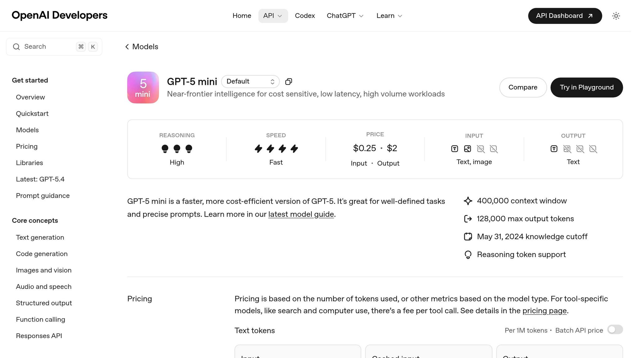
GPT-5 Mini is seamlessly integrated into UXPin Merge, enabling you to generate UI components using Ant Design directly on the design canvas. With carefully designed control parameters, this tool ensures fast and accurate component generation. However, keep in mind that unclear or contradictory prompts can lead to wasted tokens and inconsistent outputs. This integration aligns with the vision of bridging design and code, allowing for smooth transitions from prototyping to production. With the model properly configured, you can use precise prompts to generate reusable Ant Design components right on your canvas.
Configuring GPT-5 Mini for Ant Design Component Creation
Before diving into component generation, you’ll need to set two key parameters: reasoning effort and verbosity. For simpler components, keep reasoning effort low and verbosity minimal. If you’re working on more complex, state-driven components, increase the reasoning effort while maintaining clarity in the generated code.
To improve instruction adherence, use structured XML tags in your prompts. For example, define your component requirements within <component_rules> tags and include a <frontend_stack_defaults> block to specify that you’re using React, TypeScript, and Ant Design. This structured approach reduces the likelihood of errors and minimizes the need for revisions.
Once your parameters are configured, focus on writing prompts that result in clear, production-ready components.
Writing Effective Prompts for Component Generation
A good starting point is contract-first prompting – ask the model to identify any gaps or unknowns before generating the code. This method can cut revision cycles by 40–60% by clarifying requirements upfront. After the contract phase, craft prompts with Decision Drivers – three to five concise bullet points explaining the logic behind your request.
For reusable components, instruct GPT-5 Mini to use atomic handoff blocks with specific markers, such as:
===BEGIN_ARTIFACT:ComponentName.tsx=== This makes the generated code easier to extract and validate. You can also ask the model to self-reflect by using a brief quality rubric, ensuring the output meets high standards.
"Prompting is no longer ‘artsy wordplay.’ It’s prompt engineering as specification design." – Jacob Rothfield
It’s worth noting that GPT-5 Mini doesn’t format in Markdown by default when using the API. If you need code fences or inline formatting, make sure to explicitly include this requirement in your prompt using backticks.
Prototyping and Customizing Ant Design Components in UXPin
Once you’ve integrated your AI-generated Ant Design components, the next step is to bring them into UXPin for quick validation and customization. This process ensures your components align with your design system while remaining functional and ready for production.
Importing and Validating AI-Generated Components
After generating your components, the Merge Component Manager in UXPin becomes your go-to tool for importing and validating them. Simply paste your JSX code into the Manager, where you’ll see a real-time preview as you configure properties. This instant feedback loop helps you identify and fix issues early in the process.
Make sure the CSS path is set to antd/dist/antd.css and that component names follow CamelCase conventions (e.g., DatePicker). To ensure everything works as expected, cross-check the props of your AI-generated components with Ant Design’s official React documentation. This step ensures the "Property name" matches what Ant Design requires.
Once you’ve configured your component, hit "Publish Changes" and then "Refresh Library" to make it available in the design editor. A great example of this process in action: In August 2022, UXPin showcased how a designer built a fully functional email sign-up form in under a minute using three imported Ant Design components. This highlights how quickly validated components can transform into working prototypes.
Customizing Component Tokens and Properties
The Properties Panel in UXPin bridges React props with designer-friendly controls. For example, Ant Design’s six button types (Primary, Ghost, Dashed, Link, Text, Default) can be mapped to a dropdown menu by setting the Property Type to "enum" and the Property Control to "select." This not only prevents invalid configurations but also speeds up the prototyping process.
Depending on your needs, you can map props to various control types:
- Dropdown menus for enums
- Checkboxes for booleans
- Text fields for strings
- Code editors for more complex objects
This flexibility allows teams to tweak tokens, spacing, and brand colors directly in UXPin while keeping the underlying code production-ready. For better organization, group validated components into categories like General, Navigation, or Data Entry, mirroring Ant Design’s structure. This makes the components easier to locate and reuse across multiple projects.
With your components validated and customized, you’re ready to move forward. Next, you’ll explore how to generate production-ready JSX code and compare workflows.
Exporting Production-Ready Code and Workflow Comparison
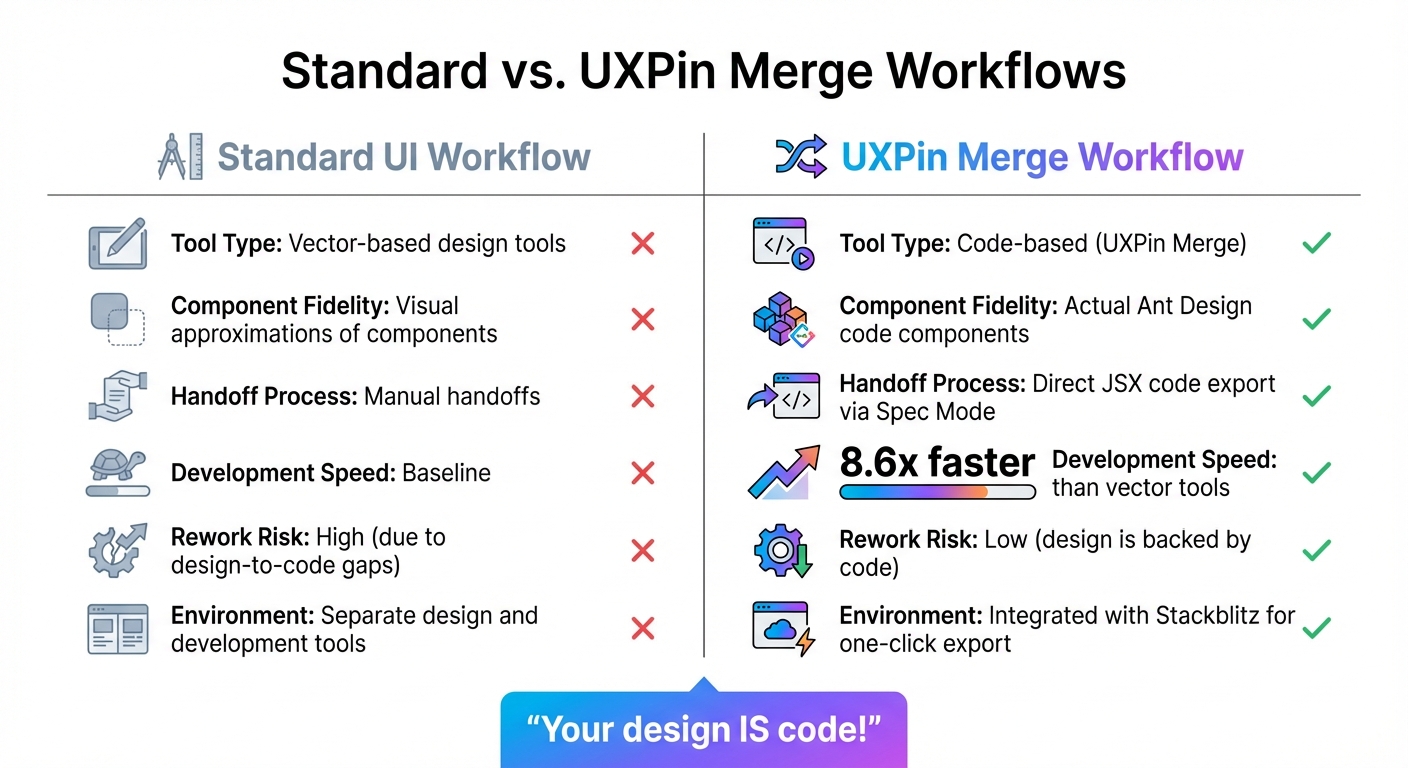
Standard UI Workflow vs UXPin Merge Workflow Comparison
Once your Ant Design components are customized and validated, it’s time to streamline the design-to-development process. With UXPin Merge, your designs aren’t just blueprints – they’re actual code, ready to use.
Generating Production-Ready JSX Code in Spec Mode
Switching to Spec Mode in UXPin instantly converts your design into JSX code. Simply click on any Ant Design component, and you’ll get the exact React code developers need – no guesswork, no redlining, and no tedious revisions. Since these are real Ant Design components, the JSX you copy is deployment-ready and can be dropped straight into your codebase.
For teams working at high speed, the Stackblitz integration takes things a step further. With a single click, you can export your entire prototype into a live developer environment. This makes it easy to test, refine, and deploy your design without dealing with file transfers or versioning headaches. It’s a seamless way to move from design to development while ensuring precision.
Comparing Standard vs. UXPin Merge Workflows
Once you’ve exported code using Spec Mode, it’s clear how UXPin Merge revolutionizes efficiency compared to traditional workflows. Let’s break it down:
| Feature | Standard UI Workflow | UXPin Merge Workflow |
|---|---|---|
| Tool Type | Vector-based design tools | Code-based (UXPin Merge) |
| Component Fidelity | Visual approximations of components | Actual Ant Design code components |
| Handoff Process | Manual handoffs | Direct JSX code export via Spec Mode |
| Development Speed | Baseline | 8.6x faster than vector tools |
| Rework Risk | High (due to design-to-code gaps) | Low (design is backed by code) |
| Environment | Separate design and development tools | Integrated with Stackblitz for one-click export |
traditional image-based design workflows often require developers to rebuild components from static mockups, which can lead to discrepancies between the design and the final product. UXPin Merge eliminates this issue entirely. As UXPin emphasizes: "Your design IS code!". This approach ensures that what you design is exactly what gets implemented, saving time and reducing errors.
Conclusion
Bringing together GPT-5 Mini, Ant Design, and UXPin Merge changes the way design and development teams work together. By using real code components from the start, teams can avoid translation errors and reduce rework, keeping projects on track and timelines intact.
The benefits are clear. UXPin Merge simplifies the design-to-development process, while GPT-5 Mini generates components as needed. This combination allows teams to prototype quickly, test ideas early, and deliver production-ready code with ease.
Scalability becomes second nature with a design system built on actual code. Every Ant Design component customized in UXPin stays perfectly aligned with your codebase. This ensures consistency across different products and teams, eliminating issues like design drift or mismatched versions. The result? A seamless connection between design and development, as outlined throughout this guide.
This workflow doesn’t just improve efficiency – it transforms collaboration. By removing traditional handoff barriers, designers can trust their work will translate directly into implementation, and developers receive precise JSX code ready for deployment.
To get started, explore UXPin Merge’s Ant Design library and experiment with GPT-5 Mini prompts. Setup takes only minutes, but the impact on your team’s speed and cohesion will last much longer.
FAQs
How do I keep GPT-5 Mini output consistent with Ant Design?
To align GPT-5 Mini’s output with Ant Design, you can use UXPin Merge to seamlessly integrate Ant Design’s components. This approach ensures that AI-generated components adhere to Ant Design’s design system without any discrepancies. With UXPin Merge, you can directly select components from the Ant Design library, guaranteeing consistency across your designs. These components come production-ready, complete with built-in interactivity and design tokens for elements like colors, spacing, and typography. This makes it easier to maintain a polished and cohesive design.
What’s the best way to map Ant Design props in UXPin Merge?
To map Ant Design props in UXPin Merge, the drag-and-drop feature is your go-to tool. Simply drag Ant Design React components onto your canvas. After placing them, you can configure the component properties directly within UXPin to align with your desired settings. For a polished and consistent design, use Ant Design tokens for colors, spacing, and typography. This approach ensures your prototypes maintain interactivity and closely mirror production behavior.
How do I export and use JSX from UXPin Spec Mode in my codebase?
To export JSX from UXPin’s Spec Mode, follow these steps to grab production-ready React code from your prototypes. Start by opening your prototype and switching to Spec Mode. From there, inspect the component properties to view the JSX code. Once you’ve located it, simply copy the JSX and integrate it into your codebase. Just make sure it aligns with your project’s structure and dependencies for smooth integration. This approach gives you clean, functional JSX that’s ready to use in development.

