Calculators break down complex numerical problems into user-friendly solutions. This guide dives deep into calculator UI design, navigating its multifaceted dimensions, from types and fundamental principles to the nuances of mobile vs. desktop design. We also explore how designers can use React components in the design process to test complex calculator functionality.
Key takeaways:
- Effective calculator UX design seamlessly merges utility with user experience, enhancing user engagement.
- The type of calculator—simple, scientific, financial, or graphing—dictates its application and targeted user base.
- Core design principles, such as simplicity, consistency, and intuitive layout, underpin successful calculator interfaces.
- Adapting calculator designs across devices, from mobile to desktop, demands unique considerations like touch inputs and cross-platform consistency.
- Leveraging React components in the design process through platforms like UXPin Merge offers dynamic interactivity, bridging the design-development gap.
How do you design interactive calculator prototypes using React components without writing a single line of code? Discover how UXPin’s Merge technology bridges the gap between design and development to significantly enhance prototyping capability for better testing and outcomes.
What is the Function of a Calculator in UI Design?
Calculators help users do instant, on-the-spot numerical computations. Its primary function is to offer users a streamlined interface to input data, perform operations, and see results without leaving the primary application or platform.
Digital products rely on key UX metrics like engagement, completion rate, etc. When needed, presenting users with a calculator UI improves these vital metrics, increasing the product’s business value while serving user needs.
Types of Calculators in UI Design
There are four types of calculators designers can use:
- Simple
- Scientific
- Financial
- Graphing
Simple calculator
Common use cases:
- Meal planning apps (calculating total ingredients)
- E-commerce platforms (quick price additions or subtractions)
- Note-taking tools (swift arithmetic on written content)
The simple calculator handles standard arithmetic operations—addition, subtraction, multiplication, and division. Designers use this type when embedding a quick calculation feature in applications like note-taking tools or basic finance apps.
Scientific calculator
Common use cases:
- Educational apps for high school and college students
- Engineering applications (computing formulas or solving equations)
- Physics or chemistry simulators (calculating reactions or forces)
The scientific calculator aids complex computations, from trigonometry to calculus. It’s essential for applications targeting students, engineers, or professionals dealing with scientific tasks.
Financial calculator
Common use cases:
- Mortgage calculators in real estate platforms
- Salary calculators in job portals
- Investment calculations in stock trading apps
- Loan interest and payoff calculators in banking apps
Financial calculators help with operations like interest calculations, annuities, or ROI evaluations. Designers embed these in banking apps, investment platforms, or e-commerce sites to assist users in making informed financial decisions.
Graphing calculator
Common use cases:
- Educational platforms teaching algebra, calculus, or statistics
- Market trend analysis tools in stock and forex trading platforms
- Research tools for data scientists visualizing complex datasets
A graphing calculator visualizes mathematical equations, showcasing graphs and plots. Predominantly found in educational tools or advanced analytical platforms, it allows users to grasp trends, intersections, or data relationships through visual representations.
What are the Principles of Good Calculator App UI Design?
Simplicity and clarity:
Users require a straightforward interface to easily input data and get results without unnecessary options or distracting visuals.
Example: Apple’s native calculator app focuses on essential functions. Users can instantly understand and use a clean, minimalist layout without wading through extraneous features.
Consistency in design
Uniform button shapes, colors, and typography facilitate swift navigation and reduce cognitive load.
Example: Apple’s calculator iOS app groups arithmetic operators–addition, subtraction, multiplication, and division–by colors, allowing users to identify and apply them without thinking.
Intuitive layout
An intuitive layout draws from familiar calculator designs and arranges functions logically, aiding rapid data entry and function application.
Example: Financial calculators often position compound interest or annuity functions prominently, reflecting their frequent usage in monetary contexts.
How to Design a Calculator’s Layout & Structure
Grid layout and the arrangement of keys
Establish a grid layout to ensure logical button placement. This foundational design aspect arranges buttons systematically, with most calculators displaying characters in a recognizable four-column by five-row grid. When users see this familiar format, they don’t have to think about how to use it.
Hierarchy of operations and functions
Prioritize operations based on frequency of use. Positioning common operations, such as arithmetic operators, at easily accessible points optimizes user experience. This approach ensures that primary functions stand out, guiding users seamlessly through their tasks.
Importance of spacing and grouping
Implement precise spacing between keys to minimize accidental presses. Group functions by similarity to aid swift location and use. Users can intuitively navigate and select the needed operations when you group related buttons, such as all trigonometric functions.
Designing for different screen sizes and devices
Adapt your calculator design for versatility. A responsive design adjusts and optimizes its layout depending on the device–i.e., smartphone, tablet, or desktop. Ensure your calculator remains user-friendly and maintains its functionality regardless of screen size.
How to Use Visual Design to Improve Calculator User Experience

Color psychology in calculator design
Choose shades that invoke precision, reliability, and clarity, such as blues and grays. Complementary colors can differentiate functions, while muted tones minimize distractions. Always prioritize user comfort and focus.
Typography and readability
Select typography that enhances legibility. Fonts with clean lines and ample spacing ensure users can quickly discern numbers and functions. Consider weight and style variations to distinguish between primary actions and secondary information.
Iconography for functions
Craft icons that immediately convey purpose. Simplify complex ideas into recognizable symbols, ensuring users identify functions at a glance. Uniformity in icon style and size promotes a cohesive look and avoids misinterpretation.
How to Enhance Your Calculator UI with Advanced Features and Functionality

Memory functions and history logs
Memory functions and history logs help save users time by storing calculations for later use, allowing for quick reference or modifications. For example, a financial analyst working on yearly projections might use memory functions to save critical figures and easily refer back to them, streamlining their workflow.
Custom themes and personalization
Custom themes and personalization options enhance the comfort of prolonged usage. For example, a user might switch to a dark theme to reduce eye strain.
Integrating AI and voice recognition
AI and voice recognition integration accelerate input and aid in accessibility. For example, with their hands occupied in a lab, a researcher might voice a complex formula and, with AI assistance, receive instantaneous results and scenarios, optimizing productivity.
How Calculator User Interface Design Differs for Mobile vs. Desktop
Designing for touch vs. mouse/keyboard inputs
For touch, prioritize larger, discernible buttons, ensuring they’re tap-friendly. Conversely, you can optimize for precision for mouse and keyboard-driven interfaces with compact layouts and keyboard shortcut functionalities.
Utilizing mobile features
Integrate haptic feedback to confirm input or signal errors, providing a tactile response for mobile app users. Harness gestures like swiping to clear entries or pinching to toggle between basic and scientific modes to streamline user interactions.
Optimizing cross-platform user experience
Users should transition seamlessly between mobile, desktop, or wearables (iOS, Windows, Android, etc.) without relearning the interface. Utilize unified native and web design principles, maintain consistent functionality, and prioritize data synchronization for those using multiple devices.
Calculator UI Design Inspiration
Here are five calculator designs we found on Dribbble.
Example 1: Simple calculator design by Hikmet Atceken on Dribbble.
We like how Hikmet uses the full screen for this simple calculator example. There is adequate spacing between buttons, and Hikmet uses subtle colors to differentiate functionality and hierarchy.
Example 2: Neuromorphic design by Mariana Konstantynova on Dribbble.
Mariana’s savings calculator uses a trendy neomorphism style–perfect for targeting a younger audience. This aesthetically pleasing UI catches the eye, encouraging engagement.
Example 3: Mortgage calculator design by Paramveer on Dribbble.
Paramveer’s mortgage calculator is an excellent example of incorporating many features and functionalities into a compact viewport. Paramveer uses a mix of mobile-friendly components, like sliders and buttons with large touch targets, to optimize the mobile experience.
Example 4: Good example of using color by Ramona Tăbuşcă on Dribbble.
Ramona uses color brilliantly to allow for consistency in light and dark modes. The calculator’s functionality is separated into three distinct color groups, making it easy to identify which buttons to press.
Example 5: Mortgage calculator design by LLT Group on Dribbble.
The LLT Group’s mortgage calculator is an excellent example for users on large screens. The use of whitespace, hierarchy, font size, and color makes it easy for users to identify key values and digest data instantly.
How to Improve Calculator Prototypes With React Components in the Design Process
While image-based design tools like Figma or Sketch are powerful UI design tools, the designs are fundamentally static. These tools can visualize the calculator’s aesthetics but fall short of simulating its intricate interactivity. Creating an effective interactive calculator takes hours of prep and setup–taking valuable resources from actual prototyping and testing.
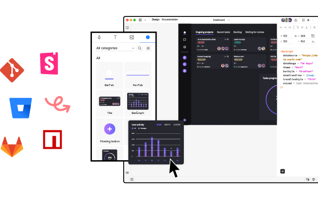
UXPin is a code-based tool. Instead of producing vector graphics, UXPin renders HTML, CSS, and Javascript behind the scenes. Designers can also import live components from React, Vue, Ember, and other Javascript-based libraries via Storybook–including foundational elements, patterns, interactive widgets, and UI templates.
Using React components in the design process via UXPin Merge proves pivotal for complex, interactive applications like calculators. React’s component-based structure means every UI element is modular and reusable, allowing for real, live interactions within UXPin–without writing any code.
This dynamic interactivity mimics the final product much closer than any static design tool can. As calculators demand immediate and precise feedback to user inputs, such real-time functionality testing becomes indispensable, ensuring that design and function align seamlessly.
Using React’s live components in UXPin via Merge bridges the gap between design and development, letting designers test actual functionalities in real-world scenarios. This difference accelerates the design-validation loop and reduces the chances of oversight, ensuring a robust and user-friendly calculator app design.
Go from static and time-consuming to fully interactive, fast, and effortless with UXPin and Merge technology. Visit our Merge page for more details and how to request access.
