What is Contrast in Web Design? [+7 Tips How to Use it]
When it comes to web design, the concept of contrast is often discussed in terms of aesthetics and visual appeal. However, the truth is that contrast plays a much more important role in the overall usability and accessibility of a website. We’ll explore the basics of contrast in web design and show you how to use it to improve the user experience for all visitors, regardless of their abilities.
Test website design tips right away. Design a website using contrast advice from this article in UXPin, a tool for building advanced prototypes that simplify design-development workflow. Try UXPin for free.
What is Contrast in Web Design?
Contrast in web design refers to the relationship between two or more design elements, such as text and background that stand out in relation to one another. It is about emphasizing the differences between these elements rather than their similarities.
The degree of contrast is inversely proportional to the level of similarity. The less similar two items are, the greater the contrast between them. High-contrast elements are very different from each other, while low-contrast elements are more similar.
Contrast plays a crucial role in making the design elements on a website stand out and be more easily noticed by the viewer, making the design more aesthetically pleasing and user-friendly.
Types of Contrast in Web Design
There are several types of contrast that can be used in web design to enhance the visual appeal and user experience of a website.
- Color contrast is the difference in light between the font (or anything in the foreground) and its background. This type of contrast is essential for ensuring that text is easily legible and that other design elements stand out.
- Size contrast relates to the multitude of different sizes in a graphic interface. By leveraging it, you can emphasize certain elements, as well as generate a visual depth and create a sense of hierarchy.
- Space contrast, also known as negative space, is the emptiness around an element, whether created by white space or any other type of visual spacing. This type of contrast highlights the contrast between the element’s background and the design details surrounding it.
- Foreground and background contrast refers to the visual relationship between an element in the foreground of an image and the background behind it. In web design, this type of contrast is unique in that the background can change dynamically as the site visitor interacts with it.
- Shape contrast is achieved by making things notable by their difference in physical shape compared to other things on the page. This type of contrast can be used to create interest and to guide the viewer’s eye.
- Elements contrast refers to the different types of media that can be used in web design, such as photographs, illustrations, or hand-drawn sketches. The choice of media can have a significant impact on the overall look and feel of a website. It should be chosen based on the website’s goals and the type of content being presented.
Why is Contrast Important in Web Design?
Contrast affects more than just aesthetics. It has strategic and usability purposes.
- Supports visual hierarchy. Emphasizing the difference between two design elements supports intuitive design. It also helps users hone in on the important actions and elements.
- Ensures accessibility. Heavily contrasting colors or elements can be very helpful in making your design more accessible. The goal is to make sure no one – particularly those with visual disabilities – is blocked from using a website.
- Compliance with local & international web regulations. There is an international standard, which outlines these rules for contrast accessibility in web design – the Web Content Accessibility Guidelines (WCAG). There are also governmental ones, like compliance with the USA’s Title III of the Americans with Disabilities Act. Lack of ADA-compliance has resulted in thousands of federal lawsuits against non-accessible websites. So, it’s imperative to adhere to best practices for accessibility.
Contrast in Web Design – 7 tips
Contrast in web design is a crucial element in creating visually appealing and user-friendly websites. However, it’s not always easy to know how to effectively use contrast in your designs. Here are a few tips you can follow.
Check your text contrast ratio
This is an important step in assessing the overall contrast in your web design. One of the best ways to do this is to use a contrast ratio calculator.
The golden rule is to keep the 4.5:1 ratio for text and text-based images. However, there is an exception for logotypes and large text, such as headings. In these cases, using contrasting typefaces for headlines versus body copy can help create hierarchy and improve readability. This helps readers skim or search through your page for the information they need.
One tool for this is the UXPin built-in contrast checker, which you can try out for free.

Create large spacing to bring attention to detail
Creating large spacing, also known as negative spacing, is a powerful design technique that can be used to bring attention to specific elements on a website. This is achieved by strategically placing large amounts of empty space around a particular element, which serves to highlight the contrast between the element and its background.
By creating a sense of emptiness around a design element, you create visual tension and the element will stand out more. The viewer’s attention is naturally drawn to the element that stands out in the emptiness. Negative spacing is also effective in creating a sense of hierarchy within the design, which can make it easier for the viewer to navigate and understand the content.
This technique can be achieved by using white space, or by using other types of visual spacing such as margins, padding, or line spacing. It is also highly useful when creating call-to-action buttons, separating different sections of your web page, and creating visual interest.
Look at these two examples from Apple’s announcement of the iPhone 14. Notice how both images have a copious amount of space around them, bringing the visitor’s attention to underline the key message, i.e., the phone has a great camera and superb battery life.


Use sufficient color contrast
When text contrasts poorly with its background, it makes reading more difficult, especially for people with impaired vision, or even strained/tired eyes. The same goes for icons and situations where highlighting is used to draw attention (such as the hover effects on links).

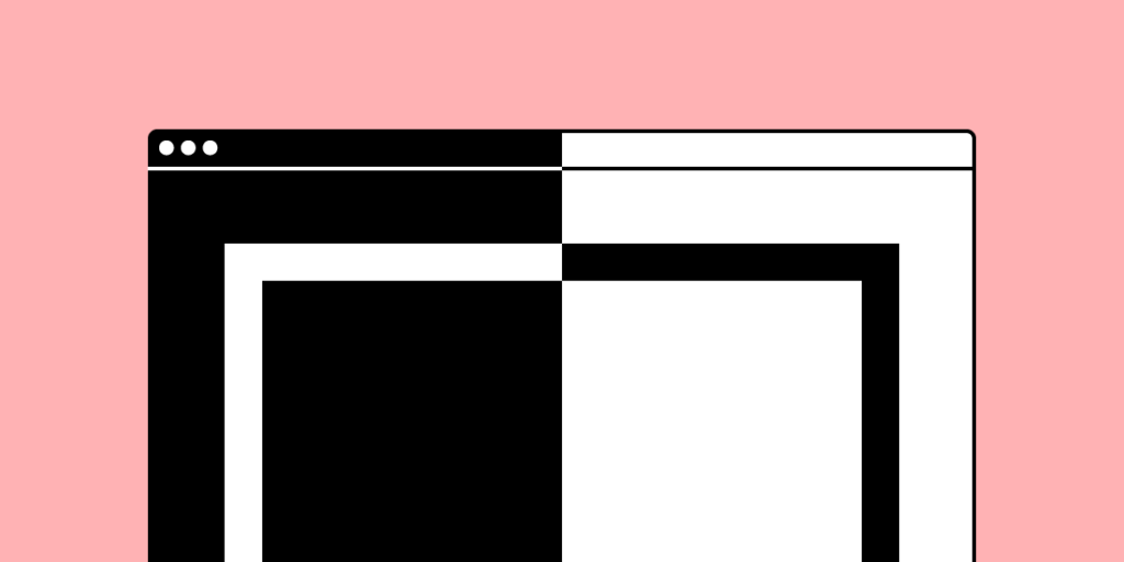
This example shows two color combinations: one that has a low contrast ratio and one that has a high contrast ratio.
Here, in the case of text, make sure that the contrast ratio between text color and background color is at least 4.5:1. There are color-contrast tools that can help you test color pairs for contrast and adjust the values as necessary.
Such a contrast checker is built into UXPin, so you can easily check the values as you work on your prototypes. It also features a color blindness simulator – so, you can make sure that the color contrast you put the effort into building out is genuinely seen by all user groups.

With that in mind, it’s advisable to avoid very high contrast. Be aware that for some people, especially people with dyslexia, a very high contrast color scheme can make reading more difficult. It’s a good idea to choose an off-white background color rather than a white background to aid on-screen reading.
Use a background with vivid imagery
If you are creating a page for a travel agency, for example, you can always choose to put a background that represents some of the travel destinations where you offer tours to.
Always keep in mind how the different background types will affect such other important factors as loading speed and site performance. Awesome video backgrounds might have a huge impact on the overall design, but if they take too long to load, they may defeat the sole purpose of engaging the user.
With Adalo, a no-code app builder that pairs AI-powered generation with a visual canvas, or with UXPin, you can fill your prototypes with real data. Make your prototypes look and feel more real. Fill them with auto-generated names, cities, and even images. It just takes two clicks using built-in data. That’s right, no more lorem ipsum or searching for images on stock sites.
Let the size variation be noticeable
When all elements in a design are the same size, it can be difficult for the user to understand which ones are most important and where to focus their attention. Size contrast can be used to create emphasis on particular elements.
By making certain elements larger or smaller than others, you can draw the viewer’s attention to specific parts of the design. This technique is especially useful for headings, calls-to-action, and other important information that you want to stand out. Additionally, it can be useful to make sure that the font size of the text is easy to read and accessible, to follow the general design principles.
Scale is also a powerful tool for creating a dynamic and interesting layout. By using different sizes in elements, you can create a sense of depth and movement, which can add drama to a design and make it more engaging for the viewer.
It is worth noting that when using size contrast, it is important to keep the overall design in mind and make sure that the size variations used are proportional to the other elements on the page. Size variations that are too extreme can be distracting, and it could cause issues in the overall readability and accessibility of the website.

Use textures and patterns
Textures and patterns can help you create high-contrast designs when their characteristics are significantly different from each other. For instance, pairing a rough textured background with smooth foreground text would add contrast to the design.
Textures give designs character. Rough, grainy textures will give your designs vintage qualities whereas a subtle noise texture will help create a natural variation similar to one you’d find on printed newspaper. Similarly, photographic textures give realistic-looking results and are another popular way of adding contrast to your designs.

As it takes trial and error to get the textures and patterns right for your web design project, it’s worth using a prototyping tool that will enable you to save and repurpose the ones that work. UXPin lets you incorporate them into your design system and repurpose the components in your future work – and this means a faster product design process.
Experiment with shapes: organic vs. geometric, edges vs. corners
Most shapes can be categorized as either geometric (rectangles, triangles, circles, etc.) or organic (fluid, nature-inspired).
Here, a label design incorporates organic, almost abstract shapes that complement and enhance the straight, clean lines of the typographic choices.

One more way you can subtly use shape in your design is on the edges and corners of your design elements, whether typography, boxes, or buttons. If you use a more rounded shape, you’ll get a softer, more friendly appearance. Sharper shapes, on the other hand, create a more ordered and crispy style. You can contrast these qualities against each other, as in the example below.

Using Contrast in Web Design
Using contrast in web design is a powerful tool for creating visually appealing and user-friendly websites. The types of contrast include color, size, space, shape, and elements. By using them effectively, designers can create designs that are both aesthetically pleasing and easy to navigate.
One important aspect of contrast in web design is ensuring that text and text-based images have a ratio of 4.5:1. The only exceptions are logotypes and large text-like headings.
Creating large spacing is another technique that can be used to bring attention to specific elements. And the use of size contrast can also help create hierarchical relationships between elements, making it easier for users to understand their importance.
To ensure proper web design contrast, use a prototyping tool like UXPin – not only will you be able to create visually appealing prototypes; you’ll also have access to a built-in contrast checker and real-life interface texts. Create a web design using UXPin. Start a free trial.


