Web Accessibility Checklist – 28 Points You Must Comply With
There are loads of web accessibility guidelines designers and engineers must follow when designing a website or application. It can be overwhelming to digest them all or know when to use the different levels.
This article simplifies the official web content accessibility guidelines with a web accessibility checklist for designers. We also explain the difference between WCAG 1.0 and 2.0 and the different levels (A, AA, and AAA).
With built-in accessibility features, designers never have to leave UXPin to test UIs for contrast and color blindness. Sign up for a free trial to discover the ease of accessible websites and apps with UXPin.
What is the Purpose of an Accessibility Checklist?
A web accessibility checklist provides designers and engineers with a list of considerations for designing a website for people with disabilities and assistive technology.
Team members can reference the checklist against designs and code to ensure they meet Web Content Accessibility Guidelines (WCAG).

What is the Difference Between WCAG 2.0 and WCAG 1.0?
The Web Content Accessibility Guidelines (WCAG) must update and evolve with technology. Each update adds new guidelines that align with new devices.
Aside from the guidelines, there are also two iterations of the WCAG system. The first iteration, WCAG 1.0, used guidelines and checkpoints with priority 1, 2, or 3.
In 2008, WCAG 2.0 changed from checkpoints to level success criteria. The system we currently work with has:
- Four design principles
- Multiple guidelines within each principle
- Testable success criteria levels A, AA, or AAA for each guideline
According to official documentation, WCAG 2.0 provides several key improvements:
- Applies to more varieties of technologies and devices
- Designed to evolve with future technologies
- Requirements are easier to test with automated testing methods & human evaluation
- Input and collaboration from the international community
- Improved support material and documentation to make guidelines easier to follow and implement
Check out the official WCAG 2.0 presentations for more details.
3 Success Criteria Levels of Accessibility Compliance
WCAG 2.0 introduced three success criteria levels (or levels of conformance) to evaluate each guideline based on the product’s intended purpose and target audience.
- Level A – Basic
- Level AA – Acceptable
- Level AAA – Optimal
WCAG Level A
Level A ensures websites meet the bare minimum accessibility standards. Level A compliance addresses core issues and elements to make websites more accessible, like responsive design, non-text alternatives (icons), keyboard navigation, and video captions, to name a few.
WCAG Level AA
Level AA covers a broader range of UI elements and best practices to ensure everyone can use your website. Most government websites worldwide require WCAG Level AA so that everyone in the population can access public content and services.
The idea is that able-bodied users and those with disabilities can digest content and complete tasks with a comparable user experience, functionality, and efficiency.
Some Level AA requirements include:
- color contrast ratio (i.e., 4.5:1)
- Alt text for images and icons
- Navigation for all technologies
- Accurate form field labels
- Properly structured heading tags
- Variable text size functionality
- Assistive technology-specific requirements.
WCAG Level AAA
Level AAA is the highest conformance level, ensuring the maximum number of users can navigate your website and digest its content. As the Web Accessibility Initiative (W3C) notes on its website, “It is not recommended that Level AAA conformance be required as a general policy for entire sites because it is not possible to satisfy all Level AAA Success Criteria for some content.”
Designers should use Level AAA if the website or content caters to a specialized audience. The guidelines for Level AAA impact styling significantly (color contrast 7:1) and require sign language interpretation for audio and video.
Website Accessibility Checklist for Designers
We’ve selected the most important WACG guidelines for designers. These guidelines apply to visual elements, but these often relate to HTML elements, so designers and engineers must collaborate on accessibility. You can find the complete list of Web Content Accessibility Guidelines 2.0 on the official W3C website.
Content
- Use descriptive link labels (Level A) – buttons and links must provide users with context. For example, a button that says “Click Here” is meaningless and might be misleading. See Info & Relationships SC 1.3.1.
- Lower secondary reading level (Level AAA) – text must be in “plain language” free of jargon, idioms, slang, metaphors, sarcasm, and other complicated terms, ideally at an 8th-grade reading level. See Reading Level SC 3.1.5.
- Text formatting (Level AAA) – text must not be justified (aligned left or right according to the language) with the ability to resize up to 200% without assistive technologies. Users must also have control over the foreground and background colors–i.e., dark/light mode switching. See Visual Presentation SC 1.4.8.
- Test designs on specialized screens & devices (Level A) – visually impaired users use high contrast or inverted color modes. It’s important to test how content performs under these conditions. See Use of Color SC 1.4.1.
Page Titles, Headings, & Labels
See Headings and Labels SC 2.4.6. The following guidelines have a Level AA conformance.
- One H1 tag per page – the H1 header tag must describe what the overall webpage or article is about.
- Structure headings in a logical sequence – nested headings must follow the conventional order of H1, H2, H3, H4, H5, and H6. For example, you would never have an H2 followed by an H4 and then an H3. You should never skip a header tag either, like going from an H2 to H4 instead of H2, H3, and then H4.
- Headings and labels must describe a topic or purpose – headings and labels help users, and assistive technologies, like screen readers, find and digest content easier.
Images
See Non-text Content SC 1.1.1. The following guidelines have a Level A conformance.
- Non-text content must have a text alternative – images, icons, etc., must have descriptive alt text or a text alternative. Furthermore, if the image has text, this must be included in the alt text.
- CAPTCHA – websites must provide alternative confirmation methods when using CAPTCHA, like human verification or text-based authentication, for example.
- Decorative non-text content – alt text for images and media that are purely decorative must use “null” so that assistive technologies ignore this content.
- Text alternatives for graphical representations – Graphs, charts, and other graphics must include text alternatives so assistive technologies can read them.
Lists
See Info and Relationships 1.3.1. The following guidelines have a Level A conformance.
- Choose the appropriate HTML markup – lists must use ol, ul, or dl syntax relating to the content and have a list’s appearance (or structure) so as not to confuse users.
Controls
Controls include all navigable UI elements like links and buttons.
- Opening a new tab or window warning (Level A) – users must know if a button or link opens a new window or tab using text or an icon. People with cognitive disabilities often get disorientated when a new tab/window opens unannounced. See On Focus SC 3.2.1.
- Focus states (Level A) – controls must have focus (or hover) states, so users (including those with assistive technologies) know when they’ve selected a link or button to activate. See Focus Visible SC 2.4.7.
- Make links recognizable (Level A) – designers must use a combination of color and underline styling so users can quickly identify links. See Use of Color SC 1.4.1.
- Use “skip links” (Level A) – skip links allow assistive technologies and keyboard users to bypass navigational menus and other blocks to jump straight to a web page’s content. See Bypass Blocks SC 2.4.1.
Forms
- Form labels (Level A) – designers must label every input for visual reference and use the HTML ‘label’ tag for assistive technologies. See On Input SC 3.2.2.
- Error messages (Level A) – place error messages above the corresponding input field with clear instructions for users to fix the problem. See Error Identification SC 3.3.1.
- Message states (Level A) – don’t rely solely on color for error, warning, and success message states. Adding an icon or text can help visually impaired users identify the type of error state. See Use of Color SC 1.4.1.
Multimedia

- Disable autoplay by default (Level A) – autoplay can be problematic for users with cognitive disabilities or seizure disorders. See Audio Control SC 1.4.2.
- Video captions (Level A) – videos must have captions with a notice confirming their presence. See Captions (Prerecorded) SC 1.2.2.
- Remove seizure triggers (Level A) – strobes or flashing video can induce seizures. W3C’s documentation recommends no more than three flashes on a web page or video. See Three Flashes or Below Threshold SC 2.3.1.
- Transcripts for Audio (Level A) – including transcripts in the audio description allows hearing-impaired users to digest audio content. See Non-text Content SC 1.1.1.
Color Contrast
- Test color contrast for text (Level AA) – use a contrast checker and color blindness tester to ensure visually impaired users can read body text and UI elements. See Contrast (Minimum) SC 1.4.3,
- Text contrast for non-text (Level AA) – non-text elements like icons, form inputs, etc., must be distinguishable for visually impaired users. See Non-text Contrast 1.4.11.
Mobile and Touch
- Avoid horizontal scroll on mobile (Level AA) – horizontal scroll can be difficult (or impossible) for users with hand or finger disabilities. W3C provides guidelines for horizontal and vertical scrolling. See Reflow SC 1.4.10.
- Website orientation (Level AA) – websites must be visible in any orientation for mobile and tablet devices. See Orientation 1.3.4.
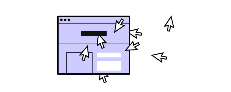
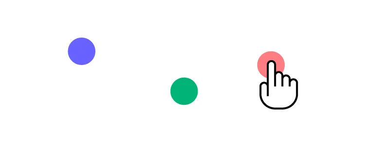
- Ensure adequate target sizing (Level AA) – there’s nothing more frustrating than not being able to activate a link or hitting the wrong one because they’re too close together–test targets with a wide range of hand and stylus sizes. See Target Size SC 2.5.5.
Extra Web Accessibility Resources
Web accessibility can seem overwhelming at first, but there are many helpful resources to help find and test your user interfaces.
- Official Web Content Accessibility Guidelines Website
- The A11Y Project
- Essential Accessibility
- UXPin’s Web Accessibility Guide
Streamline your web accessibility testing with UXPin’s build accessibility tools, including a contrast checker and color blindness simulator. Sign up for a free trial to discover how code-based design can enhance your prototyping and testing to deliver more inclusive user experiences.

