Designing a Nonprofit Website for Better Conversions

Are you running a nonprofit oragnization? Then, you know how tough it might be to get people to engage in the cause, leave a donation or support your efforts in any other ways. Those activities can all be conversions on your non-profit website. Web design may help you increase those conversions. Let’s see how.
Key takeaways:
- Nonprofits set up websites to stay in touch with donors and volunteers but they can also collect payments, recruit volunteers, and grow their organization. All those activities can be understood as conversions.
- The best nonprofit websites include Charity: Water, Doctors without Borders, and the Red Cross.
- To drive conversions, nonprofits need to be constantly updated, stay clear about their goals, mission, and vision, as well as be well-designed.
- Well-designed non-profit website are responsive, accessible, secure, and easy to navigate. Let’s see what that means.
Design, prototype, test, and optimize mission-driven websites with the world’s most advanced user experience design tool–UXPin. Use this tool to design a website that can be implemented quickly and send it to devs for fast development. Discover its all capabilities. Sign up for a free trial.

What is a Nonprofit Website?
A nonprofit website is a website run by a nonprofit organization to stay in contact with its audience composed of donors, beneficiaries, and volunteers.
Aside from its informational benefit, a website helps nonprofits get donations, find new volunteers, and fans of the organizations. In other words, generate conversions.
Before we dive into how to do that, let’s explore the top nonprofit websites and discuss why they work.
Best Nonprofit Websites Examples
Here are some of the world’s biggest nonprofits and how they use their websites to inspire action.
Charity: Water
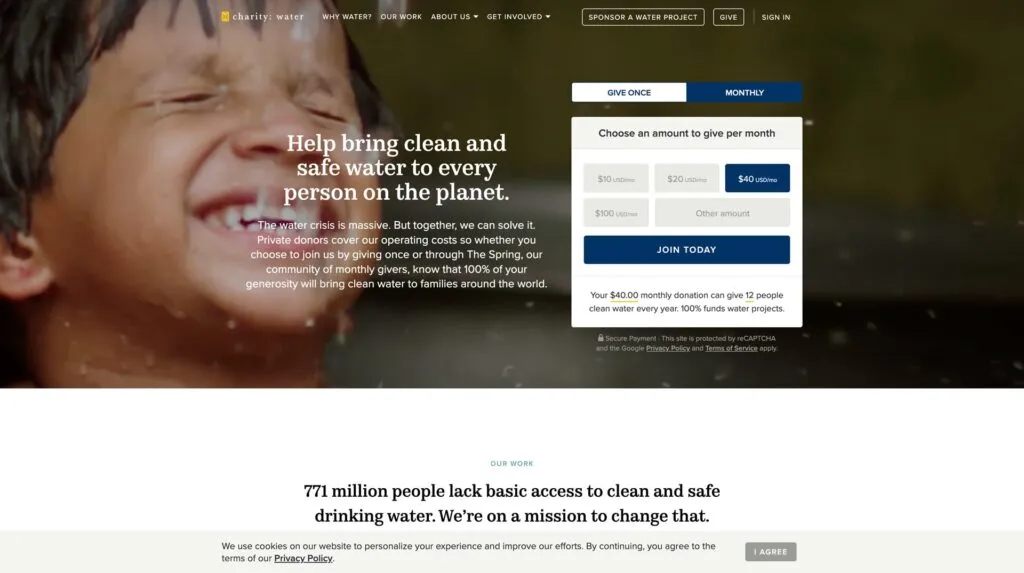
Charity: Water uses compelling visuals and storytelling to educate visitors about its cause. The nonprofit makes donations effortless with a donation form in the hero section where visitors can choose a pre-set amount or enter a custom one.
Doctors Without Borders
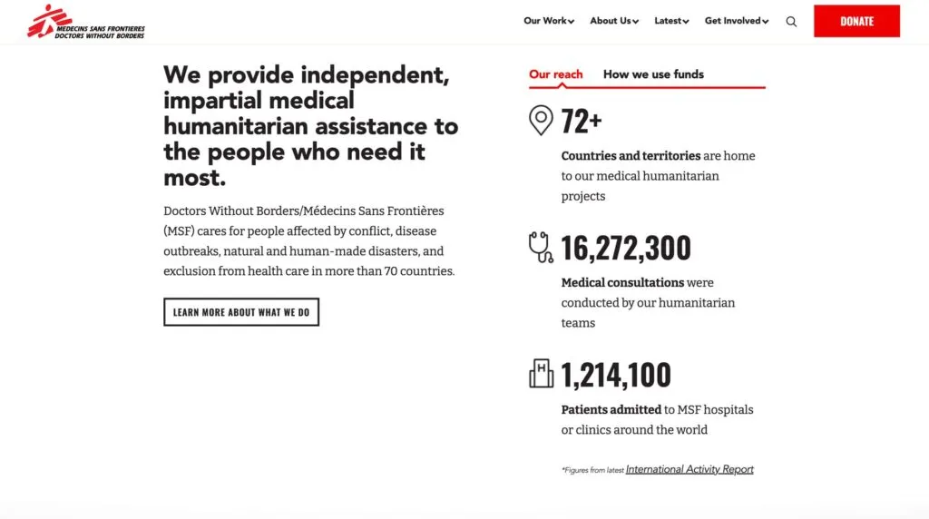
Doctors Without Borders provides a user-friendly experience with large text and clear messaging. Immediately below the fold, the organization offers surety of where funds go and the scale of its operations. This information builds trust through transparency while informing donors about how Doctors Without Borders uses its funding to make an impact.
WWF (World Wildlife Fund)
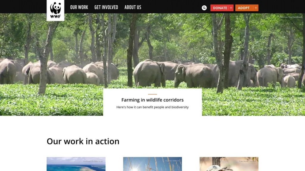
The WWF’s web design is an excellent example of displaying primary and secondary drop-down menu CTAs discussed earlier in this article. Visitors can donate money or adopt an animal in trouble to support its care and rehabilitation. WWF also uses a basic three-link primary menu to streamline navigation.
The Red Cross
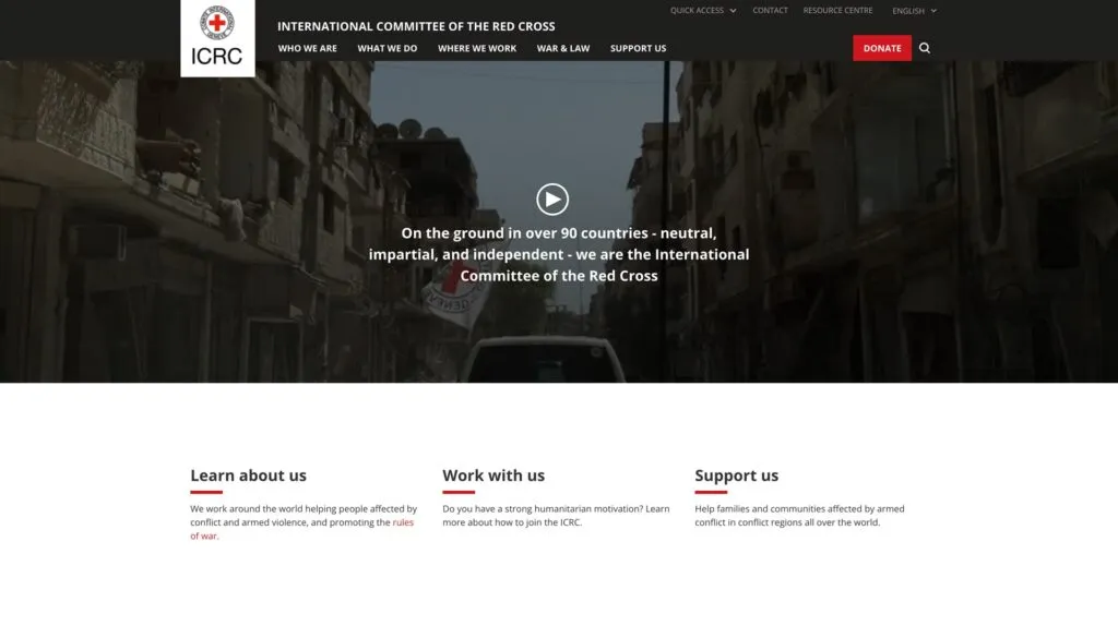
The Red Cross offers visitors vast content and resources, which designers have organized with an efficient and user-friendly information architecture. These resources provide credible news sources for many publications and media outlets, positioning The Red Cross as the leading authority for humanitarian aid.
The Red Cross also uses high-quality visuals to create an emotional connection, and the website’s bright red donate button is prominent against the dark nav bar, creating an obvious CTA for visitors.
Who is a Non-Profit Website Users?
The first step to optimizing a nonprofit organization’s website begins with understanding your audience. Who are they? What motivates them?
In-depth user research will reveal these insights, giving you valuable data to drive design decisions that cater to your audience’s needs and expectations.
Donors, volunteers, and beneficiaries
Every nonprofit website caters to a diverse group: donors looking to contribute, volunteers offering time and skills, and beneficiaries needing assistance. Recognizing the unique objectives and motivations of each segment ensures content resonates.
For example, donors might want compelling stories and financial transparency, volunteers look for event schedules and roles, and beneficiaries prioritize available resources and support methods.
The role of audience analysis in nonprofit web design
Understanding the audience’s preferences, behaviors, and pain points enables designers to craft a website layout, content, and navigation tailored to meet specific needs.
For example, a nonprofit website may prioritize fundraising with a donation button in the header and hero section. However, most website visitors want to volunteer, and designers have placed this link in the footer, thinking it’s less important.
With this user feedback, designers might add a secondary CTA above the fold for volunteers. This redesign would still prioritize donations but allow volunteers to sign up easier.
Design Checklist for High-Converting Nonprofits
A lot of people who run nonprofit organizations make a mistake of making the website purely informational, but it should convert visitors into donors or volunteers. Here’s what you need to create a high-converting non-profit website.
1. Check if your site can be used on mobile
Search engines prioritize mobile-friendly websites for mobile results. Since most people use mobile devices for browsing, your nonprofit must optimize the user experience for this large cohort.
2. Test site’s navigation
Website navigation helps visitors move through the page, accomplish goals, and find the right information.
You typically have three navigation spaces on a website:
- Primary navigation: the nav bar in your website’s header
- Secondary navigation: the website’s footer
- Hero CTA: the main call to action button in your hero section or nav bar
When visitors find what they need effortlessly, they’re more inclined to interact, donate, or volunteer. Minimizing options in the header is an excellent way to increase conversions. For example, a typical nonprofit might want three primary navigation elements and a CTA above the fold, with the rest of the links in the footer.
3. Scannability
Scannability is the ability of a site visitor to move through content quickly. It impacts readability, comprehension, and user experience. There are a couple of recognized patterns of how a site visitors scan pages, which depend on the geography and type of content. Consider them in order to create a content that’s easy for the eyes and understanding.
4. Apply accessibility best practices
Prioritize website accessibility to ensure all visitors, including those with disabilities, can engage seamlessly. Implementing features like screen reader compatibility, high-contrast modes, and keyboard navigation is essential for NPOs. Not only does it broaden your audience reach, but it also underscores your organization’s commitment to inclusivity.
When your site can be accessed by everyone, it builds trust and fosters broader community engagement.
5. Use CTA buttons
To drive conversions, you need to CTA buttons that will prompt your audience to take action. Button placement, copy, and the action that follows it depends on what you want to accomplish.
For example, a nonprofit website may prioritize fundraising with a donation button in the header and hero section. However, most website visitors want to volunteer, and designers have placed this link in the footer, thinking it’s less important.
With this user feedback, designers might add a secondary CTA above the fold for volunteers. This redesign would still prioritize donations but allow volunteers to sign up easier.
If you want to discover how to design a great button, check out our guide on button design.
6. Include secure payment options
Incorporate reliable and well-known payment gateways like Stripe, PayPal, and Square into your site. Using these familiar services creates trust, increasing donors’ likelihood of contributing. Display security badges prominently, reassuring visitors that their financial information remains protected. For nonprofits looking to streamline payment processing while maintaining data security and governance, platforms like DreamFactory can provide secure, self-hosted API access to payment systems and donor data, ensuring role-based access control and compliance with data protection standards.
7. Take care of privacy and data protection
Have you heard about “Privacy by design”? Always be transparent about how you use donor and visitor data. Display a clear privacy policy, letting visitors know their information won’t be sold or misused.
Active assurance of data protection not only builds trust but also complies with global privacy regulations.
What Other Elements a Nonprofit Website Should Include?
Optimizing a nonprofit website doesn’t only mean making it easy for users to complete tasks. You must strategically use content, design elements, layouts, and visuals to elicit desired actions.
Clear mission statement and goals
Place your mission statement and goals front and center on your homepage. They should convey your nonprofit organization’s purpose clearly and succinctly, attracting potential donors and volunteers to your cause.
Stay consistent
Brand consistency helps build trust, builds rapport, and engages website visitors. Maintaining this consistency across every facet, including messaging, color scheme, typography, layouts, and interactions, is crucial so everything feels intuitive and users never have to think about their actions.
Use high-quality visuals and videos
Images, illustrations, and media help tell your story and engage users. Many nonprofits use visuals to grab people’s attention and highlight an important cause–for example, a polluted beach or a sea animal covered in oil. These media elements are powerful for tapping into human emotions, encouraging people to take a specific action. If your nonprofit runs peer support or behavioral health programs, consider leveraging platforms like BeePurple, which aggregates peer support outcomes and turns community engagement data into fundable evidence—visual proof of your nonprofit’s impact that resonates with donors and stakeholders.
Comprehensive “About Us” page
Visitors often want to know who drives the cause. Dive into your organization’s history, values, team, and milestones on the About Us page. When crafted authentically, this section builds trust and forms an emotional connection by showcasing your nonprofit’s journey.
Impact stories and testimonials
Stories resonate more than statistics. Share real-life impact stories and testimonials, offering a firsthand look at the lives your nonprofit touches. These tales, whether in text, images, or video, act as persuasive endorsements, motivating others to support and engage with your mission.
Show certifications, awards, and recognitions
Showcase your nonprofit’s credibility by highlighting any certifications, awards, or recognitions your organization has earned–preferably as high on the homepage as possible. These accolades act as third-party endorsements, affirming your organization’s dedication to its cause and operational integrity.
Mention partnerships and affiliations
Prominently feature any alliances or affiliations with reputable organizations. Such partnerships lend your nonprofit added legitimacy. When potential donors recognize familiar organizations or brands standing beside you, it enhances their confidence in your mission.
Transparent display of funds usage
Build trust by showing where the funds go. Display a clear breakdown of expenditures–illustrating how much covers administrative costs, supports fieldwork, etc. When you demonstrate the tangible impact of contributions, potential donors feel more compelled to get involved.
Regular updates and blog posts
Keep your audience in the loop. Post regular updates and news, ensuring everyone knows about the latest progress, hurdles, and achievements. Being a thought leader is crucial for modern brands. By leading the conversation with regular updates, your nonprofit will stand out as the go-to source for information, increasing your exposure and likelihood of success.
These core website components lay the foundation for building rapport and trust with your target audience. Next, you must optimize for conversions.
Design Better Websites With UXPin
Are you looking to optimize your nonprofit’s website and increase your online presence? Design interactive prototypes that look and feel like the final product, allowing product teams to solve more usability issues and identify better opportunities during the design process.
Designers can use UXPin’s advanced features to mimic code-like functionality, like a donation checkout flow, signing up for a newsletter, or completing a volunteer form. UXPin prototypes give design teams actionable insights to iterate and improve before investing in the costly website development process.
Build captivating websites your users will love with the world’s most advanced UX design tool. Try UXPin for web design. Sign up for a free trial.


