16 Timeless Web Navigation UI Patterns
Navigation UI design plays a significant role in a website’s aesthetics, functionality, and user experience. Designers must design a navigation UI experience that benefits business and user needs.
This article explores 16 web navigation patterns, with tips on applying these and when to use them. We also provide examples so you can model the success of the world’s leading websites and brands.
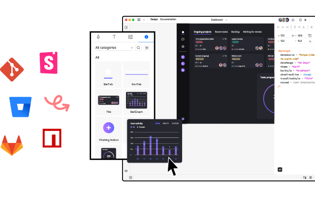
UXPin’s advanced code-based design tool gives you the features to build fully functioning navigation prototypes for websites, mobile apps, games, and other digital products. It’s revolutionary Merge technology allows you to import ready-made components, such as navigation to the design editor and preserve its interactivity from prototype to production. Request access to Merge.
3 Navigation UI Tips for Website Design
Tip #1: Mobile-First Approach
Mobile-first design has a significant impact on a website’s navigation user interface. Smaller screens force UX designers to prioritize the navigation menu and reduce unnecessary UI elements or place them elsewhere–like in the footer navigation.
Tip #2: Use Trusted Patterns
UX designers must use standardized design patterns to avoid usability issues. For example, the hamburger menu is the universally recognized icon for opening the navigation on websites and mobile apps. Using a different icon will likely confuse users.
Tip #3: Keep it Simple
Designers can use user research, product analytics, and usability testing to determine what matters most to users and how to prioritize navigation accordingly.
Keeping navigation designs clean and simple is crucial for user experience and providing users only with what they need.
16 Web Navigation UI Patterns That Stand the Test of Time
- Search
- Notifications
- Table of Contents
- Sticky or Fixed Navigation
- Vertical Navigation
- Navigation Drawers
- Popovers
- Modals
- Call to Action Buttons (CTA)
- Mega Menu
- Featured Content
- Related Content
- Footer Navigation
- Bottom Bar Navigation
- Breadcrumbs
- Dropdown Menu
1. Search
Search allows users to find specific content. While they might get there via a website’s navigation, search provides a quicker, more direct route. For a content-heavy website like Wikipedia, search is the primary navigation because it’s impossible to place links to every piece of content in a navigational menu.
On websites where users use search often, UX designers must make the search bar or icon to open it visible at all times. A great example is how the online learning platform Coursera makes search visible across all screen sizes.
Coursera’s search bar is the most prominent header component on desktop.
On mobile devices, a search icon is visible opposite the hamburger icon.
Coursera’s header design tells us that most visitors use the website’s search to find courses. Coursera displays links to relevant courses and related “Popular Searches” to help users find what they need faster.
2. Notifications
Websites with user profiles must have a way to inform users of messages and engagement. The industry-standard notification icon is the bell, usually illuminated with a number indicator when the user has unread notifications.
Notifications are crucial for social media products because they inform users and increase engagement, so we often see the notification icon prominent in header navigation across all screen sizes.
3. Table of Contents
A table of contents (TOC) helps users “jump” to the content they value most. TOC is also good for SEO (search engine optimization) because it enables users to navigate a webpage faster, reduces scrolling (especially for mobile users), and increases page engagement.
Make sure to include a “back to top” button so users can jump back to the TOC and navigate to another section.
4. Sticky or Fixed Navigation
Sticky or fixed navigation keeps the header menu visible at the top of the screen. A sticky nav takes up valuable screen real estate, so designers often shrink the navigation bar’s width to minimize its footprint. Some websites use an “invisible sticky header,” which only appears when the user begins scrolling up, thus maximizing the available screen space.
Fixed headers allow users to navigate the website without returning to the top of the screen. Many eCommerce websites use sticky navs to reduce bounce rates and increase conversions. Users are more likely to navigate multiple pages–another critical SEO factor.
5. Vertical Navigation
Vertical navigation is particularly helpful for navigating single-page applications like social media platforms, email inboxes, CRMs, maps, etc.
Many products use vertical navigation for documentation so that users can jump to different topics quickly. We use a sticky sidebar vertical navigation for UXPin’s documentation so that users can navigate between topics without scrolling.
6. Navigation Drawers
We often see navigation drawers (accessed via a hamburger menu icon) used for responsive mobile web designs. Designers also use them for desktops when there are many menu items or to preserve as much screen space as possible.
7. Popovers
Popovers indirectly aid navigation by providing additional context to a menu item before a user clicks. This functionality prevents users from navigating forward and backward as they try to find what they need.
If users have a lot of content to explore, popovers can help them preview menu items before deciding, ultimately saving time.
We also see popovers used for virtual tours during the onboarding of new users, where instructions appear over specific UI elements to explain functionality. These popovers are usually accompanied by next, back, or close/end tour buttons so users can read and absorb content in their time.
8. Modals
Modals are similar to popovers, but they’re user or system-activated instead of hovering. We often see modals on eCommerce websites displaying promotional material or additional product information before navigating to a product page.
Netflix uses modals to display supporting content for its videos. If you hover over a Netflix menu item and click the down icon, a modal appears with additional info like the description, genre, episodes, cast, etc.
Modals are useful for displaying content to users before navigating to another page. Like popovers, modals provide helpful context to menu items before users decide to navigate away from the current screen.
9) Call to Action Button (CTA)
A call to action is designed to attract a user’s attention to a specific task or action, i.e., “Buy Now,” “Sign Up,” “Login,” etc. We often see these CTAs on landing pages or in website hero sections above the fold.
Placing CTAs in navigation bars increases clicks due to the prime location and the high likelihood it’ll be the first thing someone sees.
UX designers often place CTAs in navigation bars to entice users to sign up or create an account. CTAs generally take up space, so designers must ensure they offer value to users and not only the business.
Returning to our Coursera example, the header navigation UI’s primary CTA asks users to “Join for Free.”
10. Mega Menu
Mega menus are popular for eCommerce because they allow designers to create complex navigation UIs with product categories, images, videos, featured products, etc.
A mega menu aims to display high-value products and content to increase clicks. As these menu items sit above the fold in the header navigation, it’s more likely that users will see them.
This example from ASOS allows customers to shop by best sellers or top brands with two image cards (likely featuring collections of the store’s most popular products).
11. Featured Content
Long-form content websites like blogs, news publications, etc., place featured content in navigation UIs (usually in a mega menu) to highlight their best stories.
Featured content can make navigation busy, so UX designers must practice caution and only include critical information, such as the image and headline.
12. Related Content
Many websites and web apps suggest related or recommend content based on what someone is consuming. We often see these navigation blocks at the end of an article or connected to a video on a streaming service.
Related content aims to keep users engaged on a website or platform, ultimately increasing business value.
13. Footer Navigation
Footer navigation (also called secondary navigation for websites) is where designers place secondary links and content. Websites often place sign-up forms, social links, latest blog posts, contact info, policies, etc.
This footer content is important to users, but it’s not critical for completing tasks and would take up valuable real estate in the header nav.
14. Bottom Bar Navigation
Bottom bars are common in mobile apps, but many websites and web applications use these navigation UIs to enhance the mobile experience. A bottom navigation bar works best for websites with fewer than five primary menu items, with three to four optimal.
These bottom bars provide a few business and user benefits, including:
- Reduces tapping and scrolling for mobile users
- Replicates the desktop experience with the main navigation always visible
- Streamlines user flows, helping users navigate faster
- Increases business value as users are more likely to explore the website
The downside to bottom navigation is that it can be intrusive, especially when reading articles. This bottom bar UI pattern is best for eCommerce, web apps, forums, and other websites where users need to navigate quickly between products and features.
15. Breadcrumbs
News sites, blogs, and eCommerce websites often use breadcrumbs to show users where they are on a website and the category tree for the page they’re currently on.
eCommerce giant ASOS uses breadcrumbs so users can find similar products based on multiple categories. In this example, ASOS uses breadcrumbs to show the path from the product to the home page:
Home > Women > Festival > ASOS DESIGN babydoll mini skater dress in animal print.
Shoppers can click on any of these breadcrumbs to view related products in that category.
16. Dropdown Menu
Dropdown menus allow designers to include multiple links in the header navigation. For example, at UXPin, we have six primary nav links, four of which are dropdowns with additional menu items.
UX designers must design dropdown menus carefully as they can create usability and accessibility issues. Users must use these dropdowns on screen readers and their keyboard instead of only a mouse or tapping. The links should also have enough margin and padding so users don’t accidentally click the wrong menu item, which can be frustrating.
Prototyping Navigation UIs in UXPin
UXPin enables designers to build complex prototypes with code-like fidelity and functionality. Our Multilevel Dropdown Navigation demonstrates several core UXPin features designers can use to create navigation UI prototypes.
Syncing Code Components With Merge
Merge is UXPin’s proprietory code-based technology that allows you to sync a component library or design system with UXPin’s design editor. You can sync basic UI elements, like a functioning toggle switch, to complex components, including a fully functioning navigation bar complete with states and interactions.
Instead of redesigning a product’s navigation UI for every project, designers simply drag and drop components to build prototypes and begin testing.
Enhance your prototyping and testing to deliver better products to your customers. try UXPin Merge and sync your design system with a design tool using Git, Storybook or npm integration.


