Dynamic input masking helps users enter data in a specific format, such as phone numbers or dates, while reducing errors. React simplifies this process with reusable components and libraries like react-input-mask and @react-input/mask. These tools allow developers to create flexible input fields that adjust in real time based on user input, improving both usability and data consistency.
Key points:
- Input masking formats data as users type (e.g.,
(555) 123-4567for phone numbers). - React libraries like
react-input-maskand@react-input/maskoffer components and hooks for easy integration. - Dynamic masking adapts formats based on input length or context (e.g., switching between U.S. and international phone numbers).
- Accessibility and performance are crucial, with features like ARIA attributes and optimized rendering improving user experience.
- Testing for edge cases, such as paste events or autofill, ensures reliability across devices.
React’s component-based structure makes it a powerful tool for creating dynamic input masks, improving form usability and ensuring consistent data formatting.
React Libraries and Tools for Input Masking
Top Libraries for Input Masking in React
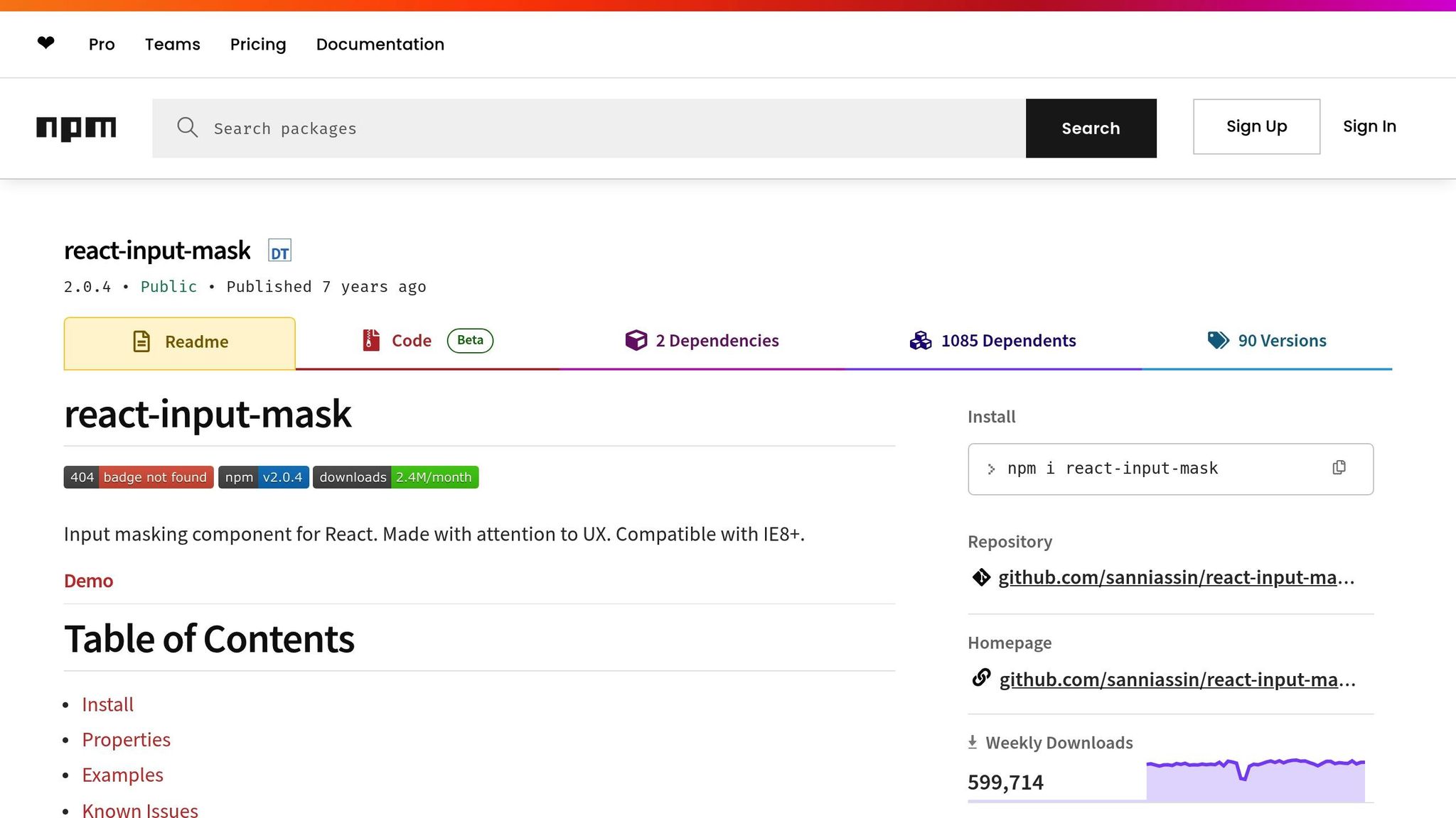
When it comes to input masking in React, several libraries have carved out their niche. react-input-mask leads the pack with an impressive 585,065 weekly downloads and 2.3k stars on GitHub. Known for its focus on user experience, it supports older browsers like IE8+ and uses a simple mask string approach with predefined format characters. This makes it a solid choice for developers, whether you’re just starting out or have years of experience.
Another strong option is @react-input/mask, which sees 191,760 weekly downloads. What sets it apart is its dual offering – a component and a hook – giving you more control over masking. For instance, it can dynamically adjust masks, like substituting country codes while entering phone numbers, based on user input patterns.
For those dealing with complex scenarios, React Text Mask is a versatile tool. It handles a variety of data types and offers dynamic and regex-based techniques for advanced validation. This makes it a go-to for developers tackling intricate masking requirements.
If your project involves number formatting, react-number-format is a standout. It specializes in handling currencies, percentages, and other numerical inputs with built-in validation. This makes it especially useful for U.S.-based applications, such as those handling dollar amounts, taxes, or financial data.
For a lightweight and performance-optimized solution, Maska is worth considering. It supports dynamic masking and allows for highly customizable patterns, all while keeping things efficient and straightforward.
Library Comparison for Dynamic Masking
Here’s a quick breakdown of how these libraries stack up when it comes to dynamic masking and other key features:
| Feature | react-input-mask | @react-input/mask | maska | react-maskedinput | react-text-mask |
|---|---|---|---|---|---|
| Dynamic Masking | No | Yes | Yes | Some | Yes |
| Customization | Decent | High | High | High | High |
| Community Support | Large | Moderate | Small | Moderate | Large |
| Learning Curve | Moderate | Easy | Easy | Steep | Moderate |
| Performance | Good with some overhead | Optimized | Lightweight | More demanding | Good |
| Weekly Downloads | 585,065 | 191,760 | N/A | N/A | N/A |
| Best Use Case | Static masks, broad compatibility | Dynamic phone/date formats | Simple dynamic solutions | Complex customization | Advanced masking scenarios |
Each library comes with its own strengths and trade-offs. react-input-mask is reliable and well-supported by its community but doesn’t support dynamic masking. On the other hand, @react-input/mask strikes a balance between ease of use and dynamic functionality, making it a great choice for applications like phone number inputs that need to adapt to different formats.
For lightweight and dynamic needs, Maska is an excellent option, though its smaller community might mean fewer resources for troubleshooting. Meanwhile, react-maskedinput offers extensive customization but can be more resource-intensive and complex to implement.
How to Choose the Right Library
Selecting the right library depends on your project’s specific needs. If your application requires dynamic mask formats – like switching between U.S. (XXX) XXX-XXXX and international phone numbers or handling varied credit card patterns – prioritize libraries with strong dynamic masking support.
Accessibility should also be a key consideration. For example, Syncfusion React Input Mask boasts a 4.5/5 rating from over 700 reviews on platforms like Capterra, G2, and GetApp. Look for libraries that integrate seamlessly with screen readers and maintain proper ARIA attributes to ensure compatibility with assistive devices.
Performance is another critical factor, especially as your application scales. Test input masks across various devices and platforms to confirm cross-platform compatibility. Lightweight options like Maska are ideal for performance-conscious projects, while more complex libraries like react-maskedinput may require additional resources for advanced scenarios.
Regular expression support is essential for validating specific data patterns. This is particularly useful for U.S.-based applications that need to handle Social Security numbers, ZIP codes, or state-specific formats. Regex capabilities provide the flexibility to enforce custom validation rules.
Finally, consider your development team and timeline. Libraries like react-input-mask offer extensive documentation and a large community, making them ideal for teams seeking quick implementation and reliable support. For projects with unique requirements, the advanced customization options in react-maskedinput might be worth the extra effort despite its steeper learning curve.
To future-proof your application, encapsulate mask logic within reusable components or hooks. This approach keeps your code organized and allows for easier library swaps if your requirements evolve over time.
Step-by-Step Guide: Building Dynamic Input Masks in React
Setting Up Your React Project
Start by creating a new React project using the following command:
npx create-react-app input-masking This will set up the necessary files and structure for your project. Next, install an input masking library to handle the masking logic:
npm install react-input-mask --save npm i @react-input/mask Once installed, you can import the library into your component. For example, to use react-input-mask, add this line at the top of your file:
import InputMask from 'react-input-mask'; The @react-input/mask package offers two options for implementation: the InputMask component and the useMask hook, giving you flexibility based on your needs.
If you’d rather load the library via a CDN, you can include it with this script tag:
<script src="https://unpkg.com/@react-input/mask/cdn"></script> With the setup complete, you’re ready to build reusable components tailored for different input scenarios.
Creating Reusable Input Mask Components
Reusable components in React allow you to keep your code modular and flexible. By passing props for the mask, input value, and onChange handler, you can create components that handle various input formats while maintaining consistent masking logic.
For example, to handle U.S. phone numbers, you can build a component that applies the standard format: (XXX) XXX-XXXX. This ensures consistency and simplifies reuse across your application.
For currency inputs, the react-number-format library is a great choice. It automatically formats numbers with dollar signs, comma separators for thousands, and precise decimal placement.
Date inputs, such as those requiring the MM/DD/YYYY format, can use a mask like 99/99/9999. Adding custom validation ensures that users enter valid months and days.
To enhance the user experience, make sure your components maintain the cursor position and handle edge cases like null or empty inputs. Use an onChange handler to update the state while preserving proper cursor placement, and display a placeholder mask when the input is empty.
Dynamic Mask Switching and Validation
Dynamic masking takes your components to the next level by allowing them to adapt in real time based on user input. This approach uses conditional logic to determine which mask to apply, making your components more flexible.
For instance, a dynamic mask function could switch between different formats based on input length. A practical example is a function that applies a CPF mask (999.999.999-99) for inputs with fewer than 12 digits and a CNPJ mask (99.999.999/9999-99) for longer inputs. This is particularly useful in scenarios where the required format changes depending on the data.
Another example is a phone number input that adjusts between 10-digit and 11-digit formats as the user types. By using a maskBuilder function, you can dynamically switch patterns to match the input length.
Time inputs, like those using the hh:mm format, also benefit from dynamic masking. Here’s an example implementation:
function TimeInput(props) { const mask = '12:34'; const formatChars = { '1': '[0-2]', '2': '[0-9]', '3': '[0-5]', '4': '[0-9]' }; const beforeMaskedValueChange = (newState) => { const { value } = newState; if (value.startsWith('2')) { formatChars['2'] = '[0-3]'; // Prevents invalid times like 24:00 } else { formatChars['2'] = '[0-9]'; } return { value, selection: newState.selection }; }; return ( <InputMask mask={mask} value={props.value} onChange={props.onChange} formatChars={formatChars} beforeMaskedValueChange={beforeMaskedValueChange} /> ); } The beforeMaskedValueChange event from react-input-mask gives you control to tweak the mask just before the input updates, enabling real-time validation.
Finally, test these components on real devices to ensure consistent behavior across platforms. Pay attention to how autofill and paste events interact with your masks. By leveraging the formatChars prop, you can define custom masking characters using regular expressions, offering precise control over valid input values. This approach ensures your components are both functional and user-friendly.
Advanced Techniques and Best Practices
Complex Masking Scenarios
When working with U.S. input formats, advanced masking techniques are often necessary to handle specific requirements. For example, Social Security Numbers (SSNs) follow the XXX-XX-XXXX format and require strict validation to ensure accuracy. Certain rules – like disallowing ‘000’ or ‘666’ as the first three digits – must be enforced.
Here’s how to implement dynamic masking for SSNs with validation:
const SSNMask = ({ value, onChange }) => { const validateSSN = (ssn) => { const digits = ssn.replace(/\D/g, ''); const firstThree = digits.substring(0, 3); if (firstThree === '000' || firstThree === '666' || firstThree >= '900') { return false; } return digits.length === 9; }; const beforeMaskedValueChange = (newState) => { const { value } = newState; const isValid = validateSSN(value); return { value, selection: newState.selection, isValid, }; }; return ( <InputMask mask="999-99-9999" value={value} onChange={onChange} beforeMaskedValueChange={beforeMaskedValueChange} /> ); }; Similarly, U.S. ZIP codes, which can be 5 or 9 digits (e.g., 12345 or 12345-6789), require a flexible approach. You can dynamically adjust the mask based on the input length:
const ZIPCodeMask = ({ value, onChange }) => { const getMask = (inputValue) => { const digits = inputValue.replace(/\D/g, ''); return digits.length > 5 ? '99999-9999' : '99999'; }; return ( <InputMask mask={getMask(value)} value={value} onChange={onChange} placeholder="12345 or 12345-6789" /> ); }; For product codes, which often vary in length and format (e.g., UPCs with 12 digits or SKUs like ABC-123-XYZ), creating a dynamic masking function that adapts to different patterns is crucial. These flexible solutions ensure your forms can handle diverse input types while maintaining reliability.
Accessibility and Performance Optimization
Accessibility is non-negotiable. Nearly 39% of users rely on assistive technologies like screen readers. To enhance usability, use attributes like aria-describedby to link input fields with descriptive helper text. This ensures that users understand the expected format:
const AccessiblePhoneMask = ({ value, onChange, id }) => { return ( <div> <label htmlFor={id}>Phone Number</label> <InputMask id={id} mask="(999) 999-9999" value={value} onChange={onChange} aria-describedby={`${id}-help`} aria-label="Phone number in format (123) 456-7890" /> <div id={`${id}-help`} className="sr-only"> Enter your 10-digit phone number </div> </div> ); }; Performance is equally vital, especially in forms with multiple masked inputs. Faster load times can significantly boost conversion rates – a site loading in just 1 second has a conversion rate three times higher than one loading in 5 seconds. To optimize performance:
- State Management: Manage state locally within individual components to reduce unnecessary re-renders.
- Memoization: Use
React.memo,useMemo, anduseCallbackto cache complex mask calculations:
const OptimizedMaskInput = React.memo(({ mask, value, onChange }) => { const memoizedMask = useMemo(() => computeComplexMask(mask), [mask]); const handleChange = useCallback((event) => { onChange(event.target.value); }, [onChange]); return ( <InputMask mask={memoizedMask} value={value} onChange={handleChange} /> ); }); - Virtualization: For large forms, use libraries like
react-windowto render only visible fields. - Throttling: Avoid excessive API calls during real-time validation by throttling input changes:
const useThrottledValidation = (value, delay = 300) => { const [throttledValue, setThrottledValue] = useState(value); useEffect(() => { const handler = setTimeout(() => { setThrottledValue(value); }, delay); return () => clearTimeout(handler); }, [value, delay]); return throttledValue; }; Handling Edge Cases and Errors
Poorly handled edge cases can frustrate users, with 75% abandoning forms due to unclear error messages. To improve the experience:
- Handle Paste Events: Clean and format pasted data to match the mask:
const handlePaste = (event) => { event.preventDefault(); const pastedData = event.clipboardData.getData('text'); const cleanedData = pastedData.replace(/\D/g, ''); if (cleanedData.length === 10) { const formatted = `(${cleanedData.slice(0, 3)}) ${cleanedData.slice(3, 6)}-${cleanedData.slice(6)}`; onChange(formatted); } }; - Monitor Autofill Events: Adjust autofilled values to match the mask:
useEffect(() => { const detectAutofill = () => { if (inputRef.current && inputRef.current.value !== value) { const autofillValue = inputRef.current.value; const conformedValue = conformToMask(autofillValue, mask); onChange(conformedValue); } }; const timer = setTimeout(detectAutofill, 100); return () => clearTimeout(timer); }, [value, mask, onChange]); - Error Handling: Show errors only on blur and hide them when users start correcting their input:
const [showError, setShowError] = useState(false); const [isValid, setIsValid] = useState(true); const handleBlur = () => { const valid = validateInput(value); setIsValid(valid); setShowError(!valid); }; const handleFocus = () => { if (showError) { setShowError(false); } }; "Most people don’t like being told they are wrong – especially when they aren’t. Users therefore naturally find it very frustrating and (quite understandably) feel unfairly reprimanded when a site claims they’ve made a mistake before they’ve had a chance to enter a valid input."
– Christian Holst, Usability Expert, Baymard Institute
For incomplete inputs, provide helpful indicators rather than blocking the user. For example, if a phone number field contains (555) 123-, show a subtle prompt to complete the input instead of throwing an error. Similarly, handle empty values gracefully by clearing the mask while keeping the placeholder visible:
const displayValue = value || ''; const shouldShowMask = displayValue.length > 0; return ( <InputMask mask={shouldShowMask ? mask : ''} value={displayValue} placeholder="(123) 456-7890" onChange={onChange} /> ); Testing is key – verify edge case handling across browsers and devices, including mobile keyboards and voice input. These advanced practices, combined with dynamic masking strategies, create a seamless and reliable input experience.
React.js Tutorial to Mask your Input Fields With Validation in JSX Using react-input-mask Library
sbb-itb-f6354c6
Using Dynamic Input Masking in UXPin
UXPin bridges the gap between design and development by enabling interactive prototypes that mimic the behavior of the final product. This dynamic capability ensures smoother integration within UXPin’s environment.
Prototyping Dynamic Input Masks in UXPin
To set up dynamic input masking in UXPin, start by importing your React components via UXPin Merge. This feature allows you to pull your React components directly into prototypes, ensuring that input masks align perfectly with production code.
Begin by creating a new project in UXPin and linking your component library. If you’re using popular libraries like react-input-mask – which boasts over 1.5 million weekly downloads as of mid-2024 – these components integrate effortlessly. Drag your React input components onto the canvas and tweak their properties as needed.
For instance, imagine you’re prototyping a checkout form. You can include dynamic input fields that adjust to various formats in real time. As users type, the mask shifts from a generic 9999 9999 9999 9999 pattern to specific formats like American Express (9999 999999 99999) or Discover (9999 9999 9999 9999). This real-time validation gives stakeholders a genuine sense of the user experience.
The true potential of UXPin becomes clear when testing more complex scenarios. Take a phone number field, for example, that needs to handle both U.S. and international formats. In UXPin, you can prototype a dropdown menu that dynamically updates the input mask based on the user’s country selection. If "United States" is chosen, the mask becomes (999) 999-9999. Selecting "United Kingdom" switches it to +44 9999 999999. This level of interactivity is a standout feature of UXPin.
You can also test edge cases like paste events, autofill, and error validations directly within the prototype. These interactions feel authentic because they rely on the same React logic that will eventually power the final product.
By leveraging React’s dynamic masking capabilities, UXPin prototypes offer real-time validation and responsiveness. This approach not only mirrors production behavior but also streamlines the entire workflow from design to code.
Benefits of Code-Backed Prototypes
The advantages of these dynamic prototyping techniques go far beyond aesthetics. UXPin’s code-backed prototypes can reduce design-to-development cycles by up to 30%, as real component logic validates input behavior early in the process.
Traditional prototyping methods often create a misleading sense of readiness. Designers craft polished mockups, only for developers to uncover challenges during implementation that require reworking designs. With UXPin, these issues come to light during the prototyping phase. For example, if a specific input mask causes performance hiccups or accessibility concerns, these problems are identified while adjustments are still easy to make.
The design-to-code workflow becomes seamless because there’s no need for interpretation. The same React components used in prototypes serve as the foundation for production code. If a designer updates the validation logic for a ZIP code field in UXPin, that change is instantly reflected in the component library. Developers don’t have to guess or translate design specs – they’re working with the actual implementation.
User testing also becomes more meaningful. Instead of asking participants to imagine how an input field might behave, they interact with a functional prototype. This allows you to observe how users respond to dynamic mask changes, whether they understand error messages, and if the input patterns feel intuitive. The feedback gathered directly informs both design and development.
Accessibility testing is naturally embedded within this workflow. By using actual React components with proper ARIA attributes and keyboard navigation, you can validate accessibility during prototyping instead of addressing it later. Features like screen reader compatibility, keyboard navigation, and focus management are tested before production begins.
The collaborative benefits extend across teams. Product managers can experience complex input behaviors firsthand, leading to better-informed decisions about features. QA teams can start planning test cases based on actual component behavior rather than written descriptions. Even marketing teams can create more accurate product demos using prototypes that reflect the final user experience.
This method is especially effective for complex masking scenarios involving multiple interdependent fields. For example, in a shipping form, the ZIP code format might change based on the selected country, and the state field could dynamically populate based on the ZIP code. With UXPin, you can prototype this entire chain of interactions, complete with error handling and edge cases. Stakeholders get a clear view of the complete user journey, enabling smarter decisions about the final implementation.
Conclusion and Key Takeaways
Dynamic input masking in UXPin offers a practical way to reduce transcription errors and simplify data entry tasks. The process revolves around three main steps: selecting an appropriate React library, defining mask patterns, and building reusable components to handle edge cases effectively.
By enforcing predefined formats, input masks ensure data accuracy and consistency while improving user experience through real-time feedback. This immediate guidance on expected input formats minimizes errors and creates a smoother, more intuitive interaction for users.
To maintain performance as your application scales, consider using tools like PureComponent or memoization to avoid unnecessary re-renders. Encapsulating mask logic into reusable components or hooks further enhances efficiency.
UXPin’s code-backed prototyping, powered by UXPin Merge, facilitates the early validation of input mask behavior through React components. This approach allows teams to test and refine masking logic during the design phase, preventing issues from surfacing during development. The same components used in prototypes can transition seamlessly into production, bridging the gap between design and development.
This workflow benefits the entire product team. Designers can experiment with complex masking scenarios and realistic user interactions, developers gain validated component logic, and stakeholders experience authentic user flows before development begins. This collaborative approach ensures a smooth transition from design to production.
Achieving success with dynamic input masking requires a focus on precision, accessibility, and comprehensive testing across devices. By addressing these elements from the outset, you can create forms that are user-friendly, error-resistant, and ready to meet the needs of diverse audiences.
FAQs
What are the benefits of using dynamic input masks in React applications?
Dynamic input masks make filling out forms easier by providing real-time guidance as users type. They help ensure data is entered in the correct format, reducing confusion and making form submissions more accurate.
These masks also promote data consistency by enforcing specific input patterns. This minimizes errors and standardizes how information – like phone numbers, dates, or credit card numbers – is entered across your application.
What are the main differences between React libraries for input masking, and how can I pick the best one for my project?
React input masking libraries come with different features and levels of flexibility. react-input-mask is a great pick for straightforward tasks like formatting phone numbers or ZIP codes. It’s easy to use but doesn’t offer much room for customization. On the other hand, react-text-mask is perfect for more intricate needs. It supports dynamic masking and works well with a variety of data types, making it suitable for more complex scenarios. Lastly, there’s react-maskedinput, which is lightweight and adaptable but hasn’t seen much active maintenance lately, which might be a concern for long-term projects.
When deciding which library to use, think about your project’s specific needs. For simple, fixed formats, react-input-mask will do the job. If you’re working with more dynamic or complex inputs, react-text-mask is the better choice.
How can I make dynamic input masks in React accessible and optimized for performance?
Accessibility
To make your input masks usable for everyone, it’s important to provide clear instructions for users. Incorporate non-visual cues, such as ARIA attributes, to assist individuals relying on screen readers or other assistive technologies. Additionally, ensure support for alternative input methods like keyboard navigation, so users can interact with your input masks without needing a mouse or touch interface.
Performance Optimization
Efficient performance is key. Start by minimizing unnecessary re-renders through proper management of component state. Opt for lightweight and efficient masking libraries to keep the implementation fast and smooth. Also, pay close attention to how your input masks handle large datasets or complex interactions – introducing delays or lag can frustrate users and degrade the overall experience.

