Lengthy, 50-page requirements are not reliable ways of conveying a digital product.
Readers quickly get bored and even worse, misinterpret what’s written.
Prototypes, on the other hand, expand each user story into a tangible part of a system. If user stories express task-level goals, then prototypes help us see the horizontal feature set (breadth) and vertical feature set (depth) required for each story.
In this practical lesson, we’ll follow a process I’ve found useful in my Agile teams:
- Prioritize your user stories for prototyping
- Start prototyping the user stories
- Annotate prototypes to get the right feedback
Let’s explore how you can whittle down requirements into a clear product vision.
1. List all your user stories
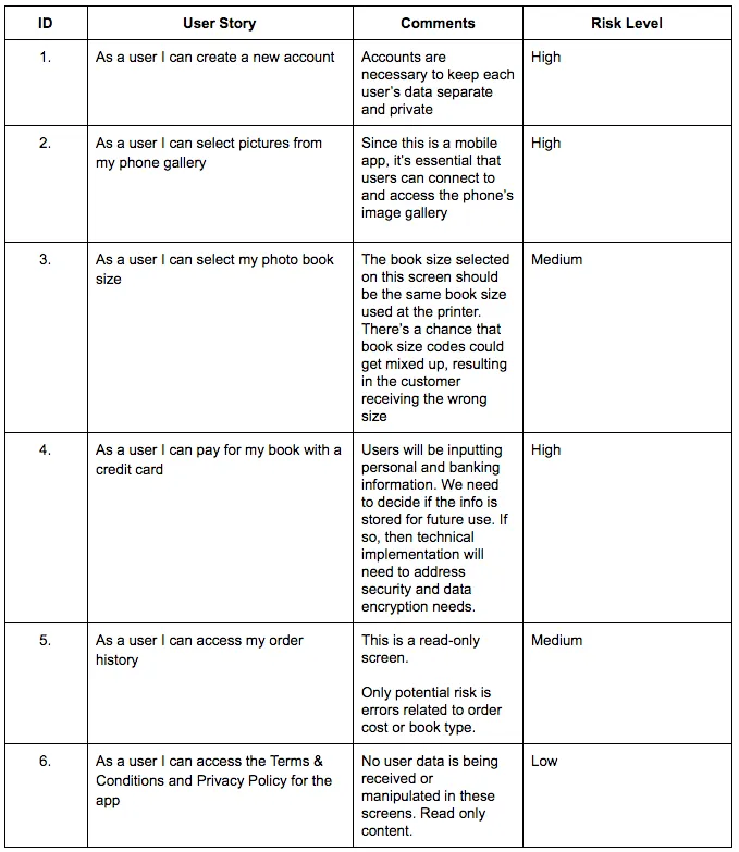
Let’s say you’re building a mobile app that allows users to print their phone pictures in a photo book. For this type of app, here are some of the primary user stories:
- As a user I can create a new account
- As a user I can select pictures from my phone gallery
- As a user I can select my photo book size
- As a user I can apply visual effects to my pictures
- As a user I can pay for my book with a credit card
- As a user I can access my order history
- As a user I can access the Terms & Conditions and Privacy Policy
As explained in Prototyping for Product Managers, don’t worry about the fine details of each user story. List the user actions so that you can identify any gaps.
2. Prioritize user stories by risk
Little benefit comes from prototyping a user story like this one:
As a user I can access the Terms & Conditions and Privacy Policy
This is a very low-risk user story because the screens involved are static and read-only.
For prototyping, prioritize user stories involving user-submitted data and processing of user-submitted data. This is where the most risk often lies and clear user experience is most required.
For the photo book example, let’s examine the potential risks of each user story.
3. Prototype the riskiest user stories
Now that you’ve identified the high risk user stories, it’s time to visualize them through your prototype.
When prototyping requirements, use low or medium fidelity. You want designers and developers to better understand how the specs might manifest themselves as interaction models and content structures. Don’t get ahead of yourself by prescribing branding and visual design.
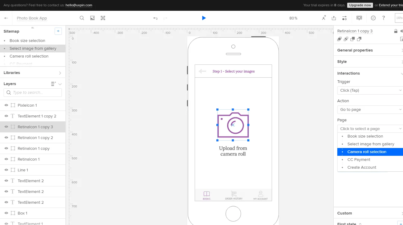
Let’s take a look at the prototypes for user stories 1, 2, 3 and 4. I’ll demonstrate with UXPin since I use it most often as a product manager. The advice, however, applies to whatever tool you prefer.
User Story 1: As a user I can create a new account
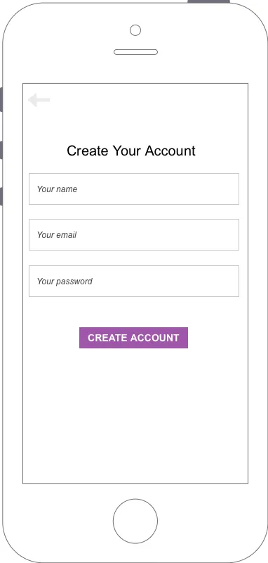
The first screen for the Photo Book App highlights the information that users must provide in order to create an account. This is a simple but critical screen to the technical team because it immediately clarifies the type of data stored in the backend:
- Name (will contain only letters)
- Email (will contain letters and numbers)
- Password (may contain letters and numbers, depending on the organization’s security rules)
Based on the above requirements, stakeholders will likely ask about the rules for passwords. For example, should they contain only letters, letters, and numbers, letters and special characters?
By presenting a prototype, you can discuss the best rules for secure passwords. Without a prototype, developers wouldn’t know the type of information stored and visual designers wouldn’t have any guidelines about the quantity of displayed information.
User Story 2: As a user, I can select pictures from my phone gallery
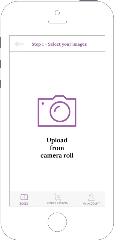
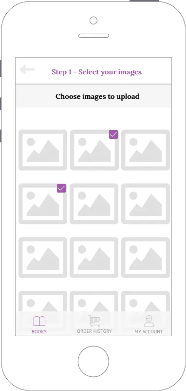
The prototype for User Story 2 involves two screens that must appear in a particular order:
- User presses the camera icon in the first screen
- The second screen displays all the images stored in the user’s phone
The prototype also ensures users can easily see their selected images. This functional need is represented by the checkboxes placed in the top, right corner of each image.
While the prototype uses a checkbox, the visual designer may choose another option that works better for the screen size, brand, and overall user flow. For example, a transparent overlay could be placed over each selected image, or the color of each image border could change to indicate that it is selected. Luckily, you can now quickly discuss and refine these items.
The technical team also benefits because they can now see the rough number of images that need to be instantly uploaded from local storage into the app.
User Story 3: As a user, I can select my photo book size

We prototyped User Story 3, even though it’s a Medium Risk story.
While you should always prioritize High-Risk stories when prototyping, you will run into situations where it makes sense to prototype a Medium or Low-Risk screen.
For our Photo Book App, once users select their photos, the above screen for User Story 2 acts as the transition point towards checkout. We can’t avoid any missteps in such a key moment when users are selecting the product.
While it’s nowhere near perfect, we’ve at least created a tangible reference for designers, developers, and marketers. The team can now all discuss:
- How might book dimensions, price and short descriptions accompany images of the photo books?
- How might we help users preview their selected images in the final photo book size?
- Should the book print the photos in the book in the order they were uploaded? Or do we allow users to reorder the pages?
- Do we include an additional step that allows users to select a cover image? Or do we randomly assign one from the images they uploaded?
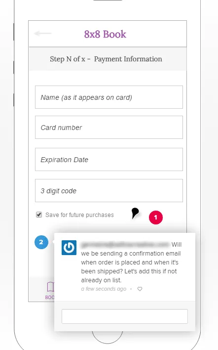
User Story 4: As a user, I can pay for my book with a credit card
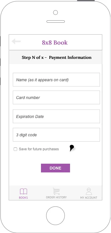
The prototype for User Story 4 showcases the basic payment information we need to collect. This allows everyone to discuss the rules for each field. For example:
- How many numbers can the user enter in the credit card field? Do we accept all card types (Visa, Mastercard, American Express)? American Express cards have 15 numbers while Visa and Mastercard have 16 numbers. We must account for these variances.
- Should we consider adding Paypal as a payment option? If so, how do we prioritize that integration for developers in upcoming sprints?
- When fields are left empty or invalid data is submitted, how does the system respond?
This prototype also highlights a very important functional requirement: saving the user’s payment information for future use.
While this is just one little checkbox in the UI, the technical implications are quite serious. We’ll need to research legal requirements for storing personal information. The technical team must also consider what might happen if servers suffer an attack or virus. Would customer data become publicly available?
By using built-in components like buttons, icons, image placeholders, and phone frames, you create a user-friendly prototype that helps everyone visualize the final product and associated risks.
Now that we’re done building all the screens, we would add interactions to all the key content:
- Calls to action leading to new screens
- Icons and images that expand or open new screens
- Form fields that react to user input
Next, we’ll annotate and share our interactive prototype for feedback.
4. Add comments and questions to your prototype
As you build your prototypes, you’ll likely have open questions for developers, designers, or management stakeholders.
It helps to annotate:
- Regional restrictions: For example, prices in the U.S. use a period (.) to separate the whole number and decimal portions. For example, $25.00. However, in the Euro zone it’s common to use a comma instead. For example, €25,00.
- Nice-to-have functionality: In the Photo Book App, the option to save the user’s payment information isn’t a must-have for the first release. You’ll need more time to work on implementing the correct data encryption and security to support that functionality.
- Potentially expensive items: Adapt your final requirements based on the feedback you receive.
5. Share the prototype for consolidated feedback
When it comes to reviewing feedback, you can set up a group meeting with all stakeholders and present the screens.
However, a better option is to provide some lead time during which all stakeholders can review the screens in your absence.
When using UXPin, I share a prototype link so that:
- Stakeholders can interact and evaluate the prototypes without feeling rushed. The feedback is less knee-jerk.
- Stakeholders can evaluate the prototypes with minimal bias. In a group meeting, the PM will usually set the context for the screens. However, outside of the confines of a meeting, the screens must speak for themselves.
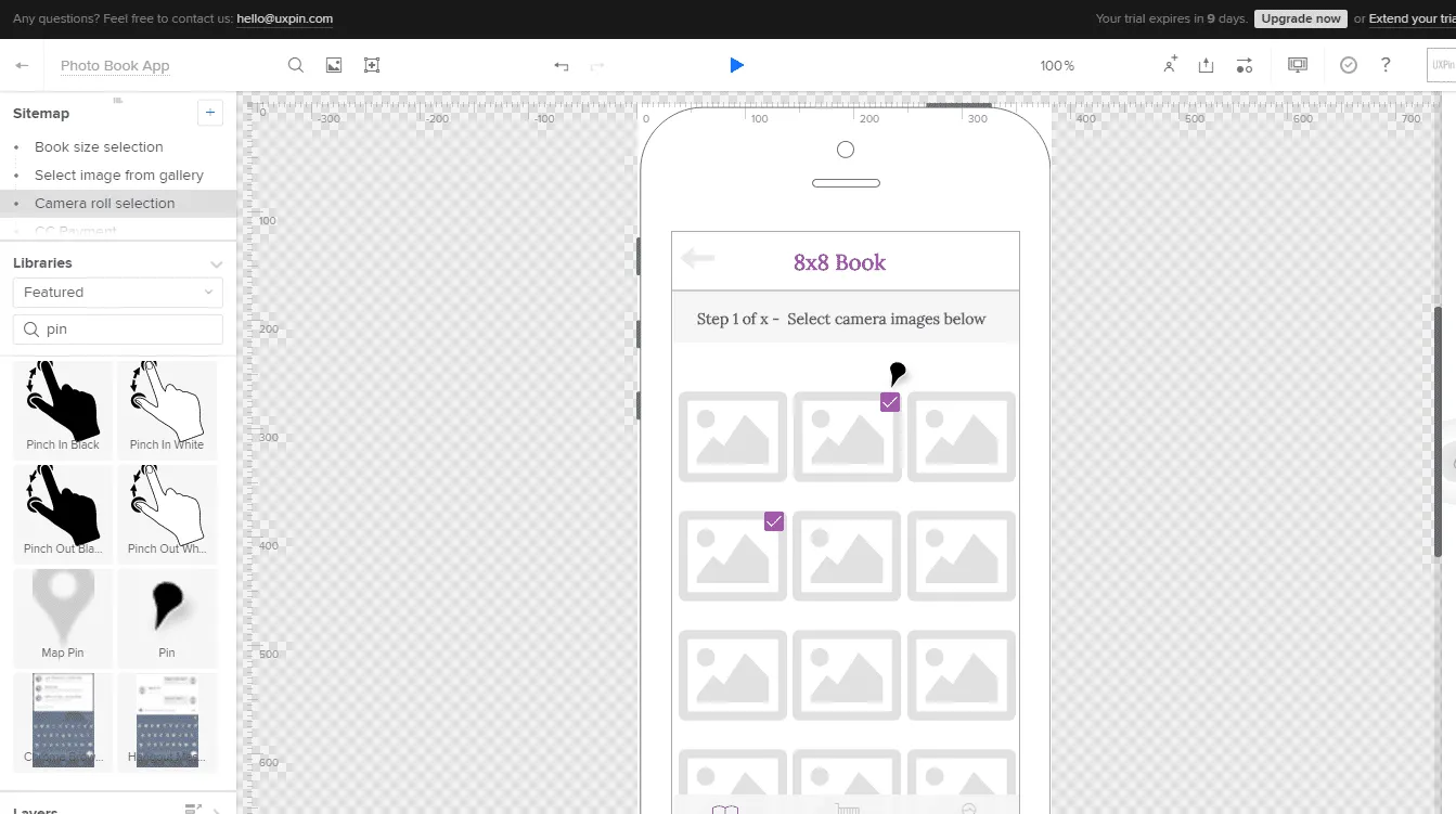
- When you share the link to a prototype, stakeholders can review all the comments and questions. Stakeholders can hover over any pin to view its details as shown below. You can leave questions regarding the legal and technical requirements for this functionality.
For a more complex project, try reviewing feedback in a group setting.
6. Analyze feedback, update prototypes and user stories
Once you’ve analyzed all your consolidated feedback, update the prototype and user stories.
For our Photo Book App example, the review process brought up an important question we missed in the original user stories: the need to send confirmation emails when an order is placed and after it’s shipped.
For any e-commerce platform, transactional emails are essential for reassuring customers that their order is on its way. Therefore, we need to update our user stories.
As a user I will receive an email when I submit my order.
As a user I will receive an email when my order has been shipped.
In this case, we also need to prototype an email to account for all legal requirements for receipts and invoices. We would, therefore, consider this new user story as High Risk.
Each time you update the prototype, reshare it with stakeholders to validate the changes are satisfactory. After the first revision, designers and developers should see enough of your vision to create the first formal build to test with users.
Conclusion
Prototypes should always be part of the specification process. In my past projects, they’ve made it much easier to notice gaps and redundancies in the user flow.
A prototype opens everyone’s eyes. The laundry list dissolves, and the product comes into focus. The consequences of additional features become immediately real for everyone from a junior designer to a Product VP.
If you found this post useful, learn more by downloading the free e-bookPrototyping for Product Managers.