Forms can feel frustrating when they overwhelm you with irrelevant fields or confusing layouts. Context-aware fields solve this problem by dynamically adjusting to your inputs, device, or situation. They simplify forms, reduce errors, and make the process faster by showing only what’s necessary. Think of a tax form that hides business-specific fields if you select "Individual" or a phone number field that formats automatically based on your country.
Key Takeaways:
- Fewer Errors: Real-time validation and formatting ensure accuracy (e.g., phone numbers or ZIP codes).
- Accessibility: Easier for users with disabilities through tailored guidance and reduced mental effort.
- Faster Completion: Only relevant fields are shown, cutting down on unnecessary steps.
- Better Experience: Forms feel intuitive and personalized, not generic or overwhelming.
Why does this matter? Because smarter forms mean happier users and higher completion rates – up to 25% more, according to research. Whether you’re designing for mobile or desktop, context-aware fields are a simple way to improve usability and accessibility while reducing frustration.
Using Autocomplete for Optimal Form UX – Designer vs. Developer #24
Core Principles and Benefits of Context-Aware Fields
Context-aware fields work on a few essential principles that make them stand out in improving user experience. By understanding these principles, designers can craft forms that feel intuitive and responsive instead of rigid and overwhelming.
Dynamic Adaptation Based on User Input
At the heart of context-aware fields is real-time responsiveness. These fields actively adjust based on user input, creating a flow that feels more like a conversation than a static form.
For instance, when a user selects "Business" instead of "Personal", the form automatically updates to show business-related fields while hiding irrelevant personal ones – without any interruptions.
Another example is progressive disclosure, where information is revealed step by step. Imagine a shipping form that starts by asking for the country, then expands to show state options, followed by city fields, and finally delivery preferences based on the user’s location. This method keeps the form simple and prevents users from feeling overwhelmed.
Context-aware fields go beyond just showing or hiding sections. They can adjust field formats, validation rules, and input methods based on the situation. For example, they might automatically change phone number formats depending on the country or switch currency symbols based on the user’s location. This dynamic functionality ensures smoother interactions and increased accuracy.
Key Benefits of Context-Aware Fields
The advantages of context-aware fields are clear – they significantly improve the user experience in several ways. By reducing the mental effort required to fill out forms, they can boost completion rates by 15–25%. Users only see what’s relevant, eliminating the need to figure out which fields apply to them.
These fields also encourage faster completion times and greater accuracy. Real-time validation catches errors as they happen, sparing users the frustration of fixing mistakes after submission. This immediate feedback loop keeps the process smooth and frustration-free.
Additionally, context-aware fields lead to higher completion rates because they remove unnecessary obstacles. A more personalized experience makes users feel understood, not like they’re just filling out a generic form. When forms adapt logically to previous inputs, they feel like helpful tools rather than tedious chores.
Static Fields vs. Context-Aware Fields
The benefits of context-aware fields become even more apparent when compared to static fields:
| Aspect | Static Fields | Context-Aware Fields |
|---|---|---|
| User Experience | Offers the same experience to everyone | Adjusts to individual needs for a tailored experience |
| Cognitive Load | High – users must figure out which fields are relevant | Low – only relevant fields are shown |
| Error Rates | Higher due to confusion over formats | Lower thanks to real-time validation |
| Completion Time | Longer because of unnecessary fields | Shorter with streamlined processes |
| Accessibility | Can overwhelm users, especially those with disabilities | Simplifies navigation with contextual guidance |
| Mobile Usability | Poor – too many fields clutter small screens | Excellent – progressive disclosure fits mobile layouts perfectly |
The difference is especially noticeable in complex forms. Take an insurance application: a static version might overwhelm users with dozens of fields covering every possible scenario. In contrast, a context-aware form reveals only the fields relevant to the user’s specific policy and coverage needs.
This adaptive approach turns forms into helpful guides, making it easier for users to complete them while ensuring only the necessary information is collected. It’s a win for both the user and the organization.
Design Patterns for Context-Aware Fields
These patterns elevate the context-aware approach, offering seamless and user-friendly experiences. By leveraging these strategies, user interactions become more intuitive and tailored to specific needs.
Conditional Field Display
At its core, conditional field display is about showing users only what they need, when they need it. Fields appear or disappear based on user selections, keeping interfaces clean and reducing mental effort.
Take, for example, a checkout form. When users select "I have a promotional code", the promo code field instantly appears below. This keeps the form tidy while giving users the options they need at the right moment.
Nested conditionals add another layer to this functionality. Imagine a travel booking form: selecting "International" unveils a dropdown for country options. Choosing a specific country might then reveal visa requirements, followed by passport information fields. Each step builds on the last, guiding users through a logical flow.
Similarly, field grouping enhances clarity by organizing related conditional fields together. For instance, selecting "Business Account" instead of "Personal Account" might display a section with fields for company name, tax ID, and business address. Grouping related inputs helps users understand how the information fits together.
To make this process even smoother, transitions matter. Subtle animations can ease the appearance of new fields, preventing abrupt changes that might confuse users.
While conditional fields streamline forms, auto-completion takes it a step further by reducing typing effort.
Auto-Completion and Predictive Input
Auto-completion simplifies data entry by turning tedious typing into quick, guided selections. This approach works particularly well for fields with predefined datasets, such as addresses, product categories, or company names.
A common example is address auto-completion. As users type a street address, suggestions from postal databases appear in real-time. This not only speeds up the process but also minimizes errors, ensuring accurate deliveries and fewer customer service issues.
Smart suggestions take it up a notch by adapting to user behavior and context. For instance, a job application form might suggest job titles based on the industry selected earlier. Similarly, an expense report could suggest vendors based on the chosen category.
Progressive refinement is another key feature. Start typing "New", and options like "New York", "New Orleans", and "Newcastle" appear. With each additional character, the list narrows, making it easier to find the right option – especially for large datasets where exact spellings might not be obvious.
Timing is everything here. Displaying suggestions after 2–3 characters strikes a balance between being helpful and overwhelming. Additionally, these suggestions should be keyboard-friendly, allowing users to navigate and select options without needing a mouse.
Dynamic Validation and Real-Time Feedback
Dynamic validation ensures errors are caught and corrected as they happen, saving users from the frustration of fixing mistakes after submission. This approach not only reduces errors but also builds user confidence.
Availability checking is a great example. For fields like usernames or email addresses, users receive instant feedback. Instead of discovering that "john.smith@company.com" is taken after submission, they see a green checkmark or a red X as soon as they finish typing.
Strength indicators are another useful tool, especially for password fields. A strength meter updates dynamically as users add characters, numbers, or symbols, encouraging stronger passwords while clarifying requirements.
Cross-field validation ensures that related fields make sense together. For instance, if a ZIP code doesn’t match the selected state, the form can flag the mismatch immediately. Similarly, end dates can be validated against start dates to prevent impossible timelines.
The key is to provide helpful, contextual feedback. Instead of vague messages like "Invalid format", a phone number field might display "Use this format: (555) 123-4567", paired with an example to guide users.
Visual cues are essential for effective validation. Color coding (red for errors, yellow for warnings, green for success) combined with clear messaging helps users identify and resolve issues quickly. Icons can be helpful too, but they shouldn’t be the sole indicator – accessibility considerations require multiple forms of feedback.
sbb-itb-f6354c6
Implementing Context-Aware Fields Using UXPin
UXPin makes it possible to create prototypes using real React components, enabling the design of context-aware fields. Unlike static mockups from traditional design tools, UXPin allows designers to build interactive prototypes that behave just like the final product.
Using UXPin for Interactive Prototyping
With UXPin, prototyping goes beyond static visuals by incorporating real React components capable of handling complex logic and state management.
The platform includes popular React libraries like MUI, Tailwind UI, and Ant Design, which come pre-loaded with form components designed for interactive experiences. For example, MUI’s Autocomplete component provides built-in filtering, keyboard navigation, and customizable suggestion rendering – perfect for predictive input fields.
Teams can also take advantage of custom component libraries by importing their own React components into UXPin through npm integration or Storybook sync. This means you can prototype using the exact components your development team has already built, such as an address lookup tool or a dynamic validation system, ensuring accuracy and consistency.
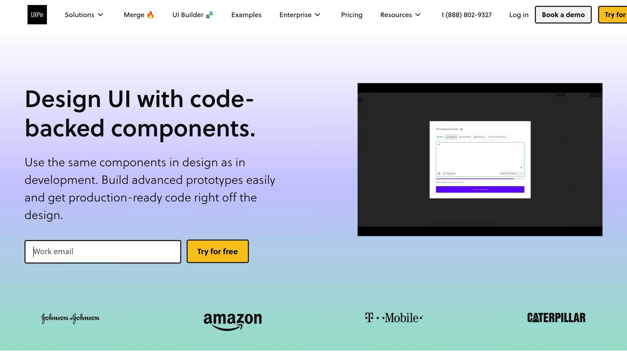
UXPin’s AI Component Creator adds another layer of efficiency. By simply describing a component in natural language – like "a phone number input that formats as the user types and validates international formats" – the AI generates a working React component ready for use in your prototype.
Additionally, real-time collaboration enables developers to review prototypes early, ensuring technical feasibility before moving into development.
Using Conditional Logic and Reusable Components
UXPin excels at creating dynamic field interactions with tools for implementing conditional logic. Designers can leverage variables, expressions, and conditional statements to replicate programming logic without writing code.
- Variables store user inputs and track form states.
- Expressions handle real-time calculations and validations, such as determining delivery dates based on shipping methods and ZIP codes.
- Reusable components save time by allowing you to standardize elements like an auto-completing address input across multiple prototypes.
For added flexibility, UXPin supports component variants. A single form field can include multiple states – default, error, success, or loading – as well as different sizes or interaction patterns. Designers can switch between these variants based on user actions or form states, creating more realistic prototypes.
The Patterns feature (available with Company and Enterprise plans) takes reusability further by saving entire form sections or interaction flows. For instance, a complete checkout flow with context-aware fields can be stored as a pattern, making it easy to reuse and adapt for different projects.
Testing for Accessibility and Usability
Dynamic, context-aware fields can introduce accessibility challenges, but UXPin provides tools to ensure inclusivity and usability.
The platform’s accessibility checker evaluates prototypes against WCAG guidelines, identifying issues like poor color contrast, keyboard navigation problems, or screen reader incompatibilities. This is especially critical for dynamic forms, where content updates might confuse assistive technologies if not handled correctly.
For example, keyboard navigation testing helps ensure logical tab order and focus management when fields appear or disappear conditionally. Similarly, ARIA announcements notify screen readers about dynamic content changes, keeping users informed.
UXPin also supports user testing features, allowing you to share interactive prototypes with users who rely on assistive technologies. Observing how they navigate dynamic forms can reveal potential issues early, preventing them from reaching production.
The platform’s version history (30 days for Company plans, unlimited for Enterprise) tracks accessibility improvements, helping teams document changes and avoid regressions in future iterations.
Real-time collaboration plays a role here too, enabling accessibility specialists to review prototypes and leave comments on specific interactions or states. This creates a clear record of accessibility requirements for developers to follow during implementation.
Finally, integration with tools like Storybook ensures that accessibility considerations from the prototype phase are carried through to development. When developers bring UXPin components into their workflow, the inclusive patterns and behaviors designed in the prototype are preserved.
Best Practices and Common Pitfalls
Building effective context-aware fields is all about finding the sweet spot between sophistication and simplicity. The goal is to improve user experience without adding unnecessary hurdles. By following proven guidelines and steering clear of common mistakes, you can ensure your forms are intuitive and user-friendly.
Guidelines for Better Context-Aware Fields
Stick to the essentials. When it comes to context-aware fields, less is more. Research from 2021, which analyzed 40,000 landing pages, found that conversion rates dropped by about one-sixth when forms asked for extra details like phone numbers or birth dates. Only ask for information that’s absolutely necessary, and wherever possible, infer or delay non-critical data collection.
Use visuals to communicate. Did you know that 20% of the brain is dedicated to processing visual information? That’s why visual cues like icons, color changes, or formatting are far more effective than lengthy instructions. For instance, a green checkmark next to a valid email address instantly signals success – no need for a line of text saying, "Email format is correct."
Clearly label required and optional fields. If only optional fields are labeled, users often leave required ones incomplete – 32% of them, to be exact. Use an asterisk (*) for required fields and add "(optional)" next to others. This clarity is even more important for context-aware fields, where requirements might shift based on user inputs.
Think mobile-first. Since context-aware fields often involve dynamic interactions, designing for mobile is critical. Start with mobile constraints – like smaller screens and touch-based navigation – and then adapt for larger devices. This ensures the form works seamlessly, no matter the device.
Keep instructions visible. Users often need to refer back to guidance, especially when fields change dynamically. Avoid hints that disappear after interaction. Persistent, clear instructions can reduce confusion and improve the overall experience.
Provide real-time feedback, but time it right. Inline validation is great for catching errors early, but don’t validate on every keystroke – it’s distracting. Instead, validate after users finish typing. For more complex checks, like password strength, use progress indicators that update as users meet requirements instead of error messages that highlight what’s missing.
Group related fields logically. When new fields appear, place them close to the trigger action. For example, if selecting "Other" in a dropdown reveals a manual input field, position it directly below the dropdown – not at the bottom of the form.
By following these guidelines, you can avoid many of the headaches that come with poorly designed forms. But even the best intentions can lead to pitfalls, so here’s what to watch out for.
Common Mistakes to Avoid
Over-complicating the logic. One of the biggest traps is designing overly complex conditional relationships. If users can’t figure out why fields appear or disappear, your form ends up causing confusion instead of simplifying the process.
Skipping accessibility considerations. Dynamic changes can disrupt screen readers and keyboard navigation if not handled properly. Accessibility isn’t something to tack on later – it needs to be part of the initial design. Use ARIA announcements to inform users of changes and manage focus carefully when fields change dynamically. And don’t rely solely on automated tools – test with real assistive technologies.
Failing to explain dynamic changes. If fields pop in or out or change requirements without explanation, users are left guessing. Always make it clear why a field has appeared or why its behavior has changed.
Overlooking form abandonment triggers. A 2018 study found that form length was the second most common reason for abandonment (27%), just behind security concerns (29%). Context-aware fields can reduce form length by hiding irrelevant options, but they can also backfire if they make the form feel unpredictable. Use analytics to track drop-off points and refine your logic.
Inconsistent behavior across devices. What works on a desktop – like expanding fields triggered by mouse hover – may fail on touch devices. Similarly, smooth desktop animations might feel clunky on mobile. Test your forms across various devices and input methods to ensure they perform consistently.
Overloading users with validation messages. Real-time feedback is helpful, but too much too soon can overwhelm users. Validate only after users finish their input to avoid interrupting their flow.
Making incorrect assumptions about user intent. Predictive logic can be helpful, but it’s not foolproof. For example, auto-filling a state based on a ZIP code is convenient – unless it’s wrong. Always provide users with an easy way to override automated selections.
Ignoring edge cases. Dynamic forms need to handle unexpected scenarios gracefully – whether it’s invalid inputs, network hiccups, or browser quirks. Have fallback options in place so users can still complete their tasks, even when something goes wrong.
Conclusion
Context-aware fields are transforming user input by making forms smarter, more accessible, and easier to navigate. By shifting from static designs to dynamic, responsive interfaces, these fields help reduce form abandonment, improve data accuracy, and create experiences that are more inclusive for users with varying needs and contexts.
However, designing these fields requires a delicate balance. The best context-aware fields are practically invisible – they work behind the scenes to anticipate user needs and guide them naturally through complex processes. Whether it’s conditional logic that reveals only relevant fields, predictive input that speeds up data entry, or real-time validation that prevents errors, the goal is always the same: to make the user’s journey smooth, intuitive, and frustration-free.
Tools like UXPin simplify the process of implementing and testing these advanced interactions. Designers can prototype dynamic field behaviors, real-time validation, and responsive adjustments, ensuring usability and accessibility are prioritized from the start. This reduces the risk of issues during development and helps create a polished user experience.
Investing in context-aware design doesn’t just boost conversion rates; it also builds trust with users, reduces support requests, and elevates your product from functional to exceptional. As user expectations grow, these fields are no longer optional – they’re becoming a key part of modern, user-focused design.
When users finish a form and feel like the process was seamless and intuitive, you’ve successfully combined intelligent automation with a human-centered approach. That’s the hallmark of great design.
FAQs
How do context-aware fields make digital experiences more accessible for users with disabilities?
Context-aware fields enhance accessibility by adjusting to users’ specific needs and surroundings in real time. For instance, they can modify interface layouts or deliver contextual prompts that align with a user’s preferences or abilities, making interactions more intuitive.
This personalized approach simplifies navigation, breaking down barriers and promoting greater independence for individuals with disabilities. By focusing on inclusivity, context-aware fields help ensure that digital tools and platforms are usable and engaging for everyone.
How can I use context-aware fields to make forms easier for users?
To create more user-friendly forms with context-aware fields, aim to streamline the process by displaying only the fields or instructions that are relevant to what the user is doing at that moment. Start by giving clear instructions upfront to set expectations, and include subtle aids like tooltips or inline help to provide extra details when needed.
Make sure form fields adjust dynamically based on factors like the user’s role, location, or specific task. This keeps the form feeling tailored and eliminates unnecessary distractions. By reducing visual clutter and simplifying the experience, users can complete forms more quickly and with less frustration.
How does UXPin make it easier to design context-aware fields?
UXPin makes designing context-aware fields a breeze by enabling you to create prototypes that respond dynamically to user actions and inputs. With tools like expressions and AI-powered features, you can build interactive forms that adapt in real time to the user’s needs and context.
Using UXPin’s reusable components and advanced interaction capabilities, designers can simplify their workflows while crafting more tailored and intuitive user experiences. This approach allows for easier testing and fine-tuning of context-aware designs before moving into development.

