What is Storybook and Why Your Product Team Needs it?
Storybook is a crucial tool in the context of building a UI component library. It simplifies the process of designing, sharing, and collaborating on UI components.
Your team can easily showcase and test individual components, ensuring they adhere to your style guide and work seamlessly. This streamlines design handoff, enhancing the product development process.
Key takeaways:
- Storybook streamlines UI component library development.
- It facilitates design, testing, and sharing of components.
- It’s a great tool for modern product teams .
With UXPin Merge, you can integrate Storybook and UXPin, so your product team can finally start exploring design in the best code-based, atomic environment. Discover what UXPin Merge is about.

Test radical ideas in isolated sandboxes
When you create components, you undoubtedly go through several versions before you decide which one to use. Even if you’re just making the shape of a button, the designer in you insists that you try it with blocky edges, rounded edges, slightly more rounded edges, and ridiculously rounded edges. You cannot move on to the next task until you have seen what your component looks like on the screen,
Storybook understands this, so it lets you test all of your ideas—no matter how wild they might seem—in isolated sandboxes.
You’ll discover how much time this ultimately saves you when you start working with interactive components. What happens when you click the button with ridiculously rounded edges to submit text to a website? Turns out, the edges are way too round and the button is nearly impossible for someone with accessibility challenges to use. Now, throw that one out and test the others until you find the one that works best. You can play as much as you want without influencing anything outside of the sandbox.
Related tip: Storybook now has an add-on that will help you test components to make sure they meet accessibility standards.
Your designers have pre-approved components, so they can build freely!
Atomic UI components break down the design into small pieces. Your new designer doesn’t have to stare at your style guide for an hour before feeling confident enough to make a password-retrieval request form.

Instead of working from scratch, they open your UI component library to find all of your approved components. If they can integrate Storybook with their design tool, it gives a whole new level of flexibility as well. From this point, the work becomes about as straightforward as possible. They:
- Choose an empty text field from the component library.
- Adjust the field’s size just to make sure it looks attractive on the page.
- Add a “submit” button from—no surprise here—the component library.
- Adjust the button’s position.
- Add some text so users know what information to provide.
That’s it. They don’t have to knock on your door, send you a Slack message, or try to reach you on Teams. The components in the UI library are already approved, so there’s no reason to seek permission.
This aspect alone is going to save your designers tons of time because they simply adjust components instead of creating them from nothing. Perhaps more importantly, you will have more time and fewer headaches because you get to concentrate on your work without getting interrupted millions of times a day (slight exaggeration, but it feels like that many on some days).
Designers hate code and coders hate design: Storybook is their peace treaty
How many visual designers do you know who have enough coding experience to work as developers? The answer is: very few.
How many sighs do you hear pour from your development team when your designers send over new visuals? The answer is pretty close to infinite.
Everyone knows why the disconnect between visual design and development teams exists. They don’t have a common language that makes them effective communicators. Of course, your developers are frustrated! The designers keep sending over ideas that will take too much time to figure out or they ask for tweaks in components that already exist!
Storybook erases this problem by giving designers and developers an interpreter that makes communication easier.
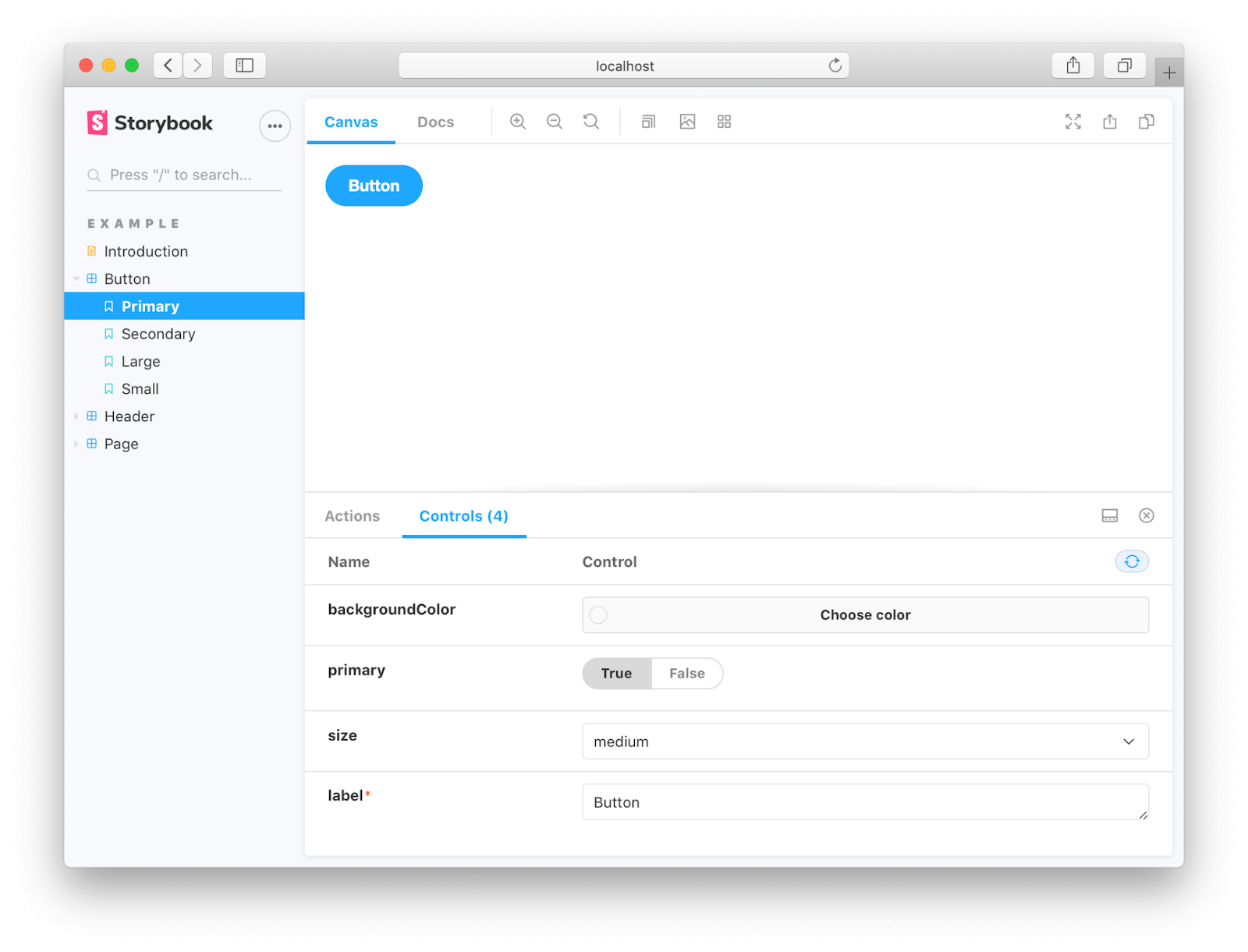
In Storybook, designers can combine and adjust components without knowing how to code. They just access the Controls function and make changes. It literally takes seconds to alter designs.
Just as importantly, Storybook will interpret the changes and update the design’s code. When it reaches your developers, they already have code that makes sense.
Yes, they should review and test UIs to make sure they function as intended. Yes, they should test the entire product in case some stray character ruins everything. For the most part, though, your developers become gatekeepers who can focus on other aspects of their jobs… like actually building behind-the-scenes functionality that will process payments, recommend products, and perform other tasks that help your company generate more revenue.
UXPin + Storybook = ❤️
Now that UXPin and Storybook integrate, you can move your UI component library from Storybook and use it directly in your product design and prototyping application.
You get the best of both worlds. And you get it really, really fast without any complications. If you’re curious to learn more about streamlining product development with UXPin Merge, request access here.


