Try Storybook Integration: Say Goodbye to Design-Dev Inconsistencies
Just a few weeks ago, we wrote about our game-changing Storybook integration, which helps designers and developers break the silos and improve the UI consistency by using code components when building prototypes. Based on our Merge technology, the integration lets you harvest the power of code, use it to build advanced prototypes faster and massively reduces the complexity of the handoff process. The bottom line is, both designers and devs get to build products with the same components.
Now, we’ve decided to go one step further – today, we’re enabling Storybook integration on trial. Check us on Product Hunt!
Why product teams need the real single source of truth
The single source of truth in product development is this one place that stores all the documentation and elements needed to design and build products. In the ideal world, it’s easily shared, is always up to date and is used by everyone involved in the process. We all know how things end up – messy, scattered and siloed.
Design systems were supposed to solve the problem of disorganized information across product teams. Now, we know that this solution is a great first step to systematize UI and documentation but won’t completely remove the disconnect between design and development.

The revolution is the Merge technology, which allows product teams to leverage dev tools such as Git repos or Storybook to improve their DesignOps processes and maintain parity between design and code. As a result, designers and developers can all use the same UI elements, documentation, and code from one source.
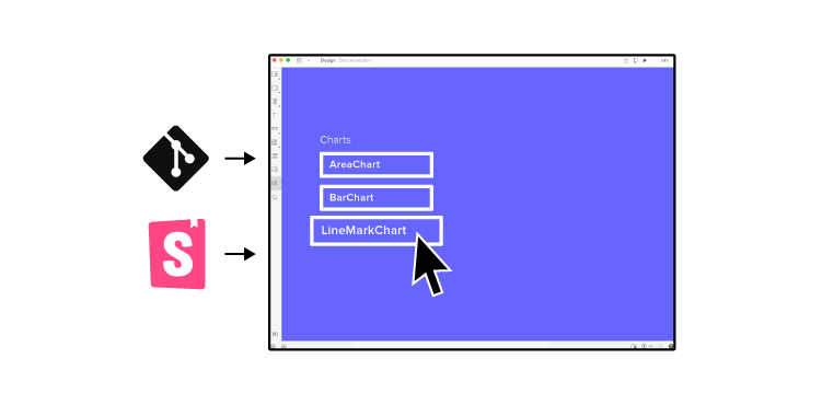
Imagine taking all the production-ready, code-based, fully interactive components from the dev library and just dragging and dropping them on the canvas to use them in the design editor. Here’s why this is so exciting:
Don’t ever ask again, “Where’s that component?”
Just like with the puzzle pieces scattered around, it takes a lot of time to find and match the right product development collaterals. It’s a real challenge to keep the components and documentation up to date. But with a centralized place to store all the information, you won’t need to search for the right version of the component or its code.
When you bring UI elements from the developers’ library to a design editor, you only need to maintain them in one place, and for designers, the libraries sync automatically.
Use the same technology as devs
The gap between what designers have created and what developers have built usually boils down to one thing – everyone used different technologies to do their work. Design tools are typically powered by vectors or pixels, whereas apps and websites are powered by specific programming languages and frameworks.
The vector or pixel-based approach is extremely limited and represents just a simple visualization of the end product. For example, when you want to add some advanced interactions to a prototype – it’s not always possible, because neither vectors nor pixels can work with variables, conditional logic or even simple input fields. However, when developers use code in UI components, those blockers disappear.
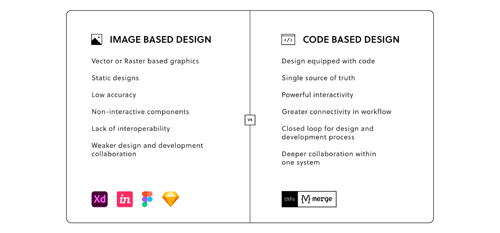
If you could prototype with code-powered technology, where design has its reflection in code, you and developers would speak the same unified language. So, instead of creating the UI elements in two different environments, you can remove the product drift by using the exact same one. What’s important, you could enjoy the complex built-in interactivity that works great already on the design stage.
10x designer
When designing a product, you need to explain to developers what exactly should happen when a user clicks this or that. You can choose to build either lo-fi prototypes to start the development process faster but sacrifice some details which you’ll need to catch up later or build hi-fi prototypes that, with all the interactions, explain the product behavior better. Building advanced prototypes takes a lot of time and usually getting the details right, ends up with a lengthy conversation in comments about interactions and the prototype’s functionalities.
This is not an efficient workflow from a design operations point of view. But if you decide to use the coded UI components in the design editor, you critically speed up the entire design process.
When working with the elements that are fully interactive and in line with all production standards the design outcome you produce is way over 10x of what it takes to build a prototype in a conventional way. The time you save can be spent on other important things like user testing.
User testing perk: prototypes behave just like the end product
How can you test a prototype when all the UI parts aren’t fully interactive? User testing isn’t reliable enough when a user can’t click through a project on their own without a lot of handholding. Describing what will happen after clicking an accordion or hovering over the menu won’t give the same feedback quality as showing it.
When all the drifts are gone, and the code-powered prototype works exactly like the end product, you can support your research team with a fully immersive experience for their usability tests.
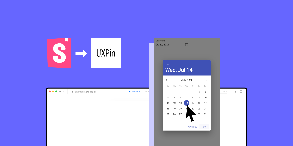
Design with code – try Storybook integration

Storybook is this one place where developers can build and store the UI components. It’s also a great tool to test the elements and prepare clear documentation. Storybook supports a lot of frameworks, including the most popular ones like React, Angular, and Vue.
UXPin and Storybook Integration
Storybook is one of two integrations (Git repo is the first one) that use Merge technology to sync coded components with our design tool, UXPin. The entire integration with Storybook takes around 1 minute, and lets you design with code components right away!
Private or public?
Your Storybook library can be either private (hosted on your server with access for only chosen users) or public where people who know the URL can access it freely. As our integration supports both types, it doesn’t matter which one you use.
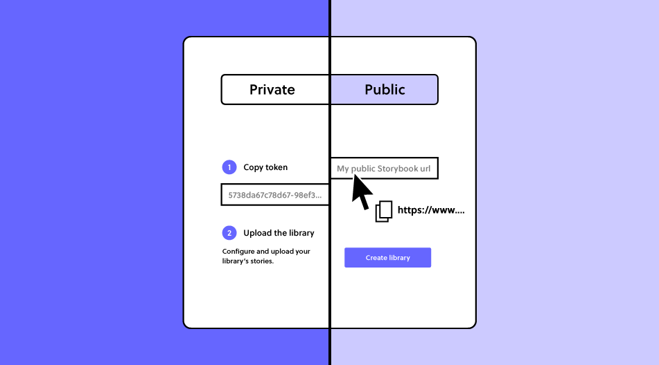
With public libraries, the process is as easy as copying and pasting the Storybook’s URL. With a private one, your developer needs to run just two simple commands. All is explained here. On trial, you can play with public libraries only. If you want to test a private one, go for a guided tour.
If you want to use public libraries of other companies, you will enjoy all these open source Storybook examples.
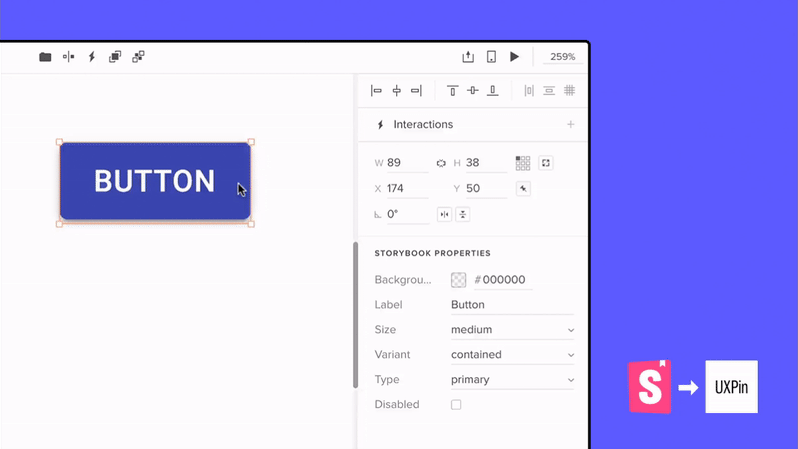
Freedom of designing with code
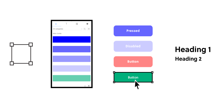
The synced components are coded, which gives you the freedom to change the properties, inputs, and styles inside the UXPin editor without the developer’s help. This gives you the power to build prototypes that are always in line with the production standards. The constraints embedded in code guides you, making sure there is no miss-match in styles.
Empower non-designers for better DesignOps
Designing with code can redefine how we structure DesignOps processes. PayPal is a great example of how transforming the design phase in product development empowered people with other roles than designers to visualize their ideas with code components in UXPin. Erica from PayPal and her team use Merge Git integration, but you can achieve the same results using Storybook.
It’s straightforward as non-designers just have to drag and drop the components on the canvas and play with the controls if needed. Then, with a design draft, UI professionals can take over by finishing off the projects and focusing on usability.
Taste the power of code
Sign up and give it a try with a built-in Material UI library with components coming straight from Storybook or sync a new library yourself. Feel the power of code and see how the whole product team can benefit from using the single source of truth!

