Component documentation is your go-to resource for understanding, building, and using UI components effectively. It bridges the gap between design and development, ensuring clarity, consistency, and efficiency across teams. Here’s what you need to know:
- Purpose: Explains what a component does, why it’s needed, and how to use it.
- Key Elements:
- Overview: Outlines functionality, purpose, and context.
- Props & API Tables: Technical details for developers.
- States & Variants: Covers visual and interactive variations.
- Usage Guidelines: Practical advice, accessibility notes, and common mistakes to avoid.
- Visual Examples: Screenshots, live demos, and code snippets.
- Why It Matters:
- Boosts productivity: Teams spend less time clarifying and more time building.
- Improves onboarding: New members quickly understand design systems.
- Ensures consistency: Centralized details help maintain uniformity across projects.
- Best Practices:
- Use clear, jargon-free language.
- Keep documentation aligned with code and design updates.
- Regularly review and update content to avoid outdated information.
- Highlight deprecations and provide migration steps for legacy components.
- Tools to Consider:
Good documentation isn’t just a manual – it’s a tool that drives better teamwork and scalable design systems.
Build it in Figma: Create a Design System V: Documentation
Core Elements of Component Documentation
Creating effective component documentation involves integrating several key elements that serve as a guide for both designers and developers. These elements ensure consistent implementation within your design system, helping teams understand, utilize, and maintain components across various projects.
Component Overview
The component overview acts as the starting point for anyone new to the component. It should clearly explain what the component does, why it’s needed, and how it fits within the broader design system. Think of it as answering the essential question: “Is this the right component for my task?”
Start with a concise description of the component’s role. For example: “This primary action button prompts users to complete important actions, such as submitting a form or making a purchase.” This gives clarity on its purpose and use case right away.
Include details about the component’s relationship to other elements in the system. If there are multiple button types, explain their differences and when to use each one. This added context helps avoid confusion and ensures informed decisions.
Lastly, mention any key limitations or requirements upfront. For instance, if the component requires specific data formats, accessibility features, or works only in certain contexts, highlight these points early to prevent misunderstandings later.
Once the overview is established, move into technical details with Props and API Tables.
Props and API Tables
Props and API tables form the technical foundation of component documentation, giving developers the detailed specifications needed for successful implementation. These tables should include columns for the name, type, requirement, default value, and a description.
Leveraging JSDoc comments can further enhance this section by embedding context directly into the source code. Tools like Styleguidist can automatically generate documentation from these comments and propTypes declarations, ensuring the documentation reflects the most up-to-date implementation.
For props that accept complex data types, like objects or arrays, provide nested documentation. Don’t just list “object” as the type – break it down to show the expected properties and their individual requirements. This level of detail helps developers avoid common mistakes and saves time troubleshooting.
States and Variants
Components rarely stay static – they often have multiple states and variants that need to be documented for consistent use across different scenarios. This section should cover both visual variations and behavioral states that influence how users interact with the component.
Focus on documenting interactive states like hover, focus, active, and disabled. These states are critical for accessibility and user experience, so specify their appearance and the conditions that trigger them. For instance, focus states should meet accessibility standards and support keyboard navigation.
For visual variants, such as different sizes, colors, or styles, explain the reasoning behind each option and provide guidance on when to use them. This ensures that design choices are purposeful rather than arbitrary.
Don’t forget to include error states and loading states. Detail how error messages should be formatted, how loading indicators behave, and how these states transition back to normal. For complex components, consider creating a state matrix to visually map out how different states interact, ensuring all combinations are accounted for.
Usage Guidelines
Usage guidelines bridge the gap between technical specs and design intent, offering teams practical advice on how to use components effectively. This section should address when and how to use the component in real-world scenarios.
Include content guidelines to maintain consistency. For instance, if a button works best with action-oriented language, provide examples of effective text like “Submit” or “Buy Now”, and explain why these phrases work better than generic ones.
Highlight accessibility requirements prominently. Document details like keyboard navigation, screen reader compatibility, and color contrast standards. This ensures teams can implement inclusive designs without needing deep expertise in accessibility.
Add layout and spacing rules to guide how the component interacts with surrounding elements. Specify margins, padding, and responsive behavior to maintain visual consistency across different screen sizes.
Finally, address common mistakes or anti-patterns. If certain misuses occur frequently, call them out explicitly and explain why they’re problematic. This proactive approach can reduce errors and support requests.
Visual Examples and Live Demos
Visual examples and live demos play a crucial role in showing how components should look and behave in real-world contexts. By combining screenshots, diagrams, and interactive demos, you can effectively demonstrate component structure, behavior, and practical applications.
- Static examples provide quick visual references, showcasing all major variants and states with realistic content and consistent styling.
- Interactive demos let users experiment with the component’s behavior. These should include realistic data and controls, demonstrating how the component responds to different inputs.
- Code snippets should accompany examples, showing realistic implementation scenarios with proper imports and context on how the component integrates into larger applications.
- Before-and-after examples can illustrate common design problems and how the component solves them. This storytelling approach helps teams see the benefit of using pre-designed components instead of creating custom solutions.
| Example Type | Purpose | Best Practices |
|---|---|---|
| Static Screenshots | Quick visual reference | Use realistic content and consistent styling |
| Interactive Demos | Hands-on experimentation | Include major variants and realistic data |
| Code Snippets | Implementation guidance | Show proper usage with context |
| Before/After | Problem-solving context | Highlight specific improvements |
Best Practices for Writing and Maintaining Component Documentation
Clear overviews and practical usage guidelines lay the groundwork for effective component documentation, but maintaining clarity and efficiency over time requires a solid, organized approach. Strong documentation practices ensure your components remain useful and relevant for both current and future needs.
Writing Clear and Consistent Documentation
To make your documentation accessible to everyone – whether they’re experienced developers or newcomers – use straightforward, jargon-free language. If technical terms are necessary, define them clearly to avoid confusion.
Consistency is critical. Stick to the same terminology throughout (e.g., always use “modal” instead of switching to “dialog box”), and consider including a glossary to ensure clarity across all component descriptions, code snippets, and usage examples.
Organize your documentation with a logical structure that mirrors how users interact with your components. Start with the basics and most common use cases before diving into advanced configurations or edge cases. This way, users quickly find the information they need without feeling overwhelmed.
Use documentation templates to standardize the presentation of information across all components. These templates should cover key sections like the component’s purpose, basic usage, props, states, accessibility considerations, and common examples. Templates not only ensure consistency but also make it easier for team members to contribute documentation that feels cohesive and complete.
Finally, ensure your documentation stays aligned with your code and design systems to avoid discrepancies. Establishing these rigorous change-tracking habits is also vital for organizational compliance, much like the protocols detailed in this guide to eDiscovery.
Keeping Documentation in Sync with Code and Design
One of the biggest challenges with component documentation isn’t writing it – it’s keeping it up to date. To prevent inconsistencies, treat documentation as an integral part of your development process, just like tests or code reviews. This mindset helps prevent “documentation debt” and keeps everything accurate from the start.
Set up clear guidelines for how team members can suggest updates or changes to documentation. Use templates for proposing updates, style guides to maintain consistency, and review processes to catch errors before they go live. These systems encourage accountability and make it easier for everyone to contribute improvements.
eBay’s Design Systems and Design Technology teams have a great example of this in practice. They use a component status table to track implementation across platforms. As Cordelia McGee-Tubb, Staff Design Technologist at eBay, explains:
“A lot of our developers have been using this component status API to figure out, ‘Hey, does the component exist in the framework I build in? And is it up to date with the Figma version? Is it up to date with the Playbook documentation?’ That’s been a huge win.”
Leverage tools like Style Dictionary to automate syncing design tokens between your design software (e.g., Figma) and your codebase. Combine this with custom linters to catch UI discrepancies and ensure documentation quality automatically.
Make documentation part of your sprint routine. Include reviews during sprint planning or retrospectives to ensure it reflects the latest updates. This regular integration helps identify gaps or inconsistencies before they become larger issues.
You can also integrate tools like Storybook with visual regression testing tools such as Chromatic. These tools automatically detect UI discrepancies between design and code whenever changes are deployed. Razorpay’s Kamlesh emphasizes this principle:
“What you see in design is what you get in code.”
Version History and Release Notes
Once your documentation is clear and synchronized, managing version updates becomes essential. Use semantic versioning to indicate breaking changes, new features, and bug fixes. Maintain a detailed changelog to track updates and provide migration steps for teams.
For breaking changes, always supply migration guides. These guides help teams update their implementations without confusion, reducing friction and encouraging them to stay current with updates.
Build multiple checkpoints into your workflow to maintain quality. These might include peer reviews for major changes, automated tests to verify example code, and periodic audits to identify outdated content or gaps in coverage.
When phasing out components or features, clearly document deprecation timelines. Provide teams with ample notice – typically at least one major version cycle – and offer clear pathways for transitioning to recommended alternatives. This approach respects the effort teams have invested while guiding them toward better solutions.
Finally, use component status indicators to show whether components are stable, experimental, or deprecated. These visual markers help teams make informed decisions about which components to use in new projects and which might need updates in the future.
sbb-itb-f6354c6
Tools and Workflows for Component Documentation
Choosing the right tools can simplify component documentation while keeping design and development teams on the same page throughout the product lifecycle. Modern platforms often include features that automate documentation tasks, ensuring consistency and reducing manual effort. One standout example is UXPin, a platform that integrates technical specifications directly into interactive prototypes.
Using UXPin for Documentation
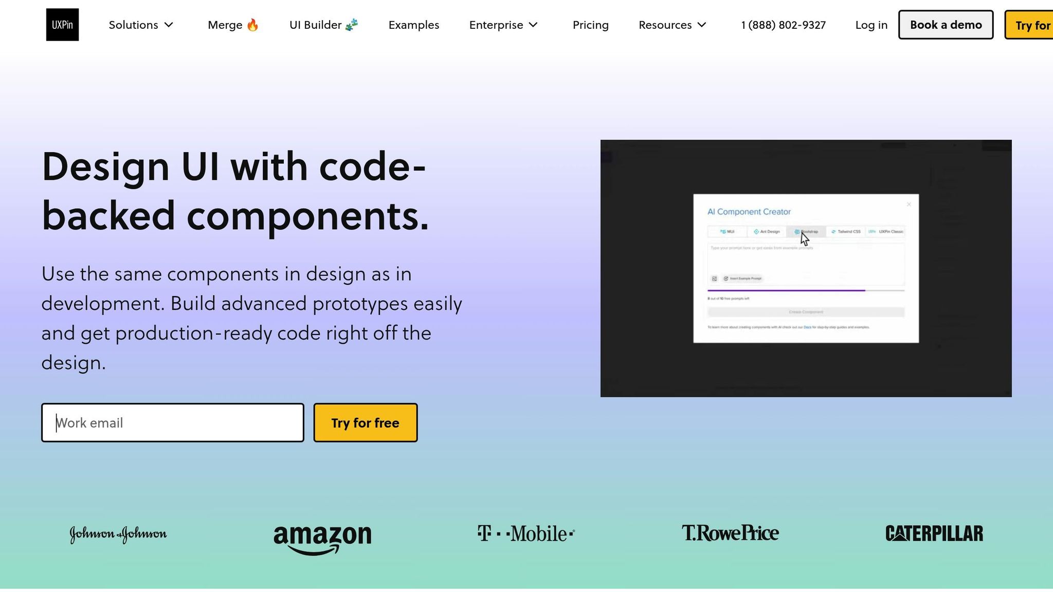
UXPin takes a code-backed approach to prototyping, which makes component documentation more efficient. Unlike traditional design tools that rely on static mockups, UXPin allows you to build interactive prototypes using actual React component libraries. This ensures that your documentation reflects the real-world behavior of your components from the very beginning.
With its Spec Mode, UXPin automatically generates detailed technical information for developers, such as component specifications and automated redlining. This automation removes the need for manual documentation, saving time and ensuring accuracy. It also aligns with the principle of creating documentation that is both technical and user-focused.
Additionally, UXPin’s Documentation Mode lets you embed notes, guidelines, and other important details directly within your design files. By keeping this information close to the visual examples, team members can better understand both the components and the reasoning behind design decisions.
For teams working with custom component libraries, UXPin offers seamless integration with tools like Storybook and npm. This lets you import existing components directly into the documentation environment, ensuring your documentation stays in sync with ongoing code changes.
Adding Interactive Examples and Code Snippets
Interactive examples that include live code can bridge the gap between design and development. These examples show how components behave in different scenarios, highlighting edge cases that might not be obvious in written descriptions.
With UXPin’s code-backed system, interactive examples are created using the same code used in production. For instance, you can demonstrate a button’s hover state or a form’s validation process, giving a clear picture of how these interactions work in real-life applications.
UXPin also includes a Comment Mode, which allows team members and stakeholders to provide targeted feedback on specific parts of a design. This feature is particularly useful for complex components where input from multiple disciplines – such as design, development, and product management – is necessary. Designers can focus on visual details, developers can address technical aspects, and product managers can provide business insights, all within one platform.
By linking code snippets to live examples, you connect theoretical descriptions to practical implementation. Version history features further enhance this process by tracking changes to both visual documentation and underlying component behavior, making it easier to review and refine your components over time.
Collaboration and Accessibility Features
Real-time collaboration allows team members to work on designs simultaneously, ensuring that documentation evolves with input from everyone involved.
User management features let you control who can edit or comment, making it easy to gather feedback while maintaining the integrity of the final content.
Accessibility should be a priority throughout the design and development process. UXPin includes tools for checking color contrast, keyboard navigation, and screen reader compatibility, making it easier to document how components serve users with different needs.
Integrations with platforms like Slack, JIRA, and Microsoft Teams improve communication and project tracking. For example, notifications about documentation updates can be sent directly to your team’s preferred channels, ensuring timely reviews and collaborative improvements.
| Feature | Documentation Benefit |
|---|---|
| Real-time Collaboration | Enables simultaneous contributions from team members |
| Comment Mode | Allows stakeholders to provide targeted feedback |
| Spec Mode | Automates technical specifications for developers |
| Documentation Mode | Embeds notes and guidelines directly into designs |
| Tool Integrations | Connects seamlessly with team workflows |
To make the most of these collaboration features, it’s essential to establish clear workflows. Define who is responsible for updates, how feedback should be incorporated, and when documentation reviews should take place. This ensures that the tools enhance your design system rather than complicate it.
Maintaining and Updating Documentation
Keeping your component documentation up-to-date is essential for ensuring it remains a valuable tool for both design and development teams. As your design system evolves, regular updates help maintain accuracy and relevance. The trick is to create processes that make these updates feel natural and manageable.
Setting Up Ownership and Review Cycles
Good documentation maintenance starts with clear ownership. Assign specific team members to oversee particular components of your design system. This doesn’t mean one person does all the work – it’s about ensuring accountability for specific areas.
“The Design System informs our Product Design. Our Product Design informs the Design System.” – Jina Bolton, Salesforce
This interdependence between product design and the design system requires active oversight. Establish a governance process for managing updates, whether it’s modifying, adding, or removing patterns. Define who can make changes, how those changes are reviewed, and the timeline for updates.
Regular reviews are key. Schedule monthly or quarterly check-ins to compare documentation with how components are actually being used in production. These sessions often reveal gaps or inconsistencies that need attention.
Set up communication channels like a dedicated Slack or Teams group, regular office hours, or other forums where team members can discuss documentation updates. These channels make it easier to share feedback and address issues in real time.
Feedback loops are equally important. Create a system where users – designers, developers, or anyone else – can report issues or suggest improvements. This input helps identify problems early and ensures the documentation stays practical and accurate.
Managing Deprecated and Legacy Components
“The biggest existential threat to any system is neglect.” – Alex Schleifer, Airbnb
When components are deprecated, transparency is critical. Simply removing them can disrupt ongoing projects, but leaving them without explanation can confuse new users. The solution? Clearly mark deprecated components and provide guidance on how to transition to alternatives.
Use semantic versioning to indicate deprecation and include clear migration steps. For example, when phasing out a component, provide a timeline for its removal and detailed instructions for switching to the recommended replacement.
Legacy components often linger longer than expected. To avoid confusion, document them in a separate section of your library. Include warnings about their deprecated status and direct users to current alternatives.
Updating Documentation for Growing Design Systems
As your design system grows, scalable documentation processes become essential. Every new component should come with clear documentation from the start. Use version control to track changes, ensuring updates are logged and accessible.
Establish guidelines for contributing to the documentation. Provide templates, style guides, and a review process to maintain consistency as more people get involved. This structure ensures that contributions align with the overall quality and tone of your documentation.
Design components need to adapt to changes in your product, and your documentation should follow suit. Modular design principles – where complex interfaces are built from simple, interchangeable parts – apply here as well. Write your documentation in a way that allows it to grow and evolve alongside your components.
eBay’s Design Systems and Design Technology teams offer a great example. They maintain a component status table that tracks implementation across platforms like Figma, Playbook documentation, and various frameworks. Cordelia McGee-Tubb, Staff Design Technologist at eBay, explains how they use a custom linter to validate documentation, ensuring compliance with guidelines, accessibility standards, and naming conventions.
“People crave documentation… Even with a system as comprehensive as ours, we constantly hear ‘What about this edge case?’ or ‘Have you considered documenting this scenario?’ This continuous feedback loop drives us to refine and expand our resources – partners are not just passively consuming the documentation, they’re actively helping us shape it.” – Ryan Tinsley, Staff Product Designer, eBay
Feedback loops, automated checks, and analytics are invaluable tools. They help you monitor how the documentation is being used, identify issues early, and prioritize updates. Analytics, for instance, can show which sections are most viewed, where users struggle, and what might be missing.
Finally, provide training and support to help users understand and make the most of the documentation. As your team grows, new members will need guidance on not just using the design system but also contributing to and maintaining its documentation.
Conclusion
Component documentation turns abstract design systems into practical, user-friendly tools. When done effectively, it bridges the gap between design vision and actual implementation, creating a shared framework that keeps everyone on the same page. These principles naturally align with the detailed practices discussed earlier.
Key Takeaways
Clear and well-organized documentation boosts team efficiency. It speeds up onboarding, minimizes misunderstandings, and ensures a unified user experience.
Think of documentation as a strategic resource, not just a formality. Successful teams set up clear contribution guidelines, maintain version control, and use change logs to manage updates efficiently. They treat documentation as a critical step before launching new components, ensuring that every release is backed by clear, actionable guidance.
Using tools like UXPin, which simplifies the workflow from prototypes to documentation, strengthens your design system as it grows and evolves.
Next Steps for Better Documentation
To improve your documentation process, consider these steps:
- Know your audience. Tailor the content to their needs, whether they’re designers, developers, or stakeholders.
- Establish clear ownership. Assign responsibilities for different sections, set up regular review schedules, and create channels for ongoing feedback.
- Prioritize accessibility. Use clear headings, consistent formatting, and plenty of visual examples to make documentation easy to navigate.
And above all, gather feedback continuously. As the Splunk Documentation Team emphasizes:
“Reliable and accessible documentation requires thorough product knowledge. It also applies equally, if not more, on knowing your audience.”
Regular feedback helps uncover gaps, correct errors, and focus on updates that matter most.
FAQs
How does component documentation boost collaboration and productivity within teams?
Component documentation serves as the go-to resource for your team, providing accurate and up-to-date information that everyone can rely on. It helps cut down on miscommunication and bridges knowledge gaps, making workflows smoother and keeping projects on track.
Keeping documentation well-organized also speeds up onboarding for new team members, reduces mistakes, and aids in making informed decisions. With clear instructions and a shared understanding, teams can work together more efficiently, save valuable time, and concentrate on delivering top-notch results.
How can I keep component documentation updated as code and design evolve?
Keeping your component documentation current as your code and designs evolve doesn’t have to be overwhelming. Start by establishing a regular review schedule and assigning responsibility to specific team members. This creates a sense of accountability and ensures updates are handled consistently.
Leverage version control systems and automation tools to streamline the process. These tools can help you track changes and cut down on manual tasks. Additionally, encourage collaboration between designers and developers. Open communication between these teams makes it easier to catch updates and reflect them in the documentation quickly. By staying on top of these practices, you’ll keep your documentation accurate and dependable.
Why is it essential to address accessibility in component documentation, and how can you do it effectively?
Including accessibility in component documentation is essential to make your product usable for everyone, including people with disabilities. It not only supports inclusivity but also helps comply with legal and regulatory requirements, while improving the overall user experience.
To achieve this, provide clear documentation on key accessibility features along with practical advice for developers and designers. Reference standards like WCAG‘s POUR principles – Perceivable, Operable, Understandable, and Robust – and include actionable details such as guidelines for alt text, instructions for keyboard navigation, and recommendations for media transcripts. This approach ensures your components are both inclusive and straightforward to use in accessible designs.

