User Interface Style Guides: The Checklist of 5 Things Your Guide Needs
Every product needs a consistent design that helps users make sense of their experience. Without consistency, users will feel lost. Frustration leads to abandoned carts. Your customers will choose an alternative that maintains a cohesive standard throughout its features – and you don’t want that. UI guidelines can help you maintain the consistency that appeals to users.
Creating a checklist with all the necessary UI elements will help ensure that your products appeal to consumers. Before you jump into creating the checklist, though, it’s important to understand the role that UI guidelines play in product development.
Key Parts of User Interface Style Guides
Now that you have a deeper understanding of what user interface style guides accomplish, you can start creating your own style guides that improve efficiency and contribute to your product’s success.
Just one last thing before you start. Use the following UI style guide checklist to make sure you cover all of the items your design team may encounter.
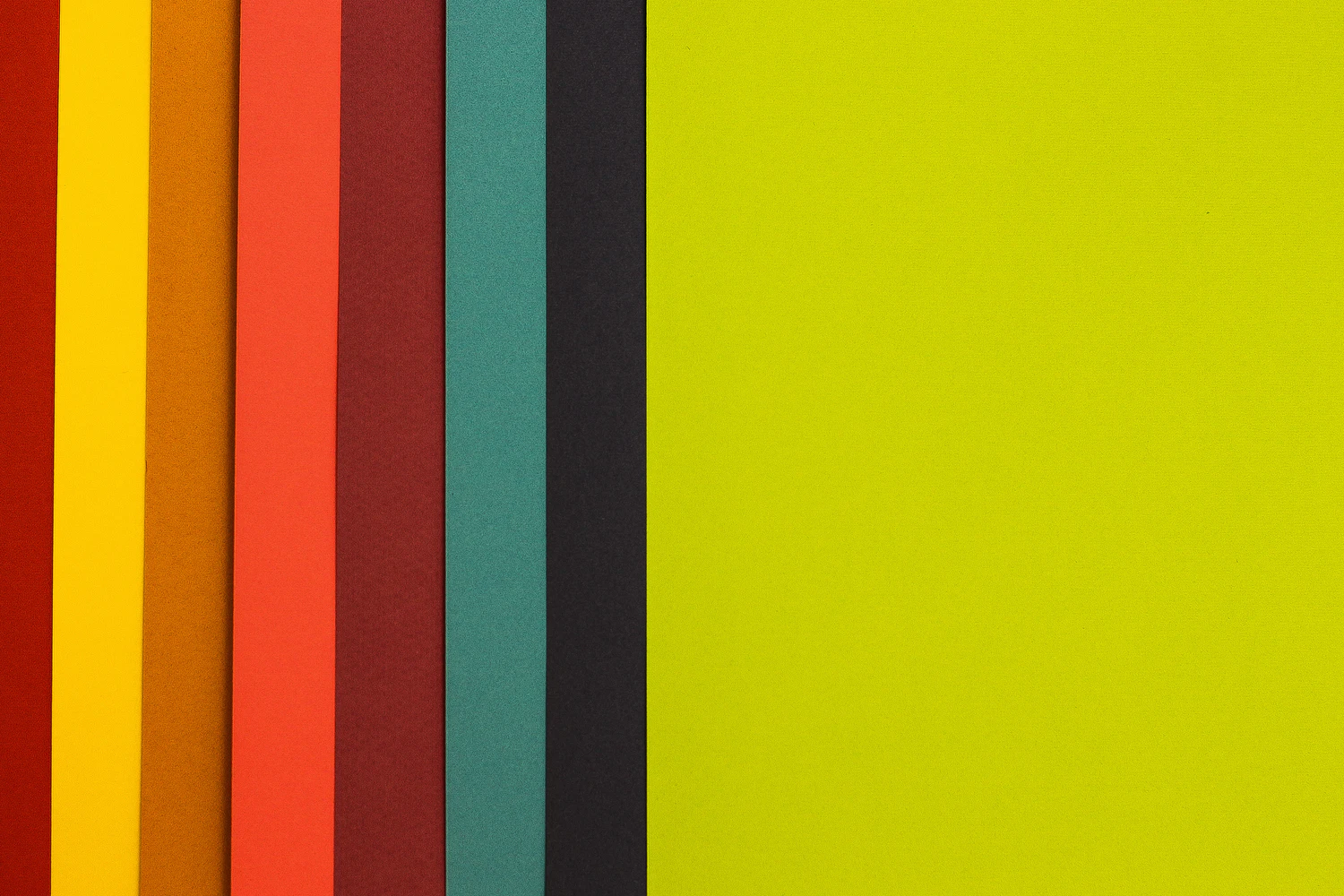
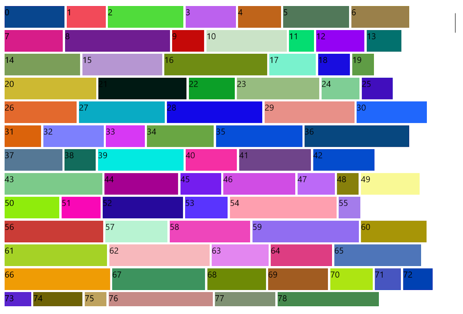
Colors
Every product needs a cohesive color scheme that separates features, communicates with users, and makes the UI attractive.
In most cases, you want to keep your color schemes as simple as possible. Some products, however, require more colors than usual. A video game with several characters will probably need more colors than an app designed to help people budget their money.
UXPin’s Design Systems feature can help you organise your color palette as well as text styles, colors, and icons.
You can also find inspiration from free tools like:
Text
Text descriptions in your UI style guide should cover features like font, font size, color, and the amount of space between letters, words, and lines.
You may need to create unique text descriptions for different fields in your product. For example, your buttons might use a different font, font size, or color from the text used in your hero banners.
Iconography
Design teams spend a lot of time creating icons that they can use throughout products. A creative system of icons can add personality to your products.
The way that you design icons can help establish your product’s tone. If it’s a whimsical app for finding rideshares, then you can use fun icons that make users smile. If it’s a serious app for filing taxes, then you can use basic icons that provide clear instructions without letting whimsy confuse users.
As long as your style guide contains the same icons, everyone on your team will know which ones they can use.
Patterns
Design patterns play an important role in helping users understand the different parts of your product. Your navigation bar, for instance, might use a pattern that differentiates it from the background, search bar, and forms.
By setting patterns in your user interface design guidelines, you ensure that every element of your product has the correct look. Even a subtle change can confuse users. Consistency is key!
Interactivity is one possible feature of your patterns. Take a moment to think about this aspect.
How do you expect users to interact with your product? Should they push, click, speak, or gesture? Your style guide needs to define the expected interaction so that users know what to expect on every page.
Similarly, you need to define how your design elements respond to interactions. Perhaps scrolling down causes icons to swell and dominate the screen. Or maybe clicking an icon initiates an animation that shows the action’s progress.
UI interactions and story mapping help to create an experience that matches your product’s purpose. You can place interactive design patterns into UXPin’s library for use by many or a select few users.
How UI Guidelines Benefit Both Users & Design Teams

Following a UI guideline benefits your users and team members. It improves the experience for users, who can approach your products with enthusiasm knowing they have the UI guidelines as an accessible resource. It also fosters independence and agency among design team members, giving them access to a variety of tools and approaches.
Benefits for Users
- Easier for users to understand the product.
- Cohesive experiences that make people comfortable using the product.
- Cross-product branding that helps users recognize other websites and applications made by your company.
- Intuitive features that people can use without reading instructions.
Overall, adopting UI guidelines makes people feel more comfortable and confident while using your products. That contributes to their brand loyalty, which could lead to greater success for other products.
Benefits for Design Teams
- Provide clear instructions instead of forcing designers to “reinvent the wheel.”
- Give designers access to a library of approved assets and elements that they can add to products.
- Reduce the amount of time that developers spend seeking guidance from project leaders.
- Improve collaborative efforts without forcing everyone to work in the same space.
UI guidelines won’t eliminate all of the problems that teams encounter while developing new products, but they can streamline the development process, lower the stress that individuals experience, and improve the time to market.
User Interface Design Guidelines Are Distinct From Other Design Documentation
New designers often get confused by the differences between design systems, pattern libraries, and style guides.
You can remember the differences by thinking about each one as a step in your design hierarchy.
Pattern libraries establish design patterns used by everyone across the company. They usually include design systems. These systems describe everything from documentation to design standards used by designers and developers across the company.
Style guides describe specific aspects of a project’s design. It can include design scales, typography, UI patterns, icons, and other assets used throughout a specific product. The design system and pattern library may contribute to a user interface style guide, but designers should focus on meeting the style guide’s descriptions when working on products.
Why You Make Style Guides at the Beginning of Projects
Creating a style guide can seem like a serious burden. Making a UI style guide could take anywhere from a few hours to a few weeks. However, it’s important to resist the temptation to skip this stage of product development. Over the course of the project irregularities will emerge. When your team doesn’t have access to a style guide, members will make subtle differences that make the product look amateurish and incomplete. Save time and energy by taking the time you need to build a comprehensive UI style guide at the outset of a new project.
Find Inspiration in These Three Outstanding UI Style Guides
On some days, your creative energy makes it easy to create spectacular UI style guides that will blow away users. When you don’t feel inspired, though, making a style guide can feel impossible. On those days, draw inspiration from these three examples of outstanding UI guidelines.
Microsoft
Microsoft has built a comprehensive Windows UI library called WinUI that can add consistency, accessibility, and intuitiveness to websites and applications. The WinUI platform emphasizes modern UI features that put a priority on control, performance, and choice. The platform also makes it easy for you to continue updating your products as Windows and similar platforms evolve.
Code Academy
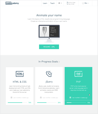
When Treehouse and other online learning platforms design their interfaces, they apply best practices learned from helping students succeed. When Code Academy updated its UI style guide, it made several of its guidelines public. The rejuvenated website uses:
- More contrast between elements to keep the color scheme as simple as possible.
- Fewer form fields to improve conversion rates and reduce typing fatigue.
- Easily identifiable icons that help users navigate the app intuitively.
Google Material Design

Google developed Material to help developers create websites and applications for smartphones and websites.This is a design system, but provides an excellent gateway to a model UI style guide.
Material feels a bit daunting at first. You expect to see terms like “typography” and “navigation.” “Machine learning,” however, looks intimidating to people without technical backgrounds. The average designer doesn’t know a lot about machine learning. Google provides instructions for using machine learning and other sophisticated tools, but you will need to spend time studying them.
More often than not, you will get the results you need by playing with Material’s design guidelines, components, icons, and other common features. If you ever want to enter the world of coding, you can find plenty of tutorials on Material’s website. Most designers will feel more comfortable using a tool like UXPin, which can simulate interactions and generate prototypes without coding experience.
Make a User Interface Style Guide With UXPin
UXPin’s design tool makes it easy for you to create design systems and style guides for your projects. Your style guide and design libraries can be shared with your team, so all of your designers and shareholders will have access to the same assets.
Want to see how UXPin’s design tool can help you create a design system and collaborate with your team? Start your free trial account to explore all of UXPin’s features. Once you have a design that you like, UXPin will help you turn it into a fully functional prototype. Get the results you deserve by adopting a tool that includes design, collaboration, and prototyping features!

