Design a System of Icons With These Techniques
Little icons have a big job. With limited real estate, they must convey meaning to people who expect to be informed about function or status. Maybe that’s why thousands of icons sets exist, many for free. But there’s nothing quite like making your own.
Project-specific icons help the project to stand apart and convey meaning unique to its functions. For example, most apps or dashboards let you create new records. But fewer systems will let you assign one record to another. That may require a creative symbol that people will come to recognize as they learn your product.
Their role in design systems leaves little room for ambiguity: meaning must remain clear in a variety of surrounding contexts, while fitting into the system’s overall aesthetic.
Unify your design and development team with a single source of truth – coded components shared across UI design and engineering. Bring your design system to the final level of maturity and speed up the entire product development process. Try UXPin Merge.

What are Icons in Design System?
Icons in a design system are visual symbols that represent ideas, objects, or actions. They are a fundamental element of user interface that helps products have a unique look and feel. Plus, they indicate that an element is clickable. They can provide visual cues where to click or tap to perform actions like saving, editing, sharing, or navigating within the interface.
Examples of icons in design system include:
- navigational icons – aid navigating through the interface, such as menus, home, arrows.
- action icons – help users perform some task like arrow for adding an item.
- media icons – indicate that users can manage media like play button or speed up button.
- utility icons – represent settings, configurations, and other customization mechanisms.
- status icons – show errors, loading, or approval.
- communication icons – such as chat bubble, phone or envelope.
Why Icons are Part of Design System?
Iconography is more than tiny pictures. Together they form an entire family, not unlike a set of typefaces, that reinforce a brand.
They also prevent extra work. When you need an icon, just grab one from the project’s style library, or use the library as inspiration. To that end writing (and drawing) guidelines for new icons is important. This approach mirrors how development teams benefit from centralized component libraries—when platforms enable designers and developers to work from shared, reusable assets, it accelerates the entire product development process.
- Make guidelines for icons. Part of your design system should include parameters on what your team can and can’t do with icons.
- Practice style. One of the best ways to develop a visual language is to apply it to new ideas. As you invent icons, make sure they fit the same look — but don’t be afraid to modify that look early in your work.
- Test each iteration. Do your icons make sense? Can people figure out what they mean? Getting stylish while retaining clear meaning requires showing your work to users.
Where to get ideas for icons
Where do icons come from? Your imagination is just the beginning. Seeking inspiration from outside sources can be critical to success.
- Look up synonyms for the word or concept you want to represent.
- Look for styles beyond the obvious. What inspiration might you find from, say, Polynesian symbols or Mandarin letterforms?
- Doodle shapes at random, avoiding backgrounds like circles or squares.
- Use the brand. Does your project’s logo have an eye-catching characteristic you can use? How about the project’s typography?
- Create negative space. How can the interactions of three or four regular geometric shapes overlap to create new and interesting forms?
Base complex forms on the same shapes
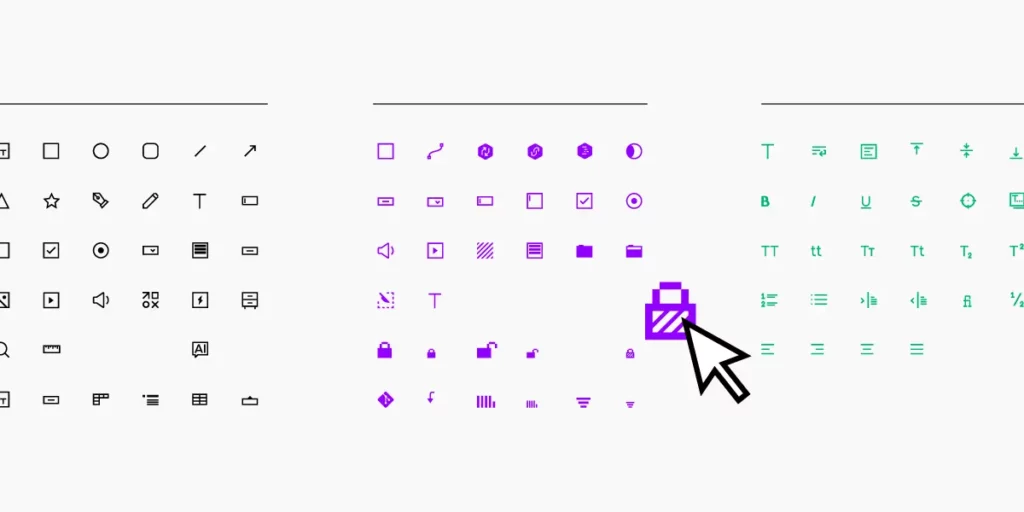
Recognizability is the most important aspect of an icon. If people don’t know it at a glance, they may waste precious time deciphering it — or look elsewhere for a shape they associate with the function at hand.
With that in mind we start by defining icons’ silhouettes. But don’t just start drawing lines.
- Use the same geometry. Here we make shapes based entirely on small circles and rectangles. When you base icons on the same general elements, they look like they belong to the same family
- Use the same angles, e.g. 90°, 45°, 30°. Doing so will make them more legible and more consistent.
- Same line weight throughout. Here, basing glyphs on the same few shapes will help keep your icons looking similar without looking derivative.
- Stick to symmetry — or the same asymmetry. Tilting your icons is a great way to make them stand out from other sets. But if you do so, tilt them all at the same angle to reinforce that they’re part of the same family. Otherwise stick to good ol’ right angles.
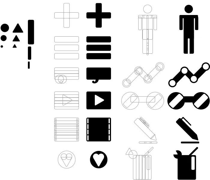
This example may stick to its base shapes a little too closely for practical design work, but demonstrates how simple geometry can create complex forms that look like they belong together.
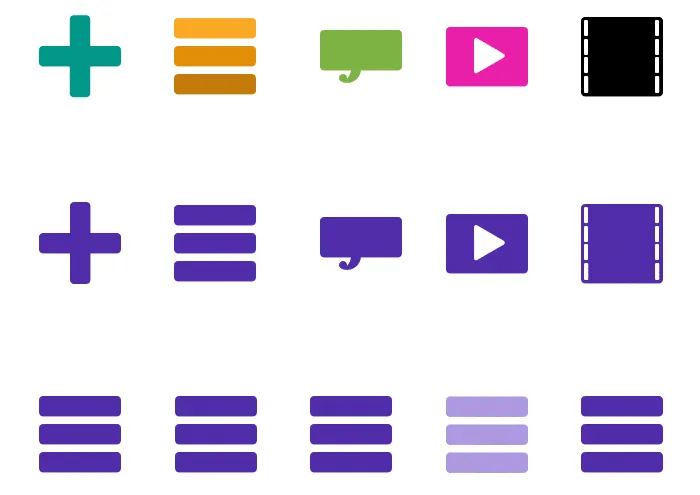
Make a consistent color palette
Like using geometry to make icons look like a set, if you plan to use color, then you should use the same color palette. But which colors?
- Seek inspiration from your photos. If you have final art for your project, make the icons look harmonious by sampling colors from that art.
- Borrow from Google’s MDL palette. They’ve done a great job of selecting bright colors that stand out against a variety of backgrounds, yet rarely clash among themselves.
- Make sure the colors work well together. Speaking of clashes, test every combination of your preferred colors to keep them from looking awkward when adjacent to each other.
- Use one color per icon. The contemporary “flat” look works best without shading, shadows, gradients, or other details that detract from their silhouettes.
- Use values. If you must use multiple colors, try to use different shades of the same hues.
- Consider meaning. Should colors imply function? It’s up to you, but remember that many people associate color with actions, like red for “delete,” green for “create,” and faded (usually less opaque) for “disabled.”
How much color is too much? How much is too little? Determine your color palette based on one factor: attention. If your icons need to grab people’s eyes, then make ’em bright. Otherwise aim for consistency.
Remember that symbols have preconceived meanings
People often associate certain “universal” icons with certain functions. The trash can, for example, means “delete.” Hamburger icons, though, aren’t universally understood … yet.
Using microcopy with icons is a good idea. Rely on shapes for quick identification, and text for folks who don’t get it.
Designing a system
Icons must do a lot with a little. In spite of running small, people expect to “get it” at first glance. That’s why silhouettes, consistency, color, and meaning all work together for a great, on-brand icon set.


