Negative Space – How Best to Use It in Website and App Design
Have you ever viewed an image or photograph that you really like and wondered why it looks so interesting and engaging? Or maybe you’ve wondered why a scene in a movie or TV show triggers a strong emotional response.
Is it the subject matter or the artist’s use of perspective? Perhaps. But then think about your favorite websites or user interfaces; what is it about how they look that makes you enjoy using them. Maybe it’s something about the colors or the fonts used on the webpage or app. Or maybe what you’re reacting to in all these examples is something else altogether: negative space.
Design any website, app or a landing page in minutes. Try UXPin, end to end design app for advanced prototyping and design handoff. Sign up for a free trial.

What is negative space?
At its most straightforward, negative space is the space around or between the subject of an image. You can see it all the time, whether it’s the white space surrounding the text of this blog post or the black background behind a model’s face in a stylish black and white photo. But beyond that, negative space can also add more information or meaning to the subject. But more on that later.

First, let’s look at what design looks like without negative space.
A world without negative space.
Chances are, as a kid, you might have encountered the Where’s Waldo (also called Where’s Wally) series of books. You know the ones, with all the intricately drawn bustling crowd scenes with hundreds of characters. And somewhere within each scene is the subject of the image, Waldo (or Wally). Sometimes it could take hours to find the little figure with his distinctive round black glasses and red and white striped clothes and hat. There’s not a shred of negative space to be found in any of those drawings.

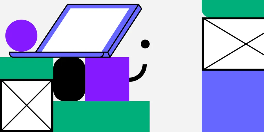
Well, imagine if that’s how we all created our designs. Imagine trying to read this post if all the letters and lines were squeezed up tight against each other, or worse still, covered in text from other blog posts. Or imagine trying to use an app designed with all the layout elements crammed together, like Where’s Waldo. It just wouldn’t work. An app or website designed like Where’s Waldo would be unusable. If you’re old enough to remember what some website designs looked like in the 1990s, you’ll understand why.
How to use negative space in design
When it comes to web pages and app design, negative space has a vital role to play. The considered use of negative space allows a web page or app to “breathe,” which helps draw greater attention to the crucial elements included on a page or app screen. Plus, clever use of negative space can help create a hierarchy of information so that not all aspects compete for the viewer’s attention simultaneously.
A thoughtful approach to negative should try to achieve:
- better scannability of a page or app.
- enhanced visual hierarchy.
- intuitive bonds between the different elements of a page or screen.
- an overall less cluttered feel.
- improved user focus on core features while reducing distraction.
- added style and elegance to a page or screen.
The difference between big and small spaces
How you use negative space in web design or app screen also depends on whether you are applying it to a small or large space.
Larger spaces
When working with larger spaces, such as the overall design and layout of a web page or app screen, you need to look at the overall content when applying negative space. Questions to ask yourself include:
- Can negative space be used to separate elements?
- Does your text need to be divided into columns?
- How big should you size your margins and padding?
- How much distance between images should you use?
This type of negative space significantly affects the user’s visual flow. Whether it is potential guidance or strong push, it can let the attention lead to where you want them to stay.
Smaller spaces
Smaller spaces require a different kind of negative spacing. These include design elements such as:
The negative space you assign to smaller design elements primarily emphasizes the overall clarity of a website or app screen, especially the amount of negative spacing associated with typography.
Negative space directly influences the readability of text on a page or screen. If there’s not enough space between your lines of text, they become hard to read and demand additional effort from the user.
What is negative space: Creative negative spaces
One example of a creative negative space is the image known as Rubin’s Vase. It was developed in the early 20th Century by the Danish psychologist Edgar Rubin and is a famous example of an optical illusion.
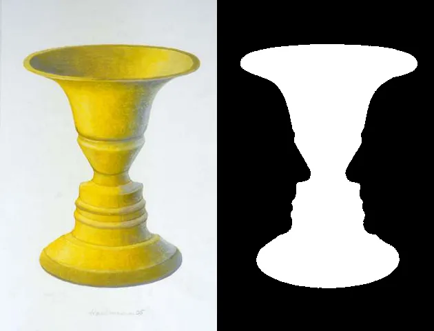
In the image on the left, the yellow vase is the subject, and the white background is the negative space. But if you look at the black and white image on the right, you might instead see the profiles of two male faces. Now look back at the picture on the left. The negative space in the original image also contains the same two male faces. The yellow vase is still the subject, but the negative space conveys additional information to the viewer.
You don’t think optical illusions are relevant to corporate designs? Well, think again. Take a look at the FedEx logo.
Look between the E and the X. Notice anything? It’s an arrow. A subliminal reinforcement of the kind of business FedEx is known for. Another example of the creative use of negative space.
How UXPin can help you improve your use of negative space
The next time you begin a new design, remember to consider the impact of negative space on your design and user experience. With UXPin, you can create designs and prototypes and preview your work across multiple devices. Collaborate with your team members or business partners to get feedback on your use of negative space. Get started on your next negative-spaced design project with UXPin today- on free 14-day trial.


