Typography in Web Design — How to Choose a Font?
Typography is one of the most critical website design factors, as it significantly impacts many other UI design facets, including usability, accessibility, branding, readability, and aesthetics. We explore website typography for UX design, including correct terminology, the basics, and advanced techniques designers can use to improve design decisions.
Design responsive websites faster with UXPin’s advanced prototyping features. Sign up for a free trial to create your first interactive prototype with UXPin.

Why is Typography Important in Web Design?
Typography significantly impacts a website’s user experience, readability, aesthetics, and accessibility. Well-crafted typography enhances the visual hierarchy, guiding users through a user interface while reinforcing the message and brand identity.
By making deliberate choices about typefaces, sizes, spacing, and other typographic elements, designers can create a cohesive and visually appealing web page that effectively communicates information and engages users.
A carefully chosen typeface can influence user perception and emotions–for example, it may evoke trust, professionalism, or playfulness, shaping the user’s impression of a brand or product. Investing time and effort in refining typography is essential for designers to create user-friendly and visually compelling digital experiences that foster user satisfaction, engagement, and retention.
What is the Difference Between Typography, Typefaces, and Fonts?
Typography is a broader concept that includes text’s overall design, layout, and appearance within a digital or print medium. It’s the art and technique of arranging type, encompassing various aspects like typeface selection, size, line spacing, letter spacing, and text alignment.
A typeface is a collection of characters, symbols, and glyphs with consistent design and visual appearance. Typefaces represent the broader design concept, including various styles, weights, and variations that define a family of fonts. Examples of typefaces include Helvetica, Times New Roman, and Arial.
A font is a specific variation within a typeface. It is a digital representation of a typeface in a particular style, font weight, and size. Each font within a typeface family maintains the overall design consistency while offering different options for emphasis, hierarchy, and aesthetics.
For example, within the Helvetica typeface, you might find fonts like Helvetica Regular, Helvetica Bold, Helvetica Light, and Helvetica Italic.
Typography Basics
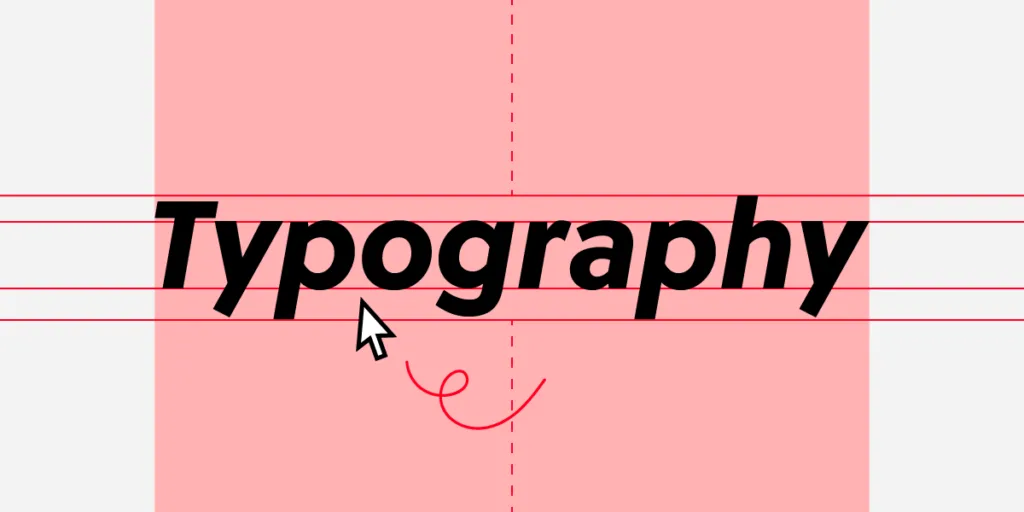
Anatomy of typefaces
Understanding the anatomy of typefaces is crucial for designers when selecting and working with fonts. Some key terms to know include:
- Baseline: The invisible line on which characters sit.
- Cap height: The height of capital letters measured from the baseline.
- X-height: The height of lowercase letters, typically measured using the letter ‘x.’
- Ascender: The part of a character that extends above the x-height.
- Descender: The part of a character that extends below the baseline.
- Serif: Small decorative strokes added to the ends of characters in some typefaces.
- Counter: The enclosed or partially enclosed space within a character.
Typeface classifications
We classify typefaces into several broad categories, each with its unique characteristics and applications:
- Serif: These typefaces have small strokes (serifs) attached to the ends of characters. They often convey a sense of tradition, professionalism, or authority. Examples include Times New Roman and Georgia.
- Sans-serif: Sans-serif typefaces lack serifs, resulting in a cleaner, more modern appearance. They are suitable for digital interfaces and offer excellent legibility. Examples include Helvetica and Arial.
- Slab-serif: Characterized by thick, block-like serifs, slab-serif typefaces are attention-grabbing and effective for headlines or display purposes. Examples include Rockwell and Clarendon.
- Script: These typefaces mimic handwriting or calligraphy, primarily used for logos, invitations, or headers. Examples include Pacifico and Brush Script.
- Monospace: Monospace typefaces have a fixed width for each character, making them preferred for coding environments and typewriters. Examples include Courier and Consolas.
Font formats
- TrueType (TTF): Developed by Apple and Microsoft, TrueType is a widely supported font format that offers good display quality on various devices and resolutions.
- OpenType (OTF): An extension of TrueType, OpenType fonts include advanced typographic features, such as ligatures and alternate glyphs, providing more design flexibility.
- Web Open Font Format (WOFF/WOFF2): The WOFF and WOFF2 formats were designed specifically for web use, offering faster loading times and improved compression compared to TTF and OTF formats. They support the same features as OpenType fonts but are optimized for web performance.
Choosing the Right Typeface
Legibility and readability
Selecting typefaces with high legibility and readability is essential to ensure users can easily consume the content on your website. Legibility refers to the clarity of individual characters, while readability encompasses the overall ease of understanding the text.
Choose fonts with clear, distinguishable characters and a balanced x-height, weight, and spacing. Avoid overly decorative or condensed typefaces for body text.
For example: Consider using a sans-serif typeface like Open Sans or Roboto for body text. These are best for on-screen legibility and readability.
Tone and brand identity
Your typeface should align with your brand’s tone and identity, as they can evoke different emotions and perceptions. Serif typefaces often convey tradition and authority, while sans-serif fonts project a modern, clean appearance.
Script typefaces can add a touch of elegance or playfulness, depending on their style. Analyze your brand personality and choose typefaces that support and enhance it.
For example, a sophisticated serif typeface like Playfair Display can help convey elegance and refinement for luxury brands.
Typeface pairing and contrast
Effectively pairing typefaces establishes visual harmony and clear hierarchy. When combining typefaces, look for complementary styles that offer enough contrast to create a distinction without clashing.
Mixing a serif with a sans-serif typeface is standard practice, as it can balance formality and modernity. Consider the weight, width, and x-height to ensure cohesion between the paired typefaces.
For example, designers often pair a serif typeface like Merriweather for headings with a sans-serif typeface like Lato for body text.
Font licensing and legal considerations
It’s crucial to understand and comply with licensing agreements and legal considerations. Fonts are intellectual property, and copyright laws may restrict their usage or require purchasing a license. There are free, open-source fonts available for commercial use. Always review the terms and conditions of a font before using it in your projects.
For example, Google Fonts offers a wide selection of open-source fonts, such as Montserrat and Raleway, free for personal and commercial projects.
Web Font Performance and Optimization

While devs are typically responsible for optimizing fonts, designers must understand the various strategies and best practices so they can collaborate to improve user experience and accessibility.
Selecting a font delivery method
Choosing the correct font delivery method is essential for balancing performance and user experience. There are two options:
- Self-hosting: Fonts are stored and served from your server or content delivery network (CDN). This approach provides more control over font files and caching but may require additional maintenance, configuration, and licensing considerations.
- Web font services: Fonts are served from an external provider, simplifying licensing, file format conversions, and updates. However, relying on external services can introduce third-party dependencies and potential performance bottlenecks.
Optimizing font files and minimizing file size
Optimizing font files and minimizing their size is crucial for improving web performance and reducing load times. Use tools like Font Squirrel’s Webfont Generator or Google Fonts to generate optimized font files and serve only the necessary font styles, weights, and character sets. Compression techniques, such as the WOFF2 format, can reduce file sizes.
Font loading strategies and performance best practices
Implementing effective font-loading strategies can prevent layout shifts and improve website performance. Some best practices include using font-display CSS property (e.g., swap or fallback) to control the rendering behavior, employing preloading or asynchronous loading techniques, and inlining critical font CSS to reduce render-blocking resources.
Addressing cross-platform rendering issues
Addressing potential rendering issues is essential to ensure consistent typography across various devices and platforms. Test your typography on different browsers, operating systems, and devices to identify inconsistencies.
Employ font smoothing or antialiasing techniques, such as -webkit-font-smoothing or -moz-osx-font-smoothing, to improve the appearance of fonts on screens.
If you don’t want to get caught up in these technicalities, using a service like Google Fonts is best, as it automatically serves the correct font format to users across multiple devices and platforms.
Typography & Responsive Design

- Fluid typography and viewport units: Utilize viewport units (vw, vh, vmin, vmax) to create fluid typography that adapts to different screen sizes. This approach ensures that text scales smoothly as the viewport size changes, maintaining legibility and readability across various devices.
- Media queries and breakpoint-based adjustments: Apply media queries to define breakpoints at which your typography styles should adapt to specific screen sizes. Adjust font sizes, line heights, and other typographic properties to optimize readability and maintain visual hierarchy on different devices.
- Modular scales and typographic systems: Implement a modular scale to maintain consistent proportions between different text elements, such as headings and body text. A modular scale is a sequence of font sizes based on a predefined ratio, ensuring a harmonious relationship between typographic elements and enhancing the overall design.
- Vertical rhythm and line height considerations: Establish a consistent vertical rhythm in your design by setting a standard line height, typically between 1.4 and 1.6 times the font size. This practice improves readability and creates a visually balanced layout, allowing content to flow seamlessly across different devices and screen sizes.
Web Typography Accessibility

Font color contrast and readability
Ensuring sufficient color contrast between text and background is crucial for readability and accessibility, especially for visually impaired users.
Following the Web Content Accessibility Guidelines (WCAG), the recommended minimum contrast ratio is 4.5:1 for regular text and 3:1 for large text. Utilize tools like UXPin’s built-in contrast checker and color blindness simulator to evaluate your color palettes on the fly without leaving the canvas.
Font size and scaling for different devices
Choosing appropriate font sizes and enabling smooth scaling across different devices is essential for maintaining legibility and accessibility.
A standard base font size for body text is 16px, while headings should be proportionally larger. Use relative units like em or rem, which allow users to resize text according to their preferences and ensure proper scaling on various screen sizes.
Supporting screen readers and assistive technologies
Designing typography that works well with screen readers and other assistive technologies is crucial for users with visual impairments or cognitive disabilities.
Use semantic HTML tags, such as headings (h1-h6) and paragraphs (p), to create a clear content hierarchy. This distinction allows screen readers to navigate and effectively communicate the content to users.
Best practices for internationalization and localization
When designing for international audiences or localizing your content, it’s essential to consider typography best practices that cater to different languages, scripts, and cultural contexts.
Choose typefaces that support a wide range of characters, accents, and special symbols required by various languages. Also, be mindful of reading direction (left-to-right or right-to-left) and ensure your design accommodates these differences.
Advanced Web Design With UXPin
UXPin gives designers the tools and features to go from concept to wireframing and mockup to interactive prototyping faster and with higher fidelity than any other design tool.
Design immersive experiences your users will love with the world’s most advanced design and prototyping tool. Sign up for a free trial to build your first UXPin prototype today.

