By Dominik Strzałkowski, UI designer at Macoscope
FIRST PART OF THIS ARTICLE
SECOND PART OF THIS ARTICLE
How to introduce innovative solutions?
Tip 7: Introduce innovative solutions only in an environment the users know.
Most of our solutions related to the user experience are based on the guidelines developed by Jared Spool. Jared Spool demonstrates how a designer should think in order to create a useful, intuitive product. The main issue that Spool emphasizes is that it is not the design that is supposed to be intuitive – it is the users who act intuitively when using the software. The design has to be thought out in such a way as to help in this matter, and, if the need arises, to inconspicuously train users.
The user’s intuitive activities are an individual issue and, according to Spool, are closely related to two issues:
- What people already know when they start using the program; in other words, their entry knowledge;
- Previous similar experiences and how do they impact their perception of the application.
Taking into account the fact that the perception of most users is normally limited to what they are already acquainted with, we, as designers, have to predict which elements the users will recognize, and which they will have to be taught.
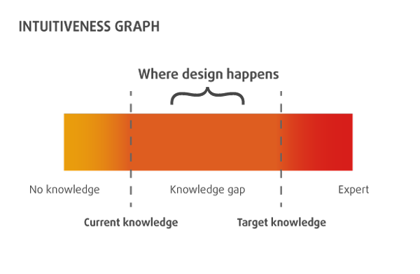
Jared Spool discerns two types of user knowledge: current knowledge, that is the knowledge a user already has, and target knowledge, the knowledge one needs to use a given program or application at full capacity. The space between them (the knowledge gap) is to be covered by a well-thought-out and intuitive product. Assessing the current knowledge of users, that is recognizing and analyzing their previous experience, can greatly help in the determining of the required target knowledge.
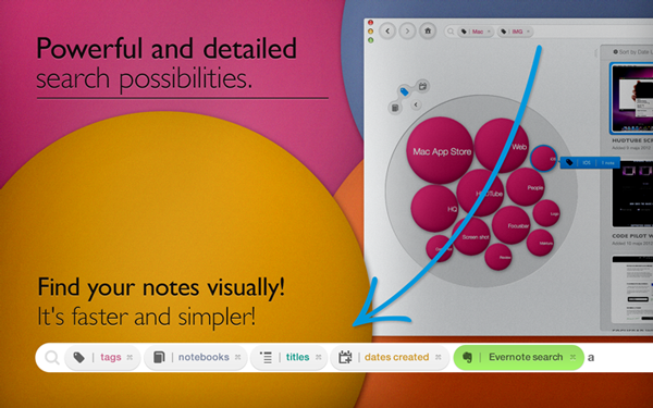
The purpose of this analysis is to minimize the amount of new knowledge that the user has to obtain in order to use the application. Obviously, an ideal situation would be one, in which this comes naturally, and one’s previous knowledge would be employed when using the application. So all the new elements of Bubble Browser 2 had to meet two basic goals: improve the prototype and make use of the elements and environment that the user is already accustomed to. Users can’t start from scratch, and we had to help them navigate through the application with their current knowledge. One of such elements that makes use of this is, for example, the omnifield, a text-based query box at the top of the screen similar to that in which users type in website addresses or submit queries in Internet browsers. We made the assumption that users will quickly understand the principle of the omnifield by analogy to similar solutions. An additional element that supports this connotation is the use of the term “browser” in the program’s name itself.
We considered three elements of the UI as relatively well-known and facilitating the use of our app:
- The omnifield for browsing, an element known from internet browsers.
- Thumbnail previews of note content.
- Note content presented in a linear way common in browsers, word processors, and Evernote itself.
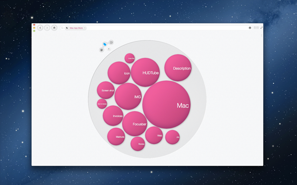
The use of accessible elements in an environment that users were acquainted with allowed our innovative use of bubbles to browse data to be a straightforward means of conveying information and facilitating navigation for those, who haven’t used Bubble Browser previously. In this way, even more so than in version 1.0, we created an accessible environment for learning how to use the application efficiently and intuitively.
Evaluation
Tip 8: Analyze application reception and its assumptions.
On the 21st of March, the newest version of Bubble Browser was made available in the Mac App Store. Of course, mistakes were made, both in the application itself as well as in the work process. But we handled them promptly with a frank and direct attitude that allowed us to complete work without significant delays. We believe that the system of extensive limitations we imposed allowed us to develop an efficient way of delivering a product with a limited number of people on the design team without any holdups and without overinvesting.
As we care about feedback and how people evaluate our software, we would like to hear from you. Take our app for a spin and let us know what you think. We would like to verify whether our assumptions work in practice and whether the aesthetic and functional minimalism allows for intuitive use of the software.