Great web design starts with the right layout. No matter how striking the visuals, users come for content — and the layout is the vehicle that delivers it clearly, intuitively, and at scale.
Some layout patterns have endured for decades because they align with how people actually read, scan, and interact with screens. In this guide, we break down 12 proven web layout patterns — from cards and grids to F-patterns and asymmetry — with real-world examples, best practices, and tips you can apply today.
Need to move from layout concept to interactive prototype fast? UXPin Forge generates page layouts from text prompts, screenshots, or URLs using real React components — so you can test ideas with users before committing to code. Start a free trial.
12 Common Web Design Patterns
- Cards
- Grids
- Magazine
- Container-free
- Split Screen
- Single-page Web Apps
- F Pattern
- Z Pattern
- Horizontal Symmetry
- Approximate Horizontal Symmetry
- Vertical Symmetry
- Asymmetry
Take a look at how to present your web layout in the most powerful format possible.
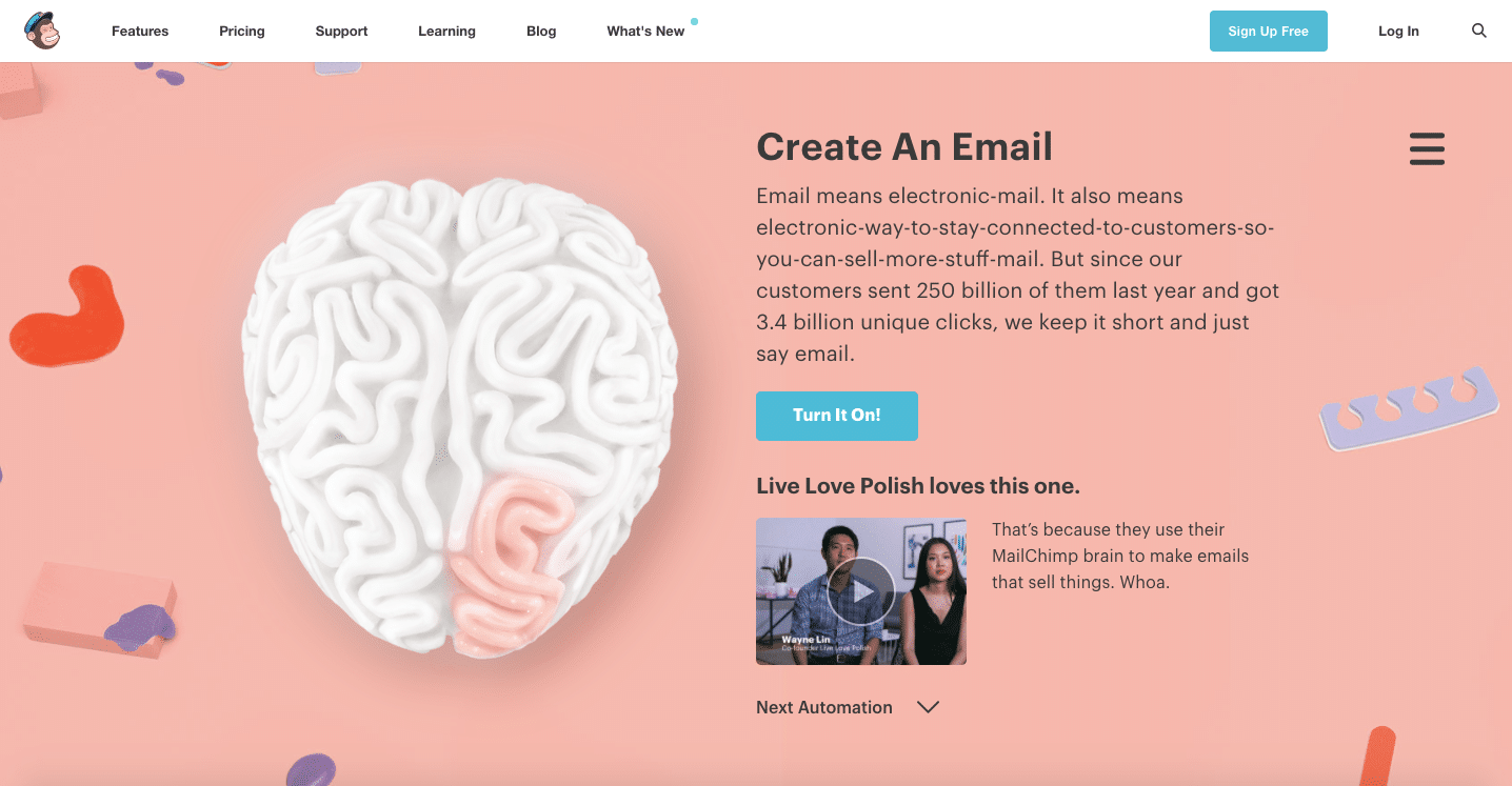
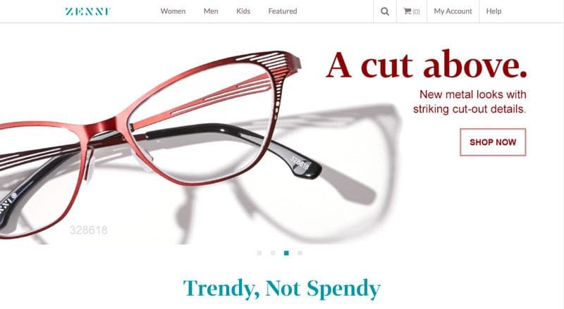
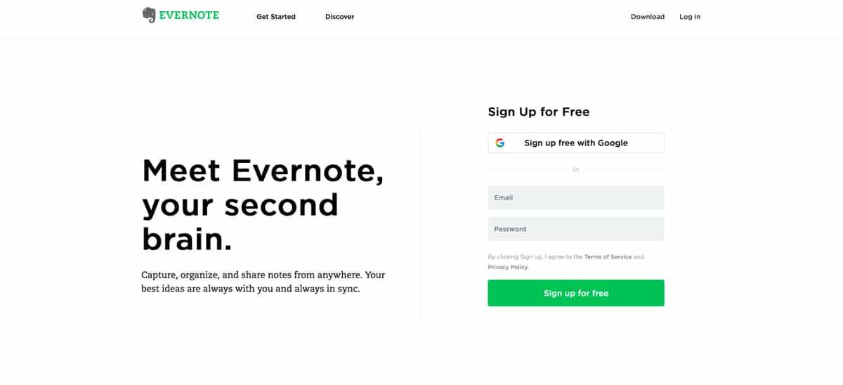
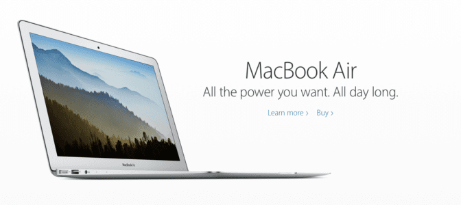
1. Cards
Oprah

Problem
Browsing is a large part of site interaction, but displaying the details for each item would clutter the screen.
Solution
Cards allow sites to present a heavy dose of content in a digestible manner. As we explain in our Web Design Book of Trends 2015–2015, cards are popping out everywhere lately, and this pattern’s success is directly related to its usefulness.
Cards act as containers for clickable information: bite-sized previews to help users find the content they want. The style of the cards varies with each site, but most contain an image and description, and sometimes individual functions, such as Facebook’s Like or Twitter’s Retweet.
Moreover, cards work well with responsive design. Since each card is self-sufficient, their placement can be rearranged to fit any screen size.
For sites with a lot of content, cards offer a lot:
- Intuitive — don’t require instructions.
- Advantageous for responsive design — since each card is self-sufficient, their placement can be rearranged to fit any screen size.
- Shareable — easy to share only specific content on social media.
- Versatile — can be used with a wide range of site styles
Tips
- Make the entire card clickable, not just certain portions. Fitts’s Law, described in Interaction Design Best Practices, states that this makes user interaction more likely.
- Focus each card around one central concept, and no more. Otherwise, that defeats the purpose.
- Keep smaller screens in mind when selecting images. You may need to crop them differently for different devices.
- Don’t get too complex. Cards work best when they’re simple, in what they show and how. Basic typography and minimal description helps browsing.
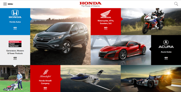
2. Grids


Problem
Content-heavy sites want to display all primary items with equal hierarchy.
Solution
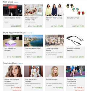
A grid structure makes browsing easier. Cards are almost always laid out in a grid format, of one kind or another. Grids offer more options for browsing than simple list views, which makes this style space-effective.
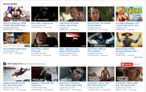
Grids can vary in size, spacing, and the number of columns. Sites like Huffington Post stagger their options to avoid that “straight-laced” feel, while YouTube plays up the strict organization, with straight rows and grouped into categories (“Recommended,” specific channels, etc.).
Tips
- Pay attention to white space (or lack-there-of, as with Diply) because it influences how users browse. Ample space is slower, but with more attention placed on each item. Minimal space is faster, but risks some content slipping through the cracks.
- Consistency is important, especially when designing for different devices. Make sure your layout stays recognizable at different responsive breakpoints.
- Get started with a basic 12-column grid with tools like 960js.
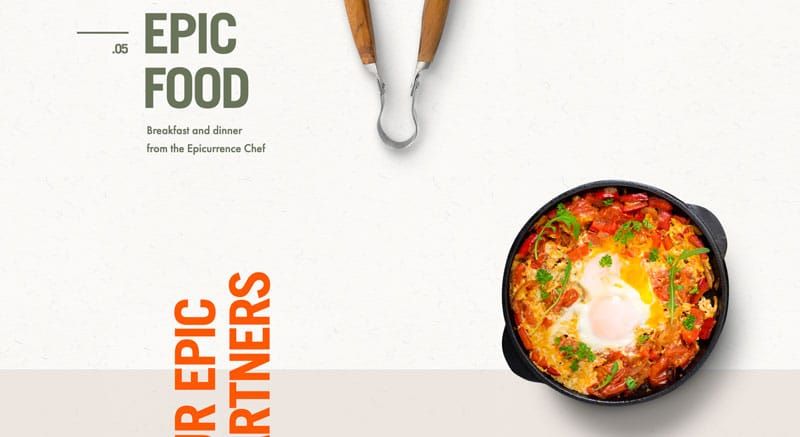
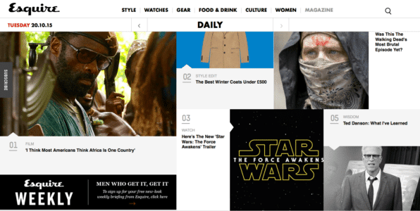
3. Magazine-Style Layout
Problem
A site has a lot of regularly-updated content in multiple categories.
Solution
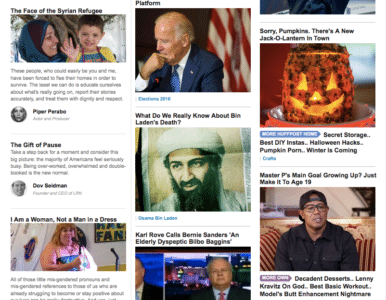
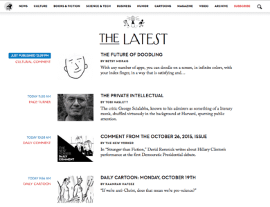
Magazines had this problem long before websites, and the format they evolved remains viable. The alternating sizes of columns, cards, and/or headlines breaks up the monotony of the grid, while still showcasing a variety of content.
The magazine layout changes up how content is displayed. The left side of the screen might be dominated by a grid of cards, while the right side might have a list of text links.
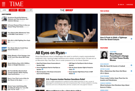
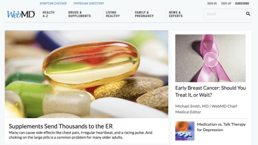
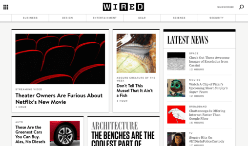
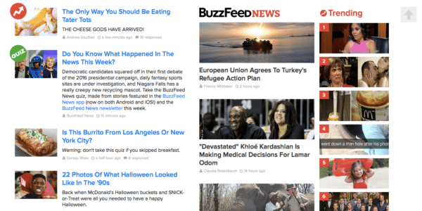
Take BuzzFeed, for example: the first column is featured content, with a detailed description next to the picture. The middle is timely content, with a brief description under the picture; and the last column is what’s trending, numbered pictures with no description. Pay attention to their typography — text colors and sizes vary to show usability and create a visual hierarchy.
Tips
- Like print magazines, this format emphasizes images. As with TIME, WebMD, and WIRED, there is usually one dominant feature image on the screen to draw focus before users scan the smaller, secondary images.
- One of the characteristics of this style is a vertical menu on either side (or horizontal menu).
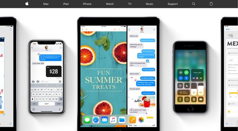
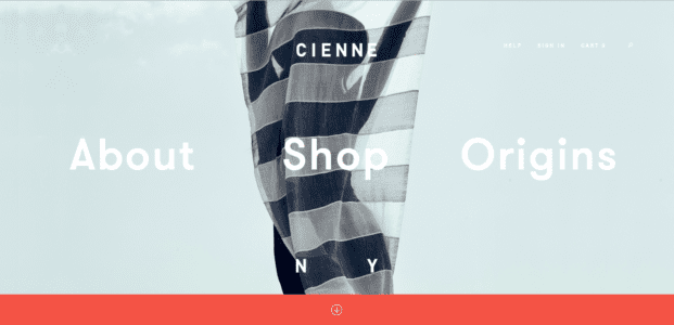
4. Container-free Format
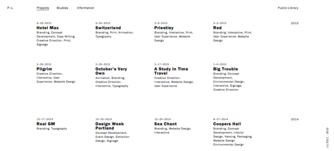
Cienne NY
Problem
A site wants a minimalist approach when presenting data.
Solution
The container-free format takes minimalism to the next level, stripping away all unnecessary visuals and breaking away from the conventions of other sites. Rather than clear-cut divisions, this pattern format relies on visuals, grouping, and common sense to show relationships.
Historically, web design has relied on linear and highly structured layouts to present information. This works well, but with more options available today, designers can experiment “outside of the box.” This style appeals to agency (Public-Library), portfolio, and fashion sites (Cienne NY), which all value appearing modern and avant-garde.
Designing without containers puts more power back to the content itself. However, extra care must be given to the visual hierarchy. This risky pattern is only as effective as the people designing it.
Often the face of minimalism, Apple disregards containers for its site. Links are all textual (no buttons), and a clever visual design explains which content relates to what.
Tips
- Typography is vital to designing without containers. Size, typeface weight, and color all communicate meaning in place of blunt dividers. Apple uses large text for the title, smaller text for the secondary description, and blue text for links out.
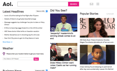
- To prevent confusion, make most elements clickable. If the user is confused about an element, they will likely click on it first to test interactivity.Content-heavy sites have difficulty with this format, although AOL shows that it’s possible (although not always ideal).
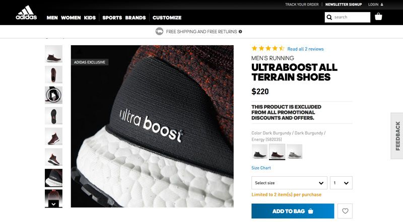
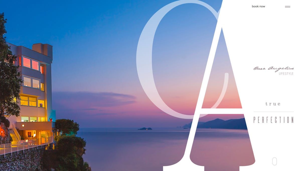
5. Split-Screen
Problem
A site has two main pieces of content that are equally important.
Solution
The split-screen layout is the logical and trendy way to give two contrasting elements equal consideration.
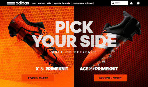
The split-screen is a choice for displaying two central elements simultaneously or — as the Adidas example shows — pit them against each other. This is a good choice whenever you don’t know which of two elements to feature prominently: do both.
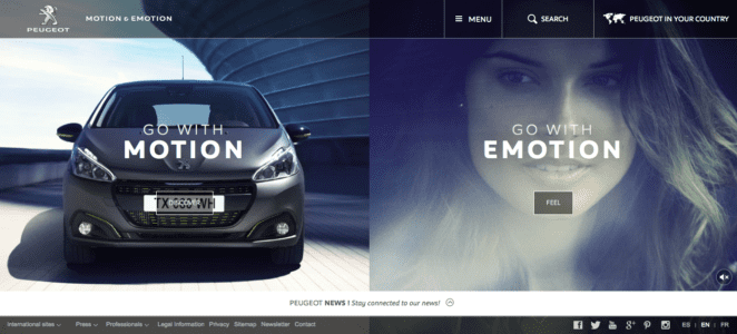
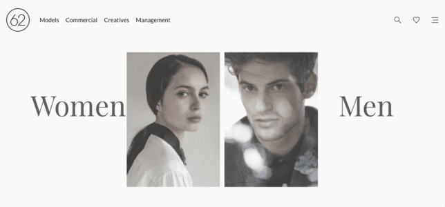
Split screens are perfect for when the site offers two drastically different variations, such as the genders in 62 Models. Users make their selection right from the start, so the site doesn’t waste time showing both options needlessly. Split screens also give the opportunity to feature two calls-to-action, as with Peugeot.
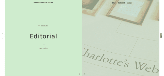
The style has since grown to become purely aesthetic. Most common is having text on one half of the page, and a header image filling the other, as with Lauren Wickware Design. Both sides are two aspects of the same concept.
Tips
- The split-screen is ideal for contrast. As designer Patrick McNeil suggests, play up the duality with opposing characteristics, such as opposite colors, different text sizes, the nature of the image, etc.
- Retain a single, unified navigation menu — ideally at the top, where it’s clear that it applies to both sides.
- Split-screen designs do not expand well with as content grows, so do not apply them to content-heavy layouts.
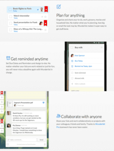
6. Single-page Layouts
Problem
Multi-page navigation system is too convoluted or unnecessary.
Solution
Modern web development has paved the way for single-page sites and web apps. Both technological advancements and the prominence of mobile browsing (in which single-page apps are more useful) gave rise to this pattern, which is restructuring how the web works.
Using AJAX, single-page web apps load asynchronously and are able to combine multiple actions into one page. This pattern is also popular for non-app sites, which section off their home page to serve the needs of individual pages.
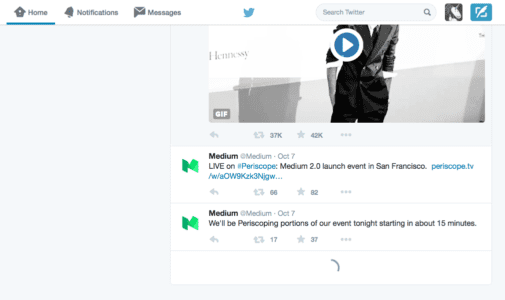
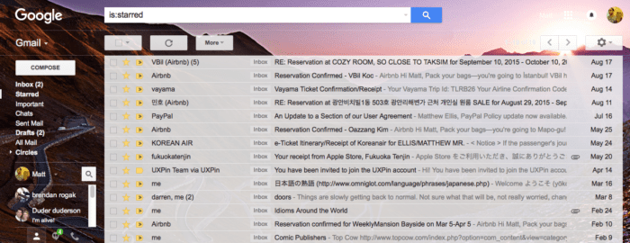
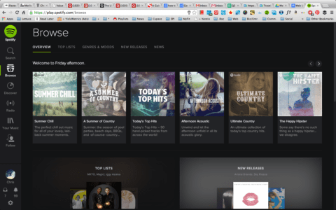
Gmail, for example, allows email reading, composing, and chatting on the same page, and even organizes emails into separate categories, which mimics a multi-page site. Spotify, too, multitasks by allowing the user to play music while they browse additional music, uninterrupted by loading pages.
Tips
- Generate unique URLs for each viewpoint, like Gmail or Twitter. Because content is loaded dynamically using JavaScript, URLs require special attention. Unique URLs also enable use of the browser’s Back button.
- Use sticky navigation to reduce disorientation, even if only a header menu.
- Apply the scrolling techniques from Chapter 4 of Web UI Patterns 2016 (Vol.1) to properly deal with scrolling issues.
7. F-Pattern
Problem
Users are having difficulty browsing text-heavy sites.
Solution
If there is a lot of content — especially text — users will respond better with the F pattern layout, which mimics the way people scan naturally.
The Nielsen Norman Group explains how eye-tracking studies revealed that users (in left-to-right reading cultures) typically scan heavy blocks of content in a pattern that looks like the letter F or E. Our eyes are trained to start at the top-right corner, scan horizontally, then drop down to the next line and do the same until we find something of interest.
For example, if the user is scanning a blog entry, they will look at the first line of a paragraph for keywords or to gage the meaning, and if it’s not what they want, they’ll drop down to the next paragraph.
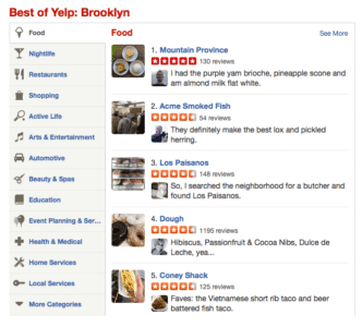
When there’s a lot of content, the F pattern organizes it into horizontal rows, one on top of the other. This creates pathways for the users’ eyes to go where they would normally, and gives the designer more control over what gets seen.
Yelp uses perfectly aligned vertical columns to give the users a starting point. When they find an interesting topic (or picture), their eyes scan horizontally for more information. If the item in the vertical column doesn’t interest them, they go down until they find one that does.
Tips
- Place the most important content like CTAs at the left and right sides, where the user begins and ends their horizontal search. This momentary pause as they drop down gives them a little extra time to consider.
- Start new paragraphs with enticing keywords. Additionally, try highlighting keywords within text, since that’s what users are looking for anyway.
- The first two rows are the most important. Users may leave the site if they don’t find what they want there.
- Use the right-side column to display relevant, but unrelated content, or as a search tool. This area is seen, but is regarded as outside the scanning process.
- Read our Web UI Design for the Human Eye: Content Patterns and Typography for more explanation and best practices.
8. Z-Pattern

Wunderlist
Problem
A site has a specific agenda or call-to-action that users are not interacting with.
Solution
Like the F pattern, the Z pattern layout mimics natural user scanning methods. However the Z pattern is better suited for sites with a singular goal and less content.
The Z pattern is effective at directing user attention to specific points by using well-placed visuals, text, and CTAs. While the F pattern is better for browsing heavy content, the Z pattern guides users through more open pages.
The user (in left-to-right reading cultures) again starts in the top-left corner. Instead of dropping down directly, however, their eyes wander a bit in the middle, then start again at the bottom or near bottom left corner. You can encourage this pattern by placing a telling image in the center (TripAdvisor), or by alternating text and images to create a zigzag.
Tips
- Place CTAs on the right side, at the end of the line: user will slightly pause at the end before moving down.
- Place your most important CTAs in the upper right corner, since the top line is the most visible.
- The Z pattern can be repeated over and over on the same page, so that the user developers a rhythm that keeps them there.
9. Horizontal Symmetry
Problem
A site includes many recurring visual patterns that must be organized clearly.
Solution
A visual phenomenon occurring in nature, symmetry is generally regarded as beautiful and creates a sense of order and structure, even trust.
Because they are visually pleasing, symmetrical images are more likely to create an emotional connection with users, which improves their enjoyment of the site, how they identify the brand, and how well they recognize the site later.
Tips
- Balance is not necessarily symmetrical. These are two different, though related, concepts. For more on visual balance, read this Smashing Magazine article.
- From its fine arts background, symmetry adds an air of elegance and sophistication to a site’s appearance.
10. Approximate Horizontal Symmetry
McWhopper
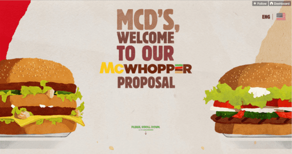
Problem
Horizontal symmetry is too structured for a site.
Solution
Approximate symmetry retains most of the benefits of symmetry, but with a little added vitality. It is created by adding slight asymmetrical aspects to an otherwise symmetrical image. The result is a more stimulating visual, though it loses a small amount of structure.
The slight visual disruption, however, can work to your benefit.
Tips
- To grab more attention, place important lines of text, images, or calls to action in areas that break up the symmetry.
- A little goes a long way; even altering a symmetrical image slightly produces visual tension. Likewise, you can create asymmetry by just placing a sidebar in an otherwise balanced design. Add your disruptive elements carefully, otherwise you risk complete visual clutter.
11. Radial (Rotational) Symmetry
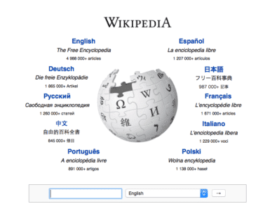
Problem
A site wants to draw attention to a central point and motivate immediate action.
Solution
Radial symmetry creates balance in a circle around a central point. While difficult to apply, when done well this creates a beautiful aesthetic that attracts attention to the center, typically to the company’s name, logo, and surrounding links.
Radial symmetry is also good for showing motion. Circular patterns in general encourage users to continually move their focus around to a natural end.
Tips
- Radial symmetry is a good way to stand out while looking good, since it’s not as common as the other types.
- Centralize your most important elements, and keep the secondary ones near the edges.
- When placing many links around the center of attention, do not complete the loop. For example, notice how Wikipedia leaves the top and bottom of the circle unoccupied. The space creates breathing room for the eye to explore links on both sides.
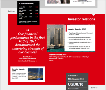
12. Asymmetry
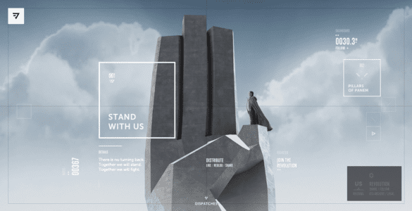
Beoplay
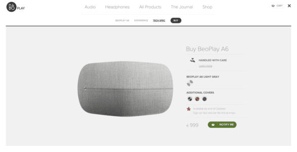
Problem
Specific feature content must stand out immediately without disrupting visual flow.
Solution
Asymmetry creates tension and dynamism — not practical for every site, but worthwhile if you want a livelier site that clearly shows points of focus.
When used properly, asymmetry can create active space, which means it makes white space more lively. Asymmetrical elements cause the eye to move more rapidly, even across emptiness, which makes the site itself appear more energetic.
However, this style is difficult to apply. Misplaced asymmetry can lead to confusion in the visual hierarchy, or just plain ugliness.
Tips
- The use of colors highlights the jarring effects of asymmetry. Both HSBC and Honda use patches of red to push and pull the user’s sight.
- To create a slight asymmetric yet organized layout, balance the text on one side with images on the opposing side.
- Objects with sharp edges (e.g., a triangle) add more visual weight to an area, which offsets the opposing area. Use these objects carefully since they can quickly unbalance the design.
Modern Layout Considerations
While these 12 patterns remain foundational, modern web design adds new dimensions to consider:
- Component-driven layouts — Design systems like MUI, shadcn/ui, and Bootstrap provide pre-built, responsive layout primitives (grids, containers, stacks) that enforce consistency across an entire product.
- CSS Grid and Flexbox — Modern CSS has made complex layouts far easier to implement. Many of the patterns above can now be built with a few lines of CSS.
- Dark mode and theming — Layouts must work across light and dark themes. Ensure sufficient contrast and spacing in both modes.
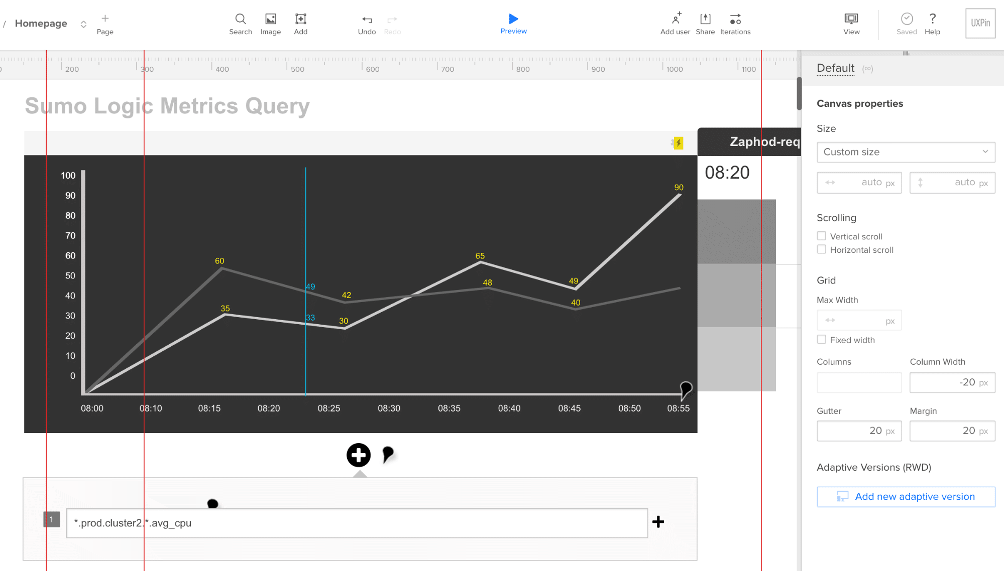
- AI-assisted layout generation — Tools like UXPin Forge can generate complete page layouts from a text description, a screenshot, or even a URL — then output production-ready JSX built from your actual component library.
Prototype Web Layouts With UXPin
UXPin helps design teams go from layout concept to tested, production-ready prototype:
- Forge generates interactive layouts from text prompts, images, or URLs — constrained to your production design system so every component is real and buildable.
- Merge brings coded React components into the design canvas. Designers drag and drop the same components engineers ship, eliminating the handoff gap.
- Auto Layout makes responsive layouts easy — components reflow automatically across breakpoints.
- Production JSX output — Engineers get clean, shippable code instead of static screenshots and redline documents.
Try UXPin for free and bring these layout patterns to life with code-backed components.
Frequently Asked Questions
What are the most common web layout patterns?
The most common web layout patterns include cards, grids, magazine layouts, F-pattern, Z-pattern, split screen, single-page apps, and various symmetry-based designs. Each pattern solves specific content presentation challenges and suits different types of websites.
When should I use the F-pattern layout?
Use the F-pattern for text-heavy pages like blogs, news sites, and search results. Eye-tracking research by the Nielsen Norman Group shows users in left-to-right reading cultures scan content in an F-shape, starting at the top-left and making horizontal sweeps that get shorter as they move down.
What is the difference between the F-pattern and Z-pattern?
The F-pattern works best for content-heavy pages where users scan text in horizontal rows. The Z-pattern suits pages with a singular goal and less content, guiding users diagonally across the page — ideal for landing pages and marketing sites.
How do cards improve web layout design?
Cards break content into self-contained, scannable units that work naturally with responsive design. Each card can be rearranged for different screen sizes without breaking the layout, and they provide intuitive, bite-sized previews that encourage browsing.
What layout pattern is best for responsive design?
Cards and grid layouts are the most naturally responsive patterns because each unit is self-contained and can reflow into different column configurations. Single-page layouts and split-screen designs also adapt well with proper CSS media queries.
How can I prototype web layouts quickly?
Use UXPin to prototype web layouts with production-ready components. UXPin Forge generates layouts from text prompts, image uploads, or URLs using real React components. Designers can then refine with professional tools and hand off clean code to developers.