To say that „Flat design is extremely popular” is to say nothing. The Flat design took over the design world. Microsoft (since 2010), Google and Apple adapted the flat design to some extent and thousands of designers followed (check out the Flat Design Showcase).
The simple and clear aesthetics of the flat design is easy to recognize and become a brand on its own rights. Some designers though tend to see it as the beginning of the revolution:
„I believe that the flat design trend is a symptom of the growing maturity in the field of web and interface design. This maturity applies to our designers – who are getting better at making interfaces that encourage interactivity and engagement – as well as to our users.” /Marci Ikeler, Designer and Founder of Little Arrows
„In essence, the flat era of design has narrowed the constraints but surprisingly expanded our approach towards design. Skeuomorphic design was not a trend, it was necessary for technology to be adopted. Now that it is, flat design is another necessary step that will facilitate exploration of new design techniques that will take the industry to new heights” /Damian Madray
If they are right, there’s hardly a way back. The flat revolution will unify the digital world under a single rule. Whatever will be in a different aesthetics will be judged as an oddity. While all the big brands are switching to the flat, that view might be truer than ever.
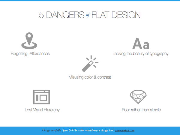
And this is exactly where I see the danger. While I admire the flat design aesthetics I’m afraid that many designers might fall into the trap that will ruin their design ambitions (and life of their users in the same, unfortunate, time). Oh yes… Flat design is tricky. Let me introduce you to 5 obvious dangers of Flat Design:
- Forgetting Affordances
In many cases texture, gradients, drop shadows and other ‘non-flat’ user interface elements hold an important information value. They help to create affordances in the interface. A button that looks like a button brings in the right mental model to the minds of users. That helps them understand the connection between a button and their goal – that’s a highway to interface efficiency.If you’re working on a flat design – make sure that you took care of affordances.
- Misusing color & contrast
Flat designs must rely on color & contrast as the indicator of interaction in the interface. That’s not an easy task. Colors got their meanings and lead to certain physiological reactions. To master color as an obedient information carrier – that’s certainly one of the biggest challenges in front of the flat design. - Lacking the beauty of typography
Flat designs rely on typography as on the primary carrier of aesthetic value and information. That’s absolutely great. Who doesn’t love beautiful typography? Right? The only problem is that typography is the art on its own. Lack of typographic skills will be more visible than ever in a bare flat design. - Poor rather than simple
Ornaments and any „extra” ingredients are banned in flat design. That’s cool. It supposes to lead to the beauty of simplicity. The danger is though that the interface will look poor and unfinished rather than simple. Creating something beautiful, useful and simple is the ultimate design challenge. - Lost Visual Hierarchy
Back in the days, designers were really concerned by the visual hierarchy of information that they are forcing on users. Having a full spectrum of effects: shadows, gradients, textures… designers could try to guide human perception of the interface. While it’s still possible in the flat design, it’s definitely harder.
All 5 dangers might be summed up in a single sentence: Flat Design is hard.
And here’s your takeaway – a handy graphic:


