
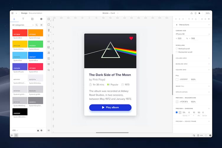
Design System Libraries
Design system libraries are the place for shared design patterns, such as colors, text styles, assets and Components that allow teams to build quality consistent prototypes; saving time while keeping projects on-brand. With DS libraries you can also create a fully documented Design System. You can access them by clicking the Design System Libraries icon in the bottom bar or by hitting the
Alt
"2"
shortcut.
Built-in Design Libraries
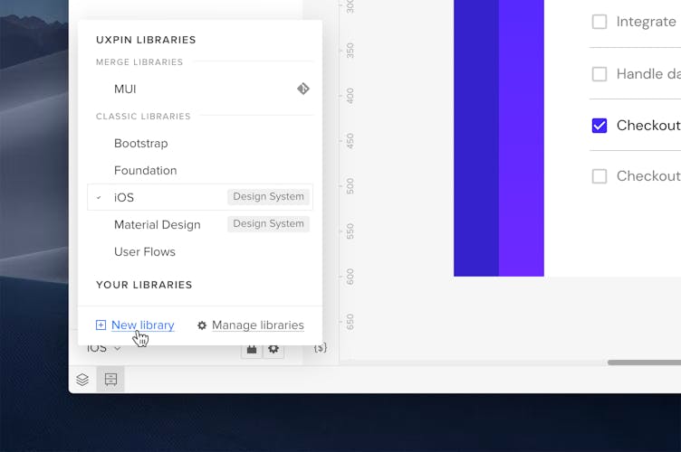
Apart from your own libraries, UXPin offers ready, built-in iOS, Material Design, Bootstrap, Foundation, and User Flows libraries with interactive elements, colors, text styles, and icons. If you want to try how UXPin Merge works with its code-based technology and built-in interactivity, you can also use Merge libraries such as Fluent UI (brought by Git integration), Material UI (Storybook), UXPin Boilerplate (Git), or our Open-Source React UI Libraries (Git).
Open-Source React UI Libraries
UXPin brings fully themeable open-source UI libraries including MUI, Ant-Design, React Bootstrap and Porsche Design System. Within these libraries, you'll discover an extensive range of components and properties that you can explore in isolation or you can take advantage of fully functional component patterns.
Note
All components and patterns maintain 100% code parity with your chosen UI library.
From the Get Code mode, you can effortlessly access the code of these components, allowing you to quickly grab the code snippets for building your application. Additionally, you can export components to StackBlitz, or download them as a React project with all the necessary dependencies.
Adding Libraries
To add your first or next library, go to Design System Libraries, open the section at the bottom of the panel and click + New library.
Permissions
You can choose who has access to your Library and who can edit it.
To manage Library permissions, open the Library settings (cog icon) at the bottom of the Library modal.
That's where you can rename your Library and change access and edit permissions:
- Me – only you can access or edit the library.
- Team – anyone in your Team can access or edit the library, regardless of their role.
- Selected – that's where you can select who exactly you want to access or edit your library.
Managing Libraries
To manage libraries, click on the current library name and choose Manage libraries. You will see a modal in which you can:
- decide which libraries are visible in the Editor
- rename libraries
- edit permissions
- delete the library
Adding and Reusing Elements
Every library has 4 sections. You can add elements to each section directly from the Editor. And these are:
- Colors
- Text styles
- Assets
- Components
Colors
You can add colors to the library in two ways:
- From selected elements - select one or more elements on the canvas and click +Add in the library panel to add all colors.
- With a HEX code - type in the HEX codes to add colors automatically.
To apply colors to the elements on your design, select the element and choose any color from the library. The colors from the currently selected library will also be displayed in the Color Picker.
Text styles
To add a text style, select the formatted text from the canvas and click +Add in the library. This way, you will store its font, size, weight, and style. You can then apply it to other text elements on the canvas.
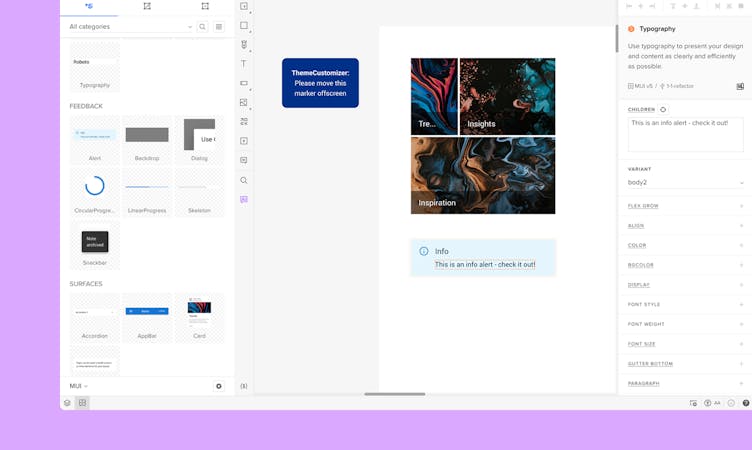
Assets
To upload assets, such as images and icons just click +Upload and choose the files from your computer. Once uploaded, you can add them to your design by clicking or dragging them to the desired place.
Grid Styles
To add a grid style, deselect all elements by clicking anywhere on the canvas. Then, in the right panel, define your grid styles and click the +Add button in the library. This allows you to store grid type, properties, and color, enabling you to reuse the saved layout grids across your designs.
Components
To add a Component, select an element on the canvas and click +Add. Any element that's not a Component will turn into one. Once added to the library, Components can be reused across different projects.
Note
If you use Merge components, you cannot convert or nest them with Classic Native Components (Symbols) or add them to Classic libraries.
Categorizing
You can create categories for Colors, Assets and Components. Create one in the drop-down at the top of the library panel by clicking +New category.
Apart from adding new elements to categories and sorting already existing content, you can move elements between them. Select All categories from the drop-down, enter the edit mode (pencil icon) and then drag and drop the elements into desired categories.
You can also reorder the elements inside the category in the same way as well as switch between list or grid view with the icon right next to the search bar, as shown below:
Switch to the list view if you want longer element names to be fully displayed.
Deleting Elements and Libraries
To delete an element from a library, enable the edit mode, select an element and click Delete.
To delete the whole library, click the cog icon at the bottom, choose Library settings and then Delete library. Removing a library with a corresponding Design System will remove the system too.
Updating Components
Design system libraries let you keep Components in sync even when working on different projects.
Sometimes you may notice a small yellow indicator in the left panel that says
"Component updates"
with a number. It means that some Component Instances on the design are out of sync with their versions in the library — the Component may have been updated in another project.
Click on the square icon and you'll see a panel to update the Instance to its version in the library without erasing overrides.
Optionally, you can choose Update all Components in the settings.