AI is transforming how we style UI components, making the process faster and more efficient. Instead of manually tweaking designs or writing CSS, AI tools now generate, customize, and optimize component styles automatically. This saves time, reduces errors, and ensures consistency across design systems. Here’s what you need to know:
- What it does: AI generates responsive layouts, turns images into code, and applies design tokens for uniformity.
- Why it matters: A 2024 GitHub survey found AI reduces repetitive styling tasks by 55%, boosting productivity and cutting costs.
- How it helps: Tools like UXPin Merge produce production-ready React components from simple prompts, eliminating handoff issues between design and development.
- What you need: Basic knowledge of React, CSS frameworks (e.g., Tailwind), and design tokens is key to leveraging AI effectively.
AI-powered styling isn’t perfect – it requires human oversight to refine code and ensure accessibility standards. However, with the right setup and tools, it can cut UI development time by up to 70%, helping teams focus on higher-level design challenges.
AI Built My Design System (with Figma + ChatGPT + UX Pilot)
Prerequisites and Setup for Automated Styling
Getting your setup right from the beginning can save you hours of frustration later and ensure you’re making the most of what AI has to offer.
Required Knowledge for Designers and Developers
To succeed with automated styling, you need a solid understanding of component-based design. This approach treats UI elements as reusable, modular pieces instead of standalone designs. It’s a crucial mindset because AI tools thrive on creating and modifying components that follow consistent patterns.
You’ll also need a working knowledge of React and JSX. Many AI styling tools generate production-ready React code, so being comfortable with JSX syntax is important. You don’t have to be a React guru, but understanding basics like props, state, and component structure is key.
Experience with a CSS framework can greatly enhance your productivity. Popular options like Tailwind CSS, Material UI (MUI), and Ant Design are commonly integrated into AI styling platforms. Knowing how these frameworks use utility classes, theme systems, or component APIs will make it easier to work with AI-generated code.
Familiarity with design tokens and atomic design principles is also important for scaling AI-generated components. These systems help maintain consistency across your design system, especially when AI tools are producing multiple components that need to align seamlessly.
For developers, knowing Git is essential. Many AI styling platforms integrate with custom component repositories, so you’ll need to manage version control and sync your libraries effectively.
Once you’ve got the knowledge, it’s time to configure your environment.
Setting Up Your Environment
Your development environment should be optimized for React and AI tools. Here’s how to get started:
- Visual Studio Code (VSCode): Use this as your primary editor for its excellent React and AI tool support.
- Node.js: Download the latest LTS version and confirm the installation with
node --version. - React Project Setup: Create a new React project using tools like Create React App or Next.js with the command:
npx create-react-app my-ai-styled-app. - CSS Framework: Install and configure your preferred framework (e.g., Tailwind CSS, MUI) to match your design system.
- AI Tool Integration: Add AI coding assistants to VSCode or configure web-based tools.
- Ensure your setup includes live preview and code linting for quick iterations.
Reports indicate that AI-driven workflows can cut UI component development time by up to 70% compared to manual coding. However, this efficiency depends on having a well-configured environment from the start.
How UXPin Supports AI Styling
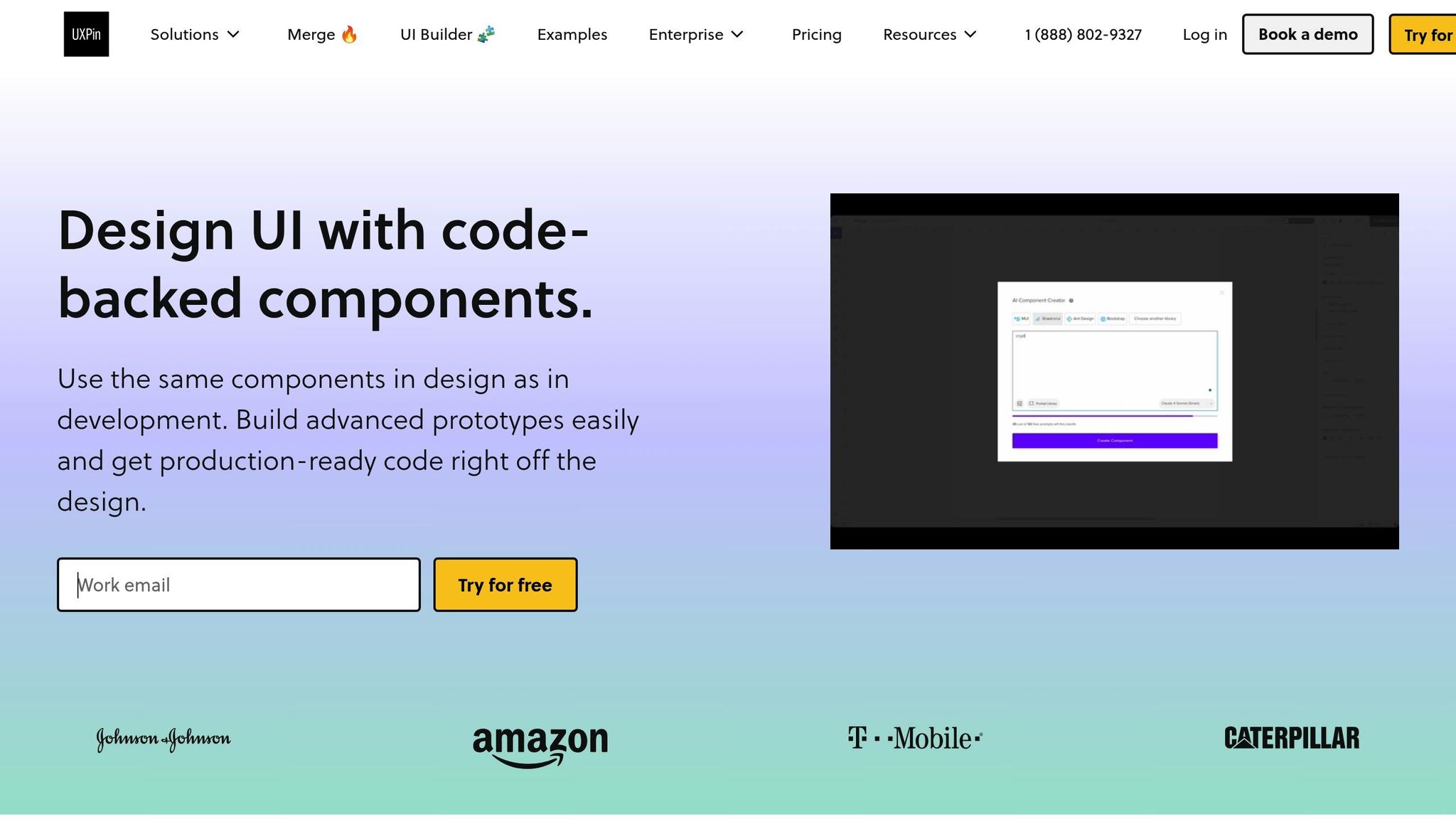
Once your environment is ready, UXPin takes things further by automating component styling with its integrated tools. The AI Component Creator feature, powered by OpenAI or Claude models, lets you generate code-backed layouts from simple text prompts. For example, you can type “a responsive pricing table with three tiers” and instantly get production-ready React components.
UXPin includes built-in React libraries like MUI, Tailwind UI, and Ant Design. This means you’re not just getting generic components but professionally designed elements that follow established design systems. You can also switch between these libraries or integrate custom Git repositories for brand-specific styling.
Brian Demchak, Sr. UX Designer at AAA Digital & Creative Services, highlights the benefits:
“As a full stack design team, UXPin Merge is our primary tool when designing user experiences. We have fully integrated our custom-built React Design System and can design with our coded components. It has increased our productivity, quality, and consistency, streamlining our testing of layouts and the developer handoff process.”
What makes UXPin stand out is its design-to-code workflow. After creating and styling components, you can export React code that’s ready for production, complete with dependencies. This code can be copied directly into your project, tested in tools like StackBlitz, or exported as a full project structure.
The platform also supports advanced interactions and real-time collaboration, allowing your team to work on AI-generated components together. Version history tracking ensures no progress is lost, while integrations with tools like Slack, Jira, and Storybook keep your workflow connected.
For teams looking to embrace AI-powered styling, UXPin’s Merge AI plan costs $39 per editor per month and provides everything needed to streamline component styling while maintaining design system consistency and high-quality code.
Step-by-Step Guide: Automating Component Styling with AI
Ready to dive into automating your component styling with AI? Here’s a clear walkthrough to help you turn your ideas into production-ready code.
Creating UI Components with AI
At the heart of AI-powered styling is the ability to generate components from prompts or images. Start by crafting a clear and detailed prompt. This allows the AI to interpret your design, map it to React components, and style it with tools like TailwindCSS.
For example, UXPin’s AI Component Creator simplifies this process. Through your dashboard, you can connect to AI models such as OpenAI or Claude. Use specific prompts like “a responsive pricing table with three tiers showing monthly and annual billing options” or “a user registration form with email validation and a password strength indicator.” The AI will then generate a layout complete with React code.
Here’s how it works: When creating something like a contact form, the AI produces JSX and CSS that usually only needs minor tweaks. In 2024, testing by Nextrope showed this approach significantly reduced development time compared to manual coding.
What’s great is that AI generates both the design and the React code simultaneously, removing the need to switch between design and coding tools. It captures design elements like spacing, typography, and color schemes while producing semantic HTML and responsive CSS classes.
For image-to-component conversion, you can upload a screenshot or mockup. The AI analyzes the visual structure, identifies interactive elements (like buttons or form fields), and transforms the design into functional React components. This is particularly useful for converting existing designs or adapting design system components into code.
The key to success here is writing precise prompts. Instead of something generic like “make a button”, try “create a primary CTA button with a blue background (#007bff), white text, 12px padding, rounded corners, and a hover state that darkens to #0056b3.” The more specific your prompt, the closer the AI’s output will align with your vision. These components then serve as a foundation for consistent themes and further refinements.
Applying Themes and Style Tokens
To ensure uniform branding, themes and design tokens play a crucial role. These tokens standardize elements like colors, spacing, and typography, ensuring a cohesive look across your UI.
AI makes it easier to apply design tokens automatically, especially for US-specific formatting needs. For instance, in financial apps, AI can enforce currency formats like $1,234.56, date formats such as MM/DD/YYYY (e.g., 12/31/2025), and proper number formatting with comma separators.
In UXPin, you can toggle between built-in themes from popular React libraries like MUI, Tailwind UI, and Ant Design. Each of these libraries uses its own design token system. For example, MUI organizes tokens into a theme object with palette, typography, and spacing scales, while Tailwind relies on utility classes grounded in design tokens.
Looking for advanced customization? Bit‘s Hope AI can generate fully branded UI component libraries from a single prompt. Teams can specify brand colors, typography, and spacing preferences, and the AI will create reusable components with consistent styling and documentation.
For custom branding, you can define a design token configuration that includes your specific color palette, font families, and spacing scales. AI tools will then apply these tokens consistently across all components. This is especially critical for US-based teams, where accessibility compliance (like meeting WCAG color contrast guidelines) is a priority.
Typically, you’ll define these tokens in a structured format (such as JSON or CSS custom properties) and instruct the AI to use them when generating or updating components. This ensures consistency – like a login form button using the same primary color and typography as a checkout button. Once themes are in place, you can move on to refining styles for better performance and accessibility.
Refining and Optimizing AI-Generated Styles
Once your components are generated and themed, fine-tuning ensures they meet production standards. AI can help identify and fix CSS issues like misalignments, responsiveness problems, and browser incompatibilities.
It’s important to review the generated markup for semantic HTML. AI might produce code that’s heavy on <div> elements and lacks proper accessibility attributes. Tools powered by AI can recommend improvements, such as adding ARIA labels, semantic HTML5 elements, and ensuring adequate color contrast. This is especially vital for US-based applications that must comply with ADA accessibility requirements.
Optimizing CSS is another area where AI can assist. It can transform styles into formats like Styled Components or TailwindCSS classes. For instance, a custom CSS button can be converted into Tailwind utility classes like bg-blue-500 text-white px-5 py-2 rounded transition-colors duration-300 hover:bg-blue-700.
For scalability, AI can suggest reusable classes, modular structures, and consistent design tokens. It might recommend splitting a large component into smaller, composable parts or consolidating repeated styles into utility classes .
Responsive design is another strength of AI. It can analyze components across different screen sizes and suggest adjustments for breakpoints, flexible layouts, and mobile-first approaches. This is especially useful in the US, where mobile usage patterns vary widely across demographics.
Performance optimization is also essential. AI can identify unused CSS, recommend more efficient selectors, and propose CSS-in-JS solutions to reduce bundle sizes. For React apps, this might involve converting inline styles into CSS modules or suggesting CSS variables for dynamic theming.
Finally, always test and validate the optimized code. AI can generate test cases to check for visual consistency, accessibility compliance, and cross-browser compatibility. This ensures your components function smoothly across the diverse browser landscape common in US enterprise environments.
While AI-generated code often needs some manual review, the time saved during the initial creation phase is substantial. Think of the AI output as a strong starting point that accelerates your workflow while maintaining quality.
sbb-itb-f6354c6
Best Practices for Consistent and Scalable AI Styling
Creating a framework that ensures consistent styling while scaling AI workflows is essential for maintaining quality and efficiency.
Using Design Tokens for Consistency
Design tokens act as the backbone for consistent styling across your product ecosystem. They centralize key design decisions – like colors, typography, and spacing – into a single source of truth, ensuring uniformity across all AI-generated components.
To make the most of design tokens in AI workflows, structure them into a three-level hierarchy:
- Primitive tokens: Base values like
#000000for black or16pxfor spacing. - Semantic tokens: Purpose-driven names such as
--color-brand-primaryor--spacing-medium. - Component-specific tokens: Tokens that reference the semantic layer, tailored for specific UI elements.
This hierarchy helps AI tools recognize relationships between styling choices. For instance, when creating a pricing table, the AI can apply your --color-brand-primary token to buttons and use a larger spacing token for section breaks – all automatically.
Take UXPin’s theme-switching capabilities as an example. Their platform allows users to switch between React libraries like MUI, Tailwind UI, and Ant Design, each with its own token system. When AI generates components, they inherit the active theme’s tokens, ensuring brand consistency without extra effort.
To maximize token usability, store them in machine-readable formats like JSON or YAML. This makes them accessible to both AI tools and developers. Include clear naming conventions, usage guidelines, and visual examples in your documentation. For example, define --spacing-medium: 16px for standard padding and show how it looks in practice.
By integrating these principles with documented styling patterns, you create a system that ensures consistency across all AI-generated designs.
Documenting and Reusing Styling Patterns
A strong token system is only part of the equation – documenting styling decisions is just as crucial. Proper documentation turns AI-generated components into reusable assets, reducing inconsistencies and saving time.
Your documentation should include three key elements: the original AI prompt, the generated output, and any refinements made manually. For example, when documenting an AI-generated navigation bar, include:
- The prompt used (e.g., “Create a responsive navigation with dropdown menus using Tailwind CSS”).
- The resulting code.
- Screenshots showing the component across different breakpoints.
- Notes on accessibility considerations.
Standardized prompt templates can also help maintain consistency. For example, a button template might read:
“Create a [size] [variant] button with [color] background, [text-color] text, [padding] padding, rounded corners, and a hover state that [hover-behavior]."
Additionally, track common AI mistakes and their solutions. If your AI tool frequently generates buttons without proper focus states, document the fix and include it in your review checklist. This shared knowledge prevents repeated errors and improves output quality.
Interactive tools like Storybook are great for documenting and testing patterns. They allow team members to view components in various states and contexts, making it easier to identify reuse opportunities and maintain consistency.
“As a full stack design team, UXPin Merge is our primary tool when designing user experiences. We have fully integrated our custom-built React Design System and can design with our coded components. It has increased our productivity, quality, and consistency, streamlining our testing of layouts and the developer handoff process.”
– Brian Demchak, Sr. UX Designer at AAA Digital & Creative Services
With a solid documentation system in place, the next step is to refine and validate AI-generated code.
Reviewing and Refining AI Output
Even with documented patterns and tokens, human review is essential to ensure AI-generated output meets production standards.
Start by comparing the AI’s output to original design specs or reference images. While automated tools can catch technical issues, human judgment is needed to evaluate design intent and user experience.
Accessibility is a key focus, particularly for US-based applications that must comply with ADA standards. Check that components meet contrast ratios, support keyboard navigation, and include proper ARIA labels. For example, ensure input fields have associated labels and error states are accessible to screen readers.
Cross-browser testing is another critical step. AI tools may not catch differences in how CSS properties like Grid or Flexbox render across browsers like Chrome, Safari, Firefox, and Edge. Similarly, test mobile responsiveness to confirm that breakpoints align with real-world usage patterns.
Code quality is just as important as design. Look for maintainable, efficient, and readable code. Avoid inline styles when possible, ensure proper naming conventions, and adhere to your team’s coding standards. AI often generates verbose code that can be optimized for better performance and readability.
Finally, define clear acceptance criteria for production-ready output. For instance, all interactive states should be fully implemented, and components must pass automated accessibility tests. Regularly audit your component library to consolidate duplicates and maintain a cohesive design system as AI scales your workflow.
Pros and Cons of AI in Component Styling
After exploring how AI automates component styling, it’s important to weigh its benefits against its challenges. This helps teams decide how best to integrate these tools into their workflows.
Key Benefits of AI Styling
Speed and Efficiency
AI dramatically speeds up component creation by automating tasks that used to take hours. For example, AI can turn screenshots into responsive code frameworks or translate designs into TailwindCSS-based React components. This frees developers to focus on more complex design challenges instead of routine styling.
AI also simplifies style conversions between frameworks, making transitions – like moving from traditional CSS to Styled Components or Tailwind CSS – faster and less prone to errors. When modernizing legacy codebases or adopting new frameworks, AI handles the tedious syntax work while maintaining visual consistency.
Consistency Across Designs
AI ensures consistency by automatically applying design tokens and patterns across components. When paired with platforms like UXPin, AI-generated components inherit theme tokens, maintaining brand alignment without extra manual effort.
It can also handle large-scale tasks, such as customizing entire UI libraries like Material UI or Radix UI. The result? Fully functional, documented components that match a brand’s identity, making it easier to manage design systems in larger organizations.
Less Repetitive Work
AI takes over repetitive tasks like generating UI animations or pinpointing CSS issues. This allows teams to iterate quickly and experiment with different styling approaches without spending excessive time on manual adjustments.
That said, while these advantages are compelling, there are challenges that teams must address to use AI effectively.
Limitations and Challenges
Quality and Accuracy Concerns
AI-generated code often includes errors that require developer intervention. Even with clear instructions, the output may not perfectly match the intended design. Developers frequently need to adjust spacing, alignment, and edge cases, as AI struggles with complex design contexts. Diagnosing and fixing CSS errors can add to the workload.
Dependence on Human Oversight
AI tools are not yet capable of fully understanding nuanced design requirements or brand-specific preferences. Developers must review the output to ensure it aligns with brand guidelines, meets accessibility standards, and functions correctly across devices. This involves verifying responsiveness, accessibility, and overall production quality – tasks that still require human expertise.
Challenges with Complex Designs
AI performs well with straightforward tasks but struggles with highly custom or intricate interfaces. Vague instructions often lead to errors, requiring significant corrections. Complex design systems can overwhelm current AI capabilities, making it essential for teams to create clear prompts and establish robust review processes.
Comparison Table: Pros and Cons
| Aspect | Benefits | Limitations |
|---|---|---|
| Development Speed | Reduces time for component creation; automates repetitive tasks | Requires manual review and corrections |
| Consistency | Enforces design system rules; applies design tokens automatically | May fall short on brand-specific nuances or accessibility standards |
| Scalability | Simplifies maintaining large component libraries; aids rapid prototyping | Struggles with custom or highly complex designs |
| Code Quality | Handles framework conversions; identifies CSS issues | Often needs optimization for performance and readability |
| Learning Curve | Less need for deep expertise in every CSS framework | Requires familiarity with AI tools and effective prompt writing |
| Workflow Integration | Supports continuous design-to-code workflows | Demands close collaboration between designers and developers |
To make the most of AI tools, teams need to understand these trade-offs. By combining AI’s efficiency with strong human oversight and quality control, it’s possible to maximize the benefits while minimizing the drawbacks.
Conclusion: Improving Styling with AI
AI takes the heavy lifting out of component styling, transforming what used to be a tedious manual task into a smooth, efficient process. For teams aiming to scale their design systems and boost productivity, the benefits of AI styling are hard to overlook. Let’s revisit the key takeaways.
Recap of Key Points
AI-powered styling accelerates the conversion of design visuals into responsive code and simplifies framework migrations. It can seamlessly transition styles between frameworks – like moving from CSS to Tailwind – and even generate complete UI components from simple text prompts. This automation frees up time for teams to focus on strategic design and enhancing the user experience.
For growing organizations, the scalability is a game-changer. AI can update entire component libraries, tailor frameworks like Material UI or Ant Design to align with brand guidelines, and even maintain documentation – tasks that otherwise demand significant manual effort as teams expand.
That said, AI styling isn’t a set-it-and-forget-it solution. Teams must implement quality control processes to ensure outputs meet accessibility standards and function well across various devices and browsers.
Next Steps for Designers and Developers
To get started, explore tools like UXPin’s AI Component Creator, which uses OpenAI and Claude models to generate production-ready React components. This platform enables you to create layouts with simple prompts and refine them using React libraries such as MUI, Tailwind UI, and Ant Design.
“When I used UXPin Merge, our engineering time was reduced by around 50%. Imagine how much money that saves across an enterprise-level organization with dozens of designers and hundreds of engineers.” – Larry Sawyer, Lead UX Designer
Begin by experimenting with straightforward components like forms, tables, or navigation menus before tackling more complex interfaces. UXPin’s code-backed approach ensures your designs translate directly into production-ready React code, eliminating the traditional handoff challenges between design and development teams.
Another tip: define your design tokens early. By setting rules for your brand’s colors, typography, and spacing, AI tools can automatically apply these elements, creating consistent and cohesive designs right from the start.
Investing in AI-powered styling tools delivers long-term value as your team grows. Platforms like UXPin handle routine component creation and maintenance, allowing designers and developers to focus on solving user challenges and crafting experiences that drive business success.
“As a full stack design team, UXPin Merge is our primary tool when designing user experiences. We have fully integrated our custom-built React Design System and can design with our coded components. It has increased our productivity, quality, and consistency, streamlining our testing of layouts and the developer handoff process.” – Brian Demchak, Sr. UX Designer, AAA Digital & Creative Services
FAQs
How does AI help ensure accessibility in component styling, and why is human oversight important?
AI has become a key tool in improving accessibility by analyzing design elements and offering style suggestions that meet accessibility standards, like ensuring proper color contrast and readable fonts. While it can streamline repetitive tasks and provide helpful insights, AI isn’t a complete substitute for human judgment. Designers and developers still need to review and refine AI-generated suggestions to ensure they align with specific user needs, contextual factors, and accessibility guidelines such as WCAG.
Human involvement is essential for tackling the subtler aspects of accessibility that AI might miss. This includes crafting designs that aren’t just technically compliant but are also intuitive and welcoming for a wide range of users. By pairing AI’s speed and analytical capabilities with human expertise, teams can create designs that are both accessible and user-friendly.
What are design tokens, and how do they help ensure consistency in AI-styled components?
Design tokens are like the building blocks of a design system. They hold the key details – colors, typography, spacing, and more – that define the look and feel of a user interface. Think of them as a central reference point, ensuring every component, whether styled by hand or through AI tools, stays consistent.
When design tokens are woven into AI-driven styling workflows, they bring both order and flexibility. For instance, if you need to tweak a primary color or adjust a font size, the change cascades across all components tied to those tokens. This not only saves time but also minimizes the risk of inconsistencies or errors.
How can teams use AI styling tools to improve their design and development workflows?
Teams can streamline their workflows by incorporating AI styling tools that integrate directly with code-backed components. These tools create a smooth collaboration between designers and developers, helping maintain consistency and efficiency throughout the product development process. For instance, AI can quickly generate elements like tables or forms based on simple prompts, which can then be tailored and reused as needed.
Leveraging AI-driven design tools allows teams to save time, cut down on repetitive tasks, and ensure a cohesive design-to-code workflow. This method not only improves productivity but also reduces the chances of errors or mismatched elements in the final product. For teams interested in building robust backend systems to support these design workflows, platforms like DreamFactory provide governed API access to enterprise data sources, enabling seamless integration between design systems and backend services.

