Design to React code – How UXPin Merge Speeds it up
Converting designs into functional React code is a pivotal step that often comes with challenges such as misinterpretation, inefficiency, and inconsistency. Emerging technologies like UXPin’s Merge aim to streamline this antiquated process by facilitating a code-to-design workflow, allowing you to design with React components.
Key takeaways:
- The traditional design-to-code workflow often results in lost design details, extended iteration cycles, and version inconsistencies.
- UXPin’s Merge technology offers a code-based design approach streamlining the transition from design to functional React code.
- Merge allows you to import React components directly into UXPin’s design editor for a more dynamic and interactive design experience.
- With UXPin’s Merge, changes to React components in the repository automatically sync, making maintenance and customization easier.
- The code-to-design workflow in UXPin provides both time efficiency and higher fidelity between the initial design and the final product.
Design with React code using an intuitive design interface and Merge technology. Discover UXPin Merge.

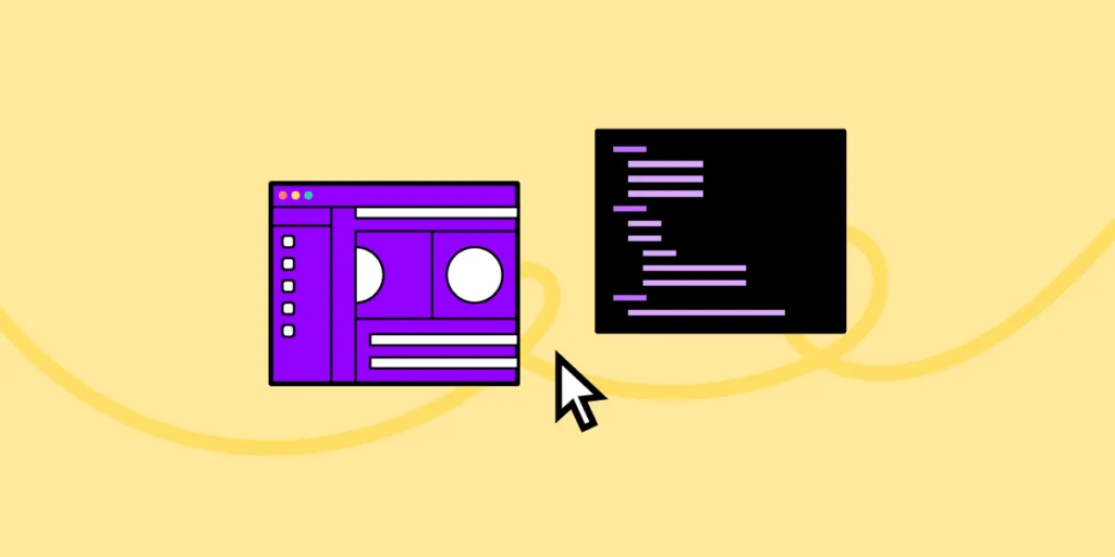
How Do You Convert Designs to React Code?
In the traditional product development workflow, designers craft mockups and prototypes, often using tools like Sketch or Figma. They then hand off these designs and documentation to developers who translate them into functional React code.
The handoff usually involves exporting designs into a standard format, perhaps annotated with extra details like dimensions, colors, and assets.
This process relies on designer/developer cooperation or a solo dev with both skill sets. Since it takes many years to develop competency in design and development, not many people choose to master both. There are other challenges.
What are the Challenges of Getting Design to React Code?

- Lost in Translation: Despite the best efforts, some design details often get lost or misinterpreted during the handoff.
- Iteration Lag: If the developer needs clarification or the designer needs to make changes, the iterative cycle elongates, wasting time and resources.
- Component Inconsistency: Without a shared language or toolset, designers and developers can end up creating their own versions of the same reusable components, leading to inconsistency.
- Static Designs: Traditional design tools often produce static mockups, not accounting for dynamic data and states, leaving gaps in the representation of the final product.
- Version Confusion: As design and code evolve, keeping track of the most current version becomes a nightmare.
Why we need a better alternative
The legacy workflow has its merits, but it’s far from optimal in a world where user experience can make or break a product. Add the component-centric architecture of React, and the room for error widens.
Here’s why we need a better alternative to the traditional design-to-code workflow:
- Time Efficiency: The traditional method extends project timelines. Shorter development cycles are not just a desire; they’re a need.
- Design Integrity: The fidelity of the final product to the initial design often gets compromised. A new approach can uphold the designer’s vision to the tee.
- Dynamic Reality: Today’s UI is interactive and data-driven. Static design handoffs can’t encapsulate this dynamic and interactive reality.
- Consistency: A consistent UI requires a single source of truth for designers and developers, which the traditional model lacks.
- Feedback Loop: Real-time collaboration can iron out issues on the fly instead of post facto corrections.
The traditional model also makes it challenging and time-consuming for solo devs to prototype and test. They must either learn a design tool or build, test, and iterate in code, adding significant time to the project.
Luckily, there is an alternative to this legacy design workflow where you can design using React code.
How Do You Design in React?
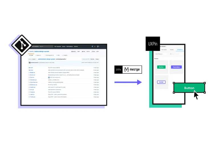
Wouldn’t it be easier to drag and drop UI components to prototype user interfaces instead of writing and editing React code? That’s precisely what UXPin’s Merge technology does.
Unlike Figma, Adobe XD, and other image-based UI design tools, UXPin is code-based, rendering HTML, CSS, and Javascript behind the scenes. This code-based technology means you can use code components on the design canvas in a no-code environment with Merge technology.
Merge lets you import React components from a repository into UXPin’s design editor. The UI elements appear in UXPin’s Design System Libraries for you to drag and drop for prototyping. You can edit styling and interactivity via the Properties Panel defined by the component’s React props.
How UXPin Merge helps you design with React code components
Devs can use the standard Properties Panel interface or switch to JSX mode for a more familiar code environment. Any changes you make to the React components in the repository automatically sync to UXPin, allowing you to update, maintain, and customize your UI elements, patterns, and templates.
This code-to-design workflow gives developers the best of both worlds–complete control over the codebase and repository with the simplified workflow of a design tool interface. Instead of editing code, devs can drag and drop to move components about the UI or make adjustments via the Properties Panel.
How to Connect Merge to Your Repository
UXPin offers two ways to sync a component library:
Git Integration (React only):
Direct connection to a React component repository (GitHub, GitLab, etc. ). We recommend the Git Integration because it gives you Merge’s features, including:
Storybook Integration
Connect any Storybook to UXPin, including React, Vue, Angular, Ember, and more. While you don’t get all the Merge features, Storybook offers many benefits, including addons and plugins for managing component libraries.
npm Integration and Merge Component Manager
You can also use the npm integration and Merge Component Manager to import individual UI elements from open-source design systems on the npm registry.
UXPin offers several built-in Merge design systems to start prototyping without any setup process, including Fluent UI (Git), Ant Design (npm integration), MUI (Git), Material UI (Storybook), or UXPin Boilerplate (Git).
How to Add React Components and Sync to UXPin Using Merge’s Git Integration
Once you have created a UXPin account and completed the onboarding process–request access to Merge–you can start setting up your repository using the Merge boilerplate repository.
Prerequisites for this step-by-step tutorial from UXPin’s docs:
- You have completed the Easy Start tutorial (request access to Merge).
- You’re familiar with HTML, CSS, and Javascript.
- You have at least a basic understanding of React.js.
Step 1: Run the dev environment
Start by running your Merge Dev environment. Execute npm start at the root, which runs the following script:
uxpin-merge –webpack-config ./webpack.config.js –wrapper ./src/UXPinWrapper/UXPinWrapper.js –uxpin-domain merge.uxpin.cloud
- –webpack-config: Specifies the webpack config location.
- –wrapper: Use if your React components need a wrapper, like a theme provider.
- –uxpin-domain: Points Merge to the correct server.
Step 2: Naming conventions
Maintain identical directory, filename, and component names.
- Example: ./src/NewComponent/NewComponent.js
Step 3: Export component
Ensure your component has an export default.
- Example: export default NewComponent;
Step 4: Define props
Use PropTypes or Flow for props definition (Typescript interfaces scheduled for release). They become editable in UXPin’s Properties Panel.
Step 5: JSX preset
Create a JSX preset file within a presets directory inside your component folder.
- Example: ./src/NewComponent/presets/0-default.jsx
Step 6: Update config
Finally, add the component to uxpin.config.js, located in the root directory.
Step 7: Restarting Merge
After adding new components, restart the Merge process by hitting CMD+C in the terminal. If you get a lifecycle error upon starting a new Merge process, type killall node -9 into the terminal and try again.
How the React Code to Design Works in UXPin
Once you have completed the initial setup, Merge will automatically sync any changes to UXPin’s Design System Libraries. Merge’s Version Control notifies you of the update, and you can choose when to switch to the latest release. Version Control also lets you change to earlier design system versions.
Setting up pages
Unlike traditional design tools using frames and artboards, UXPin uses a pages approach–a more familiar project structure for developers. You can add and manage your project’s pages in the Pages & Layers panel left of the design canvas. You can also view all pages to get an overview of your project file.
UXPin offers many standard page/screen sizes for desktop, TV, mobile (iOS, Windows, Android), tablet, wearables, and more. You can also create a custom viewport.
Designing with React code components
Drag and drop components onto the design canvas to create prototypes. Merge components “snap together” so you can create seamless layouts that look like a coded UI.
You can adjust the UI element’s properties via the Properties Panel and add Interactions for page transitions, animations, and microinteractions. UXPin offers Javascript-like Conditional Interactions with “if-then” and “if-else” conditions to create dynamic prototypes indistinguishable from code.
Any APIs, interactivity, or other properties you program in the repo are available in UXPin, allowing you to generate accurate replicas of the final product.
How to grow your component library with UXPin’s Patterns
With UXPin’s Patterns, you can evolve your design system by combining UI elements without writing code. You can use any Merge libraries imported using the Git or npm integrations–unfortunately, this feature is not available for Storybook.
Once you create a new pattern, you can save it to your Pattern’s library and share it with team members. This feature allows you to prototype and test comprehensively before committing the UI element to code, saving countless hours of fixes and front-end debt.
Patterns also lets you:
- Save multiple variants of a pattern to optimize prototyping workflows.
- Design with advanced components–even if they are not in your design library.
Design to code faster
Designing with React components creates a smooth, seamless transition from the design process to development. Simply import the component library to your project and copy the layouts from UXPin. Merge produces production-ready JSX to copy/paste from UXPin’s Spec Mode to your IDE.
Use Case: How Code to Design Simplifies Design for Non-Designers
TeamPassword is a five-person startup with two developers and no designers. The development team switched to React in 2022 and adopted a custom version of MUI. TeamPassword’s engineers use Merge to sync their UI library to UXPin for prototyping and testing.
Merge enables TeamPassword to ship products and features much faster with higher consistency and fewer errors, giving them an edge in the highly competitive security tech market. They have also eliminated drift because they use the same components for design and development, similar to how startups leverage no-code platforms like Adalo to accelerate app development without heavy engineering resources.
“Brand is essential in this market. Customers entrust us with sensitive information in their login records. Inconsistencies or an outdated design can cause some customers to question whether we are technologically up-to-date enough to keep that information secure. Front-end development builds trust and confidence in the backend performance.” Tony Caccavo, Director of Operations at TeamPassword
Ditch design to code and switch to UXPin’s code-to-design workflow to prototype and test faster. Visit our Merge page for more details and how to request access.


