13 ways to make your UI writing better
Building trust with the help of writing and making your UI more intuitive is very possible. There are some things you should avoid and others that you must follow. Here’s how to make your UI more intuitive with your writing.

1. Avoid Using Jargons and Specific Terms
Not all of your users know what those specific terms mean. At the same time, jargons are not a great substitute either. Both terms and jargons can be overwhelming to your readers when they don’t understand their meanings.
Always strive to avoid both of these to avoid miscommunication. Choose words that are easy to understand. Remember: you are writing for a wide audience. This means that you have to get through to every visitor of your website.
2. Get to the Point and Make It Concise
There is no need in making your content overly long either. Make sure you check out 3 Psychology Principles Web Designers Must Know to better understand why as these principles are useful both to web designers and to writers.
More often than not, you don’t have to include every single detail as Internet users can usually figure out what’s what. If they want to know more, they will explore features individually one step at a time. Ask yourself whether or not your users need to know what you are about to write.
3. Use Simpler Words and Sentence Structure
Using simpler words including less complicated grammar can help your UI become more intuitive. It doesn’t matter which tense you use – either past or future – as long as you use simple forms.
At the same time, refrain from using absolute forms. Don’t promise anything big and don’t boast. Explain the features of your product without excessive pride and try to be as realistic as possible. You don’t want to raise your readers’ expectations too high.
4. Specify the Gender When Possible
This may seem like a really small and unimportant detail, but specifying the gender when it is possible can make a big difference. Use either or “her” or “his” depending on the user. Even though English allows gender ambiguity (by using “they”), it is still a good idea to be more specific. This is especially true for when you are using a different language.
5. Don’t Mix Pronouns in the Same Sentence
Don’t use “you” and “your” with “me” and “my” in the same sentence. It is very confusing and can throw off your readers. Try to avoid using them in the same context when addressing the user. For example, instead of saying “Change your preferences in My Account”, use “Change preferences in My Account”.
6. Avoid Exclamations and Refrain from Using Idioms
[videojs_video url=”https://www.uxpin.com/studio/wp-content/uploads/2019/10/Blog_Exclamations_1200.mp4″ controls=”false” autoplay=”true” loop=”true” muted=”true”]
Exclamations are not very widespread which means that when you use them, they can come off as shouting. Try to avoid them as much as possible, so that you don’t sound rude or pushy to your audience.
Moreover, refrain from using idioms. Not all of your users know English perfectly, so it would be very hard for them to understand what you meant by a certain phrase. Besides, finding a corresponding phrase in a different language is very hard when you are translating your website.
7. Use Tools for Writing and Editing Your UI
Writing and editing your UI must not be overlooked as it is an integral part of the whole process. Here are some great tools to help you:
#1 Hemingway Editor and Readable – Making your content more readable is essential for your audience to understand it easier.
#2 Trust My Paper and Grab My Essay – Sometimes you won’t have time to write the content you need. Use these online writing services to help you.
#3 Focus Writer and Google Docs – A good word processor can be a lifesaver with all its features for editing and formatting.
#4 Studicus and GrammarIn – Proofreading is just as important, so make sure your text doesn’t have any grammar, spelling, and punctuation mistakes.
8. Make the Error Messages More Specific
Making your error messages as clear as possible is essential for your users to be able to complete the actions they want to make. Think of such questions as:
- What happened and why it happened?
- Why was there an error and what went wrong exactly?
- How can the user fix this issue?
- What are the specific actions that the user must make?
You must explain to the user what is wrong and how they can overcome. It is a part of a great UI just like everything else.
9. Use Numerals and Capitalize Necessary Letters
[videojs_video url=”https://www.uxpin.com/studio/wp-content/uploads/2019/10/Blog_Capitalize_1200.mp4″ controls=”false” autoplay=”true” loop=”true” muted=”true”]
Using numerals instead of words does not only save you space but also makes it easier for your users to read the content. The point is to make the experience of your users as comfortable and enjoyable as possible and numerals can help a lot.
Don’t capitalize every single letter. Such text is much harder to read, so refrain from using it even in headings, menu items, and titles. There are some exceptions, of course, such as logos or acronyms, but all other times do not require all caps.
10. Stop Accusing Users With or Without a Reason
Of course, users will make mistakes – it’s inevitable. But you shouldn’t blame them for this as you will definitely come off as rude, mean, or something similar to that.
Instead, write more neutral messages that will not have any charges for the issue. You aim to focus on the user rather than focusing on the issue itself. If you can manage that, you will be able to stop accusing users with or without a reason.
11. Avoid Common Phrases and Simplify Sentences
As mentioned earlier, simplifying the way you write can make your UI way more intuitive. For example, if you check out tips about content style guides, you will have a better understanding of this rule.
You must speak a simple language that is easy to understand. Avoid using common phrases like “to”, “you should”, and so on. Such words only take up space and sound very awkward.
12. Don’t Ask About Sureness Yet Again
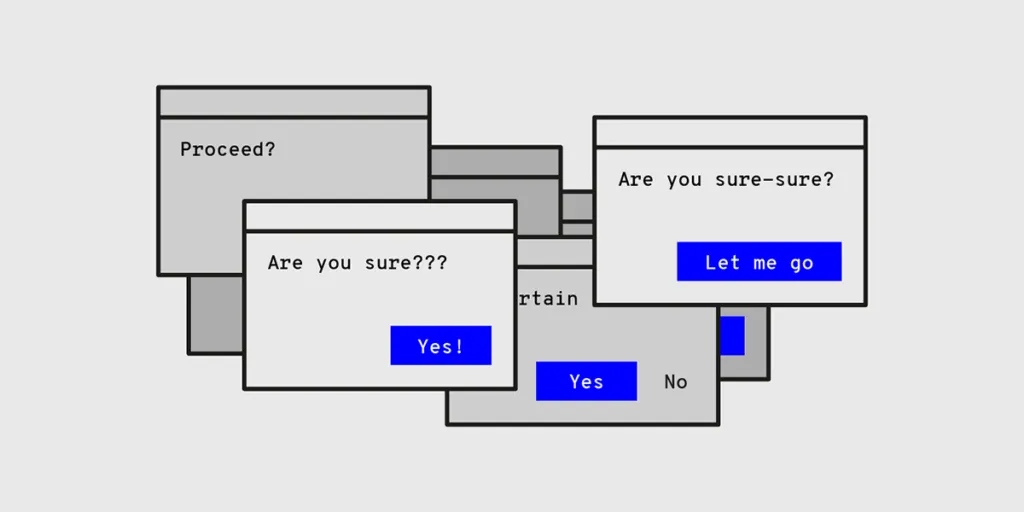
This is simply unnecessary. You don’t need to ask for sureness again and again. This includes anything from “Are you sure?” to “Do you want to proceed?” questions. They don’t add any value to the request and are usually fundamentally useless.
13. Name the Buttons with Their Respective Actions
This is very similar to the rule about unclear error messages. Instead of using “OK” in dialogs, it is better to stick to using the name of the respective actions. You not only have to ask what your users want to do but also make it clear what they can do.
The “OK” button is a standard and seems obvious for many dialogues. However, you can still use other options instead. After all, you aim to make your UI intuitive rather than stick to something conventional.
If you want to learn more about UX and UI writing we encourage you to give a listen to our podcast with Yuval Keshtcher:
Final Thoughts
To sum up, making your UI more intuitive with the help of writing is possible as long as you are willing to dedicate time to it. Follow the tips in this article and avoid mistakes. If you do this, you will be able to create an intuitive user interface.

