Way before I started the UX Writing Hub, I was a Lego fanatic.
If your childhood was anything like mine, legos were a part of it. I’d say on average, my household acquired about one new set per year. So by the time I was 8 or 9, we’d developed a nice sized “lego pile.” You know what I’m talking about, a massive jumble of Lego sets that you could use to build pretty much anything you could think of.

The funny thing about that pile was how it lacked consistency; one day it was pirates on a spaceship, and the next it was a medieval knight riding a T-Rex. Hey, it was the ‘90s—all bets were off.
Fast forward to when I joined a product team in a collaborative app for musicians at a Tel Aviv start-up. As soon as I started getting familiar with the product, I noticed huge inconsistencies with its look and feel—pirates on spaceships all over the place.

Luckily, I had recently learned about the perfect solution that I knew we had to implement. We decided to create a design system.
What is a Design System?
Design system is a collection of UI elements and instructions for their use. This includes things like color schemes, fonts & typography, and general style. It may even outline how the product should behave in different scenarios.
Imagine a big company with several digital products spread out across dozens of product teams. Now, imagine that every product team gets their own lego set with its own instructions. What do you get? Chaos. No consistency across the products—lego zoo animals driving lego race cars. Now imagine that all the design teams have access to the same super set of legos with a shared set of instructions.

But designs systems don’t stop at just graphical elements. They can also include code for these reusable parts which make life easier for the developers as well. I don’t want to get too technical here, but design systems are an awesome way to promote efficiency and consistency inside of a product team.
Two of the most well-known examples of design systems are Google’s Material Design and Shopify’s Polaris. I know what you’re thinking: “Do all design systems have cool, futuristic names?” Well, IBM’s Carbon seems to be continuing that trend, so I guess that’s a thing.

But even more recently we’re starting to see another trend. As more and more companies are becoming aware of the need for a set of guidelines for visual design, some are also creating them for the product’s content as well.
So if a design system’s UI libraries keep the visual design consistent, what keeps a product’s voice and tone consistent? Meet the content style guide.
Content Style Guides as Part of a Design System
OK, here comes the wonky definition. A content style guide is a set of writing principles that inform all of the copy and content of a company’s products. They establish rules and guidelines for copy that help bring consistency to the product’s voice and help shape the brand’s personality.
They’re important because content is important—as important as the visuals. Just have a look at Dropbox’s homepage sans real content.
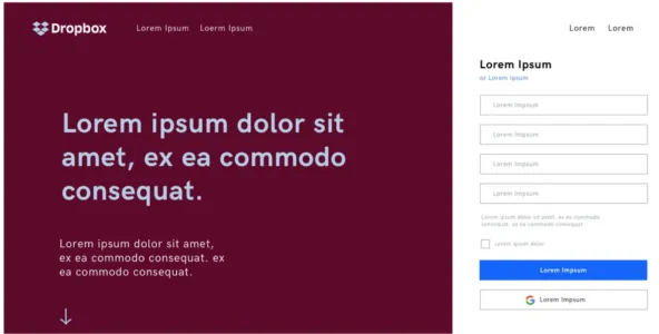
Like mentioned before in the UX Writing Hub’ newsletter, without content, the visuals do you no good. So why have more companies adopted a visual design system than one for content? It seems to be a matter of awareness.
However, there are now several forward-thinking companies that have created content style guides. The most famous one is probably Mailchimp’s but actually, Material Design and Polaris also have content style guides.
These guides include things like the voice and tone of the product, naming conventions, vocabulary, and more.
A content style guide may elaborate upon all of the content elements in a company (content marketing included) or may be oriented solely toward product writing. It depends on the team of writers and product designers to make decisions about what the guide should include. And of course, style guides are continuously being updated; they’re never really “done.”
Structure of a content style guide
So here comes the million-dollar question. How does one actually create a content style guide? Unfortunately, there isn’t a single, simple solution. After interviewing dozens of product teams, I learned that every company used a different approach to create theirs.
So while there’s no cookie-cutter for creating them, there are plenty of open-source style guides out there that we can take inspiration from. Here’s a collection of some of the very best content style guides out there.
Still, just looking at some existing guides isn’t going to do the trick. The best way to kick-start a content style guide is with your existing content. Look at the content elements of the product and analyze what you already have. If a team is going to start building a library of UI elements, they’ll start with what they have. They take a standard button from the design and describe it in the library; its color, size, font, radius, etc.
We can do the same with content. Look at the texts of your CTAs, empty states, and other content elements. Once you’ve cataloged major types of content, you can then add guidelines about them. For example, a CTA should be of a certain length, or what you want to communicate in your headlines. After this, use these four steps to give structure to your style guide.
1. Preamble
An excellent first step to take is to articulate exactly what this content style guide is for—what we hope to achieve by creating and using it. A brief statement detailing the goal of the content style guide should suffice. You can also include information about the company’s vision, including how business goals align with the needs of the end-user.
This is important because style guides, though created by the UX writers, should be used by anyone creating content for the product. That could include copywriters, marketers, designers, and perhaps even developers. Now, Bobby on the Dev team might have a way with code, but less so with words. Help him out.
2. Voice and Tone
This is one of the most important aspects of the guide as it as such far-reaching influence; every word inside an interface should match the product’s voice, which must be clearly described in the guide. So how is this done?
Again, it varies. One approach is to think of your product as if it were a person or even a fictional character. Once you’ve figured out who they are, try to imagine how they speak and what they’re like. Is that person confident, funny, serious? If we personify our product or brand, it becomes easier to understand how it will interact with our users, which is important.
Today’s successful digital products give their users an experience that feels like natural human interaction. If the user feels like they’re talking to a robot, that’s a bad experience. Though the day may come when writers will need to write the narratives for actual robots ala HBO’s Westworld, in the meantime it’s important to give your interface a personality, whether it’s a chatbot or just the content on flat UI.
Speaking of chatbots, here’s a cool example by IBM of a content style guide specifically for chatbots.
One last note about voice and tone. It’s helpful to make a distinction between the two with voice being the general style and permanent characteristics and tone being how those characteristics manifest in different scenarios.
For example, a product might have a voice that is funny and light-hearted, but when that voice is in a serious situation, it can still be clear and to the point. Think about the Robin Williams’ genie from Aladdin—whimsical and witty, but still sounds like Genie even when he’s serious or sad.
3. Do’s and Don’ts
Part of having a style guide is having a clear set of rules. This means that, when creating a content style guide, you need to know what your product is and what it isn’t.
Any time you give an example of grammar, vocabulary, naming conventions, or even documentation. Don’t forget to add do’s and don’t. Bobby will be forever grateful.
4. Accessibility
Unfortunately, accessibility is an issue that many companies are still not taking seriously. It’s almost 2020 and a blind man still can’t order Domino’s Pizza, which is sad and unnecessary.
Even though regulators tried to do something about it, not enough attention is given to this topic. This means that writers have an opportunity to take leadership in this area. They can be eyes for the blind and guide them through the platform using content and text.
So, in order to create a consistent experience that is accessible to all, accessibility practices should be documented in the content style guide as well. For example, you can decide that transcripts will be created for all videos using a tool such as REV.
The coolest project I’ve seen about content accessibility guidelines is by Content Design London. It’s an open-source project that helps everyone to create accessibility and readability rulesets. It’s well worth a read.
Now It’s Your Turn
The first step you need to do before creating a content style guide, would be to join the UX Writing Hub’s free UX Writing course if you want to learn more about the role of the UX writer as a product designer.
Now, let’s say that day has come and you’re ready to start on your very own content style guide. Remember:
First, find the common ground between the content elements of your product. Then, write a brief preamble where you state the goals and purpose of the guide. Next, define the voice and tone, create a ruleset of the do’s and don’ts, and don’t forget to make it accessible.
At first, it may be difficult to find all of the right pieces, but once you get the hang of it, it’ll be easy as legos.

