10 Error 404 Page Examples for UX Design

These 404 page examples show how designers can turn a simple computing error into a branded user experience (UX).
The earliest models of personal computers had 64k RAM or less. Programmers needed to keep things simple. They developed a classification system for program functions. Input errors got assigned to class 400.
There are four class 400 input errors.
- 400 Bad Request. The input is in the wrong syntax.
- 401 Unauthorized. The user cannot access without a username and password.
- 403 Forbidden. The user doesn’t have permission to access the file.
- 404 Not Found. The user entered or linked to a URL that doesn’t exist.
In the old days, users had to type in the exact URL. For example, If you wanted to visit Yahoo Finance, you had to type in the full URL address: http://www.finance.yahoo.com
If you “fat-fingered” the keyboard while entering the URL, you’d get an error code 400 or 404.
Nowadays, browsers let you enter an abbreviated address like www.finance.yahoo.com or even finance.yahoo.com. In fact, if you enter the full address in the search bar with the syntax in the example above, the browser will redirect you.
Why? Because it’s an old syntax using HTTP. The updated site is a more secure URL using HTTPS. The latest browsers automatically make the correction.
The 404 error is now a landing page where you can encourage users to continue using your website. Your 404 page design should keep the user from leaving.
Some elements you’d use might be:
- Hyperlinks to the home page and other useful pages.
- A search bar.
- Graphic elements that reflect the site’s brand.
- A brief message to the user in the brand voice.
In these 404 page examples, we’ll look at how different brands use these UX elements.
404 page examples: homepage link
UXPin
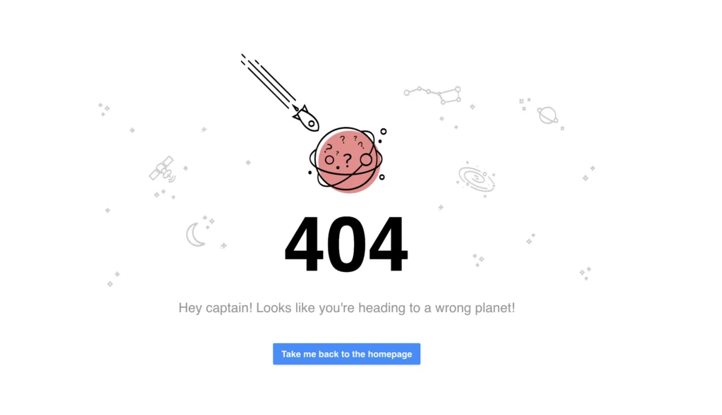
We’ll look at our own 404 page first.
As you can see, we like simplicity. We have lots of white space around outer-space-themed graphics. The message is simple, “Hey, Captain! Looks like you’re heading to a wrong planet!”
We include a call-to-action (CTA) button that takes the user back to the home page.
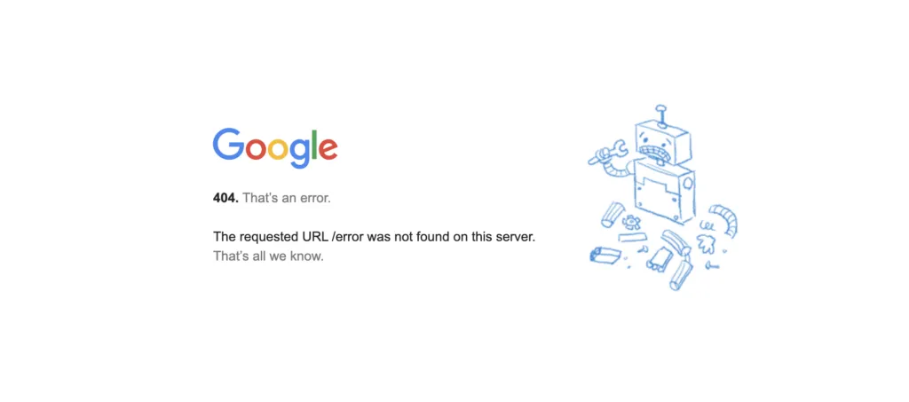
Google’s 404 page is also very simple and has lots of white space.
“The requested URL was not found on this server. That’s all we know.”
The broken-robot graphic reflects their high-tech brand. There’s no CTA, and you only discover that the Google logo is a link back to the home page if you mouseover.
A lot of UX writers will tell you that leaving out a CTA is a big no-no, and in most cases it is. Remember, you want visitors to keep using your site.
Google is an exception because they know their visitors will always come back.
404 page examples: useful page links
Angi
Formerly HomeAdvisor, this home services contractor site has a lot of links to other useful pages.
The message to the user is straightforward:
“Yikes, this is awkward…
“The page you’re looking for appears to have been moved, deleted, or doesn’t exist. We apologize for the inconveniences.”
The CTA is a list of links to suggested pages.
In the header, you also have links to home service types and blog posts.
The footer has links to find services in major metropolitan areas like New York, Chicago, Los Angeles, and Dallas. Other useful links are in the footer as well.
Angi keeps everything “above the fold.” That is, you don’t have to scroll to get to any of the links.
Starbucks
In Starbuck’s 404 the image of a coffee ring where there used to be a cup stands as a metaphor for a page that’s not there.
It offers an explanation of what might have gone wrong and some suggestions about what to do next.
It has a link where visitors can report broken links.
Glassdoor.com
Taking look at Glassdoor’s 404 page, the popular jobs board suggests several actions.
- Search for jobs.
- Read employee reviews of companies.
- View employee salaries.
- See interview questions and answers.
- Look up rankings of best places to work.
404 page examples: graphics focused
eBay
A photo of a child wearing a winter coat with the hood pulled over his eyes is the focal point of eBay’s 404 page.
“We looked everywhere.”
“Looks like this page is missing. If you still need help, visit our help pages.”
Below is a CTA button taking the visitor to eBay’s home page.
The bottom of the page contains a scroll box with trending deals.
Lego
When you land on this 404 page, you see Emmet from The Lego Movie. He’s quoted as saying, “Everything is still awesome.”
404 page examples: rotating elements
Amazon.com
Amazon’s 404 page features the search bar at the top the message suggests a search or clicking the homepage link. It has a photo of one of the “dogs of Amazon.” It links to an Amazon news page about Amazon’s dog-friendly workplace.
If you refresh the page, an image of a different Amazon dog appears. Refresh several times and you’ll see many random dog photos. We don’t know how many they have for the 404 page, but more than 7,000 dogs “work” for Amazon.
Marvel Comics
Like Amazon, Marvel rotates multiple versions of its 404 page. They show images from the Marvel Comics universe with messages like:
- “Protocol missing… Exiting program…”
- “Hydra is currently attacking this page!”
- “$#&%, you just broke something! Just kidding.”
- “Not even the eye of Nuatu sees your request.”
- “Hydra has stolen this page from the S.H.I.E.L.D. database!”
IMDB
Another rotating 404 page from the International Movie Database (IMDB). They stay on brand and offer familiarity to their fans by offering up movie quotes.
- “Webpages? Where we’re going we don’t need webpages.” – Dr. Emmett Brown, Back to the Future.
- “Someday we’ll find it… the website connection.” – Kermit the Frog, The Muppet Movie.
- “Surely, you can’t be serious.” “I am serious. And don’t call me Shirley.” –Ted Striker and Rummack, Airplane.
- “What we’ve got here… is a failure to communicate.” – Captain, Cool Hand Luke.
- “Page not found? INCONCEIVABLE!” – Vizzini, The Princess Bride.
- “I’ve got a feeling we’re not in Kansas anymore.” – Dorothy, The Wizard of Oz.
Prototype Your 404 Page in UXPin
UXPin is a full-stack UX/UI design program that gives you the tools to take any project from concept to product launch in a single app.
When designing a 404 page, you can share with collaborators and stakeholders in real-time straight from the platform. They can add their comments to make iterations smoother, instead of lots of back-and-forth emails. Start your free trial today.

