5 Things to Know about Light and Dark UI

“Should I go for the dark theme that might make my app look more cool and trendy, or should I choose the white one? Choosing the right interface for your product can be insanely tricky at times. And every time I try to figure out what’s the thinking behind it; my curiosity raises. To kick off this process, – Here’s the kicker…”
“Many times I feel DUMB because I don’t even know where to get started.”
“People often get on my nerves when it comes to learning code; I really don’t wish to.”
“Being born with NO design talent whatsoever! I exactly know it when I see something nice, but when it comes to designing ANYTHING from scratch I am clueless.”
“I’m WAY too busy with other things in life so I am looking for a web design software that’s easy to use, and can make my website look good.”
All these thoughts seem so scary, aren’t they? Now tell me something – are you someone who is probably feeling a bit lost while looking for a good web design software? Fret not buddy, here you will learn how to build a website that people won’t laugh at. For those without design experience or coding knowledge, tools like Adalo make it possible to design and build database-driven apps visually without writing a single line of code. Also, building your first website doesn’t have to be so scary. So, sit back, relax, grab a cup of coffee, and read away.
As soon as you start designing a new project, one of the first considerations you need to think through is choosing a relevant color scheme for the user interface. It’s important because the color scheme will have a long-lasting impact on the overall user experience of your product. Let’s say, for example, UI is what the car looks like, UX is how it drives or imagine UI as a dating profile, UX is how the date goes — getting Goosebumps already! The point is, UI is much more than a coat of paint that features an entire environment, a multi-faceted construct where everything counts starting from color theory to layout, font selection, smallest elements like every single pixel.
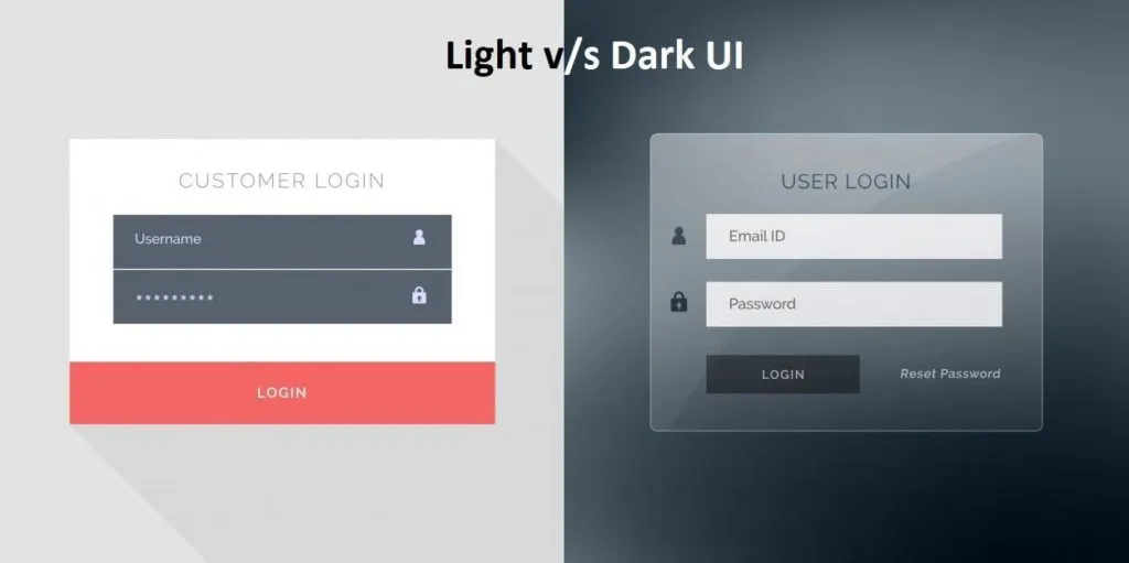
And here the confusion begins. As an endless flow of choices surrounds us all, we often end up thinking. What’s better, a light-based user interface or a darker one? Or should we let data drive decision-making or simply rely on assumptions or personal preferences? More often than not, there is no cookie-cutter answer to any such decision; it is mainly based on personal preferences and assumptions rather than solid data. In my eyes, anything claimed or predicted without any facts or figures is useless. Further below, I would like to shed some light on certain factors influencing the choice of the color scheme.
Readability and Legibility – Let me explain the point scientifically. I am sure you will agree that the sun, planets, and other bodies emit electromagnetic energy of different wavelengths? A portion of that spectrum is visible to the human eye; of course, depending on the wavelength or the color of that light. For example, a clear sky is blue because clean air scatters blue light wavelengths more than red ones.
In addition to this, wavelengths can boost our levels of attention, mood, and reaction time during the day. It’s a different story at night, though. And that’s the reason why e-book services, such as Google Play Books, introduce features such as “Night Light” for reading.
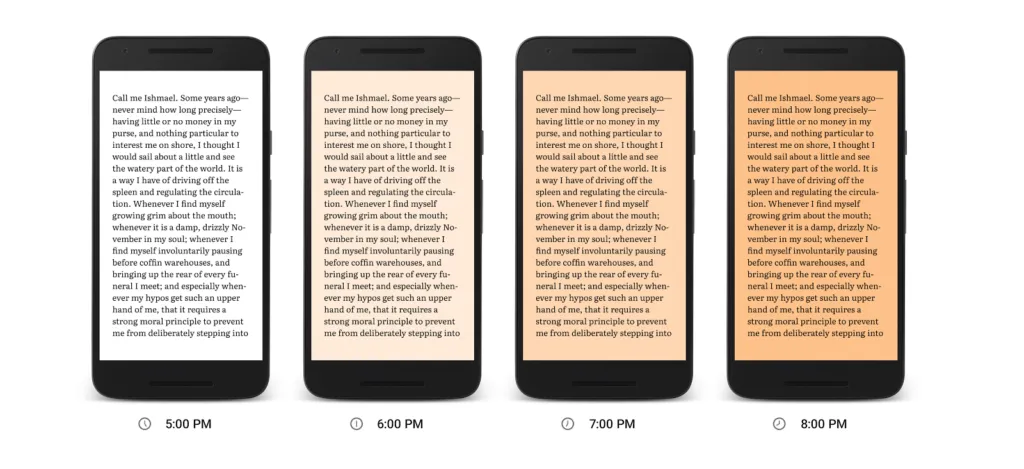
Another aspect that has been widely used across the globe is dark text on a light background. This was all for readability; for legibility you need to know what it means. It measures how quickly and intuitively users can distinguish letters in a particular typeface. This aspect must be taken into consideration, especially when the interface is filled with a lot of text. For example, black copy shown on white or light background seems to be larger than the white copy on a dark background. In any case, if the user is unable to scan the data, even more — even if the data is relevant but not readable nothing can stop from switching towards your competitor. However, it certainly does not mean that interfaces with a light background are more readable. So what you can do is use colors with high contrast between the text and the background.
Accessibility – While creating a theme, keeping the contrast between the background, text colors, font size, and other accessibility factors is extremely important. After all, you are creating a project for people who aren’t YOU, but for a broad range of users. To be precise, something that might have worked for one user might not work for another; a younger audience has different needs and preferences than an older audience. Apart from age, special needs, or disabilities, all of these can also determine the choice of color for the background and layout elements. Here the keyword is to research well to get closer to the target audience.
Clarity – in a general sense it is defined as the ability to see and distinguish all the core details on the screen or page. Let’s take simplicity and intuitiveness of navigation for starters; if your end-user can easily find zones of information and elements of interaction just by scanning the layout, he or she doesn’t need to put much effort in getting what they are looking for. In case the aspect is not tested properly; it might lead to weak visual hierarchy ending up in a complete mess. So what you are required to do is to check if the interface is clear and contrasted enough. In the end, everything has to be easily reached and noticeable.

Responsiveness – In layman’s word, the responsiveness of the interface means that what users get is usable and functional irrespective of the device they prefer using. For example, if something which looked stylish and appealing in Sketch on a high-res professional monitor may turn into a dirty stain on the small resolution screen. I am sure you must have encountered a situation where some color schemes looking nice at the design stage may lose their beauty in a variety of everyday conditions they are applied in. Provided the fact that a color scheme can have a significant impact on color, shape, and copy perceptions, one should test project on diverse devices and screens before making the final decision.
Environment – Last but certainly not least, is a question in which environments these web and mobile interfaces will be used. For example, for constant use under natural light, a dark background can literally create the effect of reflection, especially on glossy screens typical for tablets and smartphones. In a bad environment, a dark background can take the light away from the screen leading to bad influence on navigation and readability. In a nutshell, color combinations, contrast, and shades draw big attention here.
When to use dark UI?
- When there is little text to read and more images/videos to watch
- When there are very few elements in the design and are spaced well
- When you want to give your users the feel of a dark environment like in a movie
- When you want the core element of the page to stand out and gain prominence
- When you want to reduce eye strain and make it comfortable for users to stay long in your website
When to use light UI?
- When your website or app will be used mostly in the daytime
- When your readers will be reading a lot of text
- When there are a lot of elements on the screens
- When you are using different color elements
Over to You!
Designing is all about creativity! Let’s not rules bind it in fact, come up with something that boosts user experience and realize business objectives. Just go for it!
About the Author:
Olivia Diaz is working at eTatvaSoft.com, an Enterprise level Web & Mobile Application Development Company. Being a tech geek, she keeps a close watch over the industry focusing on the latest technology news and gadgets. Visit here for more details about the company.

