What is Aesthetic-Usability Effect?

The aesthetic–usability effect gives UX designers fascinating insights into human behavior and why they must avoid prioritizing usability over visual appeal. Striking the right balance between form and function plays an important role in building a successful product.
A digital product’s aesthetics is the primary driver to entice users, while good user experience and usability retain customers. Apple is a fantastic example of this theory in practice. Apple’s products look sleek and attractive and deliver an exceptional user experience.
Even with Apple’s myriad of issues, including broken cables, terrible customer service, and mediocre product releases, Apple customers are loyal and quick to forgive–the aesthetic–usability effect might be one way to explain this loyalty.
Enhance prototyping and testing with the world’s most advanced design tool. Sign up for a free trial, and design user experiences your customers will love with UXPin.

What is the Aesthetic-Usability Effect?
The aesthetic-usability effect is a psychological occurrence discovered by researchers Masaaki Kurosu and Kaori Kashimura, studying human-computer interaction (HCI) at the Hitachi Design Center in the 90s. Studies found that humans perceived aesthetically-pleasing products with usability problems as more usable than better-performing ones with less appealing visual design aesthetics.
Before prioritizing form over function for your next redesign, it’s crucial to note that the aesthetic-usability effect works on first impressions. As users use a product more, the usability issues (and even aesthetics) become annoying and frustrating.
The aesthetic-usability effect is also limited to minor usability issues–problems that aren’t obvious to users when they first use the product. If your app crashes, takes too long to load, has broken links, or has other frustrating problems, the aesthetic-usability effect probably won’t help.
Don Norman’s Nielsen Norman Group (NN Group) notes a study where users initially found the beautiful hero image on a website appealing, only to revise their opinion to “annoying” the second time when they battled to navigate and complete tasks.
Designers must also consider that beauty is subjective across cultures and demographics. Color schemes, typography, words, symbols, and other UI elements carry different meanings to various user groups. For example, a Korean user might perceive a UI as less appealing to someone in the United States.
The key takeaway is the aesthetic-usability effect works to entice users but won’t retain them if the product is difficult to use. Designers must use UX research to determine what users consider aesthetically pleasing.
Cognitive Style & The Aesthetic-Usability Effect
Humans fall into two cognitive style orthogonal dimensions:
- Verbalizers: more influenced by words or verbal associations
- Imagers: more influenced by images and aesthetics
A 1999 study on these two groups found that, interestingly, “user preference was significantly different between imagers and verbalizers, but that of the usability factor was not.”
Why Are Aesthetics Important for Interface Design?
As we see from the aesthetic-usability effect, great usability is not enough to entice people to use your product or even like it when it performs well. Finding a balance between form and function is crucial for product design, especially for startups or businesses entering a new market.
Competitive advantage
The first thing the aesthetic-usability effect tells us is that visually-appealing products and UI design provide a competitive advantage. Products that look great and perform well have a better chance of attracting new customers.
More tolerant users
Another key insight from the Hitachi Design Center’s study is that users are more tolerant of beautiful design. As long as you’re making a conscious effort to fix usability problems and communicating this to customers, they’re less likely to abandon your product–but don’t count on this retention lasting!
Positive affect
A 1999 study, A Neuropsychological Theory of Positive Affect and Its Influence on Cognition, found that “Positive affect systematically influences performance on many cognitive tasks,” including positively impacting “memories, working memory, and creative problem-solving.”
This “affect” could explain why users are more forgiving of usability issues when experiencing positive feelings toward a beautiful user interface. If designers solve these usability issues, they can leverage the aesthetic-usability effect and positive attitudes to enhance a product’s usability, creating a positive holistic user experience.
The Aesthetic-Usability Effect & User Testing
Designers must be mindful of the aesthetic-usability effect during user testing because it can bias the results. As we saw with the NN Group’s website study example, a user’s first impression was positive but changed the second time they used it.
Designers must observe user behavior carefully during testing because someone’s feedback might be positive, but they struggled at certain moments while completing tasks.
An NN Group article, First Rule of Usability? Don’t Listen to Users states, “To design the best UX, pay attention to what users do, not what they say. Self-reported claims are unreliable, as are user speculations about future behavior. Users do not know what they want.”
The article goes on to say how usability study participants will often rationalize their behavior, which could influence poor design decisions.
To avoid bias from the aesthetic-usability effect and other influences, designers must use multiple data points, including usability testing, interviews, analytics, user research, etc., to get a holistic picture of the design and user pain points.
Designers must also consider how the aesthetic-usability effect will impact stakeholder feedback and the possibility of favoring one design choice over another because it looks better.
How to Apply the Aesthetic-Usability Effect Principle in Product Design
There is no one thing designers can do to leverage the aesthetic-usability effect. Instead, designers must use a holistic approach to visual design, considering multiple factors influencing a product’s appeal.
Color Scheme
Your product or website’s color scheme plays a crucial role in beauty and aesthetics, resulting in positive feedback from users. Conversely, colors that clash immediately elicit negative emotions.
UX agency, Conversation demonstrated how PC World’s mismatched color scheme resulted in 40% of users saying the site looks “botched.” PC World’s designers used colors for a campaign that clashed with the brand’s blue and purple UI elements.
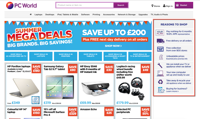
Conversation found, “According to color harmony theory, bright blue and red colors that they use for their promo campaign wouldn’t necessarily match their main brand color, purple.”
While color preferences differ from person to person, colors that clash significantly impact a user’s first impression. Designers must also pay attention to images and other visual content to reduce conflicting contrasts wherever possible.
Cluttered UIs
The ability to read and absorb content plays an essential role in aesthetics. Cluttered UIs, small illegible text, and too many options can overwhelm users, making a user interface less attractive.
Designers must prioritize content, create clear visual hierarchies, and use whitespace to separate UI elements as a foundation for aesthetically-pleasing design.
Whitespace
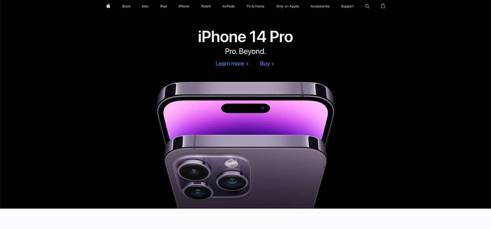
If you scroll through Behance or Dribbble, you’ll notice that the best designs use whitespace for aesthetics. Apple uses whitespace to perfection throughout its products and marketing touchpoints.
If you scroll through Apple’s homepage, you’ll notice how the tech giant uses generous whitespace throughout–usually with centered content to focus user attention. Apple also uses a predominantly black and white color scheme, with blue for links/CTAs, and the occasional red accent.
Consistency
Design consistency plays a vital role in usability and aesthetics. Consistency enables users to think less because they can find UI elements faster and predict outcomes.
Designers can enhance a product’s consistency by creating a design system. Design systems don’t only solve design inconsistencies but improve cross-functional collaboration and reduce time to market.
Motion
Microinteractions and animations are also crucial characteristics of aesthetics and usability. Interactive components breathe life into a digital product, giving users vital feedback as they navigate user interfaces.
Avoid Pitfalls of The Aesthetic-Usability Effect With UXPin
One of the challenges with prototyping is that design tools don’t have the same fidelity or functionality as the final product. Prototypes look beautiful but don’t accurately represent the user experience, adversely impacting the feedback and results during user testing.
The problem is that designers are trying to get accurate user feedback with tools that render vector graphics for a product developed in code. They can design beautiful UIs that deliver excellent results during testing but fail to meet user needs and expectations after release.
With UXPin, designers get the simplicity of a design tool with the fidelity and functionality of code. Instead of vector graphics, UXPin renders code, allowing designers to build prototypes comparable to the final product.
This increased fidelity and functionality mean designers can leverage the benefits of the aesthetic-usability effect using UXPin and avoid the pitfalls user testing might not reveal with an image-based prototype.
Get meaningful feedback at every stage of the design process with UXPin’s high-quality prototypes. Design beautiful UIs and reduce usability issues to deliver positive user experiences to your customers. Sign up for a free trial to explore UXPin’s advanced design, prototyping, and testing features.


