
Whitespace is the blank canvas from which every design begins.
The design elements contained on any website stand out or blend in based largely on the space around them. It’s natural for content managers to want to fill all the “empty space” on their site, but that impulse negatively impact everything from brand reputation to conversion rate.
To ensure your site is converting at its highest potential, it’s critical to design each section to preserve the limited attention span of your visitors.
When used well, whitespace extends site visits and turn more browsers into buyers.
What Is Whitespace?
The more elements competing for attention, the less attention a user pays to the site.
Despite what the name might imply, whitespace is blank space of any color that is free of elements like images, videos, or text. As explained in the free ebook Web UI Design for the Human Eye (Vol.1), you can use it anywhere including in, around, and between:
- Headers
- Menus
- Images
- Videos
- Text
- List items
- Margins
- Gutters
- The footer.
Think of whitespace like a volume knob for site distractions.
More whitespace equals less noise, making it easier to focus. When a site strikes the right balance of whitespace, it’s easier to process and comprehend text, easier to decipher icons and images, and provides a better overall user experience.
Two famous examples of whitespace in action are Google’s homepage, and the Apple iPhone page.
Both use plenty of whitespace to guide your attention to the most important elements. Google knows you’re there to search, so they use whitespace to help you do what you came to do.
The Apple iPhone page is a vertical flow of simple design elements, each with their own message and call to action. It’s easy to process, and feels in line with the Apple’s minimalist brand as a whole.
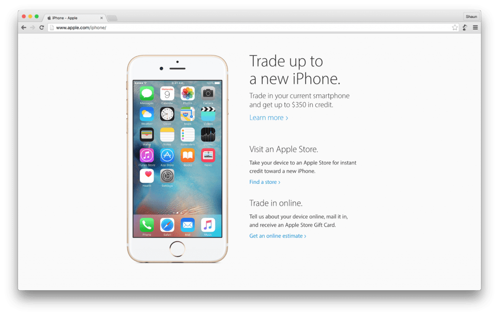
Photo credit: Apple
Typically when a site has little whitespace, it’s because the people in charge aren’t trained UI designers.
Non-designers tend to want to fill in the “gaps” and “wasted space” they see between content. They want to cram as much content as possible in “above the fold” to make sure everything important is seen by every site visitor.
But just like you wouldn’t want to litter a nature preserve, there’s no need to treat white space like wasted opportunity.
Too Much of a Good Thing
It’s easy to imagine a site with too little spacing that feels cluttered and overwhelming.
However, it’s also possible to add too much white space. In that case, you’ve created the illusion of completeness, making it appear that a user has reached the bottom of a page, when in fact there’s a lot more to see.
This is especially important to keep in mind when designing your site’s mobile experience. A lot of whitespace between elements may create a huge blank space on mobile, tricking your visitors into thinking there’s nothing more to see.
Finding the Right Balance: 3 UX Case Studies
When it’s used well, whitespace makes a site easier to navigate.
- It improves the user experience by organizing content for easy comprehension.
- It creates a clear content hierarchy, separating elements from each other.
- Finally, a site design with built in whitespace forces site managers to keep their message clear, reducing site clutter, and adding content that supports users on their journey.
At The Good, we try to improve conversion rates by continually testing small changes to a site’s user experience over time. Whitespace is a key part of that testing arsenal.
Here are a few examples from our client work to highlight the potential of small spacing changes to make a big difference on your site.
gDiapers
While working with gDiapers to improve their site conversions, we noticed that the homepage banner area performed exceptionally well on mobile, but not so well on desktop. Mobile visitors had no problem clicking through to the Shop or Getting Started sections of the site.
Desktop visitors rarely used the banner area to navigate. Whitespace helped change that user behavior.
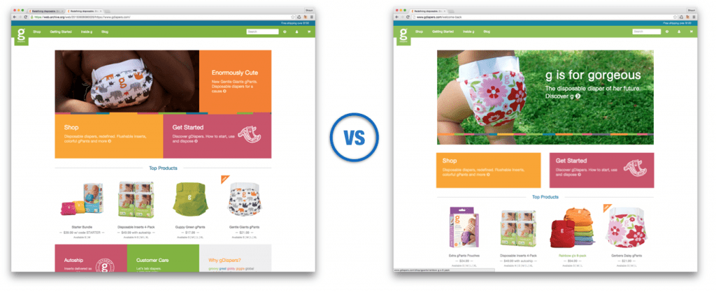
Original design on the left, revised design on the right.
Once we added some spacing between the main banner image and the two callouts below, Desktop visitors used them 150% more often, and the site’s overall conversion rate lifted by nearly 20%.
The first version (above left) was the approved design that launched with the site. Everyone thought it looked great. Maybe it did, but the lack of spacing between the primary banner elements made them appear as if they were one piece of content without a clear call to action. Testing was the key to discovering higher performance and adjusting the site to align with visitor expectations.
Cummins Allison
Another example of this is with Cummins Allison, a manufacturer of coin and currency counting machines. Their homepage was jam-packed with content. There was a persistent sidebar on every page, regardless of the content’s relevance to that page. By adjusting the page layout to clear the clutter and create a more balanced visual hierarchy, their conversion rate improved and their bounce rate dropped dramatically.
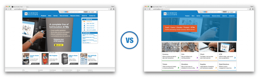
Original design on the left, revised design on the right.
Subtle design changes have a huge impact on performance.
New design elements aren’t always necessary though, as we saw on their product detail page below. We tested arranging the elements of the page in new variations, and removed the busy right-hand sidebar.
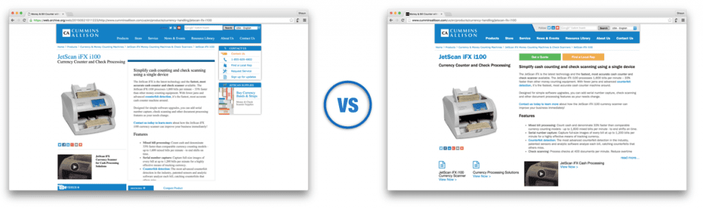
Original design on the left, revised design on the right.
With prominent call to action buttons above the content, and small shifts to the display of information, the conversion rate of this page went from 6% to over 15% instantly. Over time, these small changes improved their web lead revenue by over 70%. That’s a pretty big vote for less clutter.
Xerox
On the Shop Xerox product detail page, we can see another simple example of less clutter making a positive impact. A typical page will include multiple versions of a printer to select from (bottom left), and visitors are easily be overwhelmed.
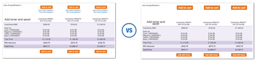
Original design on the left, revised design on the right.
By replacing the extra links around the Add to Cart buttons with whitespace, Xerox saw a 20% improvement in engagement, 5 % boost in products added to cart, and a 33% improvement in customers continuing through purchase. We tested removing other pieces of content throughout their site to increase whitespace around key elements, and saw positive results in every case.
We’ve seen this work across the board with every client.
Whenever the amount of content surrounding a call to action button is reduced, the conversion rate of that button improves. Try it on your site and see what happens.
If you have logos and social media icons around your important buttons, test moving them somewhere else or removing them completely. Aligning the page content with the most important actions for that page will result in more of those actions being taken by your visitors.
Testing Your Way to Success
The only way to be sure you have the balance of white space is with A/B testing.
Browser space is an infinite resource. You don’t have to fill every last pixel with information. People will scroll.
Don’t be afraid to embrace the power of nothing. Your users will thank you.
For more advice on designing for visual psychology, check out the free 100-page e-book Web UI Design for the Human Eye (Vol.1).

