What is an Affinity Diagram and How It Can Help You
The affinity diagram offers a framework for grouping information, be it data, user needs, opinions, insights, or other data types.
Affinity diagrams are when you put each concept, idea, or thought onto a small piece of notepaper. Then, you group ideas by different categories to see what the affinity of the two ideas could be.
Invented by the Japanese anthropologist Jiro Kawakita in the 1960s, the diagram is an invaluable tool for idea creation. It allows teams to organize the large number of information found in the numerous phases of design thinking into their natural associative relationships.
Affinity diagrams are often used in design to figure out where you should be putting features, fields, and options throughout your apps.
That’s why we love them here at UXPin. Check out UXPin, where you can easily collaborate in real-time with your design team on outlines, documentation, wireframes, UI/UX designs, and hi-fi prototypes.
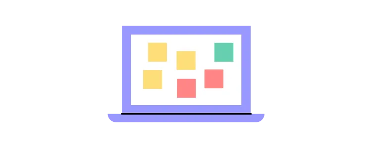
Examples of Affinity Diagrams
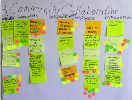
1. New Ideas Affinity Diagram
In the example below, a UX team was brainstorming about community collaboration. You can see from the diagram that community collaboration was one of the ideas they were discussing. The category of community collaboration was later subdivided into other subcategories: Contributors, Users, Evaluation.
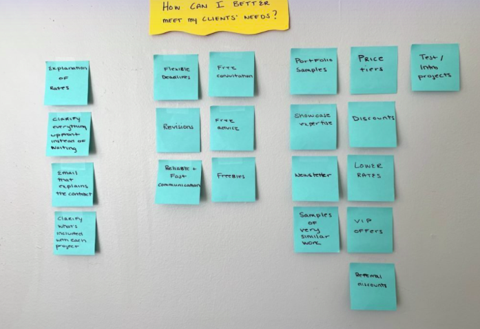
2. Organizational Affinity Diagram
In the example below, the designer organizes their information on how best to meet their customer’s needs. When you look at the diagram at a glance, you get an idea of the brainstorming solutions.
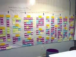
3. Color-coded Affinity Diagram
In this example, the designers organize their ideas by color-coding. It entails using several different colored sticky notes to organize ideas.
You could run the diagramming by choosing a different color for stats, ideas, or customer feedback. Or you label each cluster with a different color. The sub-categories could be a different color from the main categories. Then when you reorganize the sticky notes into new groups, they retain their color from the original organization.
Once you’re done with your affinity diagram, you can start designing and planning your design. Check out UXPin for a great design tool that lets you design in real-time with your teammates and share previews with testers and stakeholders.
Why Use an Affinity Diagram When Doing App Design?
App design involves a cluster of information and ideas. Without a coherent framework for those ideas, a team may find itself wasting time without coming to a consensus. With affinity diagram/affinity mapping, you uncover new patterns of thinking and you can easily break old patterns by sorting and clustering information into relationships. A team can discover categories and meta-categories within a cluster of information or ideas and, in doing so, find which ideas are common in the team.
The affinity diagram acts as a map for brainstorming and idea generation. The diagram helps teams create connections or find data and themes in their data. For instance, the tool is a great way to find connections after conducting qualitative user research, customer feedback, or ethnographic research.

There are lots of good reasons to do affinity diagrams – For starters, the diagram helps web and app designers find meaning in the complex web of user’s needs. You have various ways to collect customer feedback beyond usability tests, interviews, chats, etc. But it isn’t easy to measure all this data against the KPIs. Attempting to do so can be difficult. With the affinity diagram, designers can efficiently synthesize qualitative data from diverse sources into an actionable visual diagram.
The affinity diagram is also referred to as a method called “space saturate and group.” So at first, everyone comes with their ideas, and the board is “saturated” with research and ideas. To find meaning from all the data, the team must group the information since it’s saturating the space. The grouping process helps you draw connections between business perspectives, the individual information and thus develop deeper insights. This will help define the problem(s) and come up with potential solutions. Therefore, you transition from analysis to synthesis.
What are some great situations for Affinity Diagrams?
Affinity diagrams help you plan your apps before you build them – it’s great for generating ideas. The affinity map helps find connections and meaning from qualitative user research or customer feedback during the pre-design stage to organize all the data gathered.
Early on in the process of app development, teams hold workshops where they collaborate and share ideas. These sessions involve members from various departments, from marketing to UX specialists, business analysts, legal experts, and many more. After that, there’s the research and analysis phase, where the app developers construct a user persona to identify the flaws and benefits of the upcoming app. This procedure can be overwhelming without a coherent framework for mapping all the variety of data, which varies from field studies, contextual inquiry, and user interviews.

Teams can use affinity diagrams to create categories or themes from a large amount of data. This mapping helps them find patterns and quickly discover what they’ve learned by grouping data and finding connections between the groups.
For example, with the affinity map, you can:
- Find answers to specific research questions
- Organize results from the brainstorming session
- Create/develop innovative solutions
- Improve processes
- Summarize related data/notes
The idea behind the affinity diagram is to simplify the process of innovation by creating an environment where everyone’s voice is heard, conflict is avoided, and similar patterns of ideas are favored.
a) Designing the operational workflow of an app so that it is a functional app
The affinity diagram is a great method, and when followed step-by-step, helps you create a clear overview and synthesis of your findings. Once you organize all your data, you can focus on turning that information into a functional app.
b) Making your app useable
Concerning UX, it can be challenging to understand the needs of the end-user. The multiple sources of collecting customer feedback make it difficult to find connections and meaning from the vast data. But with the affinity diagram, you can map out the data obtained from users to understand their needs, behaviors, and motivations. Mapping out the user research gives you a way to handle your ideas so that it will help you deliver an exceptional user experience.
What are some not-so-great situations for Affinity Diagrams?
In the affinity diagram, team members get to jot down their ideas onto sticky notes, cards, or pieces of paper and put them on wall charts, whiteboards, or chalkboards. You end up with post-it notes that are categorized based on similar themes, patterns, or groups.
However, the issue is that this approach is temporary and fragile as some of the notes could fall off, or someone could take it down (unless you use the extra-sticky ones or choose an online template). Also, it doesn’t work with remote teams, as well as in numerous other situations.
The process of physically writing the notes and placing them on the board is time-consuming. In most cases, you’ll have to wait until the end of the research to start mapping the information.
Try using a web tool for affinity mapping, and remember Affinity diagrams have a time and place and work best when there’s buy-in from multiple parties.
The best process for making Affinity Diagrams
- During the brainstorming process, be clear about the objective of the brainstorm, i.e.what problem are you out to solve? Put all the pieces of data, documented facts, ideas, observations into notes, cards, or pieces of paper and post them on a flat surface that’s visible to everyone.
- Based on the collaboration of the team, start making clusters by moving all the related sticky notes based on relationships. Involve your team members as much as possible to save time.
- Create a “parking lot” category for the sticky notes that don’t appear to fall into any category naturally. Avoid discarding sticky notes that you feel are already represented. Redundancy of ideas is fine as it reveals how many members of your team have the same idea.
- Once the content is clustered, ask the team to suggest categories representing the clusters and write the proposed categories at the top of each column. Don’t let the members spend too much time coming up with names for a category. For instance, if there’s a disagreement between “tools” versus “gadgets,” list them both. If the members produce significantly different categories, opt for the one that gets the most approval. Naming the clusters is essential as it helps you discover themes.
- You can rank the clusters in order of importance. For instance, what does your company prioritize? Let the company’s values, motives and priorities lead you in the ranking.
- You can draw lines to make connections within the clusters.
- Make meaning from the connections. For instance, is it the user’s pain points or needs? Look for gaps that haven’t been addressed.
- Focus on translating the synthesized information into practice rather than identifying similar information.
The results of a great affinity diagram
Affinity mapping unifies large sets of data by finding connections between concepts and ideas. It helps you organize facts, research, and opinions into clusters that will help you find solutions to complex problems or spot common issues. A great affinity mapping results in a natural form of relationships that can be converted into actionable results. It helps you to:
- Identify problems
- Create ideas
- Convert complex ideas into simple solutions
- Help groups find a consensus
Affinity diagrams are a collaborative process. For great results, you’ll need to delegate a leader who will properly organize the process. It would also help if you set a time limit to avoid an overflow of ideas. Set a plan and communicate the goal of the brainstorm to your teammates. That way you’ll improve productivity and output.
Remember that the goal of the affinity diagram is to organize vast amounts of data into a more coherent format. For best results, prioritize accuracy and don’t put limitations on your team over the number of ideas generated.
Conclusion
Here at UXPin, we use affinity diagrams to do our information sharing and consensus making. We take our affinity diagrams and keep them on record during our design phases and project management.
If you’re ready to start designing, join UXPin so you can collaborate in real-time, share ideas, and generate life-like prototypes with real data and interactions.

