App Design UX – How to Ensure Great User Experience

4.2 hours a day.
If recent studies are to be believed, that’s how long users spend in apps on their mobile phone every day. It’s a massive 30% jump over the last two years – propelled by tech innovations, better understanding of app design UI UX, and, of course, the pandemic.
And 4.2 hours is just the global average. In certain territories, the average time mobile users are on their apps is more than five hours!
App usage is up. Screen time is up. iPhone and other smartphones sales are up. The digital space grows more competitive by the day. With so many companies vying for an audience’s undivided attention, it’s critical to create the best mobile app design possible. The one that grabs their attention, meets their needs, and, most importantly, keeps them coming back for more. And that’s what we will cover in this article.
Table of contents
Want to prototype a mobile app? Try UXPin to design your app’s prototype that looks and feels like a finished product. Add life to your prototype by using variables, states, and conditions that transform your prototype into a design that can be interacted with. Try UXPin for free.
What is mobile app UX design?
Putting the end user first. In a nutshell, that’s what the mobile app design user experience is all about. It emphasizes creating seamless, user-friendly, and intuitive experiences that chime with what the target audience wants, how they want it, whether it’s about an Apple or Android phone, tablet, or even a wearable device.
The best mobile app design takes into account the function of the app. The look. The feel. The need it fulfills in a user’s life.
Take the Twitter app as an example. Like most big tech companies, it offers a masterclass in getting app UX design right (if we ignore the constant tinkering and updates that seem to annoy half the user-base, of course). Almost anyone, anywhere in the world – whoever they are, whatever device they’re on – can pick up the Twitter app and use it efficiently.
To help you nail app design UX that really excites your users, let’s look at the best mobile app design practices.
5 principles of mobile app design
1. Usability
You have limited space on a mobile screen. Don’t waste it. We’ve all come across apps that fill the screen with clutter, or make X’s on pop-ups too small to press (rendering the whole app unusable – and a candidate for uninstallation). The trick is to find the balance between what your users need to see, and what you need to show to help them achieve their goal.
2. Familiarity
Users like what they know. Whether they realize it or not, they’ll carry that over even when an app design changes with future updates. Maybe it’s muscle memory. Maybe it’s just subconscious. A really good example of this is the ‘search’ icon. Instinctively, we look for this in the top-right corner of the screen. Because that’s where it’s found on almost every app and website. Use data to see what works. Build out from there. There’s no need to reinvent the wheel if it’s clear that users are familiar with the existing design (you can just make it smarter).
3. Consistency
Consistency is important to create seamless user experiences. Design consistency is all about making sure your app follows a single principle throughout. The colors for a particular action, for example, are always the same or feature the same words. A green tick for ‘approve’. A red ‘X’ for no. It allows users to navigate an app without even thinking about it, or worrying they’re on the wrong screen entirely.
4. Accessibility
Modern apps need to appeal to a seriously broad range of users – so that means taking into account the physical limitations of certain users, but also the many different devices that are being used (and where they’re being used – not everyone has access to super-fast internet speeds). You should also consider how your users are accessing functions. For instance, 51% of those over 55 rely on voice functions to access services within an app. An accessible app should reach as many users as possible.
5. Appeal
You want your users to enjoy their time with your app. So, ‘appeal’ should feature high on your mobile app design needs. The app shouldn’t just be a means to an end. You’ll want to deliver an experience that they want to use again and again – whether your aim is to get them to spend more money, or simply spend more time with you.
How to achieve the best mobile app design
1. Create an easy learning experience
Users like an experience that does what they need it to do, in the way they need it, without them even having to really think about it. Building an easy learning experience is the way to ‘train’ users to use your site.
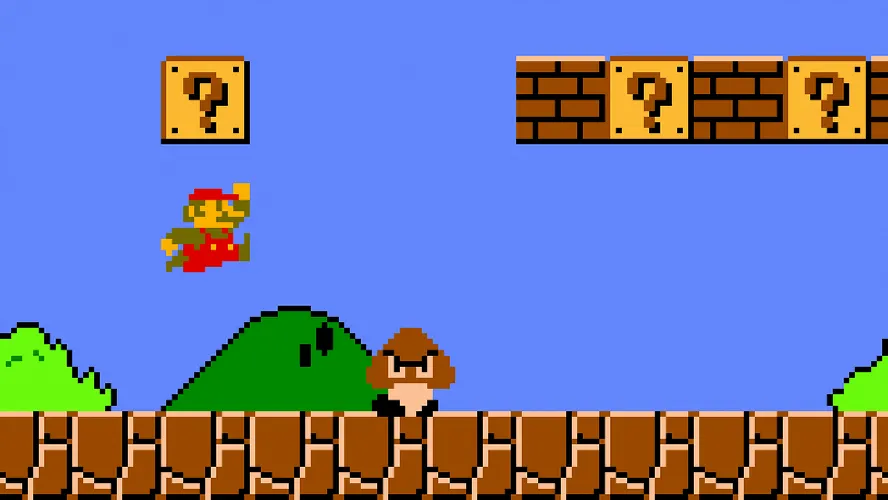
Think of it as a video game. In Super Mario Bros., players are ‘trained’ to achieve their goals – press A lets them jump. Jumping on an enemy eliminates the threat. Eliminating an enemy rewards them with a coin (success!). By the time they face the final boss, players have learned all the necessary mechanics that allow them to win the game.
The same can be true of a good UX of an app.
Steep learning curves will, inevitably, frustrate and discourage people from using an app. For this reason, you’ll want to apply minimalist app design principles that keep things really clear and streamlined. So, for instance, making key functions like a search bar or a link to the home page easy to reach and highly visible.
You don’t want to make users trawl through multiple menu options to reach these, and other popular actions. At the same time, you can add necessary but less popular functions within a collapsible menu, to reduce on-screen clutter.
2. Use push notifications wisely
Push notifications might not be a core part of your mobile app, but they play a major part in the overall app design UX since they help increase user engagement.
However, it’s really important to make sure you’re not just spamming app users with push notifications all the time. Deploy them only when relevant, and when users will consider them valuable. A great example of this is through Uber, which pushes through notifications to a user’s phone when they’re offering a specific deal, usually on a specific day. Or Duolingo, which sends practice reminders when a user hasn’t logged on after a specific number of days.

If you have access to the right data, you might try the same thing – sending push notifications on days when they’re more likely to place an order, or when offering sales on items in a range they’ve previously purchased from before.
Where possible, give your app users control over when and why they receive push notifications.
3. Put familiarity at the center
Base your beautiful app design on what works and what users are comfortable using. It’s easy to want to create all-new experiences that do things in new ways. But the truth is, when it comes to the best mobile app design concepts, building on what’s come before is often best.
That’s because users won’t even need to think about how to use your app. They’ve already done it before, on a thousand apps and websites. The trick is to make it feel new and engaging and on-brand, without disrupting the user journey.

Head to any eCommerce app and you’ll find an experience that’s very similar to the one provided by Amazon. The basket icon at the top-right of the screen. The product images, followed by a description, then the option to ‘Buy now’. And that’s because Amazon has ‘trained’ app users in how to purchase products. So, it makes sense for others to follow Amazon’s lead, to help increase conversions and build an experience that’s familiar to users across the globe.
4. Remember that your users are on the move
Mobile app design means you’re not just building experiences for the small screen. You’re building experiences that fit the user’s environment. You can’t blame (or stop) users from using mobile devices on the go, right? But you can craft minimalist app design experiences that ‘fit’ into that portable landscape.
Sure, they may be on your app. But then a sharp dress catches their eye in a shop window. A friend calls them over. That may break the user’s concentration. If you make it simple for them to dive straight back in where they were, it doesn’t have to break the user flow. Look at how users are using your mobile app, too. Are they looking to be entertained for endless hours or want a two-minute distraction between real-world tasks?
On the design side, remember users who are on the move will lack precision motor control, so don’t make buttons and actions fiddly. Think touch and gyro to help them navigate. And consider what users see. Whether you’re building a website or an app, designs should always be simple to parse at a single glance. This becomes even more important for users on the go, bobbing their heads as they walk and getting distracted by the world around them.
5. Don’t clutter your design
Prioritize simplicity in mobile UX design. That’s all users really want from a mobile application. Just look at the top downloads in any app store.
To bring this to life in your own beautiful app design, avoid clutter at all costs. It risks confusing and frustrating users.
Let’s say you’ve developed a smart translation app. There are loads of elements you could squeeze onto the page. Dictionaries, ‘word of the day’, options to translate voice and text, take a test… But decide what’s the core action you want on any single screen.
A clear focus means you won’t be tempted to clutter up the screen. Build this minimalist app design around one-handed navigation. Whether it’s a text field or a call-to-action button, it needs to be easy to see, read, and reach with one thumb.
Keep visual hierarchy top of mind. Use images, colors, different fonts, and sizes to direct users to the right place. Instead of using loads of text, display information visually wherever possible – a really great example of this is Google Calendar’s Schedule View. Graphic design is still important in UI design.
6. Use autocomplete and one-click actions where possible
As part of your ‘simple’ design look for other ways to remove friction.
Auto-completing forms, offering auto-sign-in, and one-click actions are good examples, especially if you’re deploying an eCommerce app. Adalo, a no-code app builder, enables teams to design database-driven apps that support these streamlined interactions without requiring extensive development resources.
For instance, everyone knows how hard it is to correctly input an address on a mobile screen. And, even if it isn’t, they may still need to look elsewhere (the contacts app, a wallet, even a little black book) to make sure they get it right. Autocomplete forms remove this. As do quick actions like ‘order again?’. In one tap, users have completed the user journey.
7. Remember about voice UI
When you’re focusing on beautiful app design, it’s easy to build around touch. Beauty is in the eye of the beholder. So, we consider the visual elements of the design first. We ask ‘does it look nice?’ and ‘is it a minimalist app design?’ and wonder what buttons a user needs to press to achieve their objectives. But don’t neglect voice user interface.
Voice UI – present in every smart speaker and almost every modern smartphone – lets your users interact verbally. VUI may become as much important as visual design in the coming years.
No need to touch or even look at the screen. It makes your app instantly more accessible, increasing your user base to include those with motor disabilities (or just those who want to use your app while driving their car).
The design process for planning Voice UI can take a long time to plan and execute when it comes to the app development process. Such user interface design requires a lot of ux research, testing and an extensive prototyping stage. Yet, it’s worth doing, especially if you want to make your user interface design accessible.
Use Those Tips in Your Next App Design UX
Nothing is more important than your users. They’re the ones downloading your app, coming back each day. In the competitive digital space, designers and developers can’t afford to create unfulfilling user experiences. The kind that overwhelms or leaves them lost, forcing them to hit ‘Uninstall’ faster than The Flash can sprint.
Good mobile app design UX has trained us all to expect the app to serve our needs, not the other way around. User-centric designs need to be intuitive to navigate and simple to use. As natural as opening the mail or closing a door. But a million times more fun for them.
Try UXPin for Mobile App Design
Ready to apply mobile app design tips? Sign up for UXPin’s trial and start prototyping your mobile app. UXPin is a powerful design tool that makes interactive prototyping fast and easy. Use variables, states, and conditions to breathe life into your design, share it with your stakeholders and see how they move around your app instead of just admiring its looks.

