How to Build a Sign-Up Page in Under 15 Minutes
Sign-up pages serve as the welcoming gateway for users eager to explore apps, websites, and other digital products. Whether it’s a social media network, e-commerce site, or a productivity tool, these pages grant access to whatever it is that you’re offering. They are the digital reception area where users take their first steps into getting to know your product more.
In this article, we will guide you through the process of building a sign-up page with MUIv5 components and create a prototype like this under 15 minutes. Material UI is one of the best open-source component libraries for code-based prototyping. We’ll build a sign-up page with it.
Design beautiful and consistent user interfaces even if you don’t have a designer on the team. Drag fully coded components from the library and arrange them on the canvas. Customize them as you like and ship stunning layouts 8.6x times faster. Try UXPin Merge.

What is a sign-up page?
A sign-up page is a web page or form where users provide the necessary information to create an account or access online services. It typically includes fields for entering details like name, email, and password. This page serves as the starting point for users to join a digital community, start using an app, or buy a product.
A well-designed sign-up page makes the registration process easy, builds trust, ensures security, and collects data.
What are the sign-up page elements?
After looking at a dozen sign-up pages, anyone can spot that most of them use the same UI elements: input fields, buttons, sign-up text, visuals, and so on. Those UI elements are a staple, but to make a sign-up process even more user-friendly, designers also put in error handling, password strength indicators, confirmation messages, and more.
Let’s break down the essential elements of a sign-up page.
Input field
Input fields are the primary means of collecting essential user information, such as name, email address, and password. They serve as the entry points for users to provide the necessary data for completing the sign-up process.
Well-designed input fields enhance the user experience by providing clear and easily navigable areas for entering information. Users should be able to understand what is expected in each field without confusion.
They should also realize that this is the place for entering data. To make that clear, designers apply a subtle background color or shading. This technique helps create a visual contrast, making it easier for users to recognize where they need to interact.
Input fields on a sign-up page are not just blank spaces; they are integral components that facilitate data entry, enhance user experience, and contribute to the overall success of the sign-up process.
Button
Buttons in a sign-up form play a critical role in guiding users through the registration process. Their importance lies in providing a clear call to action and facilitating user interactions.
Well-designed buttons meet user expectations in terms of placement, size, and styling. Users anticipate a button to be the actionable element that moves them forward or finalizes an action.
Buttons also contribute to the visual hierarchy of the page. The design, color, and placement of the primary sign-up button should make it stand out, guiding users’ attention effectively.
Sign-up text (header)
Most sign-up pages feature a header or a sign-up text as one of the top UI elements. It’s important to make it stand out. The header provides a clear and concise message about the purpose of the page — getting users to sign up. Thanks to the text, users instantly understand that they are on a sign-up page, reducing confusion and giving them reassurance that they are in the right place.
The header can also have a persuasive function and increase conversion rates. It can reinforce the call-to-action, providing additional motivation for users to complete the registration process.
Visuals
Visuals on a sign-up page refer to the graphical elements that complement the overall design and contribute to the visual appeal of the page. These elements play a crucial role in enhancing user engagement, conveying information, and establishing a desired brand impression.
Visuals contribute to the overall aesthetics of the sign-up page, making it visually appealing. An aesthetically pleasing design can positively impact the user’s perception of the platform and encourage them to proceed with the sign-up process.
Well-designed visuals can help break up text and reduce cognitive load. They guide users’ attention, making it easier for them to understand the information presented and navigate through the sign-up process.
Checkbox
Checkboxes are commonly used for obtaining user consent for terms and conditions, newsletter subscriptions, or additional features. They empower users to express their preferences and make informed choices during the sign-up process.
Considering checkbox design, these UI elements need sufficient size and contrast to ensure legibility. Users should easily recognize the state of the checkbox (whether it is checked or unchecked), minimizing confusion and enhancing the overall clarity of the sign-up form.
To enhance the comprehension of those UI elements, you may consider learning about different layouts, visual hierarchy, and contrast.
What do you need for this tutorial?
We’ll go over building a sign-up page. It’s possible to do that super quick if you get the same tools. You will need two things:
- UXPin trial account – sign up for free here, so you can follow our walkthrough.
- Access to MUIv5 kit – all trial accounts at UXPin have access to our built-in MUIv5 kit. It includes pre-built UI coded elements that you will use to build the layout of your sign-up page.
This walkthrough is also available as a built-in tutorial for the users who open the MUIv5 trial kit. Where to find it? Just jump into the dashboard, go to project “Start here”, and enter a prototype with the walkthrough as well as the sign-up prototype, ready to be copied and customized.
How to build a sign-up page, step by step
In about 15 minutes, we’re going to create a simple layout of a sign-up page. We’ll use some of the available MUIv5 components, lay them out on the canvas, and do a simple design magic to make the sign-up page look professional. Here we go!
Step 1: Place UI components on the canvas
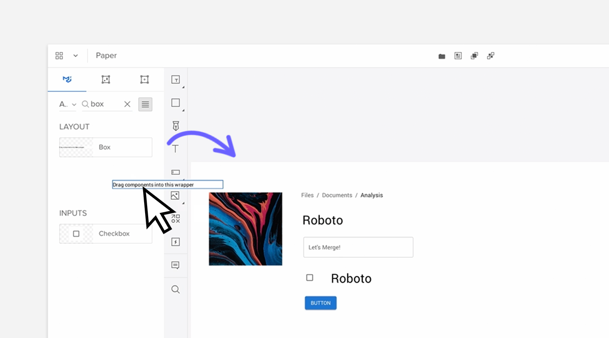
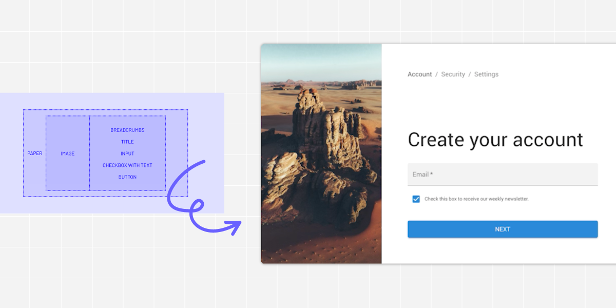
Prepare your working area. Navigate to design system libraries in the bottom-left corner, and double-check if you have MUIv5 chosen as your UXPin library. You will see that you have various components to choose from. For this tutorial drag and drop onto the canvas the following components:
- Image x1
- Breadcrumbs x1
- Typography x2
- TextField x1
- Checkbox x1
- Button x1
- Grid x1
- Paper x1
- Box x2
Below is a simple visualization of the components.
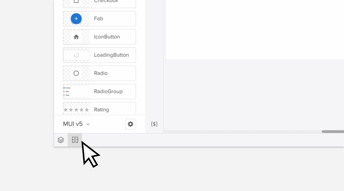
You can scroll through the MUIv5 library and drag the components onto the canvas. Can’t find them? Just type their names inside of the search field. Click the magnifying glass icon and you’ll see this field. Once you have all the components on the canvas, go to the next step.
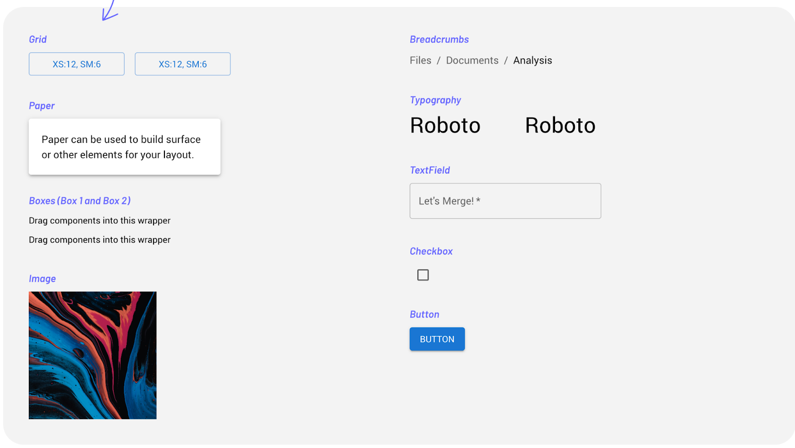
Step 2: Adjust UI components
Let’s take components and set up the right properties, so it fits our purpose – a sign-up form. Click on the UI element you want to adjust, and you will see that the Properties panel appears on the right-hand menu.
Let’s start with editing following components properties:
- Adjust colors and copy of breadcrumbs links – The breadcrumbs tell users where they are located inside of the app or site. Change the color of the link to primary and secondary. Plus, edit the copy. It should say “Account / Security / Settings”.
- Edit the TextField – This component is our input field and our sign-up form collects email addresses. Edit the copy, so it says “Email” and change its variant.
- Change the size and copy of Typography – Adjust the size of two typography components. Set up the variant of the first one as H3 and the second one as Caption and edit the copy, so it says “Create your account” and “Check this box to receive our weekly newsletter” respectively.
- Change the size and copy of the button – Set up the button size to large, edit the copy, so it says “Next,” and switch its width.
We introduced changes to five components: Breadcrumbs, Typography, Typography, TextField, Button.
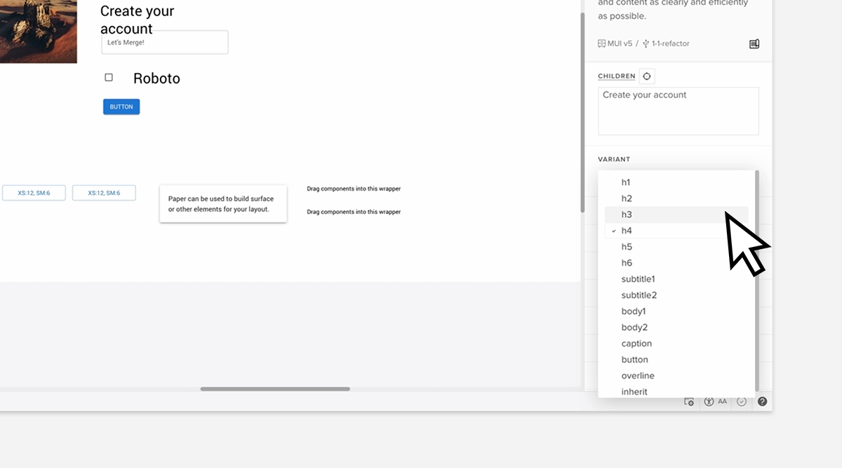
Step 3: Organize components inside the boxes
Take the components we’ve just adjusted, and place them into the boxes. One box should contain Checkbox and Typography, and together they will form our checkbox field. The other box has breadcrumbs, typography, input field and button. This arrangement helps us organize our design, providing a necessary structure.
Notice that we are not including Grid, Image and Paper in any of those boxes.
If done correctly, you should be able to see the following structure in Layers Panel, located next to Design System Libraries.
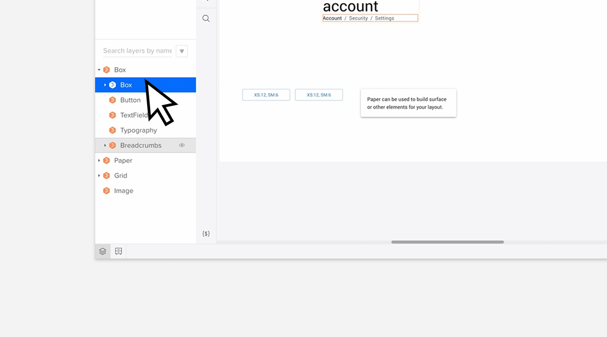
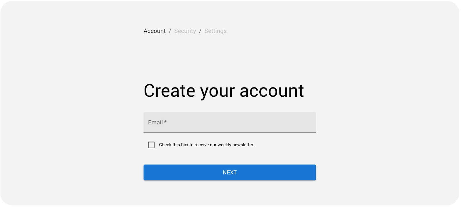
Step 4: Add padding
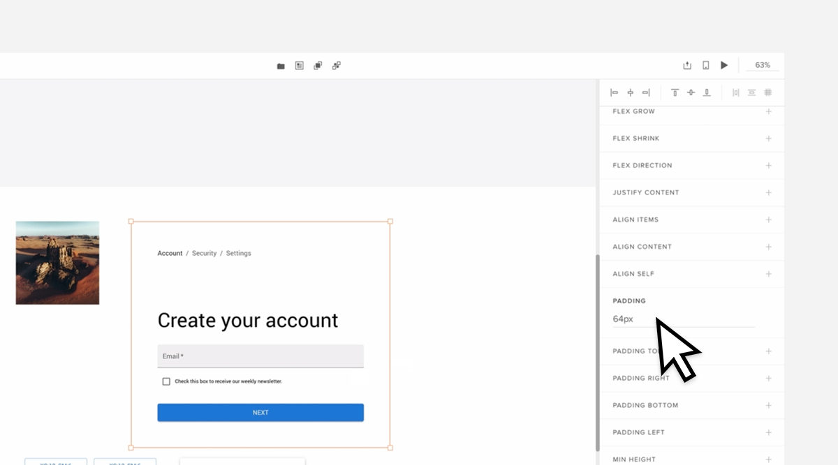
Add the padding to boxes, so the UI elements have room to breathe. Padding is a common UI term that refers to the space between an element and the border.
Start with Box 1. Add Top and Bottom padding to components in Box 1. Use 12px for the Top padding and 32px for the Bottom. Remember to type in “px” next to the number, so the measurements are crystal clear.
Let’s move on to Box 2. For this one, add a 64px padding on each side for the whole box.
If you struggle to select the right box, use Layers Panel and click on the box you want to add padding to.
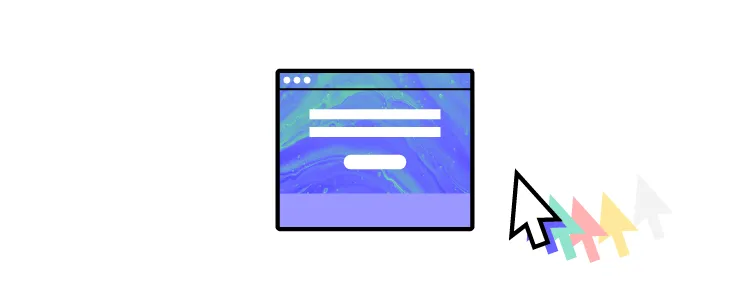
Your boxes should look like the image below.
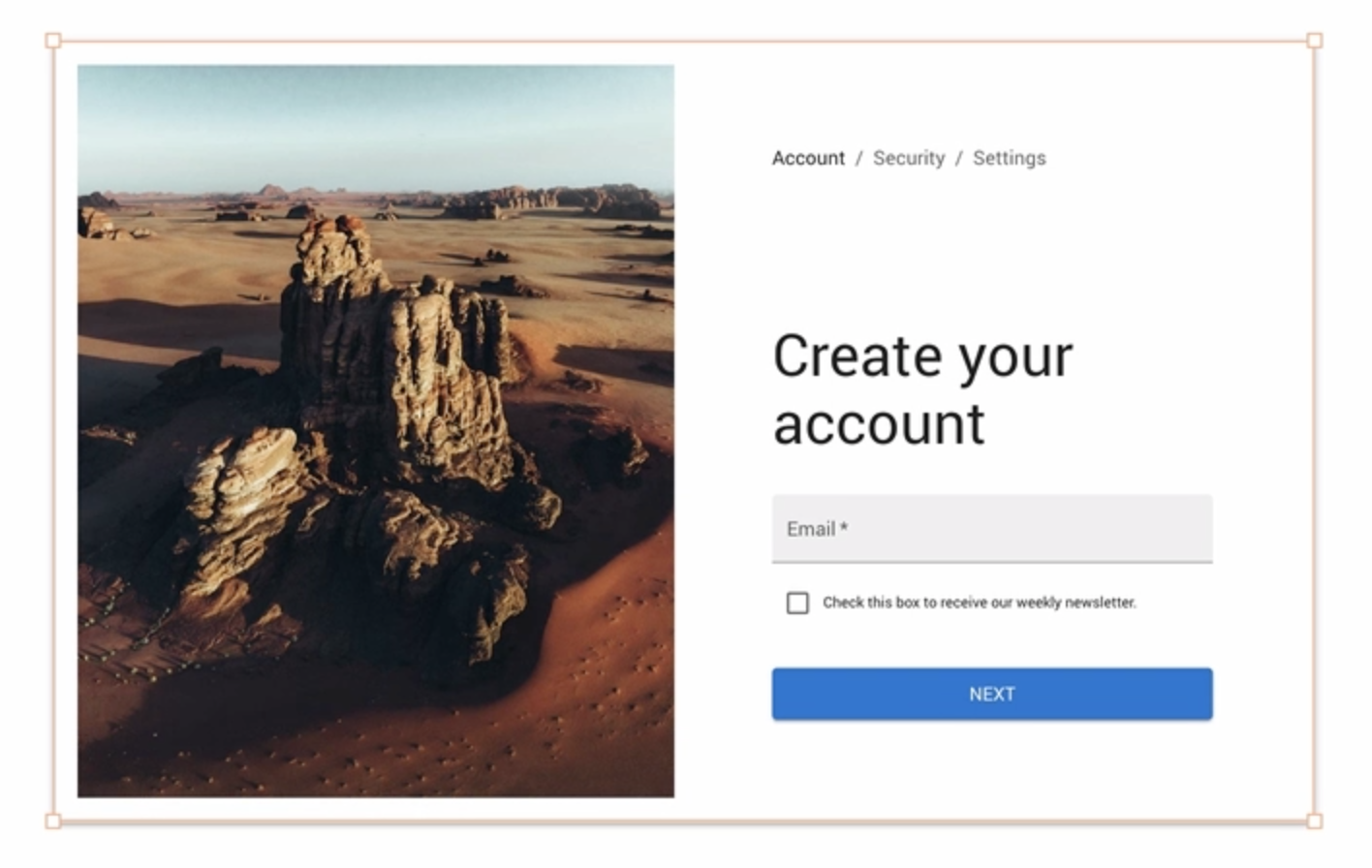
Step 5: Set up grids
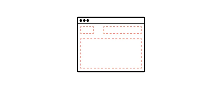
The sign-up form has a two-column layout. To make that happen, use the Grid component. It looks like this:

We want to have an Image in one column and the rest of the design in the other column. So, drag an Image component to one of the Grid’s columns (it’s this rectangle that says XS:12, SM:6) and the rest of the components into the other Grid’s column (the other rectangle.) Then, stretch the Grid component into a desired width.
Your Image component will not fit the column appropriately at first. It will be too small. To stretch it, get rid of Width and Height by clicking ‘X’. By selecting ‘cover’, the Image component will look like the one below.
Step 6: Drag everything into Paper component
There’s one component that is left. It is Paper. It adds dimension to the sign-up page. We want our design to fit inside Paper, so we can improve our form visually.
Notice that Paper has a Typography component inside, but we don‘t need it. Replace it with Grid. Stretch the Paper components, so all elements of our sign-up form fit nicely.
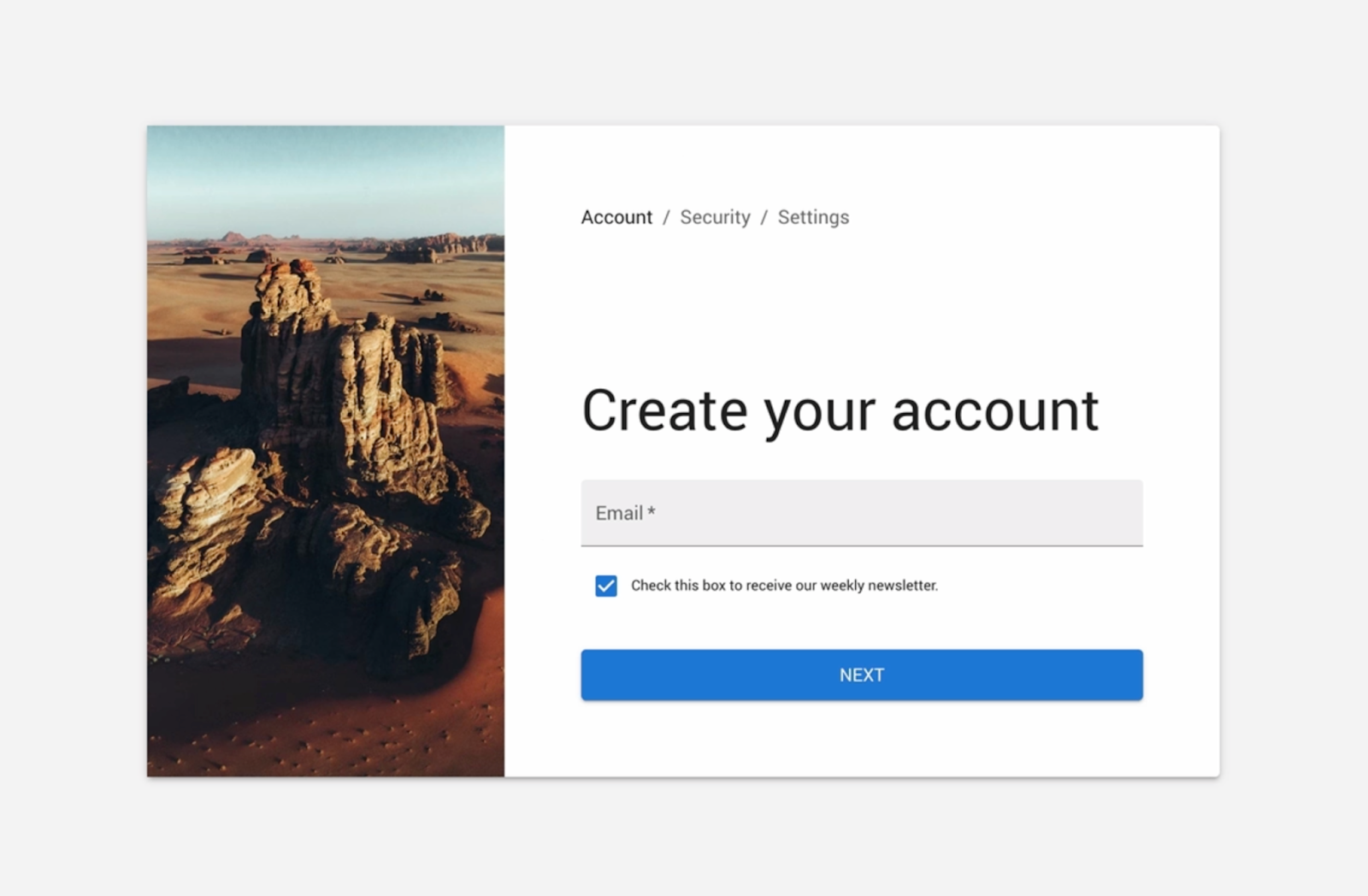
Step 7: Final UI design touches
There are a couple of tricks that designers use to make their design more harmonious and easy for the eye. Right now the design looks a bit stiff.
First of all, there’s too much padding. Get rid of it by deleting ‘SX’ PADDING from Paper and SPACING from Grid.
Secondly, Image can take less space in order to make the more important sign-up form shine. Adjust the width of both columns of the grid. Right now both columns take up 6 units. Change Image width to 4 units and the other column will take up 8 units.
Small changes, but the effect is huge, isn’t it?
Step 8: Preview your design
Head on to the preview mode to see your design in flesh. A preview mode is a powerful place where you can simulate your design’s interactions, leave comments, get specs, and copy clean JSX code out of your design. If you’re ready, you can add interactions to the form to make it sensitive to users’ input. Read our help documentation to learn how to add interactions.
What will you build next?
You did it! Congrats! Together we’ve built your first form but that’s just a tip of an iceberg. You can build interactive interfaces of pages, apps, no matter how complex they are. To do that, you can use one of the built-in libraries like the MUI one we used in this tutorial or import your own React library.
Need more practice? Take a look at our ready layouts that you can copy and customize to your needs. Or just watch our mini-course where Rachel walks you through building an employee portal in UXPin Merge. Sign up for a trial and follow her along: from creating a prototype to pushing it to code. Try UXPin Merge for free.


