Building production-ready UI has never been easier. By combining GPT-5.2, shadcn/ui, and UXPin Merge, you can design and deploy React components without the usual back-and-forth between design and development. Here’s how:
- GPT-5.2: Generates functional, code-ready UI components based on prompts, ensuring alignment with your design system.
- shadcn/ui: A React component library offering customizable, accessible components that you fully control.
- UXPin Merge: Enables designers to work directly with production-ready components, syncing designs with Git repositories for seamless handoff.
This workflow eliminates manual translation of designs into code. Designers can use real components on the canvas, while developers receive JSX code that’s ready for production. It’s fast, efficient, and keeps everyone on the same page.
Key highlights:
- Generate UI layouts with GPT-5.2 using real components.
- Customize shadcn/ui components with Tailwind CSS and design tokens.
- Sync designs with UXPin Merge for interactive, production-ready prototypes.
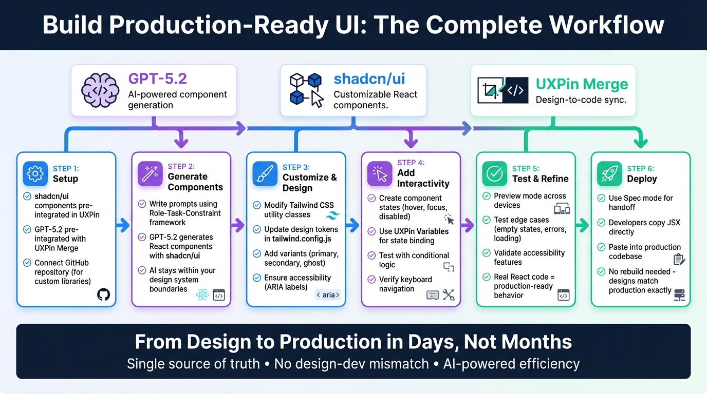
GPT-5.2 + shadcn/ui + UXPin Merge Workflow: From Design to Production
UXPin Merge Tutorial: Intro (1/5)
sbb-itb-f6354c6
Setting Up Your Environment
Start designing immediately with GPT-5.2 and shadcn/ui in UXPin Merge – no installations required. UXPin has already integrated shadcn/ui into the platform, so you can jump right in and use the components directly on the canvas.
If you’re working with a custom component library, here’s what you need to know about the setup process.
Installing shadcn/ui
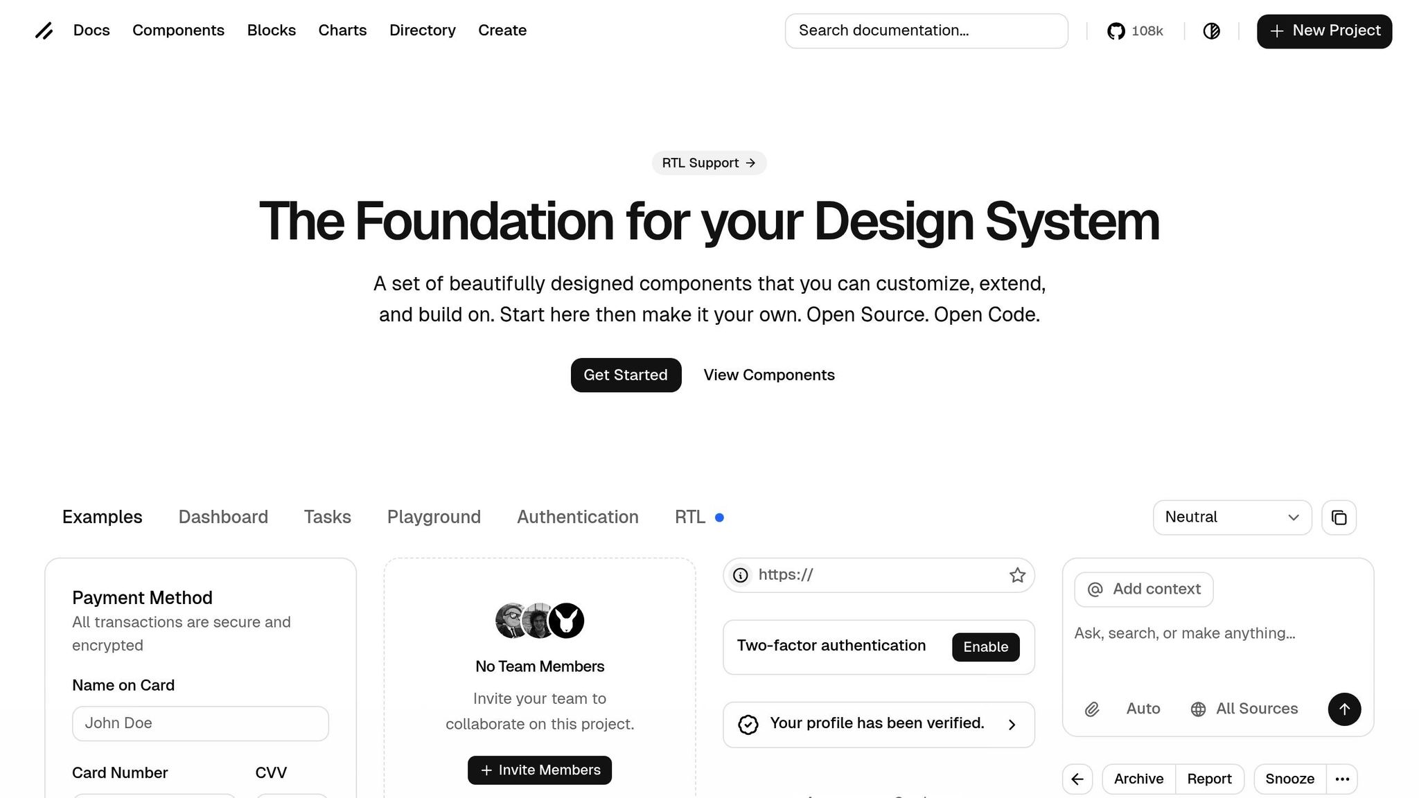
Unlike traditional npm packages, shadcn/ui is a collection of "Open Code" components designed for customization and scalability. To use them, you simply copy the code into your project, giving you complete control over modifications.
"A set of beautifully designed components that you can customize, extend, and build on. Start here then make it your own. Open Source. Open Code." – shadcn/ui
For UXPin Merge users, shadcn/ui components are already available as a built-in library. You can drag and drop them directly into your canvas. If you’re working on a custom React project, make sure your shadcn/ui components are hosted on GitHub or documented in Storybook. This ensures smooth syncing with UXPin Merge.
Setting Up GPT-5.2 for UI Creation
GPT-5.2 comes pre-integrated with UXPin Merge, enabling you to generate components with simple prompts. For example, type something like "create a persona card with an avatar, name, and bio" to produce a functional component from your design system.
The AI operates within the boundaries of your design system, meaning it only suggests components that already exist in your library. This eliminates the risk of "hallucinations" often seen in generic AI tools that generate non-existent patterns. For enterprise teams, developers can define which component properties are editable in the source code, ensuring consistency during the design-to-development handoff.
Once your components are ready, sync them with UXPin Merge to seamlessly integrate your designs.
Connecting shadcn/ui to UXPin Merge
If you’re using the pre-integrated shadcn/ui library in UXPin, you’re all set – no extra steps required. For teams with custom component libraries, syncing your GitHub repository or Storybook with UXPin Merge is key.
Host your shadcn/ui components in a React project on GitHub, then request access via the UXPin Merge page to establish the connection. Once synced, your components will appear as a drag-and-drop library in the design editor. Developers can define editable properties in the source code, ensuring designers stay within the intended design parameters.
"Merge lets you bring React components – either from open-source libraries or your own codebase – into your design environment. The result? Fully interactive, real-code prototypes that behave exactly like the final product." – UXPin
Since shadcn/ui is built on React, it integrates seamlessly with UXPin Merge. Designers work directly with JSX code and Tailwind CSS, while developers can copy the code straight from prototypes into production – no additional translation required.
Designing UI Components with GPT-5.2 in UXPin Merge
Once your environment is set up, you can dive into designing UI components directly in UXPin Merge. The AI operates within your shadcn/ui library, ensuring that components align with your design system without introducing unfamiliar patterns.
Writing Effective Component Prompts
To get the best results, crafting your prompts thoughtfully is key. Use the "Role-Task-Constraint" framework for clarity and precision. For example, start by defining the AI’s role (e.g., "You are a Senior Front-end Engineer"), specify the task (e.g., "Create a responsive Navigation Menu using shadcn/ui"), and include constraints (e.g., "Use Lucide-React for icons and ensure compatibility with UXPin Merge property mapping").
Be explicit about your tech stack. Specify that GPT-5.2 should use React, Tailwind CSS, and shadcn/ui primitives (Radix UI) to ensure seamless integration. Request "Merge-ready" code by asking for functional components with named exports and TypeScript interfaces for clear property mapping in UXPin.
Break prompts into sections for Structure (JSX), Styling (Tailwind classes), and Behavior (React hooks). For instance, instead of vaguely asking for "a button", you could say: "Create a Button component using shadcn/ui with primary, secondary, and ghost variants. Style it with Tailwind CSS, include hover states, and export it as a functional component with TypeScript props."
GPT-5.2 also supports visual analysis. You can upload a wireframe or screenshot and instruct the AI to "Translate this visual design into a shadcn/ui component using Tailwind CSS." This method speeds up the development process while maintaining design accuracy.
Once you have your initial components, you can fine-tune them to align perfectly with your design system.
Customizing shadcn/ui Components
AI-generated components often require tweaks to fit your exact design needs. With shadcn/ui‘s reliance on Tailwind CSS utility classes, customization is straightforward. Update your tailwind.config.js file in the repository linked to UXPin Merge to reflect your design system’s colors, spacing, and typography. This ensures consistency across all components.
When prompting GPT-5.2, ask it to use shadcn/ui CSS variables (e.g., --primary, --radius, --background) to maintain theme uniformity. For components like Buttons or Inputs, explicitly request "variants" (e.g., primary, secondary, ghost) using the cva (Class Variance Authority) library. This approach ensures that your components meet production standards.
Additionally, request JSDoc comments for props. These comments provide descriptions and default values in the UXPin editor, making it easier for your team to understand and use each component effectively.
Tips for Using GPT-5.2 in UI Design
Here are some tips to refine your workflow further. For complex outputs, use "Chain-of-Thought" prompting to outline component logic step by step. This method often results in cleaner, more maintainable code.
Accessibility should always be a priority. Include ARIA labels and keyboard navigation in your prompts, leveraging shadcn/ui’s built-in accessibility features. Also, ask the AI to list any additional dependencies (e.g., specific Radix UI packages) required for the component to function.
Since UXPin Merge only works with components in your library, you won’t encounter issues where the AI generates non-existent patterns. Developers can define which properties are editable in the source code, ensuring that designers stay within the intended design parameters during the handoff process.
Adding Interactivity and States to Components
Once your shadcn/ui components are designed and customized, the next step is to bring them to life with interactive behaviors. Thanks to UXPin Merge rendering actual React code, your prototypes can handle real user interactions like hover effects, click actions, and form validations.
Creating Component States
shadcn/ui components use Tailwind CSS utility classes to manage visual states such as hover:, focus:, and data-[state=open]:. For interactive states like hover, pressed, or disabled, you can prompt GPT-5.2 to include React props in your components. By leveraging Tailwind CSS modifiers, the AI can generate code with the necessary useState hooks and prop declarations.
For instance, a Button component might require props like isLoading, isDisabled, and variant. GPT-5.2 can create the corresponding TypeScript interface and apply the right Tailwind classes based on these props. When you sync the code, these props automatically appear in the Properties Panel, ensuring that even non-technical users can adjust component behavior while keeping the design consistent.
These state management techniques build upon the earlier customization steps, setting the stage for integrating conditional logic to control states dynamically.
Using Conditional Logic and Variables
To bind component states, you can use UXPin Variables. For example, set up an "Interaction" in UXPin Merge with an "On Click" trigger to update a Button’s isLoading prop to true, simulating an API call.
GPT-5.2 can assist by generating "wrapper" components that translate UXPin’s interaction triggers into React prop changes. It can also write conditional logic expressions directly within UXPin, which the tool can test in real time. This approach bridges the gap between static designs and functional prototypes, allowing stakeholders to interact with realistic user flows before development begins.
Testing Interactive Components
Testing in UXPin Merge stands apart from traditional design tools because it uses actual React code. In Preview mode, you can interact with your prototype across different devices and screen sizes. Ensure that keyboard navigation (using Tab, Enter, or Escape) functions correctly. While shadcn/ui components built on Radix UI already include accessibility features, any customizations you make should be thoroughly verified.
Map variables to props and test edge cases, such as empty states, errors, or loading conditions. Since UXPin Merge operates on the same codebase that will go into production, interactions that work in your prototype will also work in the final product. For complex components like multi-step forms or dropdown menus with extensive options, you can even ask GPT-5.2 to generate detailed "interaction checklists" to ensure everything functions smoothly under real-world conditions.
Exporting and Deploying Your UI Prototypes
Once you’ve tested your interactive components, it’s time to move them from prototype to production. With UXPin Merge, there’s no need for the usual back-and-forth between design and development. Since your prototypes are built using real React code, you can skip the tedious redevelopment process and transfer the code directly.
Preparing Prototypes for Handoff
UXPin Merge includes a Spec mode that simplifies the handoff process. Instead of marking up designs for developers, you can provide them with production-ready JSX straight from your prototype. Developers can copy this code and integrate it directly into the application. In essence, the components you design are already built for production.
"Prompt a screen. Refine it with an AI helper. Hand devs the actual React components. That’s the loop."
Major enterprise teams like Amazon, AAA, and T. Rowe Price have embraced this workflow. By connecting their custom React libraries to UXPin Merge, they create AI-assisted, production-ready code that aligns perfectly with their design systems. For teams on the Enterprise plan, the Custom Library AI feature takes this a step further by linking your Git repository to Merge. This ensures the AI generates UI components that use your design system tokens and components.
Once the handoff is complete, the next step is to deploy these designs into production.
Deploying Designs to Production
After handing off the JSX code, deploying your designs becomes a simple process. Developers can paste the JSX directly into the production codebase. From there, they just need to integrate real data and confirm the component imports to ensure everything works as intended. This method keeps the design and production versions perfectly aligned.
For ongoing updates, consider wrapping shadcn/ui components in a custom layer. This setup allows you to update the underlying shadcn/ui library via CLI without affecting your custom design changes. Use a dedicated branch to track upstream changes and merge updates as needed, maintaining consistency. By syncing your shadcn/ui library with UXPin Merge through GitHub, any design adjustments automatically update the component library, keeping your design system current across all environments.
"Merge hands your devs something they recognize – and can ship."
Conclusion
GPT-5.2, shadcn/ui, and UXPin Merge are changing how UI development works by letting teams build directly with real React components from the start. GPT-5.2 helps generate or tweak shadcn/ui code based on your prompts, while UXPin Merge ensures that the designs you create match exactly what developers will use in production. This approach eliminates the common pain points of handoffs and keeps everything consistent throughout the process.
By aligning design and production under a single source of truth, these tools remove the need to rebuild components or deal with mismatches. Developers can take JSX code directly from prototypes, making workflows smoother and more efficient.
With AI-driven tools, component creation becomes faster while staying aligned with your design system. For teams on the Enterprise plan using UXPin Merge with a custom component library, every generated component adheres to your design tokens and patterns. This means quicker iterations, better collaboration, and a faster path from design to production – turning months of work into days.
This process creates a seamless connection between creativity and execution. Code-based prototyping and direct integration of components ensure both efficiency and consistency every step of the way.
FAQs
What should I include in a GPT-5.2 prompt to get Merge-ready components?
To create Merge-ready components with GPT-5.2, you need to provide precise and detailed instructions. Focus on defining the specific type of React component you want (e.g., form, dashboard) and the design library it should utilize (e.g., shadcn/ui). Additionally, make it clear that the output must be production-ready JSX and fully compatible with UXPin Merge.
For instance, you could specify: "Create a responsive login form using shadcn/ui, including validation, and ensure it is ready for UXPin Merge." This level of clarity ensures the generated component aligns seamlessly with your design system and development standards.
How do I sync my shadcn/ui (or custom) React library into UXPin Merge?
To integrate your shadcn/ui (or a custom React library) with UXPin Merge, you can bring in components using Git, npm, or Storybook. This allows you to design with real, production-ready React components directly in UXPin Merge, ensuring your prototypes align closely with the final product.
Here’s how to get started:
- Set up your tools: Install Node.js, npm, and Git to prepare your environment.
- Configure UXPin: Use the
uxpin.config.jsfile to define your setup. - Import components: Bring your React components into UXPin Merge using Git, npm, or Storybook.
- Start prototyping: Design with actual code components to create prototypes that reflect the final functionality.
By following these steps, you’ll bridge the gap between design and development for more accurate and functional prototypes.
How can designers control states and interactions without editing code?
Designers can manage states and interactions effortlessly using UXPin Merge, without needing to touch a single line of code. Merge lets you build interactive prototypes using actual, production-ready React components sourced from repositories like GitHub or Storybook. These components bring along their built-in states and behaviors, giving designers the ability to visually test and fine-tune interactions directly in UXPin. The best part? All of this happens without altering the original code.

