Want to design UIs faster without sacrificing quality? Combine GPT-5 Mini, shadcn/ui, and UXPin Merge to create production-ready designs seamlessly. Here’s how it works:
- GPT-5 Mini: Generates layouts using real, coded components.
- shadcn/ui: Offers accessible, customizable React components.
- UXPin Merge: Lets you design with live code, ensuring prototypes match production.
This workflow eliminates inconsistencies and reduces engineering time by up to 50%. Teams design directly with the same components developers use, avoiding rework and misalignment. Plus, exporting production-ready JSX code saves time and effort. Whether you’re prototyping or building large-scale projects, this integration ensures designs are ready to ship.
Key Features:
- AI-powered layouts with shadcn/ui components.
- Direct synchronization with your codebase.
- Exportable JSX code for seamless development.
Ready to simplify your UI design process? Let’s dive in.
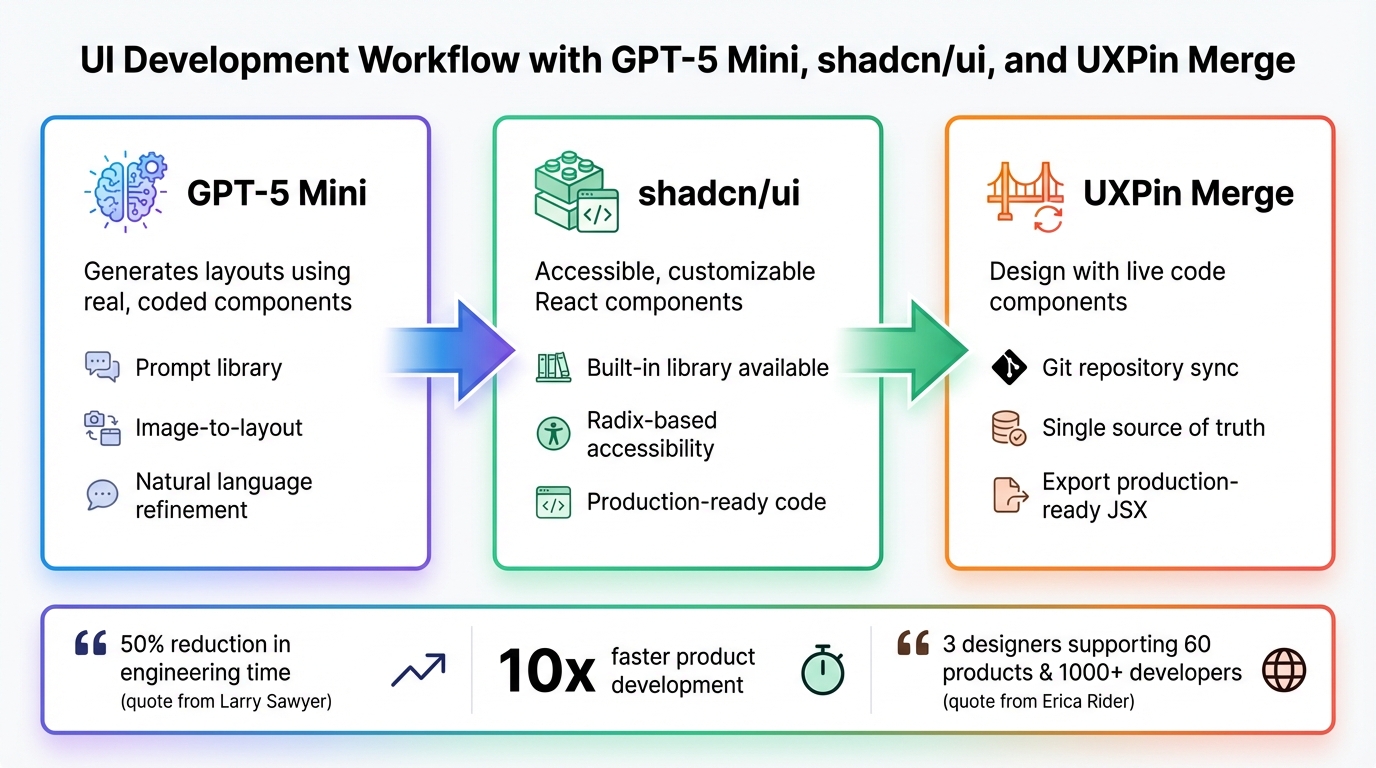
GPT-5 Mini, shadcn/ui, and UXPin Merge workflow for production-ready UI design
What UXPin Merge Does for UI Development
UXPin Merge bridges your design tool and production codebase, allowing you to design with the same React components developers use in production. This means when you add shadcn/ui components to your canvas, you’re not just working with visual placeholders – they’re fully functional, coded components.
Merge syncs components directly from your Git repository into the UXPin Editor. When updates are made in the codebase, the design library is automatically refreshed, ensuring everyone works with the latest version. This creates a single source of truth, where designers and developers use identical components.
This streamlined approach can cut engineering time nearly in half. Larry Sawyer, Lead UX Designer, shared:
"When I used UXPin Merge, our engineering time was reduced by around 50%."
What’s more, these components retain their full functionality on the design canvas. For example, shadcn/ui buttons in UXPin behave just like they will in production, complete with hover states, click interactions, and data handling. You’re essentially designing with live code, not static visuals.
How UXPin Merge Improves Team Collaboration
Traditional workflows often create a disconnect between design and development. Designers hand off mockups, developers interpret them, and details can get lost in translation. Merge solves this by enabling both teams to work from the same component library.
Designers use production-ready components directly in their prototypes. Developers, in turn, receive prototypes built with the exact components they maintain. There’s no need to convert design specs into code because the design is the code. This improves the design handoff and eliminates the back-and-forth that typically slows down projects.
This approach scales effectively as teams grow. Erica Rider, UX Architect and Design Leader, described its impact at a large organization:
"We synced our Microsoft Fluent design system with UXPin’s design editor via Merge technology. It was so efficient that our 3 designers were able to support 60 internal products and over 1000 developers."
Merge also integrates with GitHub, allowing Design Ops teams to manage versioning. When a component is updated, both designers and developers receive the new version simultaneously. This avoids the common issue of designers using outdated components while developers have already moved on.
By removing friction between design and development, teams using Merge can speed up product development by up to 10x. This unified workflow also enhances GPT-5 Mini’s ability to generate designs that align with approved systems.
Why GPT-5 Mini and shadcn/ui Work Well with UXPin Merge
These tools take collaboration a step further by ensuring consistency from AI-generated layouts to production code. GPT-5 Mini generates designs using real components from your design system, not generic placeholders. For instance, if you ask it to create a dashboard, it assembles it with shadcn/ui components already synced with UXPin Merge. The AI doesn’t invent new patterns; it works within the boundaries of your approved library.
This ensures consistency. Unlike other AI tools that create layouts requiring manual adjustments, GPT-5 Mini only uses components trusted by your developers. Every button, form, or card it suggests comes straight from your production codebase.
shadcn/ui’s architecture makes this integration seamless. Its React components are accessible and customizable, ensuring consistent behavior across different applications. When GPT-5 Mini arranges these components, it adheres to the rules of your design system, keeping everything aligned.
You can describe your requirements, let GPT-5 Mini assemble shadcn/ui components, refine the design, and export a production-ready prototype. Because the process starts with real code, there’s no messy conversion step where designs and code diverge.
As Nathan Curtis, Founder of EightShapes, aptly said:
"A design system isn’t a project. It’s a product serving products."
Merge treats your component library as a living, evolving product, ensuring it stays in sync with your codebase rather than becoming outdated the moment it’s published.
sbb-itb-f6354c6
How to Set Up GPT-5 Mini and shadcn/ui in UXPin Merge
Getting started with GPT-5 Mini and shadcn/ui in UXPin Merge is simple because shadcn/ui is already integrated into the platform. There’s no need to import libraries, configure API keys, or even have a paid ChatGPT account. UXPin includes shadcn/ui alongside MUI, Ant Design, and Bootstrap, meaning you can start designing with production-ready components right away.
The setup process varies depending on whether you’re using the built-in shadcn/ui library or a custom implementation maintained by your team. You can either use the built-in library or, for enterprise teams, connect your Git repository to integrate custom components and design tokens. Here’s how to configure GPT-5 Mini and incorporate shadcn/ui components into your design workflow.
How to Configure GPT-5 Mini for AI-Powered UI Generation
Thanks to seamless access to shadcn/ui, launching GPT-5 Mini in the UXPin editor is straightforward. Open the editor and click the AI button to access GPT-5 Mini’s design tools. From there, select shadcn/ui in the library dropdown before generating layouts. This ensures the AI uses actual coded components rather than placeholders.
GPT-5 Mini operates within the constraints of your chosen library. As UXPin explains: "AI should create interfaces you can actually ship – not just pretty pictures." By using real components, the system prevents design inconsistencies and ensures the output is ready for production.
You can generate layouts using three methods:
- Prompt library: Instead of crafting prompts from scratch, use UXPin’s optimized prompts for standard components and layouts, which deliver more precise results.
- Image-to-layout feature: Upload screenshots or sketches, and Merge will analyze the structure to recreate it using real shadcn/ui components.
- Natural language refinement: Use commands like "make this denser" or "switch button variants" to update existing layouts without starting over.
How to Add shadcn/ui Components to the Design Canvas
If you’re working with the built-in shadcn/ui library, simply select it from the library panel in the UXPin editor. You’ll have immediate access to components like buttons, forms, cards, and navigation elements. These components behave exactly as they will in production, giving you an accurate preview.
For teams using custom shadcn/ui implementations, you’ll need UXPin’s Enterprise plan, which includes Custom Library AI. This involves connecting your Git repository to UXPin Merge. Once synced, Merge integrates your specific components and design tokens. The AI then generates layouts using your custom library instead of the default shadcn/ui components.
The benefit of custom integration is that your UI design system patterns, tokens, and variants become part of the AI’s toolkit. UXPin emphasizes this point: "If [AI] ignores your component library, someone pays the price later: devs rebuild it, design drifts from code, and velocity drops." Custom Library AI ensures the AI only suggests components that align with your development team’s trusted resources, avoiding inefficiencies and inconsistencies.
How to Use GPT-5 Mini to Design UIs with shadcn/ui Components
Start creating layouts directly on the UXPin canvas. Thanks to the setup, GPT-5 Mini works strictly within the boundaries of your chosen library, using only components from shadcn/ui. This ensures that every layout generated is ready for production right from the beginning.
To get started, open the AI panel, describe the interface you need, and let GPT-5 Mini build it with real shadcn/ui components. You can refine the layout by using simple commands like "tighter spacing" or "outline buttons." The AI will instantly update the design while keeping everything consistent with your component library.
How to Generate Layouts That Match Your Design System
Once the initial layout is generated, GPT-5 Mini can fine-tune it to perfectly align with your design system. It strictly uses components from the shadcn/ui library you’ve selected, whether it’s the built-in version or a custom implementation. If you’re on the Enterprise plan with Custom Library AI, the model also respects your design tokens, ensuring even greater alignment.
The AI automatically follows strict design standards. For example, it applies spacing in increments of 4, sticks to a predefined set of font sizes, and adheres to your color system. Since GPT-5 Mini responds to precise instructions, the clarity of your prompts is crucial.
For more intricate designs – like dashboards or multi-step forms – the AI evaluates layouts against quality benchmarks. It ensures the designs meet high standards, including accessibility features built into shadcn/ui’s Radix-based components. This careful quality check guarantees a smooth transition from design to development.
How to Write Effective Prompts for AI-Driven UI Design
Once your layouts meet design standards, crafting well-structured prompts can further refine the output. The quality of the results heavily depends on how you phrase your requests. Be explicit about your frontend stack – mention tools like Next.js, TypeScript, Tailwind CSS, and shadcn/ui to leverage GPT-5 Mini’s expertise in these frameworks. For instance, instead of saying, "create a login form", try: "Create a login form using shadcn/ui components with Next.js and Tailwind CSS, featuring 2xl rounded corners and soft shadows."
Starting prompts with "You are a Senior Frontend Engineer" helps guide the AI toward generating production-ready code.
For common UI patterns, provide clear details about structure and functionality. For example, when requesting a dashboard, specify the number of columns, the shadcn/ui components to include (like cards, tables, or buttons), and any interactive elements. For navigation menus, clarify whether you need a sidebar, top bar, or mobile-responsive drawer. Including details like layout density, visual hierarchy, and component variants will help the AI produce results closer to your vision.
If you need adjustments, keep your requests concise to speed up the process. You can also ask for a brief explanation (2–3 bullet points) to understand the AI’s logic. For more complex layouts involving multiple components and interactions, detailed prompts ensure the AI considers factors like accessibility, responsiveness, and how components relate to one another.
How to Keep Components Synchronized
To keep your shadcn/ui components in sync with your code repository, connect it to a CI server like GitHub Actions, CircleCI, or Travis CI. This integration ensures that every time your team updates a component in the codebase, those changes are automatically reflected in the UXPin design canvas.
To enable this connection, you’ll need an Auth Token from the UXPin Editor. Store this token securely as the environment variable UXPIN_AUTH_TOKEN in your CI tool’s settings. This allows the build process to access the token without exposing it. Below, you’ll find details on automating this synchronization through CI/CD integration.
How to Automate Updates with CI/CD Integration
To automate synchronization, start by creating a configuration file in your repository. If you’re using GitHub Actions, set up a workflow file at .github/workflows/sync-merge.yml. This workflow should trigger on every push to the main branch. Add a script entry to your package.json file: "push": "uxpin-merge push". When the workflow runs, it executes this script to push updated components to your UXPin library, using the uxpin-merge push command within the CI pipeline.
For CircleCI, create a .circleci/config.yml file. Use a Node-compatible Docker image, such as circleci/node:10.15-stretch-browsers, and include a step to run ./node_modules/.bin/uxpin-merge push. You can customize this command with flags like --webpack-config to suit your project setup.
To make your workflow more efficient, configure it to trigger only on meaningful updates. For instance, in GitHub Actions, you can add conditions like !contains(github.event.head_commit.message, 'skip ci') to skip synchronization for minor commits. This approach ensures that only production-ready updates are pushed to your design library.
Why a Single Source of Truth Matters for UI Components
Automating this process creates a single source of truth for your UI components. This means designers and developers always work with the same, up-to-date components. The code repository becomes the definitive reference point, ensuring consistency between design and development.
With this setup, any code changes merged into the main branch are immediately reflected in the UXPin design canvas. This eliminates the risk of designers using outdated components while developers move ahead. It also minimizes rework – designers don’t need to manually verify if their components match the latest code, and developers avoid rebuilding interfaces that diverge from the original design.
For enterprise teams managing multiple products or platforms, this consistency is invaluable. Everyone works from the same, synchronized component library, making it easier to scale and maintain your design system across teams and projects.
How to Export Production-Ready Code from UXPin Merge
When you design your UI using GPT-5 Mini and shadcn/ui in UXPin Merge, you can export production-ready code directly. Unlike static mockups, UXPin Merge provides React components that developers can immediately plug into their projects. This eliminates the tedious process of rebuilding designs from scratch, saving both time and effort.
Thanks to the synchronized design system, exporting production-ready code becomes the final step in a seamless workflow. Since your prototype is already built with the same components developers use, the process is smooth and efficient. As UXPin puts it, "Merge hands your devs something they recognize – and can ship."
This method has been embraced by enterprise teams. By December 2025, companies like Amazon, the American Automobile Association (AAA), and T. Rowe Price were leveraging UXPin Merge to integrate their custom component libraries with AI-driven design workflows, speeding up the journey from prototype to production.
Next, let’s dive into how to generate JSX code that mirrors your actual components.
How to Export JSX Code from Prototypes
Exporting your design is simple. Start by selecting the prototype screens you want to export. UXPin Merge then generates JSX code that matches the structure of the components you’ve built on the canvas. Since you’re working with real React components – not just visual mockups – the exported code mirrors production syntax.
Developers can integrate this JSX code directly into their projects. Because the components are already coded and tested, there’s no need for developers to rebuild interfaces from scratch. Before exporting, you can refine layouts – adjust table columns, change button styles, or tweak spacing – without altering the core component structure. This ensures the exported code is ready for deployment.
This direct export feature translates into noticeable time savings for development teams.
Why Code-Compatible Prototypes Save Time
Using live components removes the need for developers to redraw code. In traditional workflows, developers interpret static designs and recreate them in code, often leading to errors, inconsistencies, and delays. UXPin Merge eliminates this translation step entirely, ensuring a smoother process and reducing rework.
As UXPin explains, "AI should create interfaces you can actually ship – not just pretty pictures." By using the same shadcn/ui components that exist in your codebase, developers can "receive layouts already composed from your library – stop redrawing in code." This approach significantly cuts deployment time, reducing it from weeks to just days. It’s especially impactful for enterprise teams managing multiple products or platforms, where speed and consistency are essential for staying competitive.
Conclusion
With the integration of GPT-5 Mini, shadcn/ui, and UXPin Merge, the collaboration between design and development becomes far more efficient. Instead of spending months converting static mockups into code, teams can now design directly with production-ready components, ensuring everyone stays aligned around a single source of truth.
The time savings are undeniable. Erica Rider, a UX Architect and Design Leader, highlights this transformation:
"It used to take us two to three months just to do the design. Now, with UXPin Merge, teams can design, test, and deliver products in the same timeframe. Faster time to market is one of the most significant changes we’ve experienced using Merge."
By combining AI-driven layout generation with synchronized component libraries, the process from concept to deployment can shrink from months to just days.
This guide has outlined a workflow where GPT-5 Mini generates layouts using pre-approved components, exporting JSX code that perfectly matches your production codebase. This approach eliminates inefficiencies in the design-to-code handoff, delivering benefits like faster timelines, consistent design systems, and seamless teamwork between designers and developers.
Whether you’re working on a quick prototype, an MVP, or a large-scale project, this integration offers the speed, consistency, and scalability that modern teams demand. With UXPin Merge, AI-generated designs are no longer just conceptual – they’re production-ready interfaces your team can ship.
Want to transform your UI development process? Dive into UXPin Merge and discover how designing with code components can accelerate delivery while maintaining consistent design systems across every project.
FAQs
Do I need an Enterprise plan to use my own shadcn/ui components?
No, you don’t need an Enterprise plan to use your shadcn/ui components in UXPin Merge. You can integrate your components with UXPin on any plan that includes Merge, so there’s no need for an Enterprise subscription to get started.
How does UXPin Merge keep my components synced with GitHub and CI?
UXPin Merge integrates seamlessly with GitHub and CI/CD workflows by connecting directly to your repositories. It allows you to import and keep React.js components up-to-date in UXPin by syncing them with your Git repositories. With CI tools like GitHub Actions or CircleCI, you can automate updates, ensuring that any changes made in your codebase are automatically reflected in UXPin. This eliminates the need for manual updates and ensures alignment between your design and development teams.
Will the exported JSX match my app’s Next.js and Tailwind setup?
Yes, the exported JSX is built to create React components ready for production while adhering to your design system and coding standards. It works smoothly with frameworks like Next.js and styling solutions such as Tailwind CSS, particularly when paired with shadcn/ui. Just make sure your tools and prompts are properly configured to generate React-compatible code that fits seamlessly into your app’s current setup.

