Cognitive Friction in UX Design – Good or Bad?
Incorporating cognitive friction to improve user experience sounds like an oxymoron, but it can have positive effects in the right circumstances. Friction is vital for protecting users and ensuring they don’t complete tasks accidentally.
The more familiar users get with a digital product and design patterns, the more likely they are to work on autopilot, leading to errors and nonreversible actions. Cognitive friction is a strategy to avoid these issues and improve the user experience.
Table of contents
Solve complex usability issues and create digital experiences your customers love with the world’s most advanced end-to-end design tool. Sign up for a free trial to discover how UXPin can enhance your UX workflows.

What is Cognitive Friction?
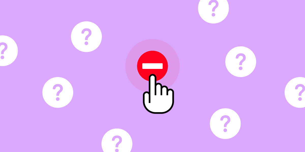
Cognitive friction in UX occurs when a user interface or feature forces users to stop and think, increasing cognitive load. It can also refer to instances where features aren’t intuitive or don’t function as they’re supposed to.
These “roadblocks” prevent or interrupt users from completing tasks, causing frustration that ultimately leads to product abandonment and fewer conversions.
UX designers are taught to avoid these scenarios and reduce decision-making by creating seamless, uninterrupted user experiences, getting users to an end goal as efficiently as possible.
6 Types of User Friction in UX Design
We have identified six primary types of user friction in UX design:
- UI friction – cluttered user interfaces and incorrect design pattern usage
- Interaction friction – UI elements aren’t intuitive and don’t function as expected
- Language friction – incorrect word choice and poor instructions
- Input friction – challenges completing forms
- Navigational friction – poor navigation, unnecessary steps, broken links, etc.
- System friction – slow load times, crashes, and other performance-related issues
How to Identify Cognitive Friction?
Using Jakob Nielsen’s 10 usability heuristics principles for interaction design is an excellent methodology to incorporate in a UX audit to identify common usability issues that cause friction.

These principles include:
- Visibility of system status
- Match between system and the real world
- User control and freedom
- Consistency and standards
- Error prevention
- Recognition rather than recall
- Flexibility and efficiency of use
- Aesthetic and minimalist design
- Help users recognize, diagnose, and recover from errors
- Help and documentation
Further reading: UX Audit – All You Need to Know, Benefits, and Checklist.
What are Some Examples of Cognitive Friction?
Here are three common examples where design decisions cause cognitive friction.
Example #1. Broken links
Broken links commonly cause cognitive friction. Users think they’re navigating to a specific feature, but the link either doesn’t work or takes them elsewhere. Frustration compounds when there is no way to navigate back or they must repeat a task.
Example #2. Hiding features
It’s not uncommon for companies to make it difficult for users to downgrade a paid plan or delete their accounts entirely. The hope is that the user will give up and keep their subscription. Searching for hidden features is time-consuming and frustrating, leading to distrust in the product and brand.
Example #3. Unnecessary steps
Companies often collect excessive data or create unnecessary steps for tasks. These additional interactions mean users spend more time completing tasks and forms than they should.
For example, asking for a customer’s age, gender, and income bracket on an eCommerce checkout form might help with future marketing initiatives, but it’s intrusive and creates a point of friction. Additionally, misusing accordions, confirmations, dropdown menus, and other interactive UI elements adds unnecessary steps and interactions.
When is Cognitive Friction Good?
Here are four instances where UX designers intentionally create friction to improve user experience.
Two-Factor Authentication
Two-factor authentication (2FA) is a fantastic example of designers creating friction to improve cybersecurity. 2FA adds an extra step for user logins or confirming critical functions (like bank payments) to reduce the risk of someone other than the authorized user from completing these tasks, providing a robust security layer that works alongside a user’s primary password management tool.
Many products use apps like Google Authenticator or a one-time pin sent to a user’s email or mobile. The user must enter a six-digit code to complete authentication.
2FA creates additional steps but keeps people safe for high-risk products and tasks.
Confirmation dialogs
Designers often use UI dialogs or modals to confirm critical nonreversible actions–like deleting something or navigating away from a page with unsaved content. For example, “Are you sure you want to delete this project?”
While some people find these dialogs annoying, they’re quickly swayed when it prevents them from accidentally deleting a project that took many hours to create!
In some instances, UX designers create additional steps within the modal to prevent mistakes–like typing “DELETE” to confirm. This added friction forces users to stop and think about what they’re doing to prevent someone from mindlessly completing a critical nonreversible action.
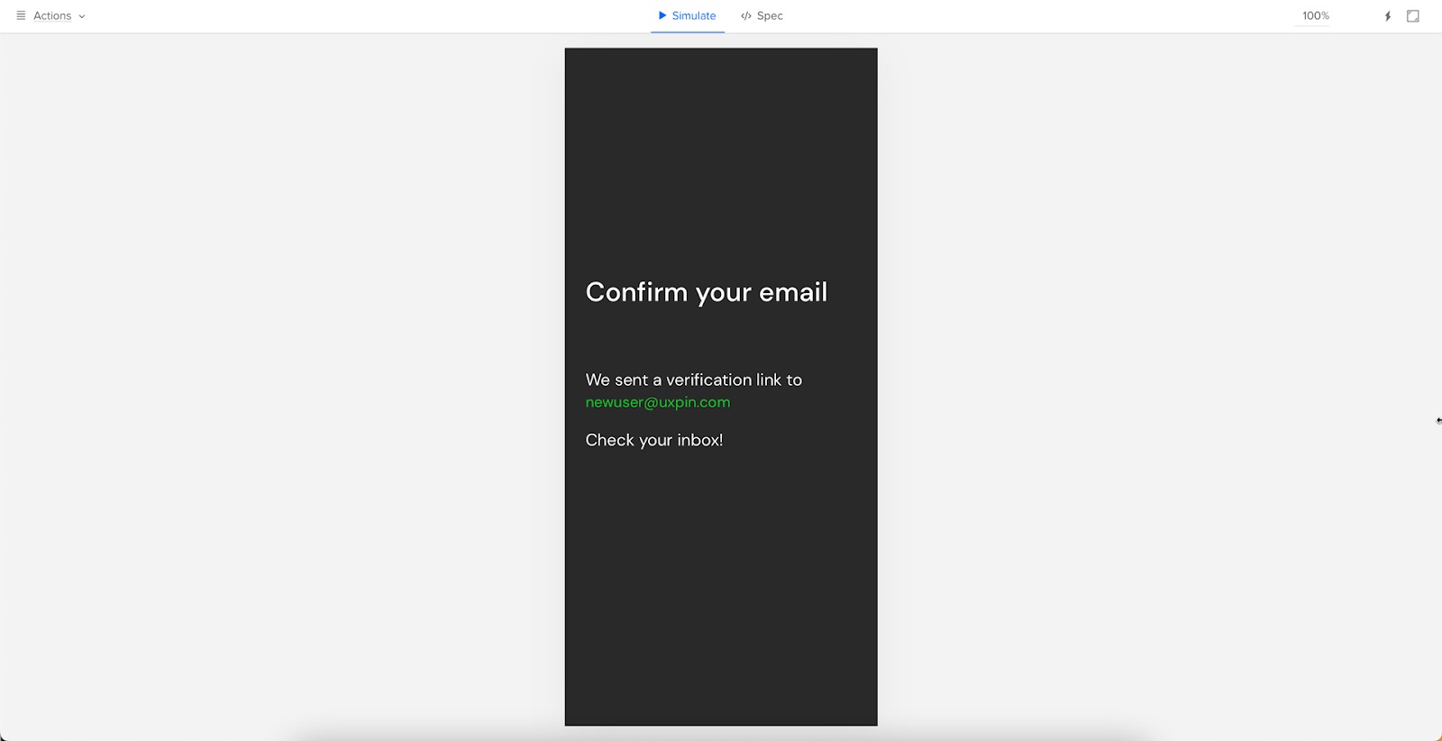
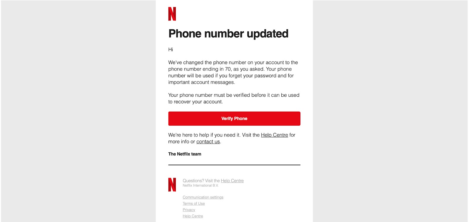
User and task verification
Many products use validation systems to confirm a user has access to a given email address or mobile number. In this example, users are asked to verify their email addresses from UXPin’s sign-up form prototype.
Designers also use friction to verify the user made critical account changes. This example from Netflix shows an email sent after users change their mobile numbers. Users must click “Verify Phone” for the changes to take effect. This friction prevents unauthorized changes to someone’s account details.
System loading
Many digital products and websites use friction via loading icons and other microinteractions when a system is loading or working. This feedback tells users to wait while the system is busy.
It’s important that UX designers only use these microinteractions when it’s 100% necessary and never allow them to last more than a few seconds. If your product takes more than five seconds to process a task, you might need to work with the engineers on performance optimization.
When is Cognitive Friction Bad? (And solutions for improvement)
Cognitive friction is generally bad, and it’s a UX designer’s job to pinpoint these issues and find solutions. Here are four common examples of bad cognitive friction and how to reduce or eliminate them.
Design inconsistency
Design consistency is an essential UX design component. It helps create familiarity, making user interfaces and interactions more predictable and easier to use.
Design inconsistency creates friction resulting in usability and accessibility issues. For example, if a sign-up sequence uses a green button to proceed to the next step and randomly uses red on one UI, users must stop to think about whether or not this red button will perform the same action as the green.
Creating a design system or UI kit is a trusted methodology for improving design consistency. When product teams use the same library of approved components, there are fewer errors, and designers have to do less thinking (friction) themselves.
Too many steps
Designers must think of every step in a task, no matter how essential, as a point of friction. UX teams can use usability testing and user interviews to understand the customer journey and identify areas for improvement.
Sometimes these improvements will come from optimizing the UI components and input fields to reduce actions rather than removing steps. For example, is it better to use a dropdown or buttons for a product’s size options?
This example uses a dropdown, meaning users must click/tap twice to choose a size. This process is particularly challenging for users on mobile devices and people with dexterity issues.
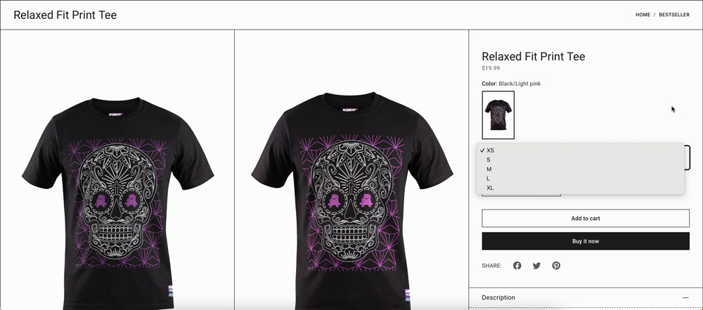
In this second example, designers use buttons, so users only have to click/tap once to make a selection. Different process, same result, one less step, and reduced friction.

This example might seem like a small change, but finding similar improvements reduces overall friction and gets users to their end goal faster.
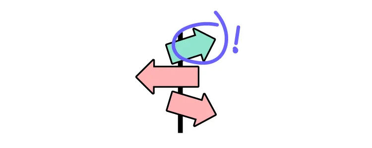
Unfamiliar patterns
Designers use internationally recognizable design patterns to solve fundamental usability issues. For example, everyone expects a hamburger icon will open the primary navigation. Using the hamburger to activate another feature or a different icon causes confusion and friction.
These patterns are essential in complex products where users must learn how to use the system. If they also have to learn to use new UI patterns, this adds to the learning curve, creating more cognitive friction.
Poor communication
Designers communicate with users through text, color, visual hierarchy, UI elements, images, and video, to name a few. Understanding user needs and how they absorb content is critical to effective communication and reducing friction.
A fantastic example is how UXPin uses multiple elements to communicate with users in its documentation.
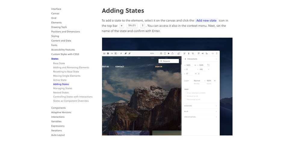
- The heading, Adding States, describes the task.
- The explanation uses short sentences and plain language.
- A blue highlight and text tell users which feature to click while blocks created to look like keys on a keyboard show the shortcut.
- A video provides added context to help users who learn better through visuals.
UXPin’s docs make it easy for designers to quickly absorb the instructions to apply to their projects.
Effective communication throughout your product, from button labels to documentation tutorials, reduces the mental effort required to complete tasks.
Reduce Friction During the Design Process With UXPin
Reducing friction during the design process is often challenging for UX teams. Design tools don’t provide the same fidelity and functionality as code, making it hard to prototype and test effectively.
UXPin is powered by code, enabling designers to build complex user interfaces and components that look and feel like the final product. The tools, features, and design canvas look the same as any other design tool, but the results are significantly better.
Higher quality, realistic prototypes result in meaningful feedback from user testing and stakeholders–allowing designers to improve with every iteration.
Designers can test complex user journeys like fully functioning checkouts or forms that capture extensive data with multiple steps–sequences that often cause cognitive friction! Integrate.io helps teams manage these complex data flows and transformations to ensure forms and systems work smoothly without creating unnecessary friction in the backend.
Improve your product design projects, reduce usability issues, and enhance your product’s user experience with quality prototyping and testing in UXPin. Sign up for a free trial to discover all of UXPin’s advanced features.


