Cross-Platform Experience – An In-Depth Guide for Product Designers

With an ever-growing list of devices, operating systems, and technologies, cross-platform experience design is an essential component of the product development process.
Many organizations have dedicated teams for iOS, Android, Windows, etc., to ensure products meet platform-specific requirements and user expectations.
Create seamless cross-platform customer experiences with the world’s most advanced UX design tool. Sign up for a free trial to discover interactive prototyping with UXPin.

Table of contents
What is a Cross-Platform Experience?
A cross-platform experience (also called platform-agnostic design) describes the user experience comparison across multiple devices, including Web, mobile, tablet, and wearables, in addition to operating systems like iOS, Android, Windows, Mac, etc.
The aim for product developers is to create a comparable, seamless user experience across different platforms and operating systems to ensure their products serve all users.
Designers also want to ensure end users can access the same features and complete tasks regardless of device or operating system. For example, the ability to make a payment from your bank account whether you use the bank’s web portal or mobile app, or build a custom database-driven app using a no-code app builder that publishes to both iOS and Android.
Responsive design vs. cross-platform design
Responsiveness is one facet product teams must consider when designing cross-platform experiences. Responsive design is specific to web browsers and how user interfaces look across desktop, tablet, and mobile viewports.
Cross-platform design is a broader concept where designers must consider web browsers, devices, and operating systems, in addition to a product’s user experience on a web, tablet, and mobile apps on iOS, Android, Windows, and other operating systems. For example, a simple alert component will look completely different on iOS, Android, Windows, macOS, Safari, Chrome, and Edge.
Why Designing Cross-Platform Experiences is Important
Business value
From a business perspective, cross-platform design is crucial. In the United States, iPhone enjoys a 65% market share, but there are 2 billion global Android users or a 71.35% market share. Android makes up more than 90% of the market in some countries where iPhones are unaffordable. Not serving either of these markets means you’re leaving a lot of money on the table!
Companies must also consider responsive design and how their website and web applications render across desktop, tablet, and mobile. Many people only use their smartphones to browse the internet; if they can’t purchase products and services efficiently using these mobile devices, these companies lose valuable revenue.
Competitiveness
People expect products to work comparably across multiple devices. If users can’t complete the same tasks on your Web and mobile applications, they’ll find a competitor that does!
Nowhere is this more apparent than in FinTech. Mobile-first/only banking and investing applications have exploded in the last decade as startups aim to fill the gap left by traditional financial institutions. Many of these legacy institutions have been slow to deliver mobile solutions, allowing FinTech startups like Robinhood, Monzo, Chime, Revolut, and others to capture significant market share.
Inclusivity
If you want your products to be inclusive for everyone, then cross-platform design is essential. Apple products like iPhones and Macs are at the high end of consumer electronics–many people cannot afford these luxuries.
If your products only serve Apple devices or don’t provide a comparable experience on Android, Windows, and the Web, then you’re excluding a massive part of the global population, including marginalized communities who cannot afford Apple’s products.
6 Key Principles of Designing Cross-Platform Experiences
Consistency
The first rule for cross-platform design is maintaining a consistent user experience across Web and mobile applications and operating systems. This consistency includes user interface design, functionality, features, interaction design, and branding, to name a few key factors.
It’s impossible to get precise UI consistency across multiple platforms and devices, but designers can control messaging, interactions, performance, and timing, which must always be consistent.
Seamless experience
A seamless cross-platform user experience means people can complete the same tasks across multiple devices. Additionally, they can start a task on one platform and complete it on another.
For example, you can create an email on the Gmail mobile app, save it to drafts and finish it on your desktop computer at another time. This seamless user experience gives users the flexibility to work and complete tasks according to their specific schedules rather than structuring their lives around technology–i.e., waiting until they get to a desktop to send an email.
Cross-platform usability (Interusability)
Cross-platform usability or interusability describes the user experience and coherency across multiple devices in an Internet of Things (IoT) ecosystem.
Netflix is a familiar example where users can watch on mobile phones, tablets, laptops, and Smart TVs. Within each category are multiple devices, operating systems, and screen sizes.
Charles Denis and Laurent Karsenty coined interusability in a 2003 publication, Inter-Usability of Multi-Device Systems – A Conceptual Framework, which describes three key components for designing coherent cross-platform experiences:
- Continuity: facilitating a seamless flow of content and interactions across products, tools, and devices
- Composition: organizing functionality across products and devices
- Appropriate consistency: designers must balance UI design consistency with native layouts and patterns
Prioritization and visual hierarchy
Prioritizing content and layouts is crucial for designing cross-platform user experiences. On desktops and Smart TVs, users can see more content and features. On mobile apps and other small screens, designers must prioritize content, often using personalization.
For example, no two Netflix or YouTube accounts look the same. Product developers use personalized algorithms to prioritize content and features to meet each user’s needs and preferences.
Prioritization also includes visual hierarchy. On large screens, there’s space for more content and features. On mobile devices, designers must determine what content is always visible and where they must hide content using accordions, navigational drawers, dropdowns, and other space-saving UI patterns.
Accessibility
Cross-platform accessibility is essential for compliance and ensuring products are fully inclusive. Designers must ensure users can use built-in assistive technologies like voice commands, screen readers, font adjustments, etc.
Designers must also provide dark and light modes to accommodate users with visual impairments. Colors render differently across devices, which impacts contrast and readability.
Adaptability
It’s not always possible to create a product for every device. For example, an enterprise warehouse management system won’t work on smartwatches–the UI and architecture is too complex. But you can create a smartwatch app that receives critical notifications so the user can get to a mobile app or desktop as soon as possible.
While adaptable experiences aren’t always in line with the product’s goals and features, they can provide value and even attract new customers.
3 Tips to Design Cross-Platform Experiences
Design for familiarity
Many apps use native styling and components to create platform familiarity. For example, using the iOS and Android icons instead of your custom set. While these features don’t conform to your brand, they can make the product feel like it was built specifically for the user’s device, thus elevating your cross-platform user experience.
Create design system
Design systems create constraints and solutions for maximizing cohesion and consistency. They also provide product teams with patterns and components to meet platform-specific rules and guidelines.
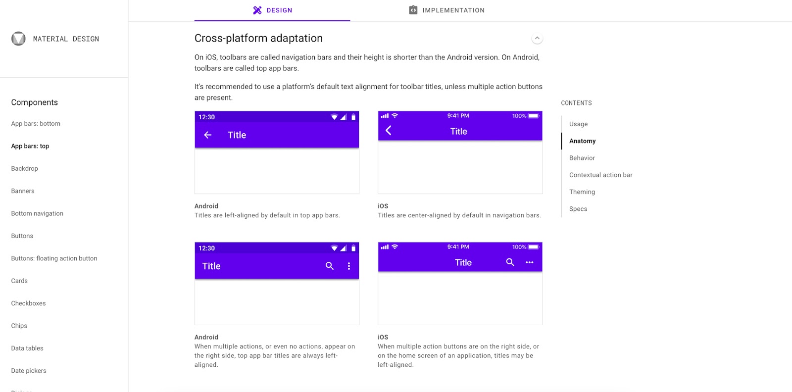
Material Design’s documentation tells designers how components will look on Android and iOS. For example, this Top App Bar from Material Design provides examples of how each operating system will render the component. The icons, alignment, spacing, and app bar height differ between iOS and Android.
Creating these cross-platform components ensures designers conduct accurate testing during the design process for the operating systems your product supports.
Use a design library
UXPin includes canvases for the Web, iOS (including iPhones, Apple Watches, and Apple TV), and Android so that you can create layouts for each device. You can also use a custom canvas size to meet your platform’s screen width.
UXPin’s built-in design libraries include iOS and Material Design components, so you can build cross-platform experiences without installing plugins or extensions. Drag and drop platform-specific UI elements to prototype products across both operating systems.
Use the UXPin Mirror app (available on iOS and Android) to test your cross-platform apps on multiple devices. You can also preview prototypes in the browser for testing on smartphones, tablets, desktops, Smart TVs, etc.
Building Cross-Platform Prototypes With UXPin
UXPin includes canvases for the Web, iOS (including iPhones, Apple Watches, and Apple TV), and Android so that you can create layouts for each device. You can also use a custom canvas size to meet your platform’s screen width.
With UXPin’s Design Systems, you can create a cross-platform component library and share it across your organization to keep teams aligned and UIs consistent. Use descriptions to include documentation for each platform and set permissions to prevent unauthorized changes to your design system.
Design better cross-platform user experiences with the world’s most state-of-the-art UX design tool. Sign up for a free trial to explore all of UXPin’s advanced features.

