iOS vs. Android UI Design: 9 Key Differences Every Designer Should Know (2026)
Apple’s iOS and Google’s Android are the two dominant mobile operating systems, and each follows distinct design standards. While developers have creative control over their app’s aesthetics, both platforms have native guidelines and component differences that directly affect mobile UI design.
This article breaks down 9 key differences between iOS and Android UI design — from navigation and typography to date pickers and dialogs — so you can create apps that feel native on each platform.
Need to prototype for both platforms? Try UXPin for free — use built-in iOS and Material Design libraries, then preview on real devices with UXPin Mirror.

Platform-Specific UI Design Guidelines
- Android → Material Design (maintained by Google)
- iOS → Human Interface Guidelines / HIG (maintained by Apple)
Why Do iOS and Android Have Design Guidelines?
Platform guidelines create a seamless experience between the OS and third-party apps. Without them, every app would feel wildly different, forcing users to relearn interactions each time. As basic UX design principles and design psychology tell us, cognitive load leads to frustration and abandonment.
Android: Material Design 3
Android devices follow Google’s Material Design. Material Design 3 (M3) introduced dynamic color theming and design tokens. UXPin supports Material Design components through the MUI library integration.
iOS: Human Interface Guidelines (HIG)
Apple’s HIG covers all Apple platforms. Apple also provides design resources with templates and component files.
9 Differences Between iOS and Android UI Design
1. Screen Sizes and Device Fragmentation
iOS offers predictable viewports — Apple controls every device. Android has thousands of manufacturers and screen sizes, making responsive layouts and density-independent sizing critical.
2. Units of Measurement and Tap Targets
- iOS: Points (pt) — 1 pixel = 0.75pt. Min tap target: 44 × 44pt
- Android: Density-independent pixels (dp) — 1 pixel = 1dp. Min tap target: 48 × 48dp
3. Navigation Patterns
Navigation is one of the biggest platform differences.
Android provides system navigation with three functions:
- View all open apps
- Return to home screen
- Go back to previous screen
iOS has no persistent back button. Users rely on swipe gestures and can view open apps by swiping up from the bottom.
Both have top navigation bars with a back button left, title center, and actions right. iOS sometimes uses text for right-side actions (“Edit”), while Android consistently uses icons.
4. Floating Action Button (FAB)
The FAB is a signature Android pattern for the screen’s primary action — composing emails in Gmail, creating posts. iOS places primary CTAs in the top nav or bottom tab bar.
5. System Fonts
- iOS: San Francisco (plus New York as a serif option)
- Android: Roboto
Both HIG and Material Design provide detailed typography guidelines.
6. iOS Flat Design vs. Material Design Elevation
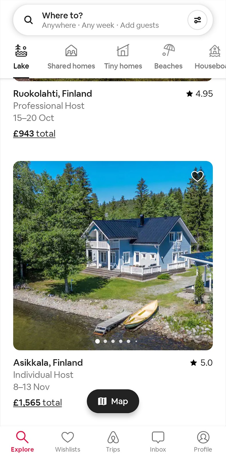
HIG recommends flat design; Material Design uses elevation and shadows for depth. Airbnb’s map FAB shows this: Android adds a shadow, iOS stays flat.

7. Date Pickers
Android uses a calendar interface; iOS uses scrolling drum/wheel selectors. Exceptions exist — iOS uses calendars for date ranges, Android uses wheels for some time selectors.
8. Dialogs and Alerts
HIG calls them Alerts; Material Design calls them Dialogs. Each has specific guidelines for anatomy and button placement.
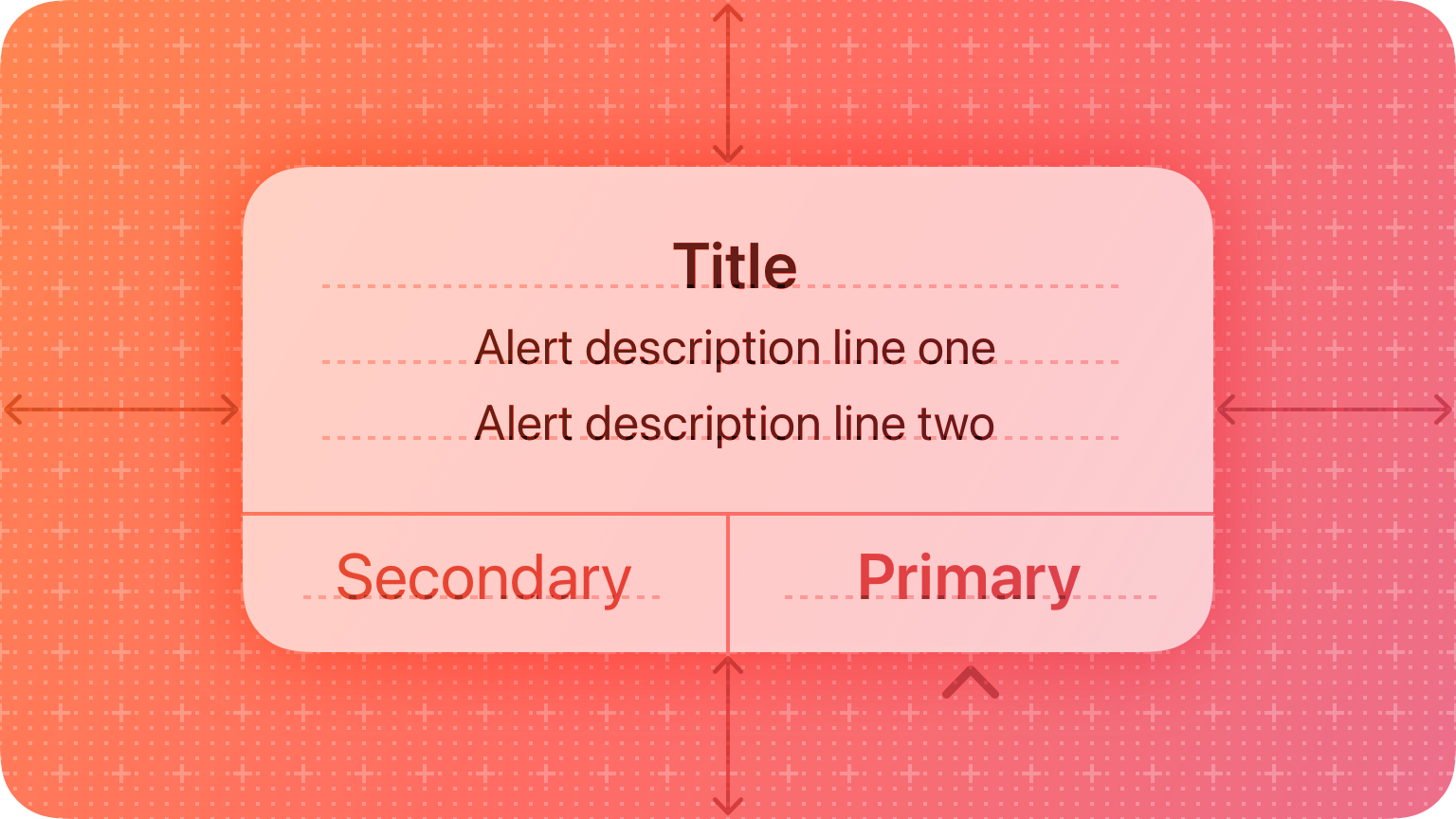

Material Design also uses snackbars for low-priority, non-blocking messages.
9. Tabs and Segmented Controls
Material Design 3 replaced Tabs with Segmented Buttons — supporting option selection, view switching, and sorting. HIG’s Tab Views are for switching views only, while Segmented Controls handle option selection.
Prototype Both Platforms in UXPin
UXPin makes cross-platform mobile design practical with built-in iOS and Material Design libraries.
Key features for mobile prototyping:
- States: Multiple component states for accordions, dropdowns, and carousels.
- Interactions: Mobile-specific triggers — tap, swipe, press-and-hold, focus.
- Variables: Capture inputs across screens for dynamic experiences.
- Expressions: Form validation, date formatting, and JavaScript-like logic.
Use Adaptive Versions for platform-specific layouts and UXPin Mirror for on-device preview. For shared design systems, UXPin Merge imports production components, and Forge generates layouts from text prompts using your component library.
Sign up for a free UXPin trial today.
Frequently Asked Questions: iOS vs. Android UI Design
What are the main differences between iOS and Android UI design?
Navigation (gestures vs. back button), typography (San Francisco vs. Roboto), visual style (flat vs. elevation), the FAB (Android-specific), date pickers, dialog anatomy, and tab behavior.
What are Apple’s Human Interface Guidelines (HIG)?
Apple’s official design standard for all Apple platforms — covering component anatomy, navigation, typography, color, and accessibility.
What is Google’s Material Design?
Google’s open-source, platform-agnostic design system (currently M3) with guidelines for components, typography, color, and motion.
Should I design differently for iOS and Android?
Generally yes. Following native patterns improves usability. Prioritize navigation, fonts, elevation, date pickers, and dialogs. Maintain brand consistency while respecting platform conventions.
What units do iOS and Android use?
iOS uses points (pt) with 44×44pt minimum tap targets. Android uses density-independent pixels (dp) with 48×48dp minimum tap targets.
How can I prototype for both platforms in one tool?
UXPin includes built-in iOS and Material Design libraries, Adaptive Versions for platform layouts, UXPin Mirror for on-device preview, and Merge for production code components.


