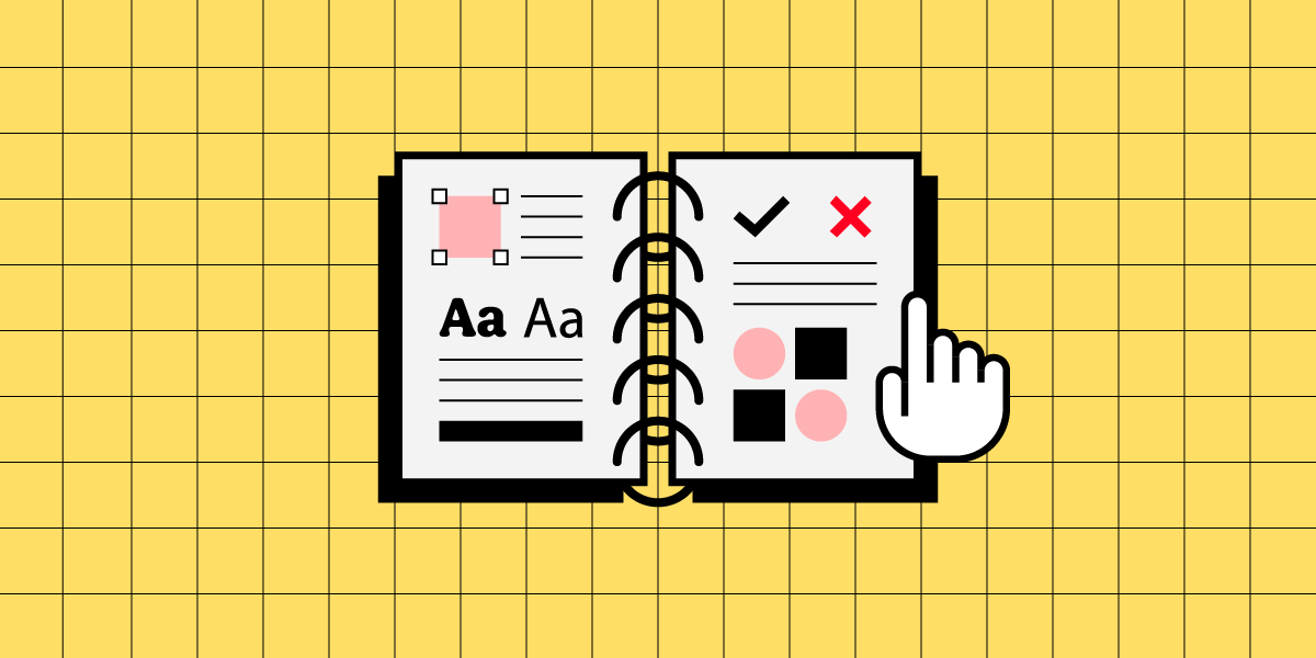
Design System Documentation in 9 Easy Steps
Design systems provide you with a complete set of standards to enhance and manage your design efforts – from beginning to end. But in order to build and maintain a functional design system, first, you’ll have to commit time and effort before enjoying the benefits of a well-oiled design machine.
Looking for a design system management tool? UXPin Merge is a technology for bringing design library’s components to UXPin and using them in prototyping. Read more about UXPin Merge.

What is design system documentation?
Design system documentation is a comprehensive guide on using a design system. It contains UI elements, components, and design language together with an explanation of how to use them. It helps share, consume, and execute these rules. This ultimately helps designers and developers to model their efforts around delivering a more predictable UI.
Design system documentation plays a crucial role in facilitating the adoption and implementation of a design system. It helps ensure consistency, efficiency, and predictability in UI design and development efforts, ultimately leading to a better user experience across products and platforms.
Two types of structuring design system documentation
A typical design system comprises a component library encompassing UI design elements and other components along with workflows. Design systems thus work to unify pattern libraries and style guides into a single cohesive experience.
Task-specific design system documentation
According to Heidi Adkisson, Principal UX Designer & Partner at Blink UX, while there are many different design documentation variants, some of the more task-specific types include:
- User Stories – allow designers to base their approach on the user needs perspective.
- Screen Flow Diagrams – are great for showing how a user might navigate between screens.
- Use Cases – offer longer, more objective narratives which hold enormous benefits down the line.
- Page-Level Documentation – describes an overview of a page’s function, purpose, and instructions for demos.
- Scenario Narratives – outline descriptive narratives around how to perform specific tasks.
Structural design system documentation
Other design documentation types related to docs from a structural perspective and often include:
- Object Model – which provides a structural view of a system.
- Architecture Map – communicates how the app or site is structured in general.
- Standardized Components – talk about standardized elements which are shared across the system.
- System Vocabulary – lists the specific words, phrases, and other relevant system-specific language.
- Navigational Framework – describes menu items, navigation elements, and control mechanisms.
Why do you need to document your design system?
Design documentation is today an essential component of any design system. From providing context to describing team coordination efforts and maintaining a clear record of the system’s component library, component documentation is fundamental to successful design.
Design system documentation was once considered “non-critical” and was often overlooked. Without ever being exposed to the potential of design system documentation, stakeholders had no idea of the value that documentation could bring.

Following the emergence of Google’s Material Design, it quickly became clear that design documentation was critical. Most design documentation consisted of disorganized notes and bullet points, leaving most of the vital information out of the system. Material Design changed all that, adding the necessary structure and warranting the need to document.
Documenting a design system comes with a raft of benefits as well:
- It provides a vision for the team to buy into – By creating design documentation that focuses on people, instead of black and white technical directives, you’re able to establish a clear vision that teams can refer back to when they lose focus.
- It gives the design system a clear, material structure – By keeping ahold of processes, designers and developers can better rely on a plan which has been laid out in front of them, instead of existing as an idea or general objective.
- It helps you to save resources – A good, high-quality document design infrastructure will save on costly trial-and-error mistakes, allow teams to optimize their time and effort, and ensure that reusable design patterns get recorded and later replicated.
- It drives engagement and satisfaction – Big projects can take a hefty toll on teams. Effective design documentation gives them something real to work towards – something they can count on when the going gets tough.
- It improves efficiency and productivity – With everything the team needs documented and made available, things get done faster, while keeping everyone on the same page.
Without effective design documentation, successfully designing and delivering a product to market is near-impossible. Design system documentation has become essential by providing the rationale behind specific design decisions and helping users understand and interact with the model.
9 steps to creating design system documentation
Step 1: Understand who is going to use the documentation
The very first step in design system documentation is to kick things off by looking at the market you’re doing all this work for – your users. Without understanding what they want, you’ll likely get your design goals and results very wrong.
Think about categorizing your documentation as a product and your team as the consumers of that product. Focus on who will be using this documentation, what you’ll need to include to give them the context they’re looking for and how to structure it in a way that it’ll be easy to consume.
Step 2: Outline the documentation needs of each component
Next, you’ll need to establish an outline covering the needs of each component and should include design guidelines on:
- Patterns
- Code snippets
- Colours
- Images
- Fonts
- ADA compliance guidelines and more.
Component documentation should consider the needs of your organization first and foremost before considering the outline in the context of other design elements.
Step 3: Create a style guide
Style guides help to establish the basis for the visual presentations of the documentation and offer a guideline for the visual and content elements of a design system. Style guides begin by looking at the other design documentation elements and describe the colors, logo prominence, and overall language tone. Ultimately, they serve as the template for others to use.

Step 4: Create a reusable template that you can share with your team
Then, you’ll need to draft a template your team can reuse over and over while sharing it with one another. Having a recyclable documentation template saves your team time, keeps things consistent and ensures that everyone understands what they’re looking at.
When sharing your documentation files, make sure they’re accessible to all team members while maintaining security standards. If your file is password-protected, you can remove PDF password restrictions to make sharing easier without compromising the integrity of your design system.
Step 5: Develop a single source of truth
Establishing, articulating, and documenting a single source of truth is probably one of the most important product design components. This universally approved agreement centers on everything your design team will be working on. From icons and color schemes to type scales and buttons – if everyone knows and understands what things need to look like, things will flow far more smoothly.
Start either with basic design components, found in your component library – created with tools like UXPin – or commence with the development phase, with React components defining the origins. UXPin, for example, allows you to ensure consistency throughout the company with UXPin Merge’s design system versioning.
Keep creating a single source of truth for your team to design from when working on projects. UXPin Merge offers a design system versioning, allowing you to optimize your single source of truth design approach and to manage code-driven prototyping with it. With tools like UXPin, you can make use of baked-in open-source libraries or import your own design system via Git, Storybook or NPM integration.
Step 6: Include a starter’s kit
Design kits are a sometimes-overlooked component of good design system documentation. However, these necessary resources represent the “starting point” elements that are so essential for good user experience. Starter kits are the perfect onboarding tools and are flexible enough to range from step-by-step guidelines to advanced user manuals.
Step 7: Collect feedback
Feedback lets you know when a design system is working well, and when it isn’t. Some organizations, for example, limit their feedback collection mechanisms to GitHub issues, creating challenges for designers and less-technical role players in giving their thoughts.
Alternative feedback collection methods like website feedback boxes on documentation sites allow users to describe and submit the issue. A streamlined feedback channel without the need to open a GitHub issue allows anyone looking to provide any feedback the ability to do so quickly and via the documentation platform.
Step 8: Distribute the responsibility
Documenting can be a labor-intensive task for which people aren’t always willing to volunteer. But sharing its importance with the team helps them to understand the value of taking care of it. Instead of burdening one person with this challenge, consider sharing the responsibility of doing so across the team. This way, you’ll get a variety of insights as well as make the task easier to accomplish.
Step 9: Update it regularly
Design systems need to be maintained, kept clean, and relevant. Continually keep an eye on identifying potential problem areas, reducing discrepancies, and streamlining the number of active systems.

A good example here would be to establish a single source of truth for your React story code examples for your documentation site and design system components, updated regularly to ensure they align with each other.
UXPin also boasts a regular update feature. Whenever making changes to a master component from a design system, UXPin allows you to update it in the system immediately, ensuring everything stays completely aligned.
Design System Documentation Template
Here is a template that you can use when writing your own design system documentation. Use it as a reference.
1. Introduction
- Overview: Provide a brief introduction to your design system. Explain its purpose, key goals, and the value it brings to your organization.
- Principles: List the core principles or guidelines that underpin your design system. These might include consistency, accessibility, responsiveness, and scalability.
2. Getting Started
- Quick Start Guide: Include a step-by-step guide on how to get started with the design system. This should cover how to access the system, what tools or resources are needed, and any initial setup required.
- Installation: Provide detailed instructions for installing any necessary software or dependencies, including commands for installing packages or setting up development environments.
- Contributing: Outline the process for contributing to the design system. This might include a guide on submitting changes, creating new components, or reporting issues.
3. Design Tokens
- What are Design Tokens?: Briefly explain what design tokens are and why they are important. Design tokens are the visual design atoms of the design system — specifically, they are named entities that store visual design attributes.
- Token Categories: List and describe the different categories of design tokens used in your design system. Common categories might include color, typography, spacing, and shadows.
- Usage Guidelines: Provide guidelines on how to use design tokens in both design and code. Include examples for clarity.
4. UI Kit
- Color: Document your color palette, including primary, secondary, and tertiary colors. Include color codes and usage examples for background, text, and UI elements.
- Typography: Define your typography styles, including font families, sizes, weights, and line heights. Provide examples of how to apply these styles in various contexts.
- Spacing: Detail your spacing system, including values for margins, padding, and grid spacing. Provide examples of consistent spacing usage.
- Icons and Imagery: Describe the guidelines for using icons and imagery within the design system. Include icon libraries, image dimensions, and file formats.
5. UI Components
- Component Library: List all available UI components, such as buttons, forms, modals, and navigation elements. Provide a brief description of each component.
- Component Usage: For each component, include the following details:
- Description: A brief explanation of the component and its purpose.
- Anatomy: A breakdown of the component’s structure, including any variants or states.
- Usage Guidelines: Best practices for when and how to use the component effectively.
- Code Examples: Include code snippets in HTML, CSS, and JavaScript (or React, Angular, etc.) to demonstrate how to implement the component.
- Accessibility Considerations: Guidelines for ensuring the component is accessible to all users, including keyboard navigation, screen reader support, and contrast ratios.
6. Patterns
- Design Patterns: Document common design patterns used across your product or website. Examples might include forms, navigation, authentication flows, or error handling.
- Pattern Usage: For each pattern, provide a description, usage guidelines, and code examples. Explain how patterns can be combined with components to create a cohesive user experience.
7. Brand Guidelines
- Voice and Tone: Outline the brand’s voice and tone, including guidelines for writing style, terminology, and messaging.
- Logo Usage: Provide rules for logo usage, including minimum sizes, clear space requirements, and acceptable variations.
- Brand Assets: Include links to downloadable brand assets, such as logos, fonts, and color palettes.
8. Accessibility
- Accessibility Standards: Detail the accessibility standards your design system adheres to, such as WCAG (Web Content Accessibility Guidelines).
- Best Practices: Provide guidelines for creating accessible designs and components, including considerations for screen readers, keyboard navigation, and color contrast.
- Testing Tools: Recommend tools and techniques for testing accessibility in both design and development.
9. Changelog
- Versioning: Explain your versioning system and how changes to the design system are documented.
- Recent Updates: Include a log of recent changes, updates, and additions to the design system. Provide links to specific updates or new components for easy reference.
10. Resources
- Tools and Plugins: List any tools or plugins that support your design system, such as Figma libraries, Sketch files, or browser extensions.
- Training and Tutorials: Provide links to training materials, tutorials, or webinars that help users understand and use the design system effectively.
- Support and Community: Include information on how to get support, report issues, or connect with other users of the design system.
Build Prototypes with your Design System
A sound design system needs to be supported by clear, unambiguous component documentation that enriches your component library and revolves around a single source of truth.
As a general good practice rule – documentation is everything. It keeps track of progress, milestones, wins, and losses, lets you go back, review and learn, and – most importantly – allows people to understand and follow the design system itself.
Do you need to ensure that your design system is being implemented? UXPin with Merge technology allows you to use UI components from your design system in prototyping. Simply import them to UXPin, drag and drop them in design editor and create consistent prototypes that look like a finished product. Read more about UXPin Merge.


