How to Import Your Components into Storybook and Use Them in UXPin
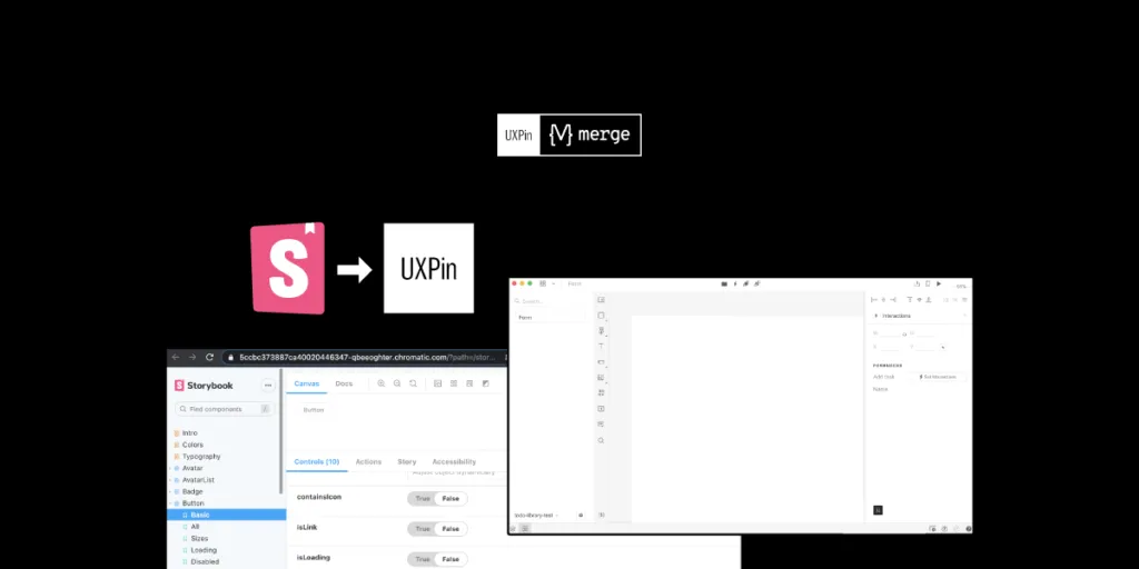
We’ve recently released our Merge-powered integration with Storybook that allows you to bring Storybook components to UXPin editor and design with them, keeping all the interactions available in Storybook. It helps break down the design and development silos and finally, let product teams use the single source of truth.
It’s the second integration (we also connect with Git libraries) supported by Merge technology that aims for keeping the parity between design and development, letting designers use the same components as devs do.

The UXPin-Storybook integration is the first like this on the market, so being a developer and seeing how much it can simplify things, I’ve decided to explore the topic from a developer-first perspective. Read on to learn more about the first step of using Storybook – importing UI code components. I’ve prepared a brief summary of what I experienced when making a project using create-react-app, installing the Storybook package and integrating it into my UXPin account powered by Merge tech for prototyping.
What is Storybook
That’s cool… but like me at the beginning of this journey, you might not have heard of Storybook. Let’s see what it is and what it solves.
So for a TD; LR; If you’ve built projects that include component libraries using Frameworks such as React, Vue or Angular and don’t have a way to view or test each component with any possible state or combination of props quickly, then you can use Storybook to do this.

It allows you to build interactive component libraries alongside its own documentation internal to the project directory but outside of the main app in an isolated environment. Meaning, it makes your component build process and documentation more efficient and easier to use without changing your original code.
Want a little bit more and a real-life example, sure, here you go. You have a website that’s made up of components, which have several properties and several states. For example, a Form may have states for:
- User input
- Validation errors and messages
- Promotions to be added
To test these states you’d have to props manually and load local versions of the app, it’s just so tedious and I would very rarely test each state when making a change. But, with Storybook, you can test each prop live in a local isolated environment. It makes things so much quicker and easier.
Storybook use cases
Storybook’s main purpose was to allow frontend developers who are working on projects utilizing Javascript frameworks to create and style component libraries. However, like most things, there are additional uses:
- Project Managers – Improved QA time efficiency without having to load an app to view component changes. Instead just view them on Storybook.
- Dev ops & Backend developers – No longer do they need to keep the local environment always up-to-date so that other users can see component changes.
- Designers – Quickly verify the design of UI components and their states are true to your designs.
- UXPin Merge users – Import your public or private Storybook Library as live React components, where you can make functionally prototypes with no need for programming knowledge.
Importing Storybook
You have to install Storybook in your project. It’s a package, so for my Storybook test I used npx create-react-app to create a React project then installed Storybook using yarn sb init. I chose React because it’s what I’m most comfortable with and the docs seem quite extensive, but in addition, there is support for Angular, Vue, Web Components, Ember and more.
Storybook is now immediately usable after installation, and after it’s complete, simply run yarn storybook to start the local Storybook server, which will open your browser at http://localhost:6006 displaying your local Storybook component library with some pre-installed examples.
My Component
Even though Storybook isn’t plug-and-play as there is a little work to integrate your components, it’s still quite easy and fast. I was a bit confused about the syntax issues but their documentation is great and it didn’t take me long to fix them. Integrating your components is not all or nothing, meaning you can add each component one at a time, which makes the integration easy to troubleshoot.
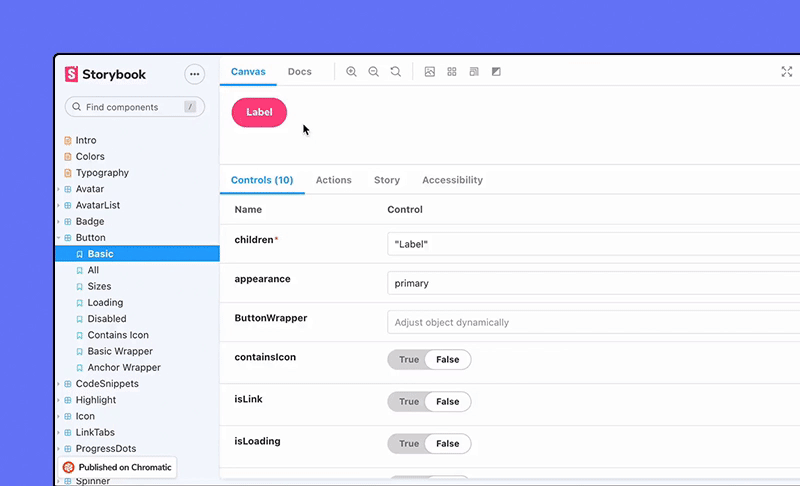
This is the first component I wanted to integrate – a simple Button which takes several props.

The next step is to integrate it into Storybook by writing a stories file.
import * as React from 'react'
import PropTypes from 'prop-types';
import ButtonStyles from './ButtonStyles';

const MyButton = (props) => (
 <ButtonStyles onClick={props.clicked} {...props}>
   {props.children}
 </ButtonStyles>
);

MyButton.propTypes = {
 disabled: PropTypes.bool,
 children: PropTypes.string,
 onClick: PropTypes.func,
 type: PropTypes.oneOf(['primary', 'secondary', 'success', 'error', 'warning']),
 size: PropTypes.oneOf(['xs', 's', 'm', 'l', 'xl', 'xxl', 'xxxl']),
}

export default MyButton;
Adding a stories file
First, what is a Storybook story? A story is a possible rendered state that a component can support. You can have multiple stories each to describe a different state, for example, a Button component with stories for a warning, error or submit theme. For more information, look here.
I need to add a stories file for the Button with several args. A stories file contains a ‘story’ describing one or multiple states that your component will be rendered in Storybook by adding args. Each arg is what properties to give to a component when it renders. I can define several args in the same stories file, therefore, I can show all the different variations of each component. For my Button I’ve shown several args, I would need to add more to cover all variants but this is just for example. You don’t have to define the args in the stories file if you’ve defined props in your component file.;
import React from 'react';
import MyButton from '../MyButton';
export default {
component: MyButton,
title: 'MyButton',
};
const Template = (args) => <MyButton {...args} />;
export const Primary = Template.bind({});
Primary.args = { children: 'primary', type: 'primary' };
export const Warning = Template.bind({});
Warning.args = { children: 'Warning', type: 'warning' };
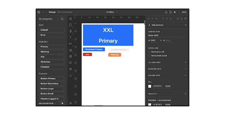
export const XXL = Template.bind({});
XXL.args = { children: 'XXL Primary', size: 'xxl' };
export const Stretched = Template.bind({});
Stretched.args = { children: 'Stretched Primary', stretched: 'true' };
export const Disabled = Template.bind({});
Disabled.args = { children: 'Disabled Primary', disabled: 'true' };
So put simply, to integrate a component into Storybook requires:
- A src/components/[COMPONENT].stories.js which include your component stories in the needed format.
- Restart the server if you’ve added a component by running yarn storybook
This is what I meant when saying Storybook is outside of the main app in an isolated environment and doesn’t interfere with your existing code. All added functionality uses the story files, the original code doesn’t change. Additionally, no Storybook-specific libraries are required when creating a stories file.
Automated documentation generation
Another great feature of Storybook is its ability to create your basic documentation automatically based on your source code. This helps tremendously with sticking to a single source of truth and is a huge time saver.
Here are the docs for MyButton component:
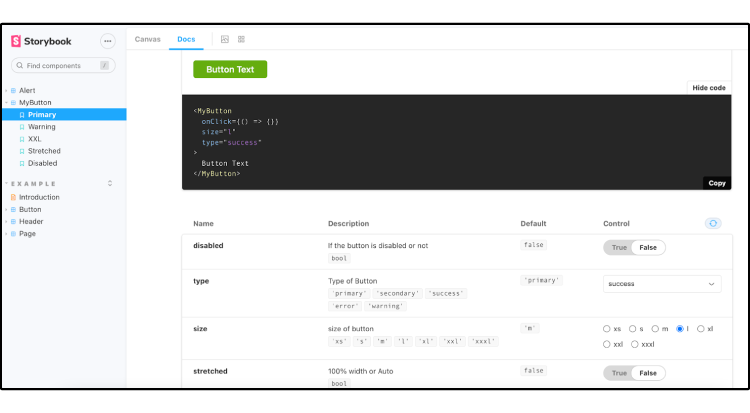
It also lists all Args you have in your source code, so you see all the different variants of your components. You can even just copy and paste the code for each!

Publishing Storybook and integrating with UXPin
My experience of importing the components into Storybook hasn’t been too time-consuming – it actually was pretty simple as there is lots of documentation to help. The reason I felt inclined to learn more about this is because UXPin, using our Merge technology has added integrating your local or private Storybook as a library in the app, so I wanted to try it and also document my experience with this too. With Adalo and other no-code platforms emerging, the ability to visually prototype with actual code components—without needing to write any code yourself—represents a significant shift in how designers and developers can collaborate seamlessly.

So, following the UXPin Storybook integration documentation I got my components integrated into the UXPin editor in a minute. I could then (if I had more components) start to build prototypes using my integrated Storybook component library, in a live code environment, with all component interactions and functionality ready to play with.
Summary
Importing components into Storybook is easy and comes with a lot of benefits. On top of that, it can work as a single source of truth for product teams, reducing handoff to a minimum, getting rid of all the design-dev inconsistencies in projects. If you want to try it out, go ahead – our integration is on trial!