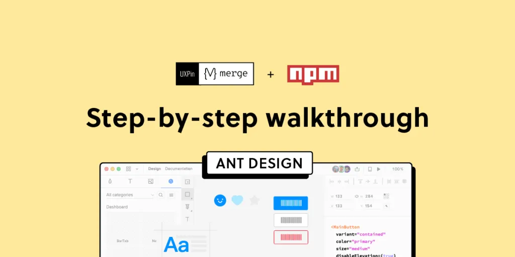
How to Import Ant Design to UXPin? An npm Integration Guide
Component-driven prototyping significantly improves user testing while providing stakeholders with realistic product design expectations. UXPin’s npm integration enables design teams to use open-source component libraries to design fully functioning, high-fidelity prototypes.
Get on board the code-based design revolution with UXPin’s Merge technology and npm Integration. Discover more about component-driven prototyping that maximizes the use of design systems, improves design handoffs, and scales design significantly.
Bring UI components via Git repo, Storybook, or through our newest npm integration. Learn more about UXPin Merge.

What is UXPin Merge?
UXPin Merge is a code-based technology allowing you to sync a component library hosted in a repository, Storybook or as an npm package to UXPin’s design editor. Designers can use these UI components to build prototypes that look and function like the final product.
Any changes engineers (or the design system team) make to functional components in the repository automatically sync to UXPin, notifying design teams of the update. Merge includes version control, allowing team members to switch to an older design system version if needed.
This single source of truth enhances collaboration while reducing the burden on DesignOps and the DS team to manage two design systems–one for design tools and the other for code.
What is UXPin’s npm Integration?
UXPin Merge required engineering expertise to set everything up until now. Not every team has valuable engineering resources for the setup, so we came up with a way of integrating npm components to UXPin.
Merge’s npm Integration gives designers complete control over installing and managing open-source component libraries available as npm packages. Designers can import and customize components to meet their prototyping needs using an intuitive interface. It requires zero coding skills to set everything up.
If you want to learn about npm for designer, read our introductory guide: What is npm package?
The Benefits of Working With Ant Design
Ant Design is the product of the Ant Group–a Chinese-based conglomerate of several tech/finance organizations, including Alipay, Huabei, and Yu’ebao, to name a few.

Organizations have used Ant Design to build a multitude of applications, including B2B, B2C, and enterprise products. The comprehensive design system includes React, Angular, and Vue component libraries, with a complementary icon set. You also get Ant Design Mobile for building native applications.
Ant Design npm Integration With UXPin Merge
Ant Design’s React component library is available as an npm package (antd). Designers can import Ant React components using UXPin’s npm Integration and customize properties in the Merge Component Manager.
If design teams want to use Ant Design with other design tools, they must use one of Ant Design’s static vector-based UI kits, but with UXPin’s npm Integration, designers have access to the same components engineers use.
Component-driven prototyping with Ant Design creates a single source of truth between designers and engineers while ensuring the highest consistency between UX and product teams.
With UXPin’s npm Integration, you can choose which Ant Design React props you want to import–color, size, icons, states, etc.
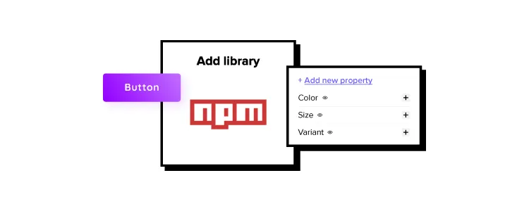
Assigning Properties in Merge Component Manager
Our npm Integration includes Merge Component Manager–your central control for importing and managing each Ant Design’s component properties.
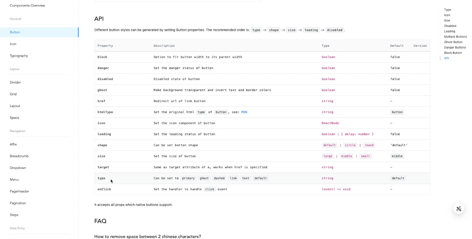
UXPin’s npm Integration works with React components, so you can follow Ant Design’s React documentation to reference which props you want to import. Once you set these up in Merge Component Manager, the component’s properties appear in UXPin’s Properties Panel.
For example, there are six types or variants of an Ant Design button:
- Primary
- Ghost
- Dashed
- Link
- Text
- Default
These button types (and all other properties) appear as a dropdown in the Properties Panel for designers to choose. Props can appear as text fields, checkboxes, code editors, etc., depending on the component.
Connecting UXPin to the Ant Design npm Package
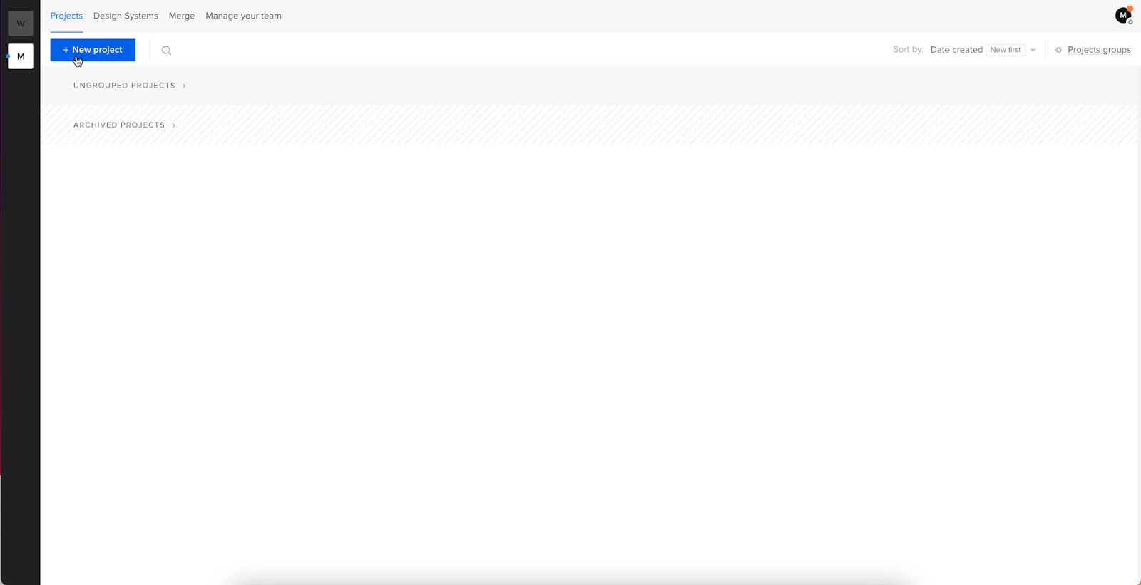
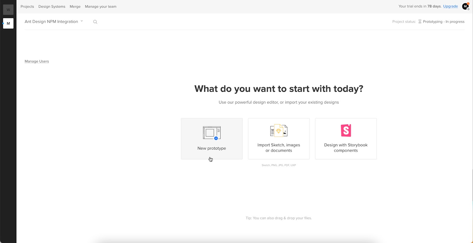
Navigate to your UXPin dashboard and click “New Project.”
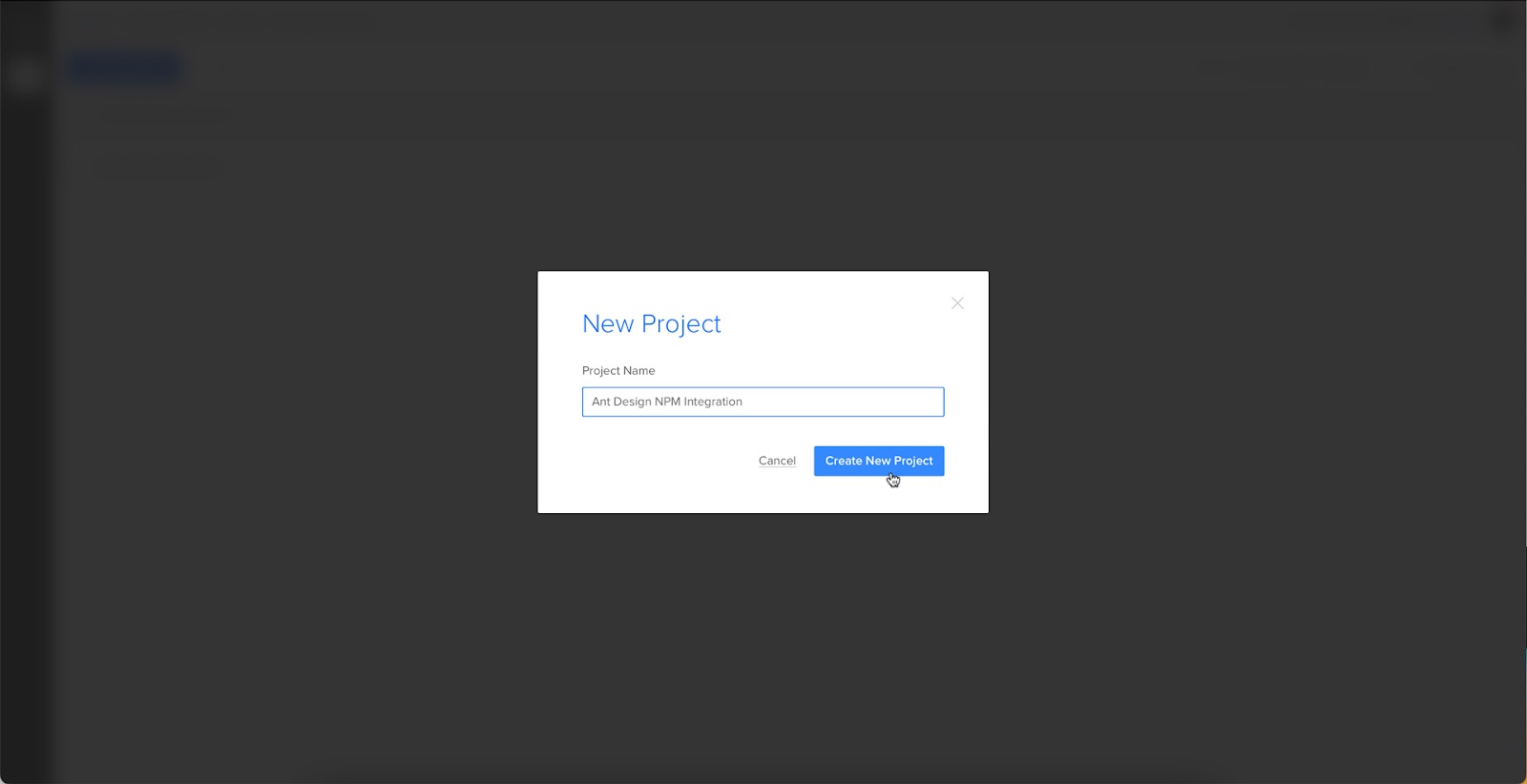
Name your project and click “Create New Project.”
Click “New prototype” to open the project in UXPin’s design canvas.
Click the dropdown at the bottom of the Design System Libraries tab in the lefthand sidebar, and click “New library.”
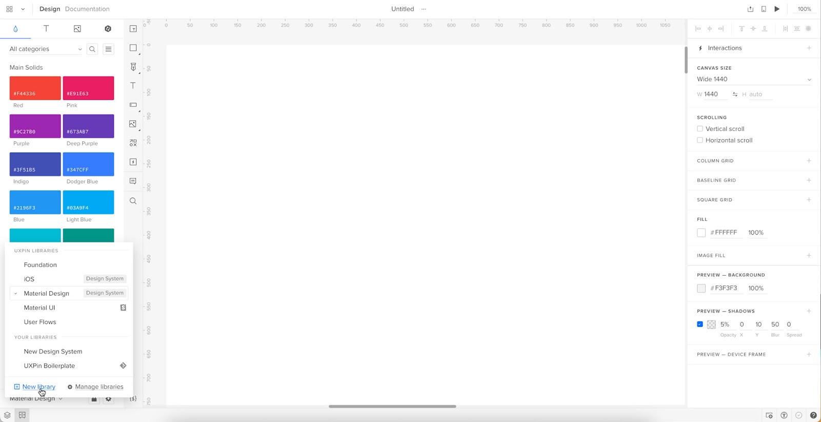
Your sidebar and available libraries may differ from the example.
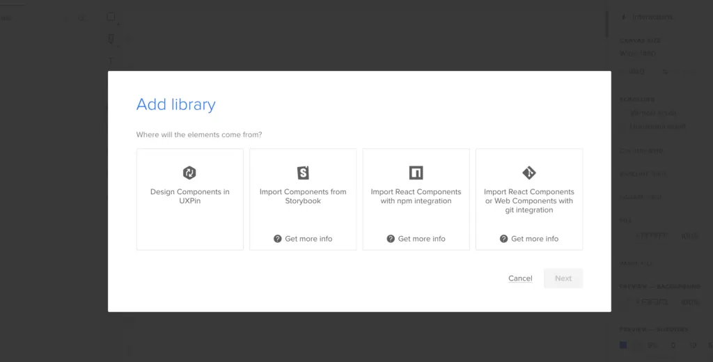
Select “Import React Components” and click “Next.”
Name your library. This name is purely for your reference and won’t impact the import.
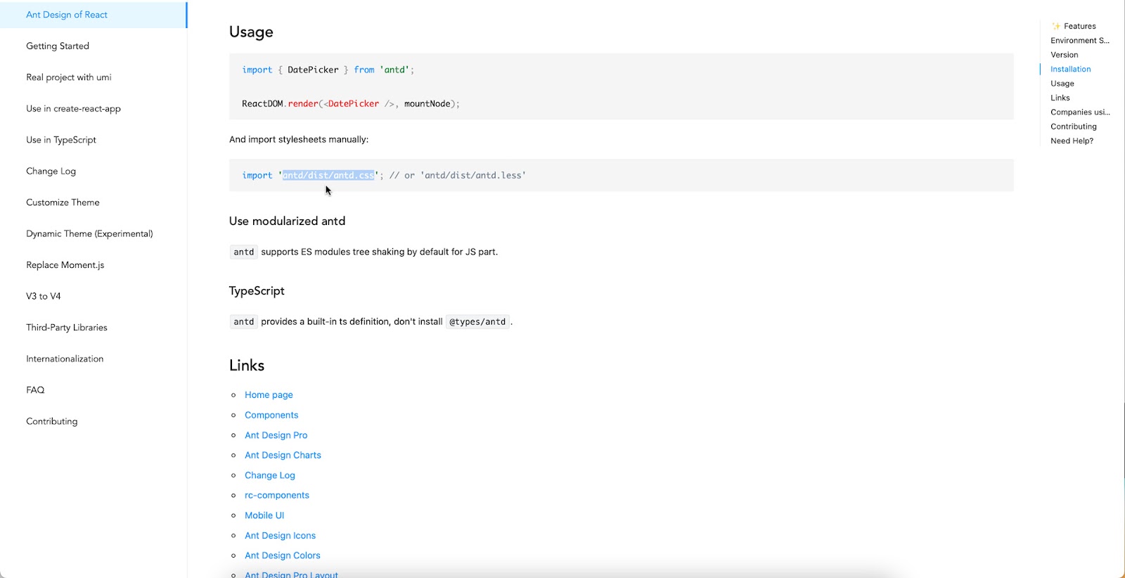
You also need to grab the npm package repository name, which you find under Install on Ant Design’s npm page. Copy and paste the Install contents from npm into the “Library package name” field (delete everything preceding antd).
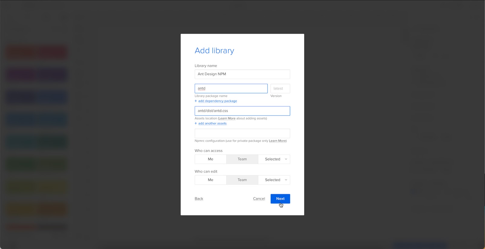
To import component styling properties, Merge requires the path to Ant Design’s CSS (antd/dist/antd.css). You can find this under Usage in Ant Design’s React installation instructions.
Importing Ant Design Components
UXPin will automatically redirect you to the canvas once you complete the npm integration. Now it’s time to select the Ant Design components you want to import.
From the lefthand sidebar, click “Open Merge Component Manager.”
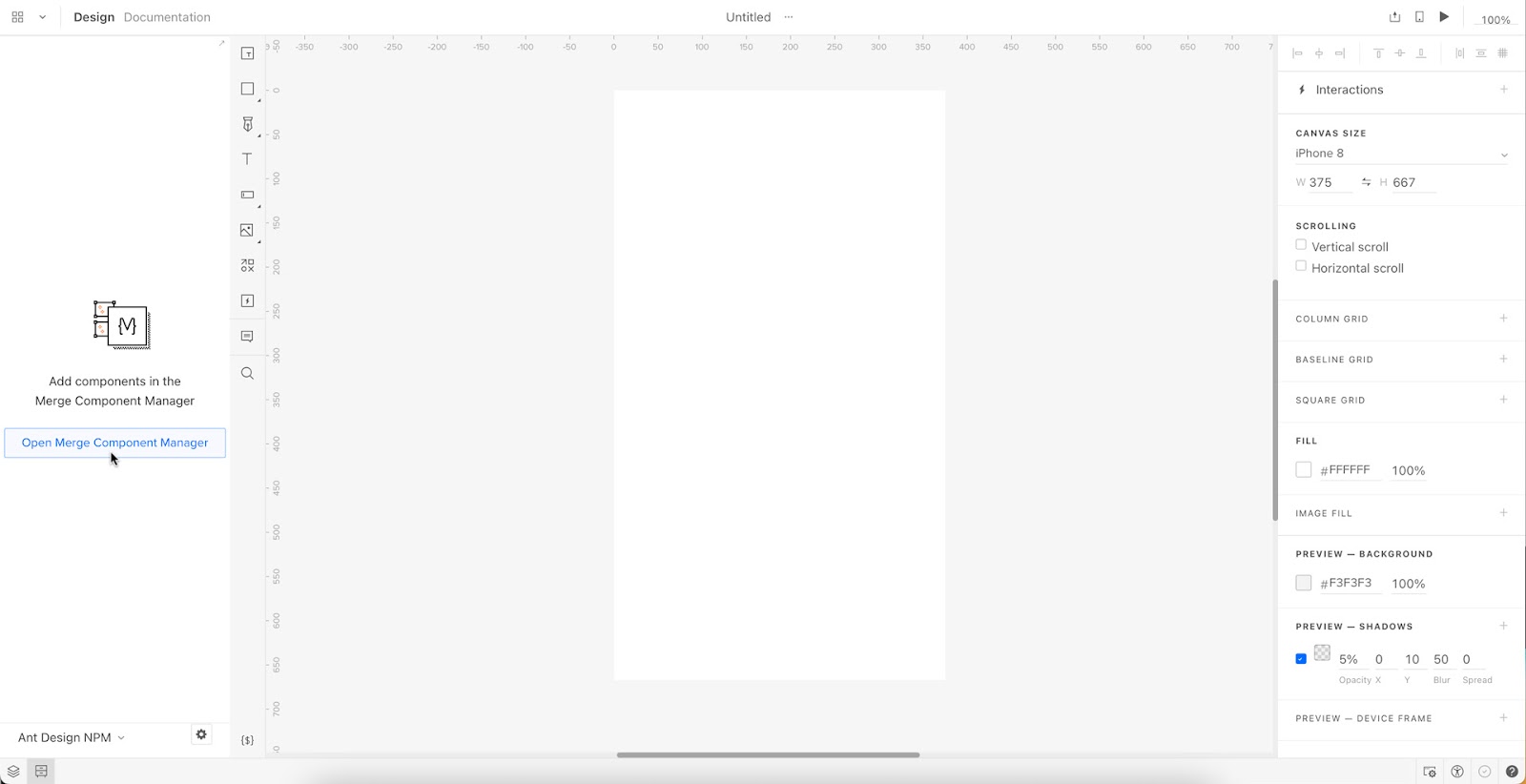
Merge Component Manager will open in a new tab.
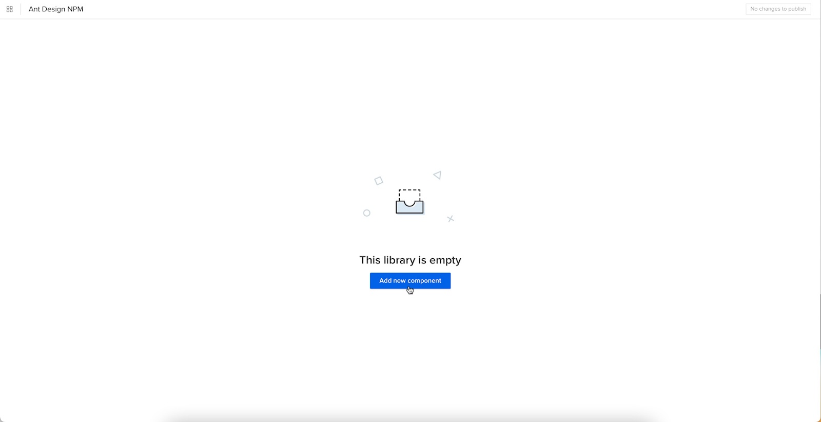
Click “Add new component.”
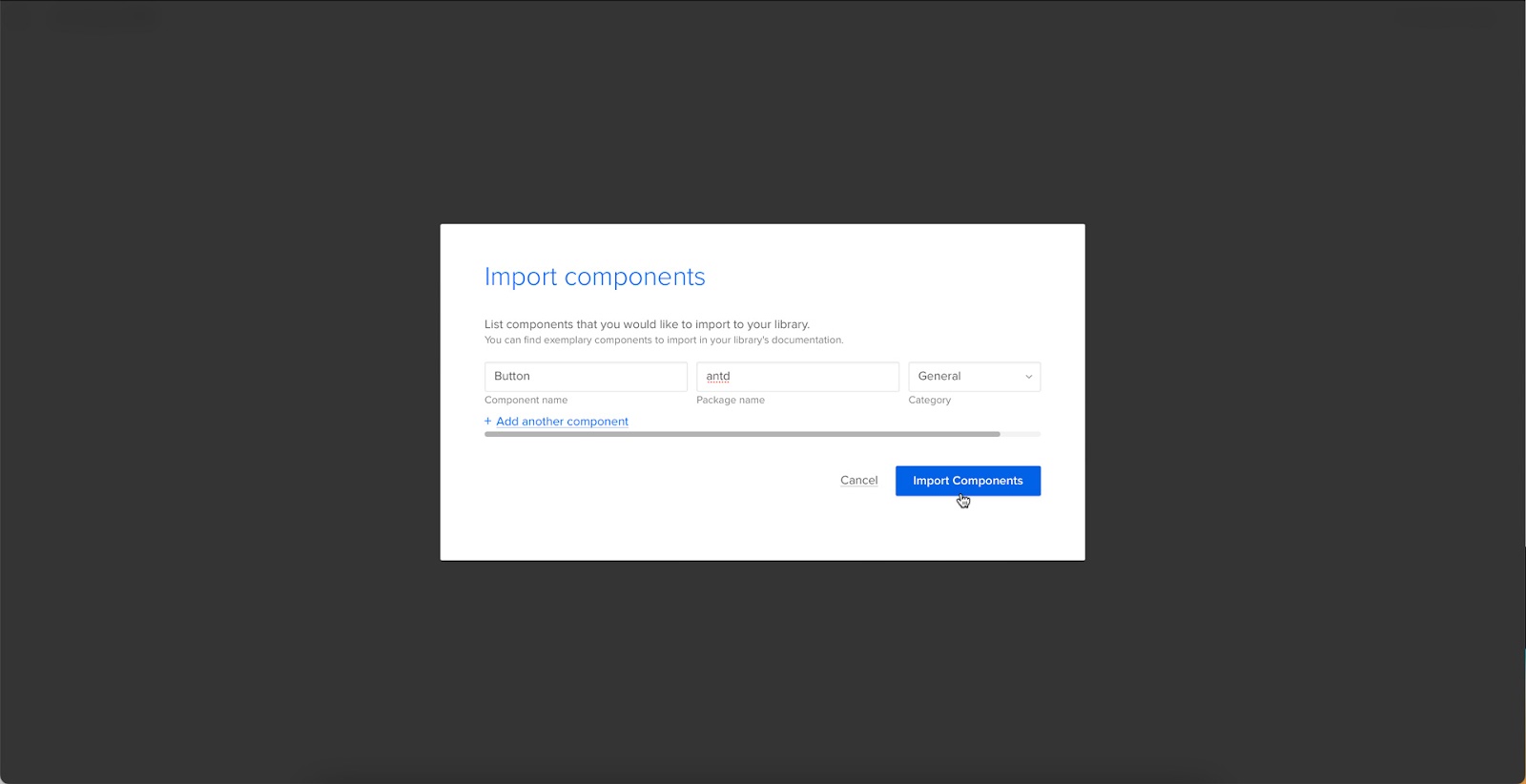
Enter the name of the component you want to import.
You’ll find the correct naming convention in the Ant Design docs under Component API. Ant Design’s components use CamelCase with no spaces. Always capitalize the first letter. For example, Date Picker would be DatePicker.

For this tutorial, we will import an Ant Design Button as our first component and add it to a new category called General. We recommend using the same categories as Ant Design’s docs, so designers and engineers have the same reference point.
You can add multiple components to a single import, saving you time repeating steps two and three.
Click “Import Components.”
Click “Publish Changes” in the top right to initialize the import process.
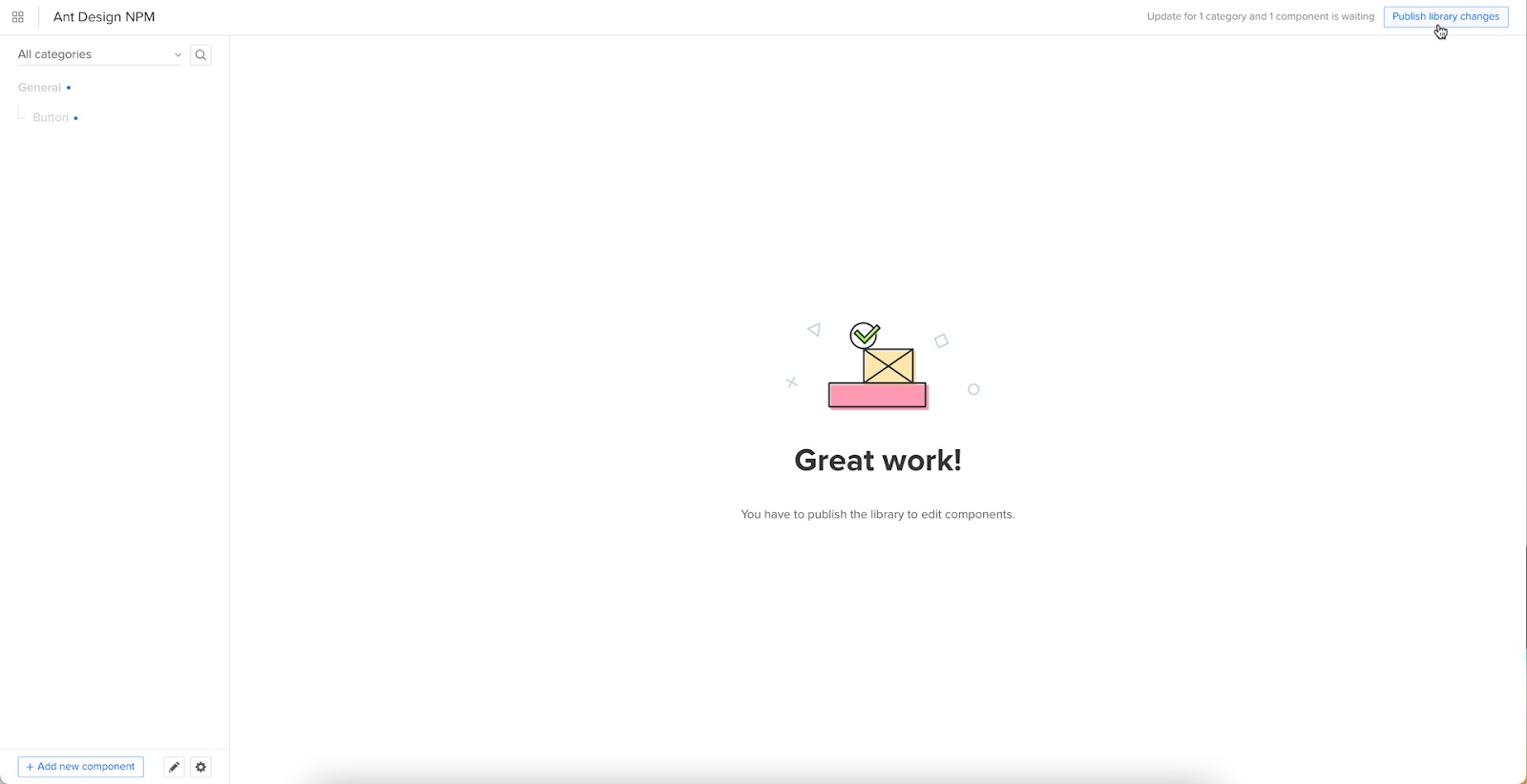
The first time you do this for a new component, it might take a minute or two.
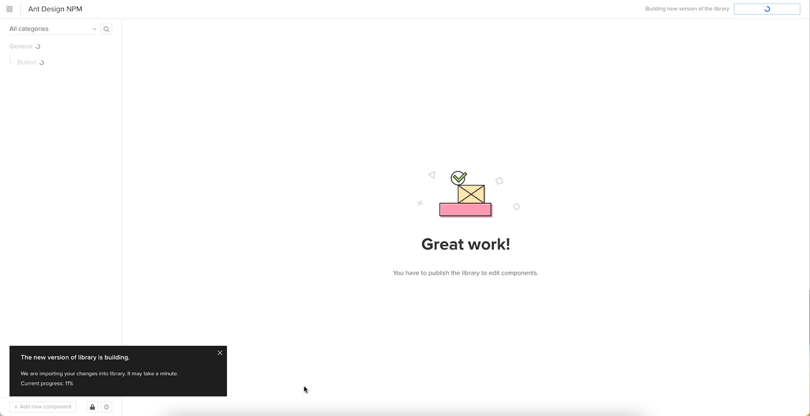
Once the import is complete, click “Refresh Library” to update the changes in your project library.
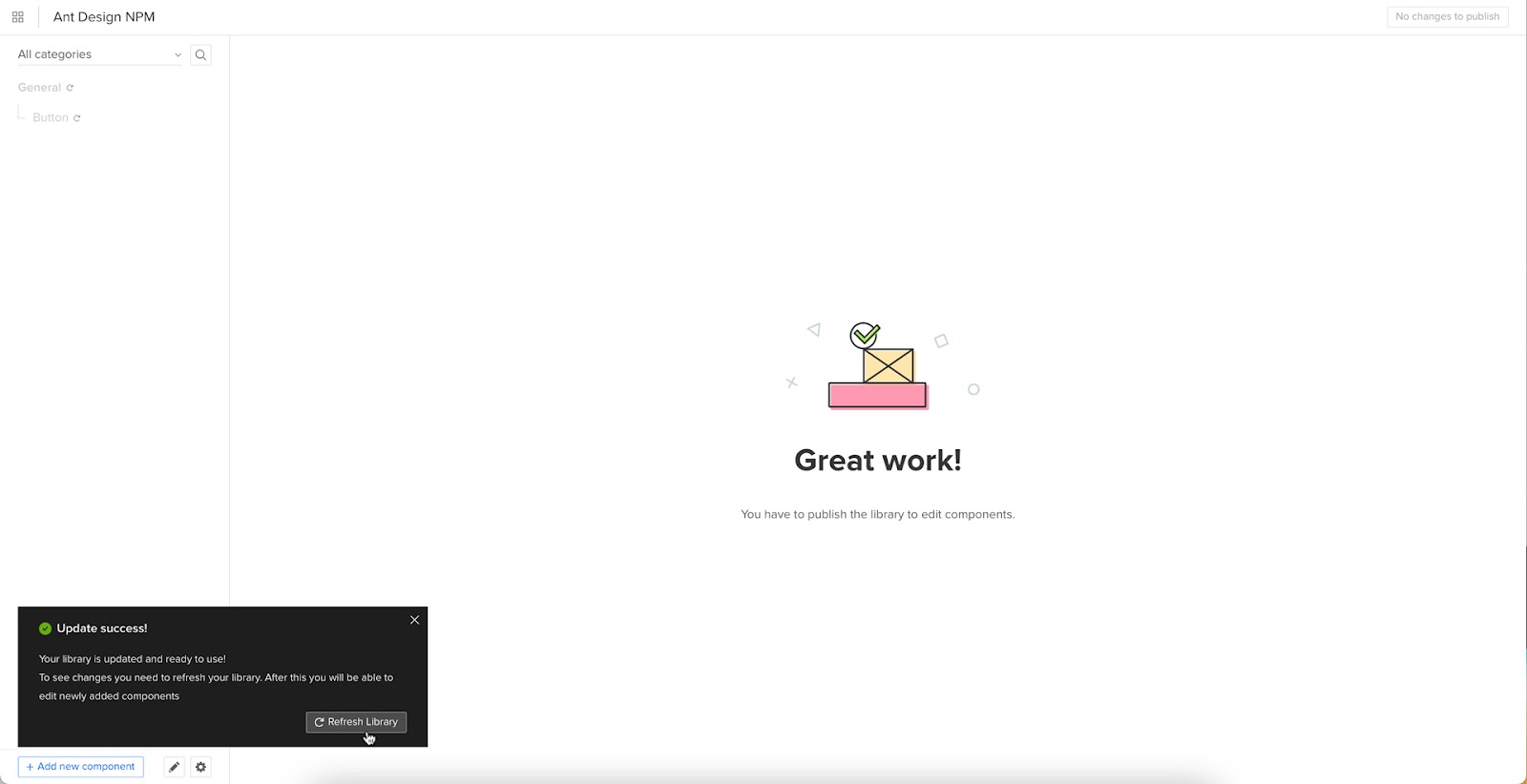
If you follow these instructions step-by-step, you’ll notice you have a category (General) and your first component (Button) in the left sidebar.
Click on the Button to begin adding properties. You can find these React props in Ant Design’s documentation under API in Components > General > Button.
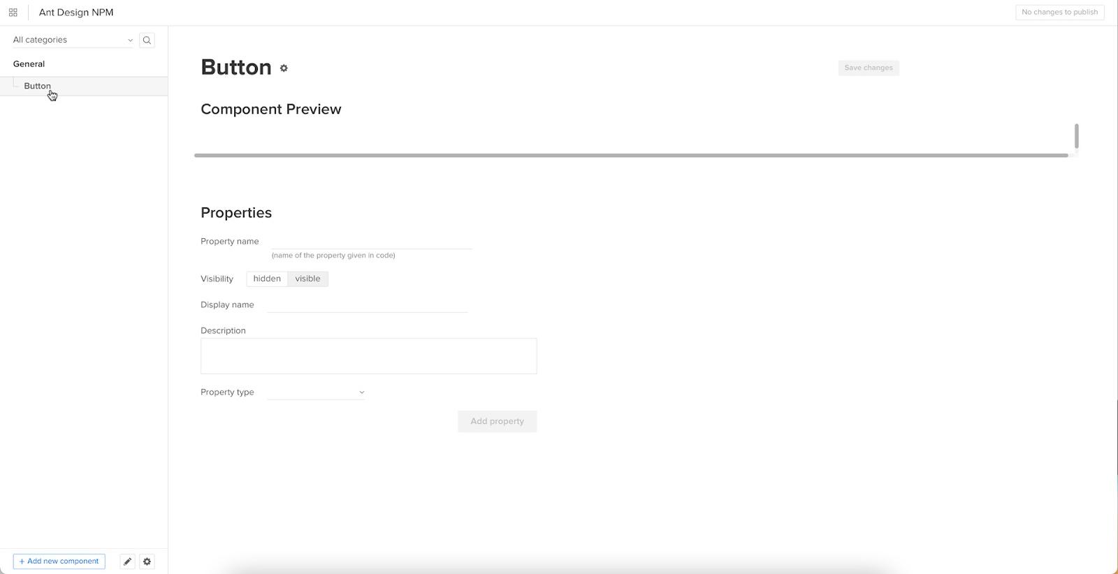
Adding Component Properties with Merge Component Manager
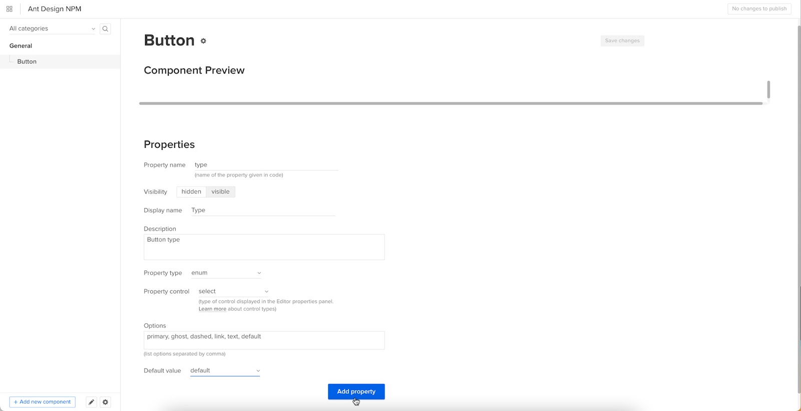
Let’s add a few Ant Design button properties using the React props from the documentation.
The React button type prop imports the six Ant Design button styles.
- Property name: enter “type” (always use lowercase for props)
- Display name: This is for your reference, but something descriptive that both designers and engineers use–we’ve gone with “Type” to keep things uniform
- Description: Add a short description or instructions for designers–we’ve used “Type of button”
- Property type: “enum”–allows you to create a dropdown display the six styles
- Property control: “select”
- Options: Add the options from Ant Design’s API docs–primary, ghost, dashed, link, text, default
- Default value: Your preference–we’ve gone with “default” as per Ant Design’s docs
As you complete the component’s properties, you’ll notice a component preview will appear and change according to your preferences.
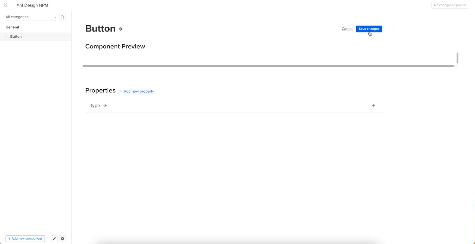
Once you have completed all the fields, click “Add property.”
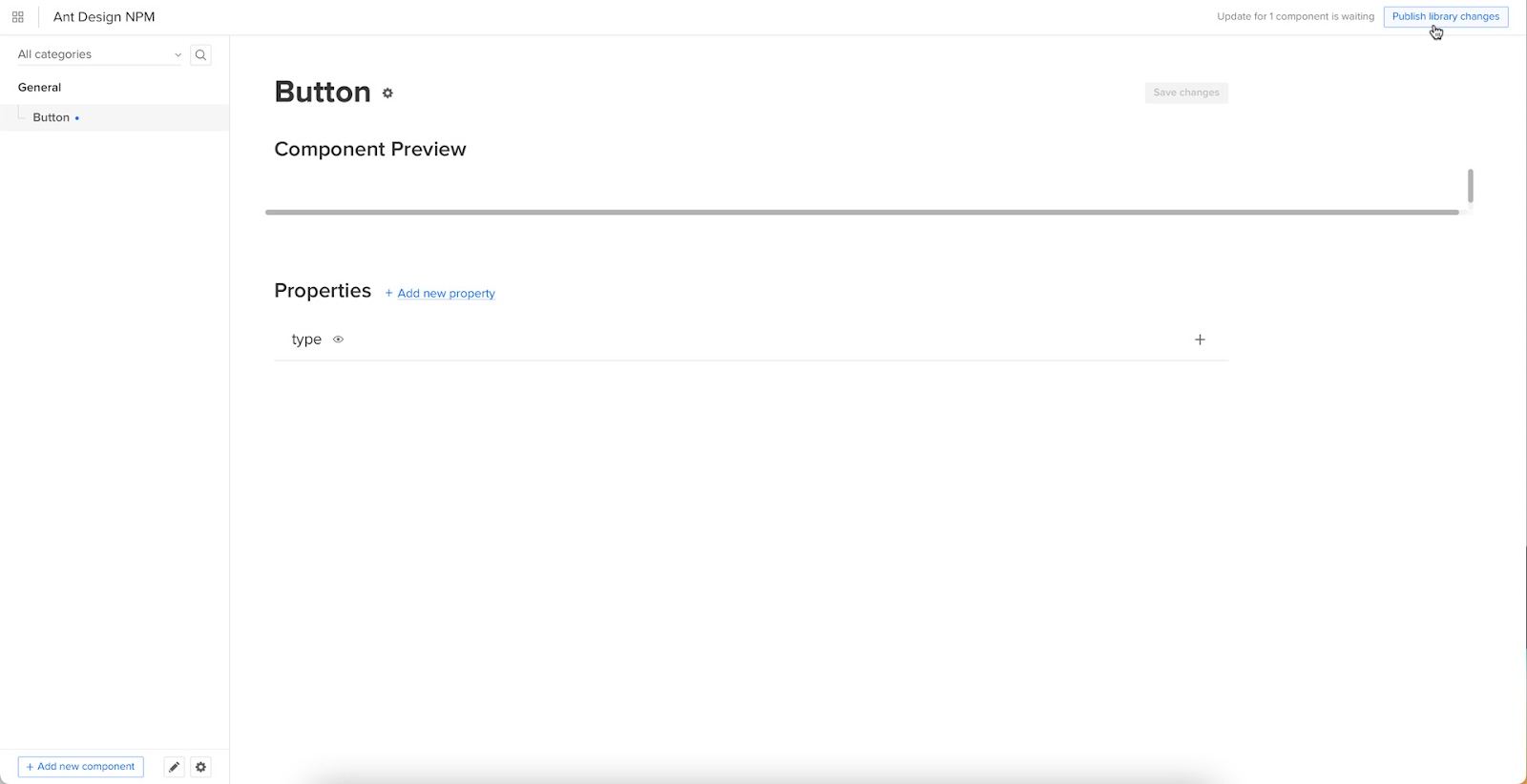
Then “Save changes.”
Lastly, “Publish library changes.”
Component-Driven Prototyping in UXPin
Once you import the Ant Design components and properties you need, prototyping in UXPin is as simple as drag-and-drop to build layouts. We created this simple email sign-up form using three Ant Design components in less than a minute.
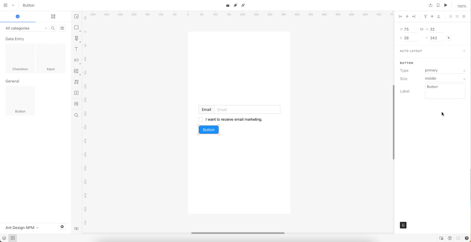
When you select an Ant Design component, the properties you created in Merge Component Manager appear in the righthand Properties Panel.
Try building an Ant Design prototype with UXPin’s npm integration. Discover how component-driven prototyping can revolutionize your product development workflows to deliver better user experiences to your customers. Learn more about UXPin Merge.


