Internationalization and Localization – Key Differences in App Design
Internationalization is crucial for startups and companies with global aspirations. If organizations want to succeed in an international market and compete locally, they must create relatable, locally relevant product experiences.
Internationalization and localization go beyond translated text and currency changes. Designing experiences related to users, their cultures, and their environments create the trust necessary to increase adoption and grow in global markets.
Prototyping and testing are vital for delivering positive user experiences for a global market. Sign up for a free trial to explore UXPin’s advanced design, prototyping, and testing features.

Table of contents
What is Internationalization?
Internationalization (or what Google calls globalization) is designing and developing digital products to allow language, regional, and cultural adaptations. This flexibility enables companies to adapt products and enter new markets while maintaining the product’s integrity and user experience.
Simple examples of internationalization are language and currency selectors–not specific languages or currency, but the UI design and programming that make it possible.
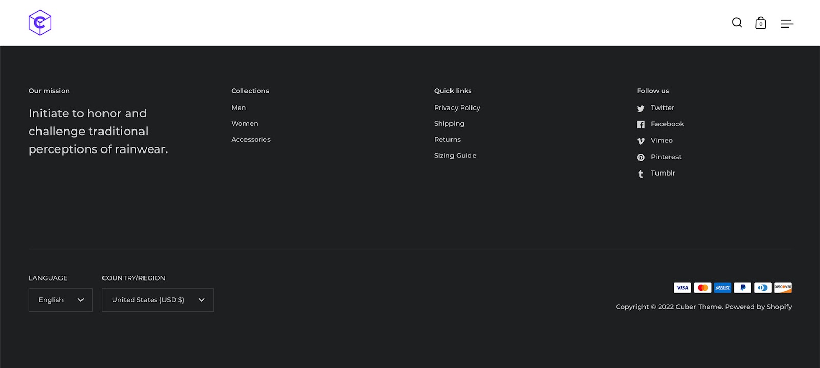
The Cuber Shopify Theme uses dropdowns for the store’s internationalization design. Shopify store owners can use these internationalization features to localize their eCommerce store for different countries–i.e., A US-based store providing Mexican Peso and Spanish for a Mexico-based target audience.
This eCommerce example leads us to localization.
What is Localization?
Localization is the process of adapting a product to meet specific market needs, including translation, currency, and cultural changes.
Localization aims to deliver a user experience that’s relevant and relatable–beyond simply changing the language and currency.
For example, it doesn’t snow in New Zealand over Christmas because it’s summer. Referring to snow and keeping warm during December wouldn’t make sense to New Zealanders as it would to Canadians.
Designers must also adapt user interfaces to meet native language markup and structure, like left-to-right (LTR) (i.e., English or Italian) vs. right-to-left languages (RTL) (i.e., Arabic, Hebrew).
Legal requirements and compliance
Product teams must also consider compliance for different locales and legislative impacts on content and user data. GDPR, CCPA, and other data privacy acts dictate how products and websites collect, store, and share user information.
Designers must notify customers in these regions about their cookie policy and allow them to opt out of tracking–like this example from Stack Overflow.

Internationalization and Accessibility
Internationalization is vital for accessibility, inclusive design, and making products localizable. W3C provides an overview of i18n (industry standard abbreviation for ‘internationalization’) and how to make products more inclusive for a global audience.

A universal source code base
Product developers must use Unicode for internationalization and architecture. Unicode gives digital products the foundation to translate and serve content in any language.
Engineers must also consider appropriate metadata to support different language structures and markups.
Text direction
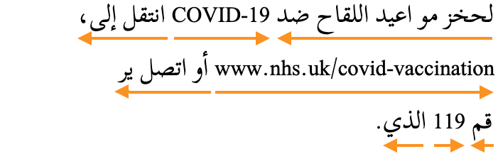
Right-to-left languages are complicated for digital product design because they often mix directions within a single line of text. This example from W3C demonstrates bidirectional text in Arabic content.
Designers must collaborate with engineers to ensure these directional nuances are correctly addressed.
Names & addresses
Forms often create confusion for users from different parts of the world. For example, some European countries write the street before the number, whereas in the United States, its number, street.
Some countries don’t have postal codes, so making this a required form field creates a frustrating roadblock for those users.
Designers must also consider name lengths and structure. Some cultures place their family name (surname/last name) first and “first name” second. A person’s name may also have several words–how do they enter this data?
Time zones, currencies, dates
Date formats can cause a lot of confusion and frustration. For example, users can interpret 10/02/2022 as:
- October 02, 2022, in the United States
- 10 February 2022, in Europe
A good way around this confusion is to abbreviate the month so everyone can read the date–i.e., Oct 02, 2022. Designers can also separate these fields on forms, so users enter the correct date and databases read and save them correctly.
If your product uses time, it’s crucial to factor in timezones and daylight savings to save and present users with the correct time format.
Currencies present another design challenge. Some currency formats place the symbol before and others after. Thailand, Turkey, Vietnam, and Sweden are four examples where people position the currency symbol after the number.
Cultural norms & expectations
UX teams must do their homework and perhaps hire local UX designers when entering a new market.
For example, thumbs up in the West means good, but it’s insulting in Japan, Bangladesh, and the Middle East! Using thumbs up or thumbs down to rate a service or feature might get mixed results from users in these regions.
Colors, symbols, words, phrases, and metaphors carry different meanings across various languages and cultures. Extensive user and cultural research must be a priority for UX teams, especially when they don’t speak the language.
Further reading and research: W3C provides a list of groups for regional internationalization, including the Americas, Europe, Africa, the Middle East, the Far East, and South East Asia.
Internationalization and Localization Best Practices
1. Avoid metaphors and cultural references
Every country and culture has metaphors and references, but these often don’t translate to a global audience; in some instances, they might be offensive–like a thumbs up in Bangladesh.
Designers must also use descriptive names rather than “clever” cultural references. Australians are renowned for their hilarious slang, but using these in a product would be confusing rather than entertaining.
2. Design internationally-friendly forms
Form field labels, particularly addresses, can create confusion. Designers must design forms that accommodate an international audience.
For example, most countries use “postal code” instead of “zip code.” They also write the entire state/province/county rather than abbreviating it into two letters like the United States (i.e., Florida = FL). An international approach to form labels and field sizes will make forms more globally inclusive.
Further reading:
- Web Form Design Best Practices
- Form Internationalization Techniques
- International Address Fields in Web Forms
3. Design UIs to accommodate translations
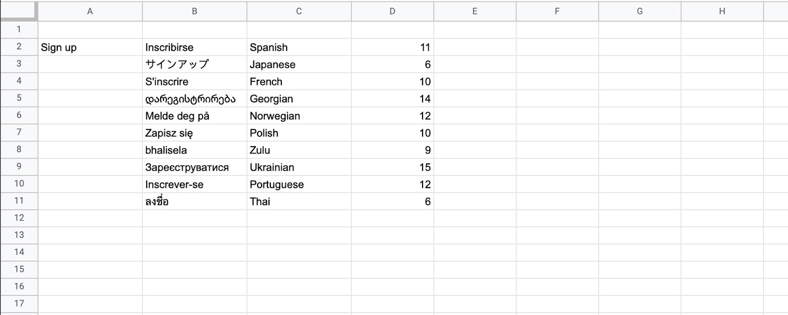
Designers must avoid designing UIs to accommodate a single language. As designer John Saito points out in a Medium article about internationalization, “Think of the label ‘New!’ for example. In English, it’s 4 characters with the exclamation point. But in French, it’s 9 characters: ‘Nouveau!'”
John recommends creating a Google Sheet and using a Google Translate function to visualize multiple languages and calculate character count.
We compared a standard CTA, “Sign up,” against ten languages. Sign up has seven (including the space), but most languages have ten or more characters, which could create issues if designers don’t leave enough room.
4. Prototype with real copy
The example above demonstrates the importance of prototyping with real copy. If you’re adapting your product for a new language, translate content on every UI as it would appear in the final product.
As we saw with translations, some words might be longer than the English version requiring the extra UI width.
If your UI element doesn’t have enough space, it will break the text into a new line. This looks unprofessional and might push other components creating usability issues.
5. Don’t embed text in images
Another recommendation from John Saito is not to embed text in images. Even if you translate these, it creates multiple assets which adversely impact performance.
Embedding text in images also excludes users with visual impairments and screen readers.
Text overlays are a good alternative, but they create additional CSS and Javascript, so designers must use this method sparingly.
6. Use relatable content
If you’re going to use content, particularly images and video, make sure it’s culturally relatable. Users must feel like someone from their country or region designed the product specifically for them.
For example, the Google News and Apple News apps use location tracking to present relevant, localized stories. In some instances, this localization might be as changing a picture of NYC for Americans to Nairobi for Kenyan users.
7. Internationalizing Typography
Yona Gidalevitz’s interesting UsabilityGeek article looks at language’s impact on typography. Asian languages like Mandarin, Korean, and Japanese have complex characters which don’t translate well into bold typefaces.

These languages also represent multi-character English words as a single character, requiring a large font for legibility which ultimately alters the UI element or the entire screen.
8. Number formats and separators
Number formats and separators differ in languages and regions. Microsoft’s number formatting for globalization demonstrates that countries will display the number negative five hundred and twenty-seven in four different ways:
- -527
- 527-
- (527)
- [527]
People also use date and number separators differently. Returning to our example of Oct 02, 2022, we can write this date in at least three ways:
- 10-02-2022
- 10.02.2022
- 10/02/2022
In the United States, people use a comma (,) to separate the thousands, while Germany uses a period (.).
While these might seem like minor issues, they could severely impact usability. Understanding these nuances will help product teams avoid potential problems.
Internationalized Product Design With UXPin
Designing digital products is challenging. Developing multilingual products for a global audience adds an extra layer of complexity for design teams.
With UXPin’s Design Systems, product teams can create multiple design systems for each language to streamline prototyping and testing. Create a new design system from an existing library and edit the components to meet language/market requirements.
Each design system can have locale-specific components, assets, typography, and documentation, giving designers the tools to build localized prototypes for testing.
Avoid the time-consuming process of prototyping and testing for multiple markets with the world’s most advanced user experience design tool. Iterate faster to build inclusive products capable of competing internationally with UXPin. Sign up for a free trial today.


