Keyboard navigation is a must for accessible and user-friendly prototypes. Why? Because it ensures everyone, including users with disabilities, can interact with your designs effectively. Here’s what you need to know:
- Focus Indicators: Always visible, high-contrast outlines help users track their position.
- Logical Navigation: Use a natural reading order for smooth keyboard movement.
- Key Functions:
- Tab and Shift + Tab: Navigate forward and backward.
- Enter/Spacebar: Activate buttons or links.
- Escape: Close modals and return focus correctly.
- Arrow Keys: Navigate within grouped components.
- Testing: Conduct manual and screen reader tests to catch accessibility issues early.
- ARIA Attributes: Use labels and live regions to improve assistive tech compatibility.
Keyboard Accessibility Principles
What is Keyboard Accessibility?
Keyboard accessibility ensures that every interactive element in a user interface can be operated using only a keyboard. This feature is crucial for individuals with motor disabilities who depend on keyboards or devices that replicate keyboard functionality.
"Keyboard accessibility is one of the most important aspects of web accessibility. Many users with motor disabilities rely on a keyboard." – WebAIM
Three key principles guide keyboard accessibility:
- Focus management: Users should always see clear focus indicators. Avoid overriding them with CSS rules like
outline: 0. - Logical navigation: The focus should follow a natural reading order, ensuring intuitive movement through the interface.
- Composite widget interaction: Use Tab to navigate between elements, while Arrow keys handle navigation within grouped components.
Building these principles into your prototypes early on allows you to test functionality with real users, making it easier to identify and resolve accessibility barriers before they become costly to fix.
WCAG Guidelines for Keyboard Navigation
The Web Content Accessibility Guidelines (WCAG) reinforce these principles with specific criteria for keyboard navigation. A core requirement is that all content and functionality must be accessible using only a keyboard. Focus indicators should always be visible, enabling sighted keyboard users to track their position on the page. Additionally, every interactive element must respond properly to keyboard input.
WCAG also provides guidance on tab order and tabindex usage. Avoid using positive tabindex values, as they can disrupt the natural navigation order. Instead, structure the DOM so the focus aligns with the visual layout. Use tabindex="0" for custom elements to include them in the tab order and tabindex="-1" for elements that need to be focused programmatically without being tabbable.
Key keystrokes include:
- Tab and Shift + Tab: Move forward and backward through interactive elements.
- Enter: Activate links or execute buttons.
- Spacebar: Activate buttons.
- Escape: Close dialogs or modals and return focus to the triggering element.
- Arrow keys: Navigate within grouped elements like radio buttons or tabs.
High-fidelity prototypes should mimic these interactions by using states and variables, creating a more realistic environment for testing and refining keyboard accessibility.
Accessible Design in Figma: Beyond the Basics
How to Implement Keyboard Navigation in Prototypes
Keyboard Navigation Implementation Guide for Accessible Prototypes
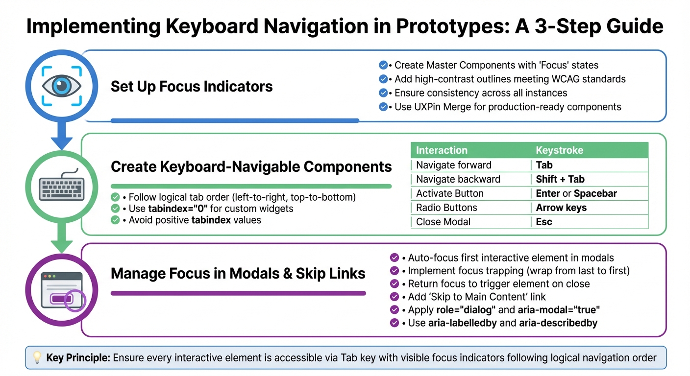
To make your prototypes accessible via keyboard navigation, you’ll need to focus on three key areas: focus indicators, component behavior, and focus management. With UXPin, you can build prototypes that closely resemble production-level accessibility – all with minimal coding.
Setting Up Focus Indicators in UXPin
Focus indicators are crucial for sighted keyboard users, as they show which element currently has focus during navigation. In UXPin, you can use the States feature to create visual cues for focused, active, and disabled elements.
Start by creating a Master Component for interactive elements like buttons or input fields. Within each Master Component, add a "Focus" state. This state should include a high-contrast outline or border that meets WCAG contrast guidelines. By doing this, every instance of the component in your prototype will have consistent accessibility styling.
If you’re using UXPin Merge, you can prototype with production-ready React components that already include built-in focus indicators. Libraries like Material Design, Bootstrap, or custom component libraries ensure your focus indicators look and function exactly as they will in the final product.
Creating Keyboard-Navigable Components
For components to work seamlessly with keyboards, you’ll need to address tab order, keystroke mapping, and native controls. The tab order should follow a logical flow – typically left-to-right and top-to-bottom – aligned with the layout users visually expect.
UXPin’s libraries include interactive behaviors that support standard keyboard navigation. Map common keystrokes to their expected actions, such as:
- Enter or Spacebar for activating buttons
- Arrow keys for navigating grouped elements like radio buttons
- Escape for closing modals
Here’s a quick reference for standard keystrokes:
| Interaction | Standard Keystrokes |
|---|---|
| Navigate forward | Tab |
| Navigate backward | Shift + Tab |
| Activate Button | Enter or Spacebar |
| Radio Buttons | Arrow keys (↑/↓ or ←/→) |
| Close Modal | Esc |
For custom widgets, use tabindex="0" to include them in the tab order. Avoid using positive tabindex values, as they can disrupt logical navigation and confuse users.
Managing Focus in Modals and Skip Links
Once your components are ready, you’ll need to manage focus in more complex elements like modals and skip links. These features ensure smooth keyboard navigation through your interface.
When a modal opens, the focus should automatically move to the first interactive element inside it. For text-heavy modals, you can place focus on the first paragraph using tabindex="-1" to guide users to start reading from the top.
"When you open a modal, you will need to programmatically move focus to an element inside of it." – Primer
To maintain focus within the modal, implement focus trapping. This ensures that when users navigate past the last element, focus wraps back to the first. Upon closing the modal, return focus to the element that triggered it.
Add a "Skip to Main Content" link at the top of your page. This allows keyboard users to bypass repetitive navigation elements and jump straight to the main content. Use UXPin’s interaction triggers to make this link the first focusable element on the page.
For screen reader support, apply role="dialog" and aria-modal="true" to modal containers. These attributes signal assistive technologies that the background content is inactive. Additionally, use aria-labelledby to link the modal to its title and aria-describedby to describe its purpose.
sbb-itb-f6354c6
How to Test Keyboard Navigation in Prototypes
After implementing keyboard navigation, it’s crucial to manually test your prototype to ensure everything functions as intended. Roughly 25% of digital accessibility issues are tied to poor keyboard support, so careful testing is a must before handing the prototype off to development.
Manual Testing Methods
Start by testing the prototype using only the keyboard. Use the Tab key to move forward through interactive elements and Shift + Tab to move backward. As you navigate, ensure each element has a visible focus indicator, such as an outline or border.
"A sighted keyboard user must be provided with a visual indicator of the element that currently has keyboard focus." – WebAIM
Check that standard keyboard actions work as expected. For instance:
- Enter should activate links and buttons.
- Both Enter and Spacebar should trigger button actions.
- Arrow keys should move through radio buttons.
- Escape should close modals, returning focus to the element that opened them.
Be on the lookout for focus traps – situations where users can’t navigate out of a section using standard keys. Also, confirm that elements with tabindex="-1" don’t unintentionally remove interactive components from the natural focus order.
Once manual testing is complete, enhance your checks with screen reader testing to cover all accessibility bases.
Testing with Screen Readers
To complement manual keyboard testing, use screen readers to verify that focus changes and element roles are announced correctly. On Windows, try NVDA (a free screen reader), and for macOS or iOS, use VoiceOver, which is built into the operating system.
With the screen reader active, navigate using the keyboard and ensure each element is announced with a clear and descriptive name. Confirm that ARIA landmarks, such as <main> and <nav>, are recognized, enabling users to skip directly to key sections.
Additionally, check that the reading order matches the visual layout. For mobile prototypes, connect an external keyboard to a tablet or phone to verify keyboard accessibility on those devices.
Using ARIA Labels and Announcements
ARIA attributes play a key role in making interactive elements accessible to everyone, especially for users relying on assistive technologies. These attributes ensure that screen readers can effectively communicate the purpose, status, and any updates of elements in your design. This is especially important when navigating prototypes using a keyboard.
"Providing elements with accessible names and, where appropriate, accessible descriptions is one of the most important responsibilities authors have when developing accessible web experiences." – ARIA Authoring Practices Guide (APG)
How to Apply ARIA Attributes
To start, every interactive element should have an accessible name. You can do this using aria-label or aria-labelledby. For instance, if you have a search button that only shows an icon, adding aria-label="Search" ensures that screen readers can announce its purpose.
State attributes are equally important. For example, dropdown menus or accordions should use aria-expanded="true" or aria-expanded="false" to indicate whether they are open or closed. Similarly, for tabs or selectable items, mark the active option with aria-selected="true" so users can easily identify the current selection.
ARIA landmarks also help users navigate your prototype more efficiently. Use semantic HTML elements like <main>, <nav>, and <aside>, or assign explicit roles such as role="navigation" and role="complementary". These landmarks allow screen reader users to skip repetitive content and jump directly to essential sections.
For dynamic content, ARIA attributes ensure updates are accessible in real time.
Providing Real-Time Feedback
When your design includes dynamic updates, such as validation messages or status notifications, ARIA live regions can make these changes accessible without disrupting the user’s focus. For example:
- Use
role="alert"oraria-live="assertive"for critical updates that need immediate attention, such as error messages. - For less urgent updates, apply
role="status"oraria-live="polite"to announce changes without interruption.
If the entire message needs to be read for context, include aria-atomic="true. For example, when updating a timer from "10:01" to "10:02", the screen reader should announce the full time, not just the changed digits. Make sure that live regions are already present in the markup before any updates occur. Pre-initialized empty containers help assistive technologies recognize changes.
Finally, confirm that every interactive element announces its name and role when it gains focus. State changes and live region updates should also be clear and intuitive, ensuring users don’t have to navigate manually to understand what’s happening.
Conclusion
Creating keyboard-accessible prototypes ensures a better experience for everyone. By focusing on keyboard navigation from the beginning, you make your designs more usable for individuals with motor disabilities, visual impairments, or those who simply prefer using a keyboard. This focus on accessibility lays the groundwork for inclusive and effective design.
To achieve this, ensure every interactive element is accessible via the Tab key, has clear and visible focus indicators, follows a logical navigation order, and uses ARIA attributes to communicate its purpose and state. While automated tools can help, manual testing is crucial for catching issues like keyboard traps or hidden focus indicators that tools might overlook.
Tools like UXPin make this process easier. With its ability to build code-backed prototypes using React component libraries that include built-in accessibility features, you can design with accessibility in mind from the start. This allows for real-time testing and ensures your prototypes align with WCAG 2.2 guidelines, such as Focus Order, Focus Visible, and Focus Not Obscured. Not only does this streamline your workflow, but it also improves the overall user experience.
FAQs
How do I make my prototype accessible for keyboard navigation?
To make your prototype more accessible for keyboard users, here are some practical steps to consider:
- Stick to WCAG 2.1.1 standards: Ensure all interactive elements can be operated with a keyboard. Avoid setting strict timing constraints, and include clear focus indicators like high-contrast outlines. Use semantic HTML and appropriate ARIA attributes when working with custom components.
- Establish a logical tab order: Align the focus sequence with the visual layout of your interface. Use
tabindexonly when necessary, keeping navigation intuitive with Tab and Shift + Tab. - Maintain consistent interactions: Standardize controls – use Enter or Space for activating buttons or dropdowns, arrow keys for navigating menus or lists, and Esc to close modals or pop-ups. When working with modals, make sure to trap focus inside and release it correctly when the modal is closed.
- Test extensively: Use only the keyboard to navigate your prototype, ensuring no interactive element is skipped or inaccessible. Additionally, test with screen readers like NVDA or VoiceOver and leverage automated tools to identify any accessibility gaps.
By following these steps, you’ll create an interface that’s easy to navigate for users who depend on keyboard controls.
What are ARIA attributes, and how do they enhance accessibility in prototypes?
ARIA (Accessible Rich Internet Applications) attributes are a set of standardized roles, states, and properties that you can add to HTML elements. Their purpose? To make sure assistive technologies, like screen readers, can better understand and interact with custom widgets and dynamic content. These attributes communicate key details about an element, such as its function (role="dialog"), current state (aria-expanded="true"), or connections to other elements (aria-labelledby="title").
Incorporating ARIA attributes into your prototypes ensures smoother navigation for users relying on keyboards or assistive tools. This is especially crucial for interactive components that don’t follow standard HTML behavior. For instance, applying role="dialog" and aria-modal="true" to a modal guarantees it meets accessibility guidelines, making it usable for everyone, even without a mouse.
Why is manual testing important for ensuring keyboard navigation works in prototypes?
Manual testing plays a key role in ensuring that keyboard navigation in prototypes is both functional and user-friendly. While automated tools are great for spotting straightforward issues – like missing tabindex attributes or weak focus outlines – they fall short when it comes to evaluating the overall flow. They can’t tell you if the focus order feels natural, if transitions make sense, or if users can easily exit modal dialogs. These elements are vital for building an experience that works for everyone.
Using an actual keyboard (and optionally a screen reader) helps uncover problems that automation might miss, such as hidden focus traps, inconsistent tabbing, or poorly defined focus indicators. Tackling these issues early in the design phase ensures that all functions are accessible with common keys like Tab, Shift + Tab, Enter, Space, and the Arrow keys. This hands-on approach not only avoids expensive fixes down the road but also ensures compliance with accessibility standards and creates a smoother experience for users with mobility challenges.

