Keyboard navigation testing ensures websites work smoothly for users relying solely on keyboards, including those with disabilities and power users who prefer shortcuts. This process is vital for accessibility, aligning with WCAG 2.1 guidelines, and preventing legal risks. Here’s what to focus on:
- Key Testing Areas: Tab order, focus visibility, activation keys, arrow key navigation, modals, and escape key functionality.
- Common Issues: Illogical tab order, missing focus indicators, and keyboard traps.
- Tools: Screen readers (like NVDA, JAWS), browser developer tools, and testing aids like Microsoft Accessibility Insights.
- Benefits: Improved user experience, compliance with accessibility laws (e.g., ADA), and broader audience reach.
Testing involves navigating entirely with the keyboard, ensuring every element is accessible and functional. Start early in the design phase using tools like UXPin to catch and address issues efficiently.
Keyboard Navigation Deep Dive | Accessible Web Webinar
Why Test Keyboard Navigation
Keyboard Accessibility Statistics and Impact
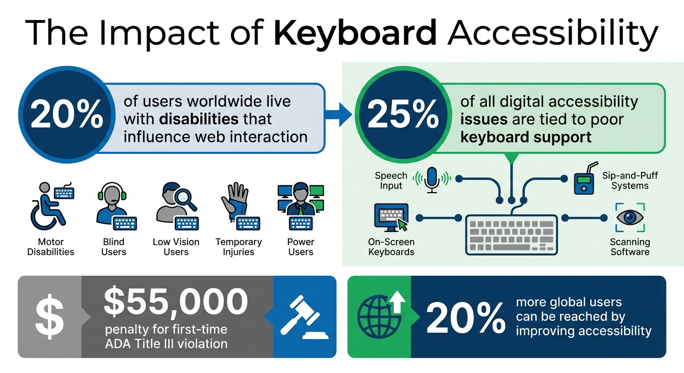
Testing keyboard navigation is essential to ensure your digital product is accessible to everyone. Around 20% of users worldwide live with disabilities that influence how they interact with the web. This includes individuals with motor disabilities who may struggle with precise mouse control, blind users who rely on keyboard commands paired with screen readers, and those with low vision who find it challenging to track a small mouse pointer.
Keyboard accessibility isn’t just for users with permanent disabilities. It also supports individuals with temporary injuries and benefits power users who prefer keyboard shortcuts for faster navigation. Moreover, keyboard accessibility is the backbone of many assistive technologies, like speech input software, sip-and-puff systems, on-screen keyboards, and scanning software. Without proper keyboard support, these tools simply don’t function.
A staggering 25% of all digital accessibility issues are tied to poor keyboard support. By addressing keyboard navigation problems, you tackle a significant portion of accessibility barriers. Plus, improving accessibility can help you reach 20% more global users. Beyond the numbers, it’s simply the right thing to do.
This understanding aligns with the WCAG 2.1 criteria for keyboard accessibility, which provide clear standards for testing and implementation.
WCAG 2.1 Criteria for Keyboard Accessibility
The WCAG 2.1 guidelines outline specific requirements to ensure keyboard accessibility. These criteria help you focus on what to test and why it matters:
| WCAG 2.1 Criterion | Level | Description |
|---|---|---|
| 2.1.1 Keyboard | A | All functionality must be operable through a keyboard interface without requiring specific timings for keystrokes. |
| 2.1.2 No Keyboard Trap | A | If focus can be moved to a component using a keyboard, it must also be possible to move focus away using the keyboard alone. |
| 2.4.7 Focus Visible | AA | Any keyboard-operable user interface must include a visible indicator showing where the keyboard focus is located. |
| 2.1.4 Character Key Shortcuts | A | If a keyboard shortcut uses only letters, punctuation, numbers, or symbols, users must have the option to turn it off or remap it. |
The W3C summarizes the intent of these criteria: "The intent of this success criterion is to ensure that, wherever possible, content can be operated through a keyboard or keyboard interface.". Meeting Level A standards is the bare minimum for accessibility, while Level AA compliance is often required under accessibility laws and policies.
These guidelines not only ensure inclusivity but also offer measurable benefits for users and businesses alike.
Benefits for Users and Businesses
For users, keyboard navigation can mean the difference between accessing your product or being excluded entirely. As TestParty states, "Keyboard accessibility is non-negotiable for website accessibility. A site that works only with a mouse effectively excludes users who cannot use a mouse."
For businesses, prioritizing keyboard accessibility has clear advantages. It helps you comply with regulations like ADA Title III and Section 508, avoiding hefty penalties that can start at $55,000 for a first-time violation. Additionally, accessible websites tend to perform better in search engine rankings due to their structured and navigable design.
Investing in keyboard accessibility builds trust with users and reflects your brand’s commitment to inclusivity. When your product works seamlessly for everyone, it not only creates a better user experience but also opens the door to a broader market.
Setting Up Your Testing Environment
Before diving into testing, it’s essential to configure your tools and workspace to reflect how keyboard-only users interact with your product. This preparation helps uncover subtle navigation issues that might otherwise go unnoticed.
Tools and Accessibility Features
Your testing toolkit should include a mix of screen readers and browser tools. For screen readers, consider options like VoiceOver (built into macOS/iOS), JAWS (Windows), or NVDA (Windows). These tools let you hear how keyboard interactions translate into audio feedback, providing insight into the experience of blind users.
Additionally, make use of your browser’s developer tools. These are invaluable for inspecting focus styles and testing content accessibility at high zoom levels – aim for a magnification range of 300–500%. This will help ensure that your design remains functional and easy to navigate when enlarged.
For a more guided approach, try Microsoft’s Accessibility Insights, which offers walkthroughs to identify common keyboard navigation challenges. If you’re using macOS, make sure to enable full keyboard access. You can do this by going to Safari Preferences > Advanced and checking the box for "Press Tab to highlight each item on a webpage".
If you need to test keyboard-only interactions but don’t have a physical keyboard handy, virtual keyboards can come to the rescue. On macOS, access the Accessibility Keyboard by pressing Option + Command + F5. On Windows, you can use the On-Screen Keyboard by pressing Win + CTRL + O. These tools are especially helpful for recording sessions or demonstrating issues to your team.
Disabling the Mouse for Testing
To create an authentic keyboard-only testing environment, you’ll need to eliminate mouse usage. If possible, unplug your mouse or move it out of reach. For wireless devices, simply turn off the trackpad.
Start testing by activating the browser’s address bar to set the initial focus. Then, remove your hand from the mouse entirely. Use the Tab key to navigate through interactive elements on the page. This approach mirrors the experience of keyboard-only users who rely solely on the keyboard when mouse functionality isn’t an option.
As you test, ensure that every interactive element is accessible and operable using just the keyboard. This step is crucial for identifying and addressing navigation issues.
Step-by-Step Keyboard Navigation Testing
It’s time to dive into systematic testing to confirm that every keyboard interaction works smoothly. Here’s how to approach it step by step.
Testing Tab and Shift+Tab Navigation
Start at the top of the page. Use Tab to move forward through interactive elements like links, buttons, and form fields. Use Shift + Tab to move backward.
The first thing you should encounter is ideally a "skip to main content" link. This allows users to bypass repetitive navigation menus, making the page more accessible. As you navigate, ensure the focus follows a logical order – header, main navigation, content area, and footer. Only interactive elements should receive focus; things like plain text or decorative elements should be skipped.
Be on the lookout for keyboard traps – situations where you can enter a section but can’t leave it using standard keys. As the DWP Accessibility Manual puts it, "It is only a trap if there is no obvious way out". Lastly, make sure focus indicators meet accessibility standards with a minimum contrast ratio of 3:1.
This step ensures that navigation is intuitive and accessible. Next, test how interactive elements respond to activation keys.
Testing Activation Keys
Now, check how activation keys behave for each interactive element. For example:
- Links should activate with Enter.
- Buttons should respond to both Enter and Spacebar.
- Checkboxes should toggle states with the Spacebar.
Here’s a quick reference:
| Interactive Element | Primary Activation Key | Secondary Key |
|---|---|---|
| Link | Enter | N/A |
| Button | Enter | Spacebar |
| Checkbox | Spacebar | N/A |
| Radio Button | Spacebar | Arrow Keys (to navigate) |
| Select (Dropdown) | Spacebar (to expand) | Enter (to select) |
For elements with custom ARIA roles, like role="button", make sure they respond to both Enter and Spacebar, as browsers don’t natively support these roles.
Next, focus on how arrow keys function within composite widgets.
Testing Arrow Key Interactions
While Tab moves focus between components, arrow keys are used to navigate within composite widgets. For instance, in a radio button group, you should be able to tab into the group and then use arrow keys to change the selection. This behavior extends to menus, tab lists, and sliders.
For dropdowns, test the following sequence: use the Spacebar to expand the list, arrow keys to navigate options, and Enter to make a selection. If your interface includes more complex widgets like carousels, ensure the arrow keys function as expected according to ARIA guidelines.
Once this is complete, move on to testing how modals and pop-ups behave with the keyboard.
Testing Escape Key and Modal Handling
Press Escape to close modals, dropdown menus, or pop-ups. When these elements close, the focus should return to the element that triggered them. While a modal is open, use Tab to confirm that focus remains trapped within the modal instead of jumping to background content. Make sure all modal controls are accessible and that the Escape key reliably closes the modal and returns focus to the trigger.
Finally, verify how well focus indicators perform across all interactions.
Testing Focus Indicators
Every interactive element should clearly show a visual indicator – like an outline or highlight – when it receives focus. Review your CSS to ensure you’re not using rules like outline: none, as this can severely impact accessibility.
If you’ve created custom focus styles, double-check that they maintain a contrast ratio of at least 3:1 against the background and are consistently visible. The W3C emphasizes that subtle visual changes can cause users to lose track of focus, making navigation difficult. Test these indicators at higher zoom levels (e.g., 300–500%) to ensure they remain effective when content is magnified.
sbb-itb-f6354c6
Common Issues and How to Fix Them
Even with careful planning, keyboard accessibility issues can still sneak in. Spotting and addressing these common problems can save you time while ensuring a smoother browsing experience for everyone.
Logical Tab Order Issues
When the visual layout of a page doesn’t align with its underlying HTML structure, keyboard focus can jump unpredictably. This often happens when CSS techniques like Flexbox, Grid, or absolute positioning rearrange elements visually but leave the DOM structure unchanged. To fix this, make sure your HTML follows a logical reading order – typically left-to-right and top-to-bottom – so users encounter elements in the expected sequence.
Another common issue comes from using positive tabindex values (1 or higher). As TestParty warns, "Positive tabindex values create maintenance nightmares and typically result in confusing focus order as pages change". Instead, rely on semantic HTML elements like <button>, <a>, and <input>, which are naturally focusable and follow the DOM order. For custom elements, use tabindex="0" to include them in the tab order or tabindex="-1" for elements that should only receive focus programmatically, such as modals or error messages.
It’s also essential to manage focus after user actions. For instance, when a modal is closed or an item is deleted, ensure the focus moves to a logical starting point rather than resetting to the top of the page.
Finally, verify that focus indicators are visible, which ties into the next issue: missing or inadequate focus styles.
Missing or Inadequate Focus Indicators
A frequent problem is the removal of default browser focus indicators – often through :focus { outline: none; } – to achieve a cleaner design. However, this can leave keyboard users unsure of where they are on the page. The fix is straightforward: don’t remove the outline unless you replace it with a clear, custom focus style.
Use the :focus-visible pseudo-class to show focus indicators only when users navigate with a keyboard. Make these indicators at least 2 pixels thick, with an offset of at least 2 pixels, and ensure a contrast ratio of at least 3:1 against the background. You can also use background color changes, underlines, or a mix of techniques to create a distinct and accessible focus state.
Beyond visual cues, ensure users can move freely through the interface, which leads us to keyboard traps and navigation loops.
Keyboard Traps and Navigation Loops
Keyboard traps occur when users enter a section – like a modal or widget – but can’t leave it using standard keys. As the DWP Accessibility Manual puts it, "It is only a trap if there is no obvious way out". To prevent this, ensure the Escape key always dismisses dynamic elements like popups, menus, and dialogs. When a modal closes, programmatically return focus to the element that triggered it to maintain a logical flow.
If an element is removed from the DOM, move focus to the next logical item or its parent container to avoid defaulting to the body. To ensure everything works as expected, test your page by navigating with only the Tab and Shift+Tab keys. This will confirm that users can enter and exit all interactive components without any roadblocks.
Testing Keyboard Navigation in UXPin Prototypes
UXPin makes it easier to tackle accessibility early in the design process. By incorporating UXPin prototypes during the initial stages, you can validate keyboard navigation flows efficiently and with minimal expense. This approach ensures accessibility is a priority from the start, not an afterthought.
Simulating Accessibility Features in UXPin
When building prototypes in UXPin, use its React-based libraries like MUI, Tailwind UI, or Ant Design. These libraries ensure interactive elements in your prototype mimic how they’ll behave in production. UXPin’s event system allows you to map keyboard behaviors effectively: assign Enter or Space to buttons, use Arrow keys for menu navigation, and bind Esc to close modals while returning focus to the trigger element.
Once your prototype is ready, switch to preview mode and navigate exclusively with the keyboard. Use Tab, Shift+Tab, Enter, Arrow keys, and Escape to test interactions. Pay close attention to focus indicators on interactive components, ensuring they appear consistently and follow a logical sequence. For modals and overlays, confirm that focus shifts into the dialog when it opens and returns to the trigger element when it closes. This prevents users from losing their place in the interface.
These simulation techniques provide real-time insights into how well your prototype handles keyboard interactions.
Benefits of Early Testing in Prototypes
Catching keyboard navigation issues during the prototyping phase saves time and money. With UXPin, you can adjust focus order, key bindings, and component behaviors using intuitive drag-and-drop settings – bypassing the need for extensive code changes. Common problems like illogical tabbing sequences, missing focus indicators, or inaccessible custom components can be resolved before they become embedded in the final product.
"When I used UXPin Merge, our engineering time was reduced by around 50%. Imagine how much money that saves across an enterprise-level organization with dozens of designers and hundreds of engineers." – Larry Sawyer, Lead UX Designer
Conclusion
Testing for keyboard navigation is a crucial step in ensuring your digital products are accessible to all users. Poor keyboard support is a common barrier, affecting individuals with motor disabilities, screen reader users, and even power users who prefer navigating without a mouse. If this step is overlooked, you risk creating issues like keyboard traps, confusing tab orders, and missing focus indicators, all of which can severely limit accessibility.
To get started, disconnect your mouse and test navigation using keys like Tab, Shift+Tab, Enter, Spacebar, and the Arrow keys. Make sure every interactive element can be accessed and operated with the keyboard. Focus on logical tab sequences and how modals are handled, as these are common trouble spots. As WebAIM emphasizes, "Keyboard accessibility is one of the most important aspects of web accessibility. Many users with motor disabilities rely on a keyboard". This hands-on testing approach complements automated tools by addressing real-world usability gaps.
While automated tools can identify many technical issues, manual testing remains essential for verifying logical navigation and ensuring focus indicators are clear and visible. Combining both methods provides a more thorough assessment, catching both technical and usability challenges.
For even better results, consider testing accessibility early in the design process. Starting during the prototyping phase, rather than waiting until development is complete, can save both time and resources. Tools like UXPin enable you to test keyboard interactions directly within prototypes built with production-ready React components from libraries like MUI and Tailwind UI. This allows you to validate tab orders, key bindings, and focus management early on, addressing potential issues before they become costly fixes. By integrating accessibility checks from the outset, you lay a stronger foundation for inclusive design throughout your project.
FAQs
How do I test keyboard navigation in digital products?
To evaluate keyboard navigation, begin by creating a keyboard-only setup. Adjust your browser and operating system settings to enable full keyboard navigation, and confirm the configuration using accessibility tools. Then, pinpoint all interactive elements – like links, buttons, form controls, and custom components – that should be accessible via the keyboard.
Use standard shortcuts to navigate: press Tab to move forward, Shift + Tab to go backward, Enter or Spacebar to activate elements, and arrow keys for navigating menus or widgets. Check for clear focus indicators, a logical tabbing sequence, and ensure there are no "keyboard traps" that prevent users from moving freely. Additionally, verify that focus management functions correctly, such as skip links being usable and focus shifting properly in modals or dialogs.
Prototyping tools, such as UXPin, are useful for testing and refining keyboard navigation early in the design phase. This approach helps identify and fix accessibility issues before development begins, ensuring your product works seamlessly for users who rely on keyboard navigation.
Why is keyboard navigation testing important for accessibility?
Keyboard navigation testing plays a key role in making digital products accessible to people with disabilities, such as motor impairments, limited hand mobility, or visual impairments. It ensures that essential features – like a logical tab order and visible focus indicators – work correctly, allowing users to navigate and interact with the interface smoothly.
By conducting these tests, you help create a more inclusive experience, enabling users who depend on keyboards or assistive technologies to use your product effectively and without assistance.
What should I check for when testing keyboard navigation?
When testing keyboard navigation, the goal is to make sure your site or app is accessible and easy to use for everyone. Start by verifying that all interactive elements – like links, buttons, form fields, and widgets – can receive a visible focus. This means there should be a clear indicator, like an outline or highlight, showing where the focus is. Without this, users relying on keyboards could lose track of their position.
Next, review the tab order. Pressing Tab should move the focus forward in a logical sequence, typically following the natural reading order. Shift + Tab should move the focus backward. If the focus skips elements or jumps around unexpectedly, it can make navigation confusing. Be on the lookout for keyboard traps too – situations where users get stuck in a component, such as a modal or dropdown, and can’t exit using Esc or Tab.
Make sure there are skip links or similar shortcuts to help users bypass repetitive content, like navigation menus. Also, confirm that all controls can be activated with the keyboard, such as using Enter or Space for buttons and arrow keys for menus. For hover-only interactions (like tooltips or dropdowns), ensure they work with the keyboard too. Additionally, when users close modals or dialogs, the focus should return to the element that triggered them.
By addressing these areas, you’ll help ensure your product meets WCAG 2.1.1 guidelines and U.S. accessibility standards, improving the experience for all users.

