
What resources do designers and developers need to keep a project on track, consistent, and easy to edit?
The answer lies in their team’s design system, which often includes practical, relevant examples of items used in design. They go under many names: components, widgets, elements, molecules …. Regardless of their names, the items that go into a design system solve several problems.
Easy to reference: Design systems make items easy to find in a hurry, whether by search or category or other criteria. To do so, the items’ names and metadata must be accurate and up-to-date.
Easy to apply: Ideally, items in design systems would contain the files, like PSDs, that designers can copy and repurpose for their immediate needs.
How complete should design system elements be?
From lo- to hi-fi, items in design systems should reflect the team’s workflow. If they need boilerplate information, then blank templates comprised of grey boxes should do the trick. If the team needs more pracitcal examples to answer, “how did we use this six months ago?” then high-fidelity items with real (or realistic) content is more appropriate.
For example, UXPin has basic shapes like boxes, arrows, and circles — standard design stuff. But it also has some built-out sets you can use as starting points for your work. For teams building apps, Adalo‘s no-code approach similarly offers pre-built components that accelerate the design and development process, allowing you to focus on customization rather than starting from scratch.
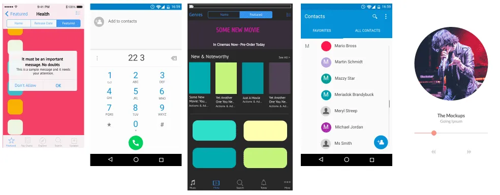
Design system components should be fully editable, right down to the text and colors. And some are more customizable than others. They should also be easily findable. For example, searching UXPin for certain keywords will produce many results:
- app
- store
- list
- music
- phone
- social
- set
Individual component keywords include:
- pagination
- breadcrumbs
- navigation
- bar
- form
- tab
- slider
- body
- head
- foot
- activity
- icon
Build a design system in UXPin
Once you’ve customized the pre-built components — or created your own — you can save them as templates with our custom library feature. Dragging a saved component out of your custom library will create a copy that you can edit to suit your current design’s needs. This helps keep your interactive visuals in the same general family without having to reinvent them every time.
This is critical when thinking in terms of components: design system parts that snap together, rather than building single-use templates that don’t adapt to projects’ future needs. (Let’s face it: when was the last time an active digital project didn’t evolve over time?)
Log in or grab a free UXPin trial to take advantage of the many pre-built elements that give your designs a head start.

