Svelte is a fast, lightweight framework for building web apps, and its growing ecosystem includes several UI libraries that can speed up prototyping. These libraries range from pre-styled options for quick setups to unstyled, flexible tools for custom designs. Here’s a list of the 10 best Svelte UI libraries to help you build prototypes efficiently:
- SVAR Svelte Parts: Optimized for data-heavy apps with built-in components like DataGrid and Gantt charts. Lightweight (155 KB) and SSR-friendly.
- Melt UI: Offers headless components for full customization. Ideal for accessible and flexible designs.
- Svelte Headless UI: Focuses on functionality without pre-styled components, giving you complete styling control.
- shadcn-svelte: Generates component source code directly into your project. Tailwind CSS compatible.
- Smelte: Combines Material Design with Tailwind CSS for polished, ready-to-use components.
- Skeleton: A design system with pre-styled components and Figma support. Tailored for Tailwind CSS users.
- Flowbite-Svelte: Provides over 60 pre-styled components for modern web apps. Works seamlessly with Tailwind CSS.
- Bits UI: Headless components for custom designs. Great for building unique interfaces.
- Svelte Material UI (SMUI): Native Material Design components for Svelte. Highly customizable.
- Sveltestrap: Brings Bootstrap 5 components to Svelte for quick, responsive designs.
Quick Comparison
| Library | Key Features | Styling Approach | SSR Support | Best For |
|---|---|---|---|---|
| SVAR Svelte Parts | Data-heavy apps, lightweight (155 KB) | Plain CSS | Yes | Dashboards, enterprise apps |
| Melt UI | Headless, accessible components | Customizable CSS | Yes | Custom designs, accessibility |
| Svelte Headless UI | Functionality-focused, unstyled | Bring your own styles | Yes | Fully customizable UIs |
| shadcn-svelte | Code generation, Tailwind-friendly | Tailwind CSS | Yes | Modern UI prototyping |
| Smelte | Material Design with Tailwind integration | Tailwind CSS | Yes | Material Design prototypes |
| Skeleton | Design system with Figma support | Tailwind CSS | Yes | Prototypes with design systems |
| Flowbite-Svelte | 60+ pre-styled components | Tailwind CSS | Yes | SaaS, modern apps |
| Bits UI | Headless, fully customizable | Tailwind/UnoCSS | Yes | Unique component libraries |
| Svelte Material UI | Material Design components | Custom theming | Yes | Material Design compliance |
| Sveltestrap | Bootstrap 5 components | Bootstrap CSS | Yes | Bootstrap-based prototypes |
Each library has strengths tailored to specific needs, from fast prototyping with pre-styled components to building custom, scalable designs. Choose based on your project’s requirements, whether it’s speed, flexibility, or compatibility with tools like Tailwind CSS or SvelteKit.
I Tried Every Svelte UI Library
How to Choose Svelte UI Libraries
How to Pick Svelte UI Libraries
The UI tools you use shape how you build your app. The right one lets you work fast and is easy to change. The wrong one can slow you down with big, slow code or fixed looks you do not like. Here are things to think about when you choose what to use.
First, see if the library has real Svelte parts. Those built for Svelte work best with it. If a tool is not made for Svelte, it may run slow, make your code bigger, and not work well with other parts.
How big the bundle is also matters. One of Svelte’s big plus sides is that it makes small, lean code. So, do not pick tools that will make your code much bigger. Choose ones that let you only use what you need. Some, like SVAR Core, are light and quick, with a bundle size of just 155 KB, which is great for fast work. Big tools can make your site load slow and hurt your flow.
How you style things is up to what you need. If you want to get things done fast, tools like Skeleton or Flowbite-Svelte come with built-in looks ready to use. But, if you want more say on how things look, tools like Bits UI let you change styles any way you want. You can use Tailwind CSS or plain CSS to make it fit your needs.
Do not forget access for all. Pick tools that help people use your app no matter how they get to your content. Look for keyboard help, screen reader support, and special tags so everyone can use your work. These save you time and help real users.
If you use SvelteKit, your tools should work well with SSR (server-side rendering). SSR can make your pages show up faster and help people find your site on search engines. Your UI tools need to work well both on the server and in the browser, or you will get errors or bugs.
How well the tool works with SvelteKit and Tailwind CSS can make things easy. SvelteKit is a top choice for those who work with Svelte. Tailwind CSS is used a lot for styles. Tools like Skeleton and Flowbite-Svelte work well with both, so you spend less time setting things up and more time building your site.
In short, always look at if the tool fits with Svelte, how big it is, how you can style it, if it helps with access, if it works well with SSR, and how it works with SvelteKit and Tailwind CSS. If you keep these points in mind, you will pick the best tool for you and your app.
| Way | How Fast To Set Up | How You Can Change | How Big | Best Use |
|---|---|---|---|---|
| Ready-Made (Skeleton, Flowbite-Svelte) | Quick | Only what’s given | Bigger | Fast try-outs |
| Plain Parts (Bits UI, Melt UI) | Not too quick | Change all you want | Smaller | Make your own look |
| Copy and Paste (shadcn-svelte) | Not too quick | Change all you want | Changes | If you know shadcn/ui |
In the end, try not to fall for the same old traps. Bad notes and old tools can make things tough and slow you down. If you work with SvelteKit, be sure to test it with SSR from the start so you know it works. Try out a few ways or tools before you make a choice. This helps you pick what fits you best.
Pick what works for you and your way of doing things. If you want things fast, pick tools that come with styles set up. If you want to change more things and tweak stuff, go for tools that let you build from the ground up. If you want to be in the middle, use the way where you copy and paste bits that work for you. This way, you find what feels right and makes your job simple.
1. SVAR Svelte Parts
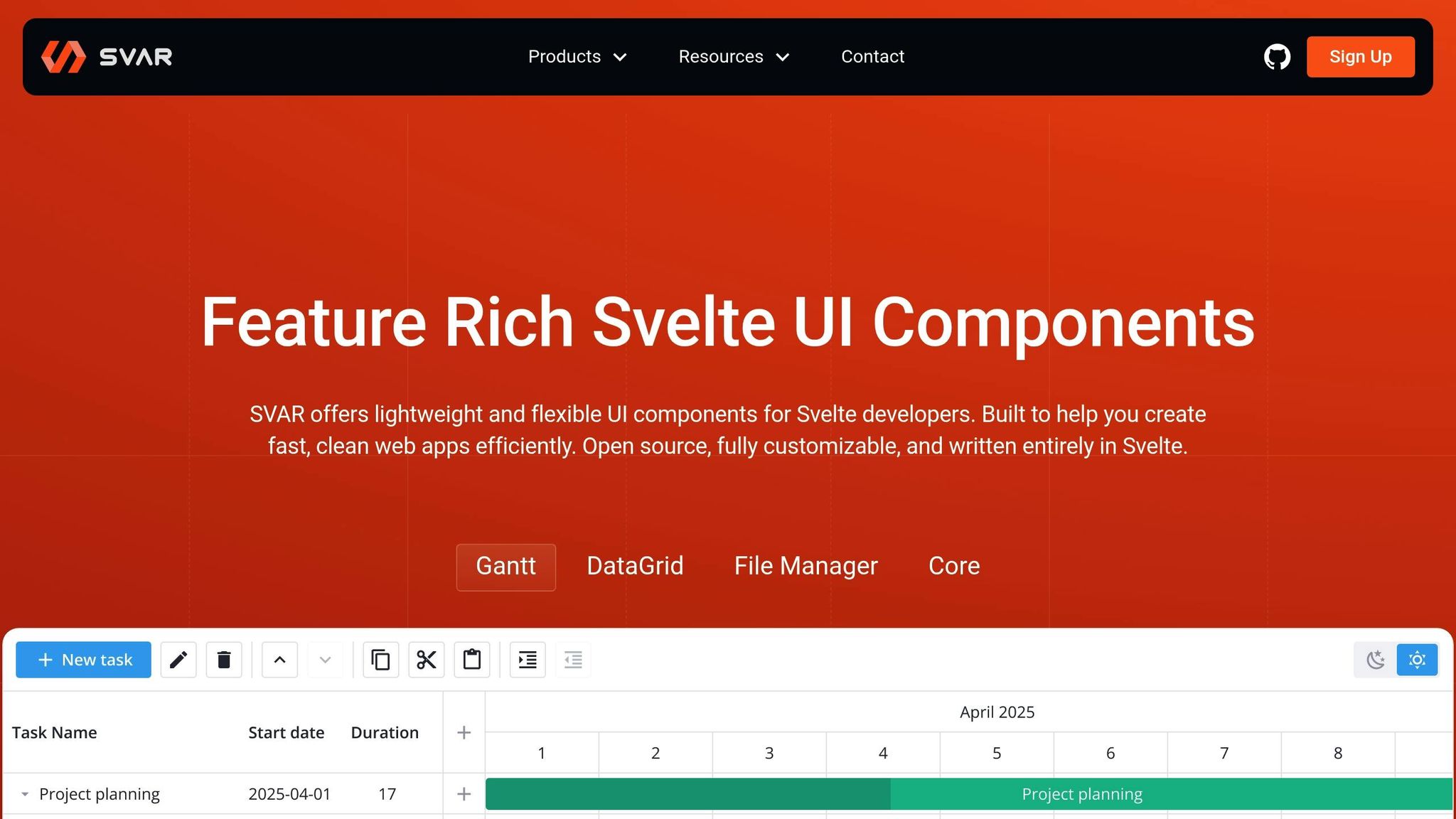
SVAR Svelte Parts is a Svelte set made for Svelte 5. Other sets use wrappers, but SVAR does not. Each part in SVAR is made in Svelte from start to end. This means it runs fast, works well, and uses Svelte state and updates just like you would expect.
The set is built for apps that use lots of data. It brings strong parts like DataGrid and Gantt charts, with Scheduler and Filter parts coming soon. These bits fit great for dashboards, admin screens, and so on.
Styling Is Easy
SVAR makes style easy with scoped CSS. All is kept neat, with no extra tools to learn or use. Each part has style on it from the start, so you don’t wait long to make things. Want to change looks? You can do it with normal CSS, no fuss. You change styles without working with JavaScript. Good looks and strong fit with server-side work (SSR) mean SVAR goes with many needs.
Made for All and SSR Ready
SVAR cares for all users. You get easy keyboard use and screen reader help. The parts let all people use them well. With SSR, SVAR works great with SvelteKit. It fits both server and browser use with no trouble. Smooth SSR help is good for quick smart mockups.
Quick Use with SvelteKit and Tailwind
It is simple to use SVAR in your SvelteKit jobs. Here is an example of how to add the DataGrid part:
<script> import { DataGrid } from 'svar-svelte'; let rows = [{ id: 1, name: 'Alice' }, { id: 2, name: 'Bob' }]; </script> <DataGrid {rows} /> SVAR has its own style tools, but you can use it with Tailwind CSS too, for more class help. SVAR Core is only 155 KB, so your pages stay fast and light. The code gets new updates all the time, and fixes for real problems come quick. Most parts of SVAR do not cost money and you can see or change them on GitHub as open code.
2. Melt UI
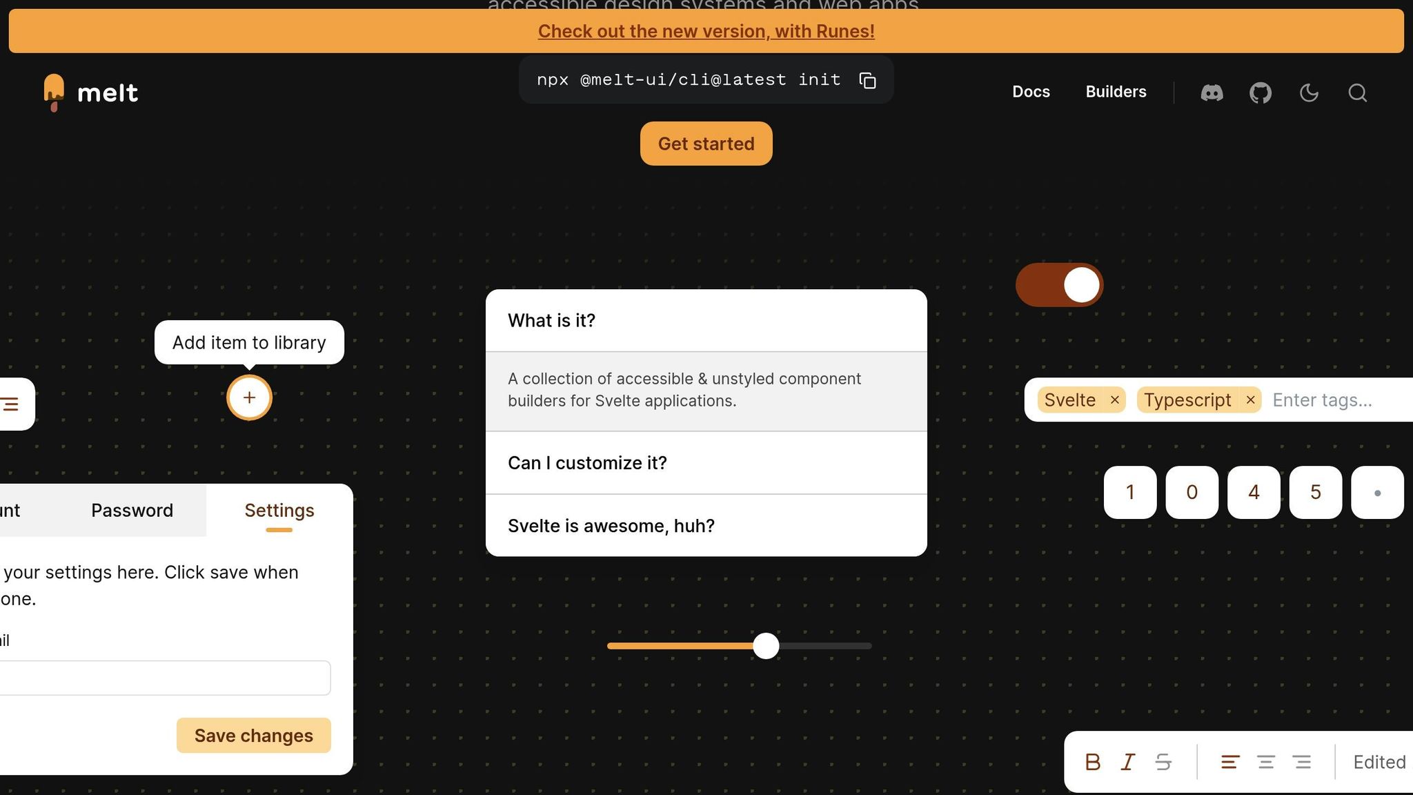
Melt UI is a Svelte set of tools that does not come with styles. You get basic blocks that you can use as you like. Other kits may have ready parts that look a certain way. Melt UI lets you make things the way you want, so you get to set up your own look for your test apps or your site.
Native Svelte Components
Melt UI is made just for Svelte. It uses the Builder API way, so you get to choose each part and how it works. You can set what it does and how it shows up. Melt UI works well with Svelte 5, so you are safe to use it as you make new things.
Here is a sample of how you might build a part that opens and shuts with Melt UI:
<script> import { createCollapsible, melt } from '@melt-ui/svelte'; const { elements: { root, content, trigger }, states: { open } } = createCollapsible(); </script> <div use:melt={$root}> <button use:melt={$trigger}>Toggle</button> <div use:melt={$content}> <p>Content goes here.</p> </div> </div> You can try things with this method and change how things look and work with ease. You are not locked into styles that are set ahead of time. If you want to try new looks or need parts that bend and shift for your tests, this way is good.
Change Styles Your Way
Melt UI is made with basic tools and build steps that give you power over how things look. You can make it match your brand or try fresh ways to build new things. It does not box you in.
Since it is "headless", you can shape how it looks with style rules, CSS tools, or quick style kits like Tailwind CSS. You get to choose, so your tests and samples match your ideas and plans.
Built-In Help and Shared Styles
All pieces in Melt UI follow rules that help folks with tools like readers and keys, and use clear, easy HTML. The setup has guides that help, like simple use with keys or clear words for readers. That way, your work can be used by most people from the start.
Melt UI also fits well with SvelteKit, and works right from the server or in the browser. It runs smooth, no matter how or where you use or share your work.
Easy Start with SvelteKit and Tailwind
To start, it is easy and quick – just put it in with npm, and you are ready to go.
npm install @melt-ui/svelte When you use Melt UI and Tailwind CSS together, you style things fast. You add small, quick parts to change looks in a snap. This helps you shape your work in less time. Melt UI does not get in your way, so you can use Tailwind just as you want.
Melt UI is quick and light. It only adds what you use, making your work small and fast to load. Your files stay lean, and your pages open fast, which helps when you show shares or pitch ideas. It gives you what you need and leaves out what you do not use.
3. Svelte Headless UI
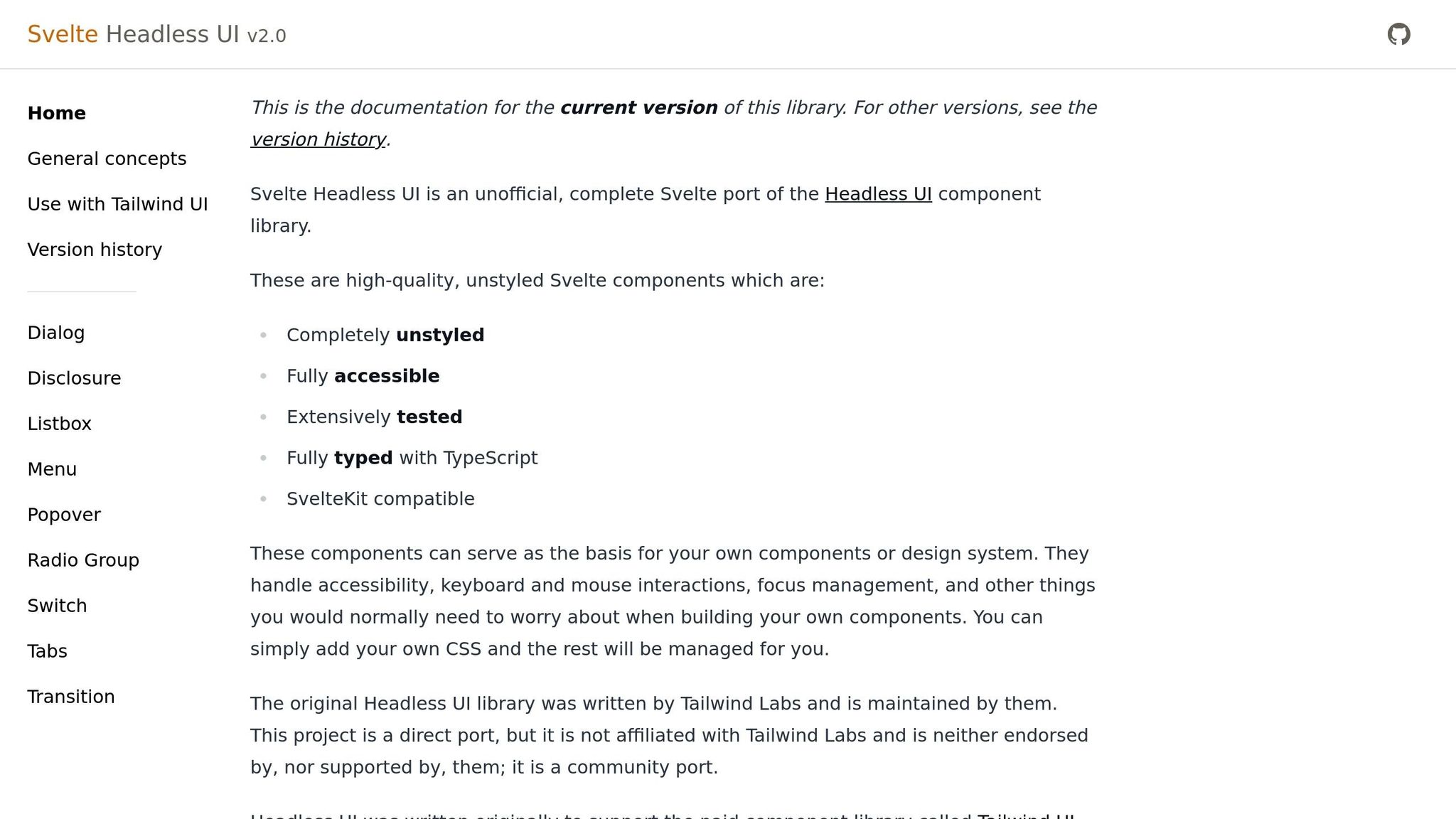
Svelte Headless UI is a powerful tool for building fast, customizable prototypes without compromising on code simplicity or accessibility. Borrowing tried-and-true patterns from React and Vue, it offers 10 essential components (like Dialog, Menu, and Popover) that focus solely on functionality. Styling is left entirely in your hands, giving you complete creative freedom.
Native Svelte Components
This library brings familiar Headless UI APIs to Svelte, making it an easy transition for developers who’ve worked with React or Vue. Each component follows a predictable structure and naming convention, which means less time learning and more time building.
Here’s an example of how a basic dialog component looks in Svelte:
<script> import { Dialog, DialogPanel, DialogTitle } from '@rgossiaux/svelte-headless-ui'; let isOpen = false; </script> <Dialog bind:open={isOpen}> <DialogPanel> <DialogTitle>Settings</DialogTitle> <p>Your dialog content goes here.</p> <button on:click={() => isOpen = false}>Close</button> </DialogPanel> </Dialog> This shared API approach allows teams to leverage their existing knowledge and easily adapt patterns across different frameworks. It also ensures a consistent development experience, reducing friction when experimenting with new technologies.
Total Styling Control
As a fully headless library, Svelte Headless UI gives you the freedom to style components however you like. It takes care of the heavy lifting – like focus management, keyboard navigation, and screen reader support – while you focus on the design.
The library works exceptionally well with Tailwind CSS, as its structure aligns closely with Tailwind UI patterns. You can quickly add utility classes to components, making it easy to create cohesive designs. Whether you’re refining a brand’s look or trying out bold new visuals, you can adjust styles without worrying about the underlying logic.
This flexibility lets you create prototypes that feel polished and production-ready. It’s a great fit for developers who value a hands-on approach to both design and functionality.
Seamless Integration with SvelteKit and Tailwind
Svelte Headless UI is designed to work effortlessly with modern tools like SvelteKit and Tailwind CSS. Its components come equipped with built-in accessibility features, including ARIA attributes, keyboard navigation, and focus management, ensuring your prototypes are inclusive and user-friendly.
The library also supports server-side rendering (SSR) through SvelteKit, which helps deliver fast load times and reliable performance.
To get started, install the library:
npm install @rgossiaux/svelte-headless-ui Once installed, you can combine the unstyled components with Tailwind CSS utility classes to create polished, functional interfaces. This setup is perfect for teams that need to move quickly without sacrificing the ability to build custom design systems later. With Svelte Headless UI, your components are ready to grow with your project, from initial prototype to finished product.
4. shadcn-svelte
shadcn-svelte takes a unique approach by generating component source code directly into your project rather than relying on pre-built packages. Like other libraries we’ve discussed, it focuses on modularity and performance, but it stands out with its full code-generation capabilities. As an unofficial Svelte port of the popular React shadcn/ui library, it gives developers full control over their components while maintaining the ease and speed of a traditional UI library.
Native Svelte Components
Designed specifically for Svelte 5, shadcn-svelte offers native components built from scratch to ensure smooth integration and high performance.
What sets it apart is its CLI-based workflow. Instead of installing components as dependencies, you generate the actual source code directly into your project:
npx shadcn-svelte@latest init npx shadcn-svelte@latest add button Once generated, you can import the components as you would any standard Svelte module:
<script> import Button from '$lib/components/ui/button.svelte'; </script> <Button>Click me</Button> This method gives you complete ownership of the code, allowing for easy modifications without being tied to specific library versions. It also opens the door to more flexible styling options.
Styling Flexibility
shadcn-svelte strikes a balance between ready-to-use components and extensive customization. The components come pre-styled with Tailwind CSS, making it easy to prototype and maintain consistency. You can tweak spacing, colors, and layouts using Tailwind’s utility classes or dive into the component code for deeper adjustments.
Since the source code resides in your project, you’re free to strip away the default styles for a headless implementation or adapt them to fit your branding. This flexibility is particularly useful for teams building custom design systems. You get production-ready components right away, but you’re not locked into the library’s design decisions as your project evolves.
Accessibility and SSR Support
shadcn-svelte components are built with accessibility in mind. They include ARIA attributes, keyboard navigation, and full support for server-side rendering (SSR) with SvelteKit. By adhering to the same accessibility principles as the original shadcn/ui library, these components meet modern standards, ensuring an inclusive user experience.
Whether rendering on the server or hydrating on the client, the components perform seamlessly, making them a reliable choice for any SvelteKit project.
Seamless Integration with SvelteKit and Tailwind
Integrating shadcn-svelte into a SvelteKit project is straightforward. It works seamlessly with Tailwind CSS v4 and aligns with SvelteKit’s file-based routing and component structure.
The setup process takes care of scaffolding configuration files and ensures Tailwind is ready to support the components. This means you can dive straight into prototyping without worrying about setup conflicts or tedious configurations.
Since the library only generates the components you need, your project stays lean and well-organized. You can add components as your project grows, keeping the development process efficient and focused.
With the recent addition of chart components, shadcn-svelte has expanded its prototyping capabilities. This ongoing development ensures the library remains aligned with the latest trends and tools in the Svelte ecosystem.
5. Smelte
Smelte combines the principles of Material Design with the flexibility of Tailwind CSS, offering a collection of over 30 components. These components bring Google’s design language to life while leveraging utility-first styling. With Smelte, you get ready-to-use Material components that look polished right out of the box, but you also have the ability to customize them extensively using Tailwind’s utility classes. This makes it easy to create professional-looking interfaces quickly while retaining the freedom to tweak layouts, colors, and spacing to suit your needs.
Native Svelte Components
Smelte’s components are built specifically for Svelte, taking full advantage of its reactivity and performance. They integrate naturally into Svelte’s component lifecycle and state management, making them intuitive to use.
To get started, install Smelte and Tailwind CSS:
npm install smelte npm install -D tailwindcss Once installed, you can import and use Smelte components directly in your Svelte files:
<script> import { Button, Card, TextField } from 'smelte'; </script> <Card> <TextField label="Email" /> <Button>Submit</Button> </Card> These components are designed to feel right at home in a Svelte application, adhering to its conventions and keeping your code clean and easy to read. This makes the development process smoother, especially during prototyping.
But Smelte doesn’t stop at just functionality – it also gives you powerful styling options.
Styling Flexibility
Smelte strikes a balance between pre-styled Material Design components and the customization power of Tailwind. The Material Design foundation ensures your interfaces look polished from the start, while Tailwind integration gives you the ability to tweak styles quickly without writing custom CSS.
For example, you can easily customize a button’s appearance using Tailwind classes:
<Button class="bg-purple-600 hover:bg-purple-700 rounded-full"> Custom Button </Button> This approach lets you experiment with color schemes, spacing, and layouts on the fly, all without diving into component internals or managing separate stylesheets.
In addition to styling, Smelte ensures your prototypes are accessible and optimized for performance.
Accessibility and SSR Support
Smelte components include built-in ARIA attributes and support for keyboard navigation, aligning with Material Design’s accessibility standards. This means your prototypes are already on track to meet accessibility requirements, reducing the need for major overhauls as you transition to production.
The library also works seamlessly with server-side rendering (SSR) in SvelteKit. This ensures fast initial load times and better SEO, as components render on the server and hydrate on the client without issues.
Seamless Integration with SvelteKit and Tailwind
Integrating Smelte into a SvelteKit project is straightforward. After installing the necessary packages, you’ll need to update your Tailwind configuration to include Smelte’s styles and ensure unused CSS is properly purged.
Once set up, Smelte components can be used alongside your own Tailwind-styled elements without any conflicts. This gives you the best of both worlds: the convenience of pre-built components and the creative freedom of Tailwind CSS for rapid prototyping and iterative design.
6. Skeleton
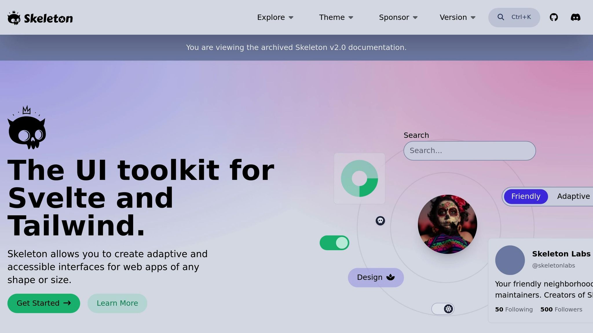
Skeleton stands out among Svelte UI libraries by offering more than just tools for prototyping – it provides a complete design system paired with a Figma UI Kit. This combination makes it an excellent choice for teams aiming to maintain design consistency from the initial prototype to the final product. Skeleton simplifies the development process with pre-styled components while allowing extensive customization, ensuring both speed and scalability.
Native Svelte Components
Skeleton’s components are built using Zag.js primitives, ensuring they integrate seamlessly with Svelte’s reactive framework. This approach eliminates unnecessary wrappers, resulting in better performance and a more natural fit within the Svelte ecosystem.
Getting started is easy. First, install Skeleton and its dependencies:
npm install @skeletonlabs/skeleton npm install -D @tailwindcss/typography @tailwindcss/forms Then, import and use the components in your project:
<script> import { AppShell, AppBar, LightSwitch } from '@skeletonlabs/skeleton'; </script> <AppShell> <svelte:fragment slot="header"> <AppBar> <svelte:fragment slot="lead">My App</svelte:fragment> <svelte:fragment slot="trail"><LightSwitch /></svelte:fragment> </AppBar> </svelte:fragment> <main class="container mx-auto p-8"> <!-- Your prototype content --> </main> </AppShell> This straightforward integration ensures your prototypes run smoothly and align naturally with Svelte’s architecture, making the leap to production much easier. Additionally, Skeleton emphasizes adaptability in styling.
Styling Flexibility
Skeleton offers a dual approach to styling: pre-styled components for quick setup and headless options for full customization. It uses Tailwind CSS as its foundation, allowing developers to either stick with the default design or tailor components to meet specific needs.
For example, you can easily tweak a pre-styled component using Tailwind classes:
<script> import { Button } from '@skeletonlabs/skeleton'; </script> <Button variant="filled" class="bg-gradient-to-r from-blue-500 to-purple-600"> Custom Gradient Button </Button> If you need more control, Skeleton’s primitives let you create entirely custom interfaces while retaining essential functionality and accessibility features. This flexibility is especially helpful during the prototyping phase, where experimenting with different designs is often necessary.
Accessibility and SSR Support
Accessibility is baked into Skeleton’s components, ensuring they are usable by everyone from the outset. Features like ARIA attributes, keyboard navigation, and screen reader compatibility are standard, so you won’t need to add them manually.
Skeleton also supports server-side rendering (SSR), making it a great fit for SvelteKit projects that prioritize performance and SEO. This means you can test your prototypes in environments that closely mimic production, without worrying about compatibility issues.
Seamless Integration with SvelteKit and Tailwind
Designed to work effortlessly with SvelteKit and Tailwind CSS, Skeleton requires minimal setup. After installing the necessary packages, you can configure Tailwind to include Skeleton’s theme by updating your tailwind.config.js:
import { skeleton } from '@skeletonlabs/tw-plugin'; export default { content: ['./src/**/*.{html,js,svelte,ts}'], plugins: [skeleton({ themes: { preset: ['skeleton'] } })] }; Once configured, you can immediately start building with Skeleton components alongside your custom Tailwind designs. The inclusion of a Figma UI Kit further bridges the gap between design and development, ensuring smoother collaboration and consistent results from concept to code.
sbb-itb-f6354c6
7. Flowbite-Svelte
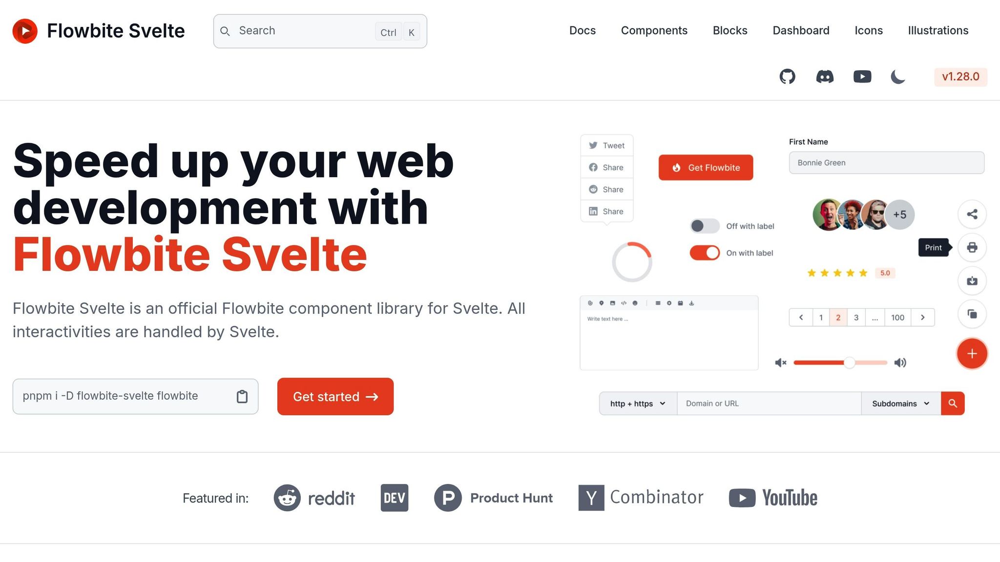
Flowbite-Svelte offers over 60 pre-styled components built specifically for Svelte, all grounded in the Flowbite design system. By combining the visual harmony of a well-established design system with Tailwind CSS’s utility-first philosophy, it’s a go-to option for creating polished prototypes quickly. Here’s a closer look at what makes it stand out.
Native Svelte Components
Flowbite-Svelte isn’t just a wrapper around components from other frameworks – it’s built natively for Svelte. This ensures smoother performance and fewer compatibility hiccups.
Getting started is simple. First, install it in your project:
npm install flowbite-svelte Then, import and use its components:
<script> import { Button, Modal, Navbar, Dropdown } from 'flowbite-svelte'; let showModal = false; </script> <Navbar> <div slot="brand">My Prototype</div> <Dropdown label="Menu"> <div>Dashboard</div> <div>Settings</div> </Dropdown> </Navbar> <Button on:click={() => showModal = true}>Open Modal</Button> <Modal bind:open={showModal} title="Prototype Dialog"> <p>This modal demonstrates Flowbite-Svelte's interactive components.</p> </Modal> With components like dropdowns, navbars, modals, buttons, and cards, Flowbite-Svelte provides everything you need to create complete, functional interfaces without writing custom components from scratch.
Flexible Styling Options
Flowbite-Svelte doesn’t just deliver pre-styled components – it also lets you tweak them to fit your design. Using Tailwind CSS, you can easily customize the default styles to match your vision.
For instance, here’s how you can style a button with a gradient:
<Button class="bg-gradient-to-r from-purple-500 to-pink-500 hover:from-purple-600 hover:to-pink-600"> Custom Gradient Button </Button> This balance between ready-to-use components and the freedom to adapt them makes it perfect for both quick prototypes and more tailored designs.
Accessibility and SSR Compatibility
Accessibility is a priority with Flowbite-Svelte. Components come with built-in ARIA attributes and support for keyboard navigation, ensuring usability from the start. Plus, it integrates seamlessly with SvelteKit’s server-side rendering (SSR), making it easy to create fast, SEO-friendly prototypes.
Smooth Integration with SvelteKit and Tailwind
Flowbite-Svelte works effortlessly with SvelteKit and Tailwind CSS. Once installed via npm, you can jump straight into building with its components. Tailwind utility classes ensure consistent styling, while its straightforward setup process gets you up and running quickly.
With active maintenance and a supportive community, Flowbite-Svelte is a reliable choice for prototyping and can adapt as your project grows.
8. Bits UI
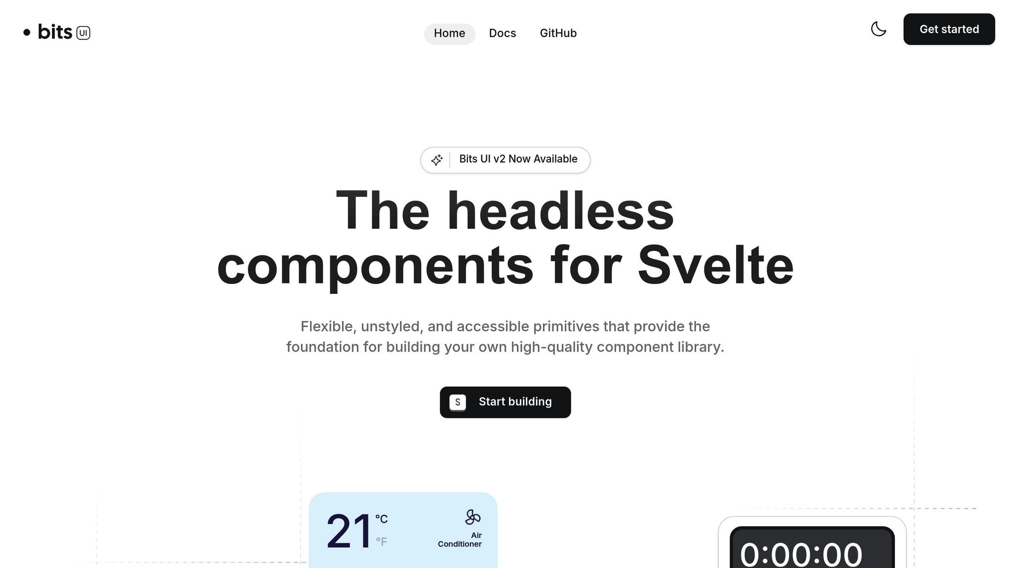
Bits UI offers a headless approach to Svelte component libraries, giving developers full control over how their prototypes look. Specifically designed for Svelte 5, this library focuses on providing the core logic and accessibility features while leaving all styling decisions up to you. It’s an excellent choice for teams building custom design systems or prototypes that need to meet strict branding requirements.
Native Svelte Components
Bits UI is built as a native Svelte library, meaning it operates without any wrappers or compatibility layers. This ensures smooth performance and seamless integration, allowing you to dive straight into its headless functionality.
To get started, just install the library:
npm install bits-ui Here’s an example of using a Bits UI component with your own custom styling:
<script> import { Button, Dialog } from 'bits-ui'; let dialogOpen = false; </script> <Button.Root class="bg-blue-600 text-white px-4 py-2 rounded hover:bg-blue-700 transition-colors" on:click={() => dialogOpen = true} > Open Dialog </Button.Root> <Dialog.Root bind:open={dialogOpen}> <Dialog.Portal> <Dialog.Overlay class="fixed inset-0 bg-black/50" /> <Dialog.Content class="fixed top-1/2 left-1/2 transform -translate-x-1/2 -translate-y-1/2 bg-white p-6 rounded-lg shadow-xl"> <Dialog.Title class="text-xl font-semibold mb-4">Custom Dialog</Dialog.Title> <p>This dialog is completely styled with your own CSS classes.</p> <Dialog.Close class="mt-4 px-4 py-2 bg-gray-200 rounded hover:bg-gray-300"> Close </Dialog.Close> </Dialog.Content> </Dialog.Portal> </Dialog.Root> Full Styling Freedom
Bits UI’s headless design means the components come without pre-defined styles. Instead, they expose class and style props, letting you apply your own CSS or use frameworks like Tailwind CSS or UnoCSS. This flexibility allows you to seamlessly match your project’s design system.
For example, here’s how you could style a dropdown menu using Tailwind CSS:
<script> import { DropdownMenu } from 'bits-ui'; </script> <DropdownMenu.Root> <DropdownMenu.Trigger class="bg-purple-600 text-white px-6 py-3 rounded-lg hover:bg-purple-700 font-medium"> Custom Menu </DropdownMenu.Trigger> <DropdownMenu.Content class="bg-white border border-gray-200 rounded-lg shadow-lg p-2 mt-2"> <DropdownMenu.Item class="px-4 py-2 hover:bg-gray-100 rounded cursor-pointer"> Dashboard </DropdownMenu.Item> <DropdownMenu.Item class="px-4 py-2 hover:bg-gray-100 rounded cursor-pointer"> Settings </DropdownMenu.Item> <DropdownMenu.Separator class="my-2 border-t border-gray-200" /> <DropdownMenu.Item class="px-4 py-2 hover:bg-red-50 text-red-600 rounded cursor-pointer"> Logout </DropdownMenu.Item> </DropdownMenu.Content> </DropdownMenu.Root> This approach ensures that you have complete control over the look and feel of your components, making Bits UI a great option for rapid prototyping while maintaining alignment with your design vision.
Accessibility and SSR Compatibility
Accessibility is built into Bits UI from the ground up, with support for WAI-ARIA standards to ensure that all interactive elements work seamlessly with assistive technologies. Additionally, the library integrates well with SvelteKit’s server-side rendering (SSR), which is perfect for projects requiring fast initial loads or better SEO performance. Its components handle hydration properly, ensuring everything functions as expected after the initial server render.
Tailwind and SvelteKit Integration
Bits UI works effortlessly with Tailwind CSS, as its components allow direct use of class props. This makes it an excellent choice for SvelteKit projects, especially when speed and flexibility are crucial. While the lack of pre-designed themes means you’ll need to style everything yourself, it also ensures that your prototypes can be tailored exactly to your needs.
9. Svelte Material UI (SMUI)
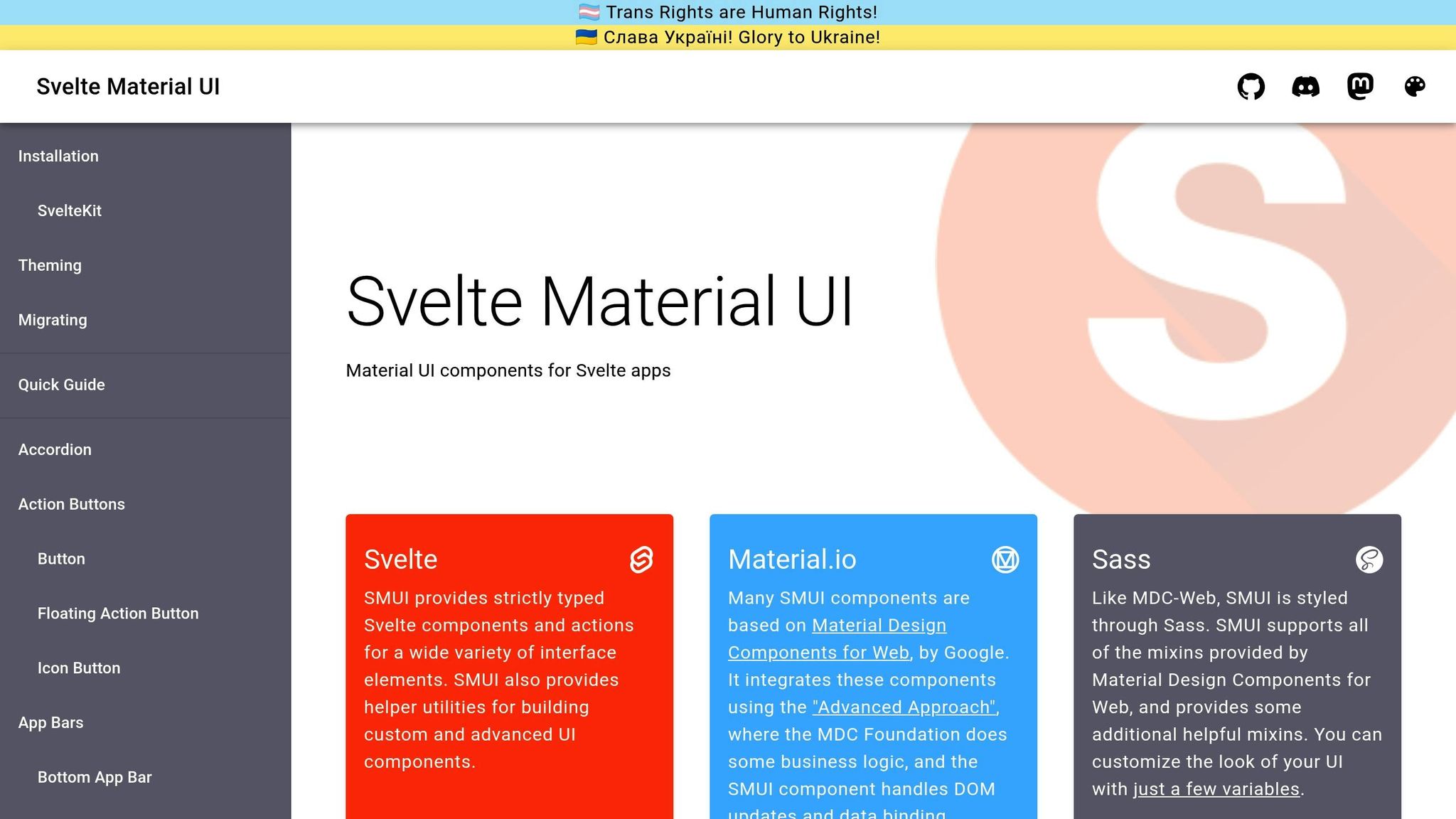
Wrapping up this list, Svelte Material UI (SMUI) delivers a polished Material Design experience tailored for Svelte. With over 40 Material Design components and more than 2,000 stars on GitHub as of late 2025, SMUI has become a dependable choice in the Svelte ecosystem. It’s ideal for creating professional, consistent interfaces that align with established design principles.
Built for Svelte
SMUI is crafted entirely with native Svelte components, ensuring it works seamlessly with Svelte’s reactivity system. This native approach not only enhances performance but also makes the components feel intuitive to use. To get started, you can install SMUI components like this:
npm install @smui/button @smui/textfield @smui/card Here’s an example of a simple Material Design form using SMUI:
<script> import Button, { Label } from '@smui/button'; import Textfield from '@smui/textfield'; import Card, { Content, Actions } from '@smui/card'; let email = ''; let password = ''; </script> <Card> <Content> <h2>Sign In</h2> <Textfield bind:value={email} label="Email" type="email" style="width: 100%; margin-bottom: 16px;" /> <Textfield bind:value={password} label="Password" type="password" style="width: 100%;" /> </Content> <Actions> <Button variant="raised"> <Label>Sign In</Label> </Button> </Actions> </Card> This example highlights how SMUI leverages Svelte’s reactivity while maintaining a smooth and natural development experience. The components are designed to be both functional and easy to customize, making it simple to adapt them to your project.
Flexible Styling Options
SMUI provides a strong starting point with pre-styled Material Design components, but it also allows for extensive customization. Whether you prefer using CSS variables, SASS, or class overrides, SMUI has you covered. For instance, you can define a custom theme with CSS variables:
:root { --mdc-theme-primary: #6200ea; --mdc-theme-secondary: #03dac6; --mdc-theme-surface: #ffffff; --mdc-theme-background: #fafafa; --mdc-typography-font-family: 'Roboto', sans-serif; } Or, you can style individual components directly:
<script> import Button, { Label } from '@smui/button'; </script> <Button class="custom-button" variant="raised" style="background-color: #ff6b35; border-radius: 24px;" > <Label>Custom Styled Button</Label> </Button> <style> :global(.custom-button) { box-shadow: 0 4px 12px rgba(255, 107, 53, 0.3); transition: all 0.3s ease; } :global(.custom-button:hover) { transform: translateY(-2px); box-shadow: 0 6px 20px rgba(255, 107, 53, 0.4); } </style> This flexibility allows you to build on Material Design’s foundation while adding your own unique touch.
Accessibility and SSR Compatibility
SMUI prioritizes accessibility by including ARIA attributes, keyboard navigation, and focus management across all components. This ensures a smooth experience for users relying on assistive technologies. Additionally, SMUI supports server-side rendering (SSR), making it a great fit for SvelteKit projects.
Optimized for SvelteKit
SMUI integrates effortlessly with SvelteKit, Svelte’s official application framework. Setting up is straightforward, and you can quickly start prototyping. For instance, you can include Material Design fonts in your project’s main HTML file:
<!-- app.html - Add Material Design Fonts --> <link rel="stylesheet" href="https://fonts.googleapis.com/css?family=Roboto:300,400,500,600,700"> <link rel="stylesheet" href="https://fonts.googleapis.com/css?family=Roboto+Mono"> While SMUI includes its own styles, it also plays well with Tailwind CSS, ensuring layout flexibility without conflicting styles.
With its rich component library, reliable codebase, and supportive community, SMUI is a fantastic option for developers looking to implement Material Design without the hassle of building components from scratch.
10. Sveltestrap
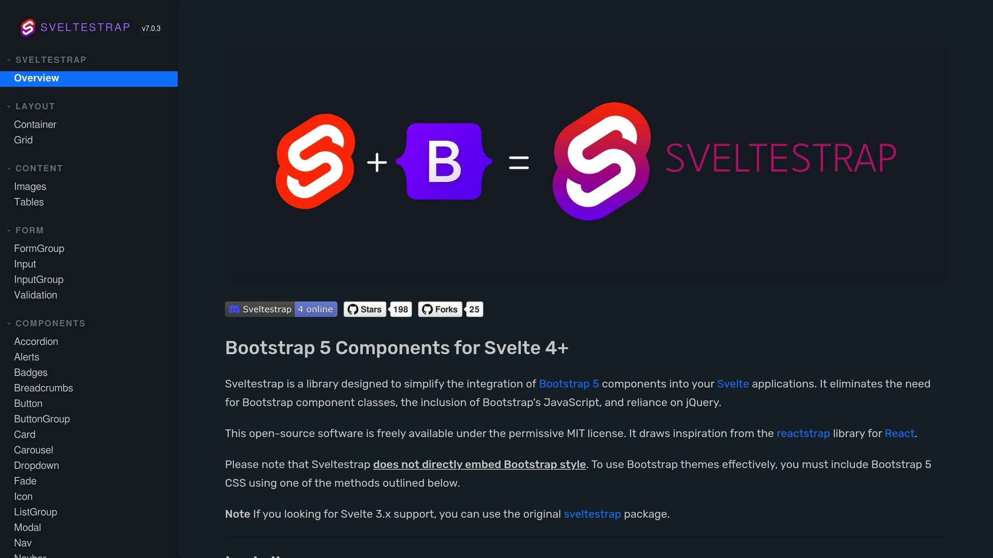
Sveltestrap brings Bootstrap 5 patterns directly into Svelte, making it a go-to tool for rapid prototyping. If you’re already familiar with Bootstrap, transitioning to Sveltestrap is straightforward. It combines Bootstrap’s design principles with Svelte’s reactivity and performance, giving you the best of both worlds.
Native Svelte Components
Every component in Sveltestrap is built natively in Svelte, ensuring smooth performance and reactivity. To get started, install it with:
npm install sveltestrap bootstrap Here’s an example of creating a responsive navigation bar:
<script> import { Navbar, NavbarBrand, Nav, NavItem, NavLink, Dropdown, DropdownToggle, DropdownMenu, DropdownItem } from 'sveltestrap'; let isOpen = false; </script> <Navbar color="dark" dark expand="md"> <NavbarBrand href="/">MyApp</NavbarBrand> <Nav class="ms-auto" navbar> <NavItem> <NavLink href="/features">Features</NavLink> </NavItem> <NavItem> <NavLink href="/pricing">Pricing</NavLink> </NavItem> <Dropdown nav bind:isOpen> <DropdownToggle nav caret>Account</DropdownToggle> <DropdownMenu> <DropdownItem>Profile</DropdownItem> <DropdownItem>Settings</DropdownItem> <DropdownItem divider /> <DropdownItem>Logout</DropdownItem> </DropdownMenu> </Dropdown> </Nav> </Navbar> This example highlights how Sveltestrap integrates Svelte’s dynamic structure with Bootstrap’s familiar components, making it easier to build responsive layouts quickly.
Styling Flexibility
Sveltestrap gives you access to pre-styled Bootstrap 5 components, making it easy to hit the ground running. You can also tweak styles using Bootstrap’s utility classes and CSS variables. Here’s an example of using the responsive grid system:
<script> import { Container, Row, Col, Card, CardBody, CardTitle, Button } from 'sveltestrap'; </script> <Container> <Row> <Col md="6" lg="4" class="mb-4"> <Card> <CardBody> <CardTitle>Quick Prototype</CardTitle> <p class="text-muted">Build interfaces rapidly with familiar Bootstrap components.</p> <Button color="primary" size="sm">Learn More</Button> </CardBody> </Card> </Col> <Col md="6" lg="4" class="mb-4"> <Card> <CardBody> <CardTitle>Responsive Design</CardTitle> <p class="text-muted">Bootstrap's grid system ensures your prototypes work on all devices.</p> <Button color="success" size="sm">Get Started</Button> </CardBody> </Card> </Col> </Row> </Container> To customize further, you can override Bootstrap variables in your CSS:
:root { --bs-primary: #6f42c1; --bs-success: #198754; --bs-border-radius: 0.5rem; --bs-font-sans-serif: 'Inter', system-ui, sans-serif; } Accessibility and SSR Support
Sveltestrap adheres to Bootstrap 5’s accessibility standards, ensuring that your prototypes are user-friendly. It supports ARIA guidelines, semantic HTML, and proper keyboard navigation, making it accessible to all users. Additionally, its native Svelte components work seamlessly with Svelte’s server-side rendering (SSR) capabilities.
Seamless Integration with SvelteKit and Tailwind
Sveltestrap integrates effortlessly with SvelteKit. You can start using its components in your SvelteKit pages or layouts without additional setup. Here’s an example of a simple SvelteKit page:
<!-- src/routes/+page.svelte --> <script> import { Alert, Button, Modal, ModalBody, ModalFooter, ModalHeader } from 'sveltestrap'; let showModal = false; let alertVisible = true; </script> <svelte:head> <title>Prototype Dashboard</title> </svelte:head> {#if alertVisible} <Alert color="info" dismissible bind:isOpen={alertVisible}> Welcome to your prototype dashboard! </Alert> {/if} <Button color="primary" on:click={() => showModal = true}> Open Modal </Button> <Modal bind:isOpen={showModal}> <ModalHeader>Prototype Feature</ModalHeader> <ModalBody> This modal demonstrates how quickly you can build interactive elements with Sveltestrap. </ModalBody> <ModalFooter> <Button color="secondary" on:click={() => showModal = false}>Cancel</Button> <Button color="primary" on:click={() => showModal = false}>Confirm</Button> </ModalFooter> </Modal> If you’re using Tailwind CSS, make sure to manage CSS specificity to avoid conflicts with Bootstrap styles.
For teams already comfortable with Bootstrap, Sveltestrap simplifies the process of creating Svelte prototypes while maintaining consistent design patterns. It’s a practical choice for building prototypes quickly without diving into unfamiliar tools or frameworks.
Library Comparison Table
Picking the right Svelte UI library hinges on your specific project needs and technical goals. To simplify your decision, here’s a table that outlines the core features of each library:
| Library | Component Coverage | Styling Approach | Accessibility Features | SSR Compatibility | Best Use Cases |
|---|---|---|---|---|---|
| SVAR Svelte Components | Extensive enterprise suite (155 KB core) | Plain CSS | Yes, ARIA support | Yes, SvelteKit ready | Data-heavy dashboards, enterprise apps |
| Melt UI | Headless primitives | Customizable CSS | Yes, accessibility-first | Yes, SSR compatible | Custom accessible interfaces |
| Svelte Headless UI | Headless components | Bring your own styles | Yes, built-in accessibility | Yes, SSR support | Fully customizable, accessible UIs |
| shadcn-svelte | Modern component set | Tailwind CSS | Yes, accessible by default | Yes, SvelteKit integration | Custom modern UI prototyping |
| Smelte | Material Design components | Tailwind CSS + Material | Partial accessibility | Yes, SSR compatible | Material Design prototypes |
| Skeleton | Comprehensive design system | Tailwind CSS | Yes, ARIA compliant | Yes, SvelteKit optimized | Design system prototyping, Figma integration |
| Flowbite-Svelte | 63+ ready-made components | Tailwind CSS | Yes, accessibility features | Yes, SSR ready | Fast modern web apps, SaaS MVPs |
| Bits UI | Headless primitives | Tailwind/UnoCSS | Yes, accessibility-first | Yes, SSR support | Custom accessible component libraries |
| Svelte Material UI (SMUI) | Full Material Design suite | Custom theming system | Yes, Material standards | Yes, SSR compatible | Google Material Design compliance |
| Sveltestrap | Bootstrap 5 components | Bootstrap CSS | Yes, Bootstrap accessibility | Yes, SvelteKit integration | Bootstrap-based rapid prototyping |
The table offers a quick overview, but let’s dig deeper into the standout features of these libraries.
Component coverage is a key factor. Libraries like SVAR and Flowbite-Svelte shine with their extensive collections. SVAR caters to enterprise-grade needs with advanced controls, while Flowbite-Svelte delivers over 63 ready-to-use modern components. On the other hand, headless options like Melt UI and Bits UI offer fewer pre-styled components but allow for unparalleled customization.
Styling approaches vary widely. Tailwind CSS dominates libraries like shadcn-svelte, Skeleton, and Flowbite-Svelte, enabling fast and flexible customization. Sveltestrap, however, sticks to Bootstrap CSS, making it a natural choice for teams already familiar with Bootstrap workflows. For those preferring plain CSS or custom theming, SVAR and Svelte Material UI (SMUI) provide straightforward options for tailored styles.
Accessibility is a priority across the board. Libraries such as Bits UI, Flowbite-Svelte, and Skeleton go the extra mile with full ARIA support, keyboard navigation, and screen reader compatibility. Even headless libraries like Svelte Headless UI ensure accessibility is baked in, helping teams adhere to best practices without extra effort.
SSR compatibility is another strong point for these libraries. All modern Svelte UI libraries integrate seamlessly with SvelteKit, making them ideal for production-ready projects that require server-side rendering.
When it comes to best use cases, the choice becomes clearer. SVAR is perfect for enterprise applications with data-heavy requirements, while Skeleton and Flowbite-Svelte are excellent for teams working with Tailwind CSS who need to build quickly. Sveltestrap suits teams familiar with Bootstrap, and Svelte Material UI is ideal for projects adhering to Google’s Material Design standards.
Ultimately, your choice will depend on your team’s expertise and project timeline. Libraries with extensive components, like SVAR and Flowbite-Svelte, can save significant time on complex projects. Meanwhile, headless options like Bits UI offer unmatched design flexibility, though they require more effort for styling. With this breakdown, you’re better equipped to pick the right library to elevate your Svelte prototypes.
Best Practices for Svelte Prototyping
Creating effective prototypes with Svelte UI libraries isn’t just about picking components – it’s about tapping into Svelte’s strengths while making smart decisions that balance architecture, performance, and user experience.
Take advantage of Svelte’s reactivity. One of Svelte’s standout features is its built-in reactivity. With reactive statements ($:), you can instantly update your UI when the state changes, eliminating unnecessary code and making it easier to test user interactions. This makes Svelte an intuitive choice for dynamic prototypes. Pairing this with the right framework can amplify your efficiency.
Use SvelteKit for production-ready prototypes. SvelteKit is more than just a framework – it’s a tool that bridges the gap between prototyping and production. Its server-side rendering (SSR) capabilities boost performance, improve SEO, and streamline navigation. Plus, prototypes built with SvelteKit can easily evolve into full-scale applications, saving time and effort when moving to production.
Pick the right styling approach. How you handle styling can significantly impact your workflow.
- Pre-styled libraries like Smelte and Flowbite-Svelte provide ready-made components that speed up prototyping. These libraries are especially useful when working with familiar design systems like Material Design or Bootstrap, helping you quickly validate ideas.
- Headless libraries like Bits UI and Svelte Headless UI, on the other hand, offer unstyled primitives, giving you complete control over the look and feel. This is ideal for custom branding or unique user experiences but requires more effort to implement.
The choice is simple: go pre-styled for speed and consistency, or headless for flexibility and customization.
Make accessibility a core focus. Accessibility isn’t just a nice-to-have; it’s a must from the beginning. Choose libraries that come with built-in accessibility features like keyboard navigation and ARIA attributes. Bits UI and Flowbite-Svelte are great examples, offering strong accessibility support out of the box. Test your prototypes with screen readers and follow WCAG guidelines to ensure inclusivity for all users.
Prioritize performance, even in prototypes. Svelte’s compiled output is naturally efficient, but you can push it further. Use native Svelte components and fine-grained reactivity to reduce unnecessary re-renders. Lightweight libraries, such as SVAR Core (just 155 KB), are excellent for data-heavy prototypes without sacrificing performance. Incorporate lazy-loading for components and assets, and use browser developer tools to identify and address bottlenecks.
Think ahead for scalability and maintainability. A forward-thinking approach can save you headaches later. Keep your code modular and document everything – component choices, customizations, and accessibility practices. Building a shared component library with clear documentation ensures a smoother transition from prototype to production. This approach also strengthens collaboration between design and development teams.
Test with real users and data. Prototypes shine when they mimic real-world scenarios. Use realistic content and test with actual users whenever possible. For US audiences, ensure proper localization – use the dollar sign ($), MM/DD/YYYY date formats, and imperial units where applicable. These small details lend credibility and improve the quality of user feedback.
Start fast, then refine. Kick off your project with pre-styled libraries for rapid iteration. Once the core concepts are validated, transition to headless or custom components as your design evolves. Skeleton is a great example of this dual approach, offering both quick prototyping and extensive customization through its Figma integration and Tailwind-powered primitives.
Code-Backed Prototyping Platforms
Svelte UI libraries provide the foundation for building interactive prototypes, but code-backed prototyping platforms take things further by merging design and development into a unified process. These platforms allow teams to create prototypes using actual component code instead of static mockups, enhancing collaboration between designers and developers. This approach aligns seamlessly with the rapid prototyping strategies mentioned earlier.
Take UXPin, for example. This platform enables a code-backed workflow where designers and developers build interactive prototypes using built-in or custom React component libraries. With features like advanced interactions and reusable components, UXPin streamlines product development. While it primarily focuses on React, its principles can also enhance workflows for Svelte-based projects.
The advantages are striking. Engineering teams using these platforms report up to 50% faster development times. One senior UX designer highlighted how this efficiency impacts large-scale organizations with dozens of designers and hundreds of engineers:
"What used to take days to gather feedback now takes hours. Add in the time we’ve saved from not emailing back-and-forth and manually redlining, and we’ve probably shaved months off timelines." – Mark Figueiredo, Sr. UX Team Lead at T.RowePrice
When paired with Svelte libraries, these platforms become even more effective. Libraries like shadcn-svelte, Bits UI, and Melt UI allow native Svelte components to integrate directly into workflows. This ensures designers and developers work from the same code, reducing redesign cycles and maintaining consistency throughout the process.
The real game-changer? Establishing a shared component language between design and development teams. When both teams use the same Svelte components, the traditional friction of design handoffs disappears. Designers can create with real component behaviors and constraints in mind, while developers receive prototypes that closely mirror the final product.
"As a full stack design team, UXPin Merge is our primary tool when designing user experiences. We have fully integrated our custom-built React Design System and can design with our coded components. It has increased our productivity, quality, and consistency, streamlining our testing of layouts and the developer handoff process." – Brian Demchak, Sr. UX Designer at AAA Digital & Creative Services
Svelte’s performance advantages make it particularly well-suited for this approach. Its compile-time framework reduces browser workload compared to runtime frameworks, resulting in prototypes that are faster and more representative of the final product. Pairing Svelte with headless libraries like Bits UI or Melt UI adds flexibility, enabling teams to prototype unique interactions while preserving the performance benefits of Svelte’s native components.
The design-to-code workflow becomes seamless with this setup. Prototypes built using native Svelte components can transition directly into production-ready code, eliminating the need for developers to refactor or resolve discrepancies. This single source of truth ensures that the design intent matches the final implementation, which is especially crucial for complex, data-intensive prototypes. Libraries like SVAR, with its lightweight 155 KB core and virtual scrolling capabilities, further enhance performance and accuracy from prototype to production.
Conclusion
Throughout this guide, we’ve looked at how 10 Svelte UI libraries can streamline prototyping by offering the performance and flexibility developers need. Tools like Flowbite-Svelte, with its extensive collection of over 60 components, can cut development time in half for common UI patterns, making it a standout option for speeding up your workflow.
Performance remains a key strength of these libraries. With native Svelte integration, options like SVAR, Skeleton, and Flowbite-Svelte ensure prototypes stay fast and responsive, even as complexity increases.
Modern Svelte libraries also prioritize accessibility and inclusivity. Built-in ARIA attributes, keyboard navigation, and screen reader support make it easier to conduct real-world user testing without requiring extensive manual adjustments.
When it comes to design flexibility, libraries such as shadcn-svelte, Smelte, and Melt UI shine. They allow teams to craft prototypes that align closely with their product vision. Integration with popular styling frameworks like Tailwind CSS further simplifies customization while ensuring consistent visuals across projects.
To get the most out of these tools, choose a library that aligns with your project’s specific needs for design, performance, and customization. Libraries with detailed documentation and active user communities, such as SvelteUI and shadcn-svelte, can make onboarding easier and troubleshooting quicker during the prototyping phase.
For projects based in the United States, don’t overlook localization needs. Libraries like SVAR include built-in features to handle currency, date formats, and measurement units seamlessly.
Thanks to their ready-to-use components, native Svelte performance, and extensive customization options, these libraries are invaluable for rapid prototyping. Whether you’re working on data-heavy enterprise tools or consumer-facing applications, they provide a strong foundation for creating prototypes that are both functional and aligned with your final product vision.
FAQs
What should I look for when selecting a Svelte UI library for my project?
When choosing a Svelte UI library, prioritize features such as support for code-driven components, tools for building detailed prototypes, and options to export ready-to-use production code. Opt for libraries that let you work with pre-made components or seamlessly incorporate your own from a Git repository.
These capabilities streamline your process, helping you design and prototype interactive UIs efficiently while ensuring an easy handoff to the development phase.
What’s the difference between headless Svelte UI libraries and pre-styled libraries when it comes to customization and flexibility?
Headless Svelte UI libraries focus on delivering essential functionality and components without enforcing any predefined styles or designs. This approach allows you to tailor every aspect of the user interface to suit your project’s specific needs. They’re perfect for developers who want full creative control over their designs.
On the other hand, pre-styled libraries come with ready-made styles and design systems, making them faster to set up. While they save time and ensure consistency, they can be limiting if you require extensive customization. These libraries work well for quick prototypes or projects where maintaining a uniform design and speed is a priority.
What is server-side rendering (SSR) in Svelte UI libraries, and why does it improve performance?
Server-side rendering (SSR) in Svelte UI libraries involves generating HTML content directly on the server before it’s sent to the user’s browser. This method speeds up how quickly users see content since the page arrives fully rendered, cutting down on the time needed for the browser to process and build it.
Beyond performance, SSR plays a key role in improving search engine optimization (SEO). By delivering pre-rendered content, it ensures search engines can easily index the page, which helps with visibility. It also benefits users with slower internet speeds or less powerful devices by reducing the amount of JavaScript their browser has to handle. In short, SSR helps build applications that are faster, easier to access, and more user-friendly.

